Category Archives: Research

Wine and type pairing survey

wine cover

What can a typeface reveal about the wine we drink? Take the survey and help us to find out.

Do you agree with the predictions at the end of the survey? Results will be published once enough people have taken part for clear patterns to form, and the next stage will be to do a real life tasting session. Sign up to the mailing list for updates.

It’s Nice That ‘Why Fonts Matter, and how they impact your mood’

Screen Shot 2016-01-28 at 10.18.54

Typography might just help you date, solve obesity and impact your mood; so we’ve learnt from type fanatic Sarah Hyndman. We’ve previously dubbed her “the one woman tour-de-force behind the Type Tasting enterprise”, which looks at the power typography has over our lives and senses. She’s now published a new book on the subject, Why Fonts Matter, and has kindly offered us an extract looking at the effects of typography on our emotions.

“Physically, we use our voice, facial expressions. gestures and posture to convey a wide range of emotional cues from the subtle to the dramatic. Typefaces and the way they are used provide a similarly extensive emotional range typographically.”

Read the full article.

Christmas ‘font sniffing’ kits

blog 001

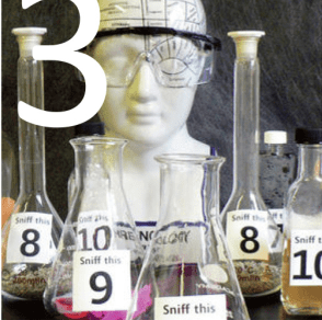
This year’s seasonal fun from Type Tasting invites recipients to play with one of the multi-sensory typography themes we’ve been experimenting with throughout the year. What smells would you think of as being quintessentially ‘Christmas’ and which typefaces would you match them with?

Continue reading

AIGA: The World’s Most Expensive-looking Font Might Surprise You

Screen shot 2015-11-04 at 14.59.50

The World’s Most Expensive-looking Font Might Surprise You
By Madeleine Morley for AIGA

When you hear the word “luxury,” it’s easy to conjure up the colors gold, silver, and velvety purple; yet when it comes to typography, what we associate with wealth is less clear-cut. For the ancient Greeks, rare and precious purple ink came from sea snails found deep in the ocean, a dye so difficult to obtain it was reserved for kings. We don’t mine the sea for letters of the alphabet though, so what’s the typeface equivalent of purple ink, the fanciest looking font?

Continue reading

Final Weekend

Screen Shot 2015-10-24 at 10.02.49
FINAL WEEKEND
It’s the final weekend to purchase a copy of the first edition of The Type Taster: Why Fonts Influence You

Books purchased this weekend will all be signed and have free UK postage
This first, limited edition of the book is only available until the end of Sunday 25th October 2015.

From 28th January 2016 The Type Taster will be published as Why Fonts Matter under the Virgin Books imprint of Penguin Random House.

Click here to pre-order Why Fonts Matter

Layout 1 (Page 9 - 10) Layout 1 (Page 9 - 10)   virgin logo    PRH_BRAND_SYSTEM_REGION_PENGUIN_UK_1C_BLACK

Typography resources for graphic design students

subconscious

Are you a graphic design student? Would you like to know more about the power of typefaces and how exciting typography can be?

Type is both functional and evocative
Type functions as a carrier of words. It displays these efficiently so that the reader’s eyes can glide seemingly effortlessly across the page as they read. It is sometimes considered that type should be ‘invisible’ and not intrude on the reading experience. The title of American typographic expert Beatrice Warde’s 1930 essay, ‘The Crystal Goblet’ refers to her opinion that type should function like a clear wine glass and purely ‘carry but not obstruct’ the content. Much research into typefaces explores their legibility, focusing on the mechanics of letter shapes and how they function. Testing includes eye-tracking and monitoring response times. An example is the research Monotype type foundry has done with MIT into legibility of typefaces on car dashboards. There are rules for legible typography, scroll down to the resources section below for nine of the important rules.

However there is more to typography than legibility…

Screen Shot 2015-09-28 at 10.19.49

patrick

Continue reading

Learn about typography: The Type Taster student discount offer

student pack of games

Are you a UK design student? Prepare yourself for the new year with a discounted copy of The Type Taster and free postage (save £5). This is a book about typography from the point of view of the type consumer and takes you through the associations and science behind fonts influence you as a reader.

Buy it quickly! This edition is only available until 25th October.*
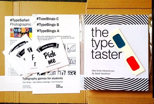
Student copies of the book will also include a selection of typography games (shown above).
subconscious

You have really opened my eyes to such a brilliant subject. It’s already making me view design work from such a different view point and I have now become excited by the possibilities typefaces present while experimenting with them.” Design student Jessica Dutton

“This alongside the typography bible (Robert Bringhurst’s elements of typographic style) should become a staple in everyone’s collection.” James (Via Creative Review blog)

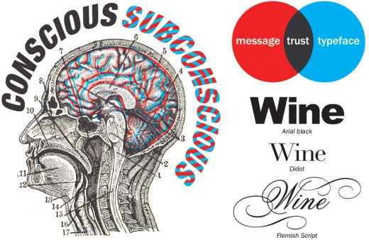
“This is no boring instructional tome on the correct use of ligatures, rather it takes a look at the emotional lives of fonts, and examines how their distinct personalities create (often subconscious) emotional responses.” Grafik

Continue reading

If Futura Extra Bold was a person, what would they be like?

Type Dating Game

A taste of type

Posted on 23rd September 2015. Type / Typography

Typeface #3 was described as an “unstable wannabe with no style and a 50s moustache who, on a date, would take you for a hotdog at a bowling alley, all the while smelling of JOOP!”

If Futura Extra Bold was a person, what would they be like? Would you go on a date with them? And what does a typeface smell like? Sarah Hyndman’s Type Tasting games question our responses to fonts. Last weekend, she brought a pop-up version of her workshop to the V&A. Natalie Kelter described what happened for Creative Review.

Type Dating Game

creative review logo
Read the article here…

Type Tasting at the V&A in photos

sat 3

A glimpse of the Type Tasting at the V&A for the London Design Festival at the weekend in photos. Thank you to the team of brilliant volunteers and to everybody who came along and threw themselves into the games and experiments exploring the influence of different typefaces and fonts so wholeheartedly. We estimate around 500 of you visited during the two three-hour sessions and we now have lots of research data to tally up. You can still take part in a selection of the games and experiments online if you click here.

sat 001b
Type Personality Game Show

Continue reading

Brilliantly bizarre event

Screen Shot 2015-09-21 at 10.24.45

“This brilliantly bizarre event seems like it could be plucked straight from Willy Wonka’s chocolate factory. Uncover the personalities of your favourite fonts and learn more about your own through a series of multi-sensory games at the V&A.”

Type Tasting at #3 on Rockett St George’s Our Favourite Things to See and Do at This Years London Design Festival