Tag Archives: research

What’s your typographic superpower?

A meditation in typography for people with a fondness for fonts.

A fun game created by Adobe Fonts and Sarah Hyndman to showcase the new browse-by-tags feature that lets you help build the Adobe Fonts collection of tags. More fonts and tags will be added in the future.

The game was built by Oddbird with sound created by Rob Taliesin Owen.

Play the game here https://game.fonts.adobe.com/

Continue reading

Experience the emotional impact of type: Mood at MAX multisensory installation

Type Tasting installation at Adobe MAX in Los Angeles

Type Tasting created a large-scale multisensory installation for Adobe Fonts at the Adobe MAX conference in Los Angeles from 2nd to 6th November 2019.

“F*!*ing genius!”

Visitors were immersed in the mood of different typefaces through all of their senses. At each station they were invited to put on headphones, to smell a scent in a jar or by flipping the pages of a book, to eat a small taster and to feel a texture. Each set of stimuli was designed to bring a mood to life in the participant’s imagination. There was curiosity and intrigue as the first visitors arrived and they were soon returning with groups of friends saying “you have to try this”.

This is a multisensory installation featuring a selection of booths designed for participants to experience the emotional impact of type. Each booth immerses you in the mood of a typeface with sound, smell, texture and taste.

Continue reading

Take part in the Typographic Interventions project

What is a typographic intervention? What if it’s not what it says on the tin? Can typography alter your experiences, or nudge you to change your behaviour?

This year we are exploring the potential for creating typographic interventions that initiate positive behaviour change. You are invited to take part in typographic research. Some of the experiments you will take part in are in their early proof of concept stages, for others data is being gathered potentially to be published as a future collaborative study.

Continue reading

Pop Up Type Tasting Typography Lab

Pop Up Type Tasting Typography Lab
Stoke Newington Literary Festival
2nd & 3rd June, 11am to 8pm, free.
Venue – Locations around the Town Hall

*** NEWS ***
One of the experiments we ran at this event has now been published: The role of typeface curvilinearity on taste expectations and perception by Carlos Velasco, Sarah Hyndman (Type Tasting), Charles Spence (University of Oxford), International Journal of Gastronomy and Food Science, January 2018.
***

Continue reading

AIGA: The World’s Most Expensive-looking Font Might Surprise You

Screen shot 2015-11-04 at 14.59.50

The World’s Most Expensive-looking Font Might Surprise You
By Madeleine Morley for AIGA

When you hear the word “luxury,” it’s easy to conjure up the colors gold, silver, and velvety purple; yet when it comes to typography, what we associate with wealth is less clear-cut. For the ancient Greeks, rare and precious purple ink came from sea snails found deep in the ocean, a dye so difficult to obtain it was reserved for kings. We don’t mine the sea for letters of the alphabet though, so what’s the typeface equivalent of purple ink, the fanciest looking font?

Continue reading

Wired on how typography impacts human perception

Franklin_Gothic_1-01

If You Love That Font So Much, Why Don’t You Date It?
By Liz Stinson for Wired

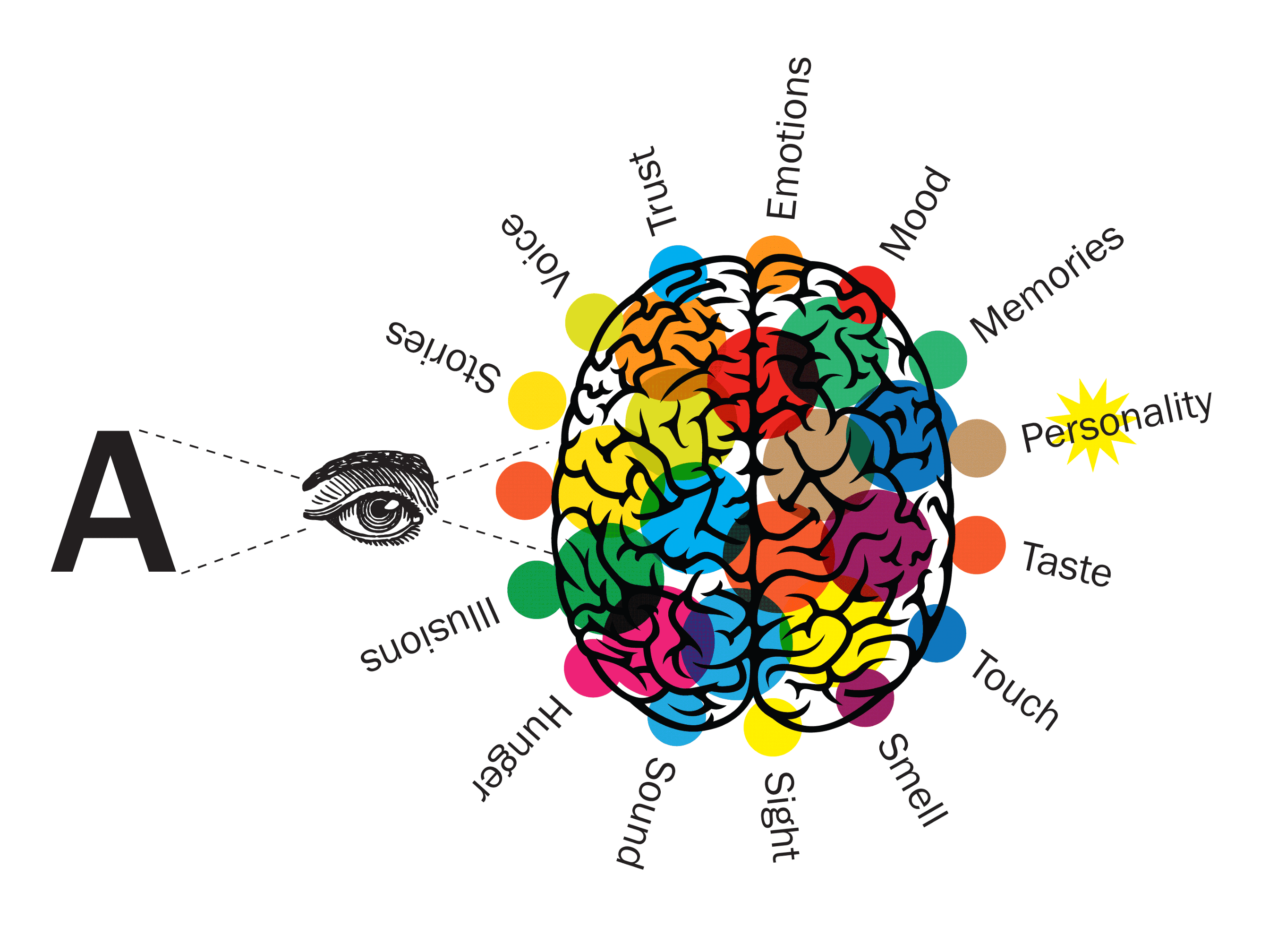
“If I were going to date a typeface, it would probably be something like Franklin Gothic bold condensed. The font is undeniably masculine—sans-serif, solid, reliable. If it were a human, it’d be the type of guy who would fix my broken sink and play football in the backyard on Thanksgiving. I’m not alone here. Lots of women find Franklin Gothic to be a total dreamboat.”

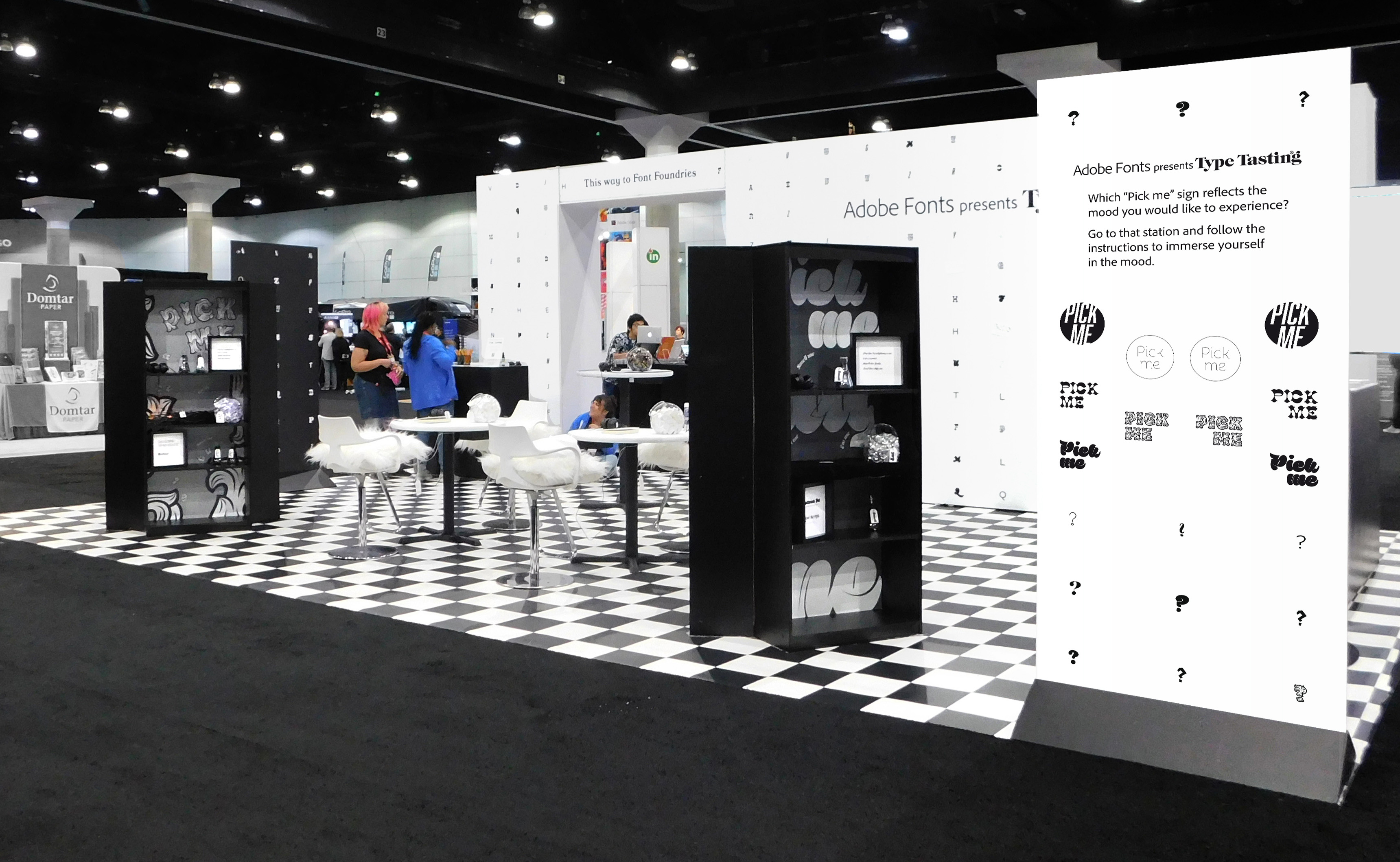
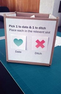
“Some proof: When graphic designer Sarah Hyndman asked women to choose between dating nine fonts including Franklin Gothic, Futura Light, Helvetica, and Arial bolded round, 20 percent of women said they’d pick Franklin Gothic as their typographic beau, the winner by a landslide. I know it sounds weird, but let me explain. Hyndman’s dating question is part of Tasting Type, a series of online experiments she’s been performing to gather data on how typography impacts human perception.”

wired logo LR
Read the full article…

Pop-up Preparation: A Type Tasting Event Teaser

12041767_10153758807598968_1235409926_n copy 12033324_10153758807563968_1083172833_n

Hello it’s Natalie again! Here I am giving you another glimpse into the wild and wonderful things that I’ve been up to in the Type Tasting studio this week. If you’d like to find out how sixteen carefully wrapped parcels and a rather cheeky looking answer box are going to be involved in this weekend’s event, then carry on reading.

Continue reading