I’ve been chatting to artist friends recently who’re interested in psychogeography. I always assumed that psychotypography would be a similar field, just with type instead of geography. Searching hasn’t turned much up but I think psychotypography describes what I do pretty well so I think it should be a thing.
Since psychogeography describes the effect of a geographical location on the emotions and behaviour of individuals (Tate), then I propose that psychotypography describes the effect of the typographic environment on the emotions and behaviour of individuals.
I love that an early influence was the flâneur, or urban wanderer. I think my Dalston Type Safaris could be considered a flâneur’s ramble through lettering in the urban environment.
Who’s experimenting in this space?
I made a psychotypography website ready for some experiments, it’s very empty right now.
This is a question I’ve been asking recently. Thank you for all your great answers, keep them coming.
Maybe it’s “I want to use more trending fonts” or “I want to know what font rules I can break, so I can have fun with fonts” or even “My teacher wants a simple design that is typeset in Arial. Is there any way I could secretly drop in another font without them noticing?”.
I recognise many as problems I had earlier in my career, when I also shared your feelings of anxiety and frustration.
By sharing your problems you’re joining me in my mission to change the way we think and talk about typography by making it exciting for everybody. Let’s all go from “overwhelmed” to “empowered”.
I’ll pick one a week to answer. You’ll also be helping me to make sure my books and workshops are really useful for you.
These are some of the problems you’ve written to me about, how many of them resonate with you?
“Finding the right fonts for client’s websites” • “I want to use more trending fonts” • “My teacher wants a simple design that is typeset in Arial. Is there any way I could secretly drop in another better font without them noticing?” • “How to choose the best font” • “I love fonts, but never know when to use serif or non-serif ones—what should guide this decision?” • “I’m struggling to find a consistent font theme for my sector” • “I can’t decide” • “I want to know what font rules I can break, so I can have fun with fonts”.
How these make you feel
“Screaming” • “Disoriented” • “Old fashioned and stuck” • “Overwhelmed about how to start” • “Frustrated” • “Unsure” • “Frustrated, apprehensive (did I get it right?) & unconfident” • “Anxious that the font we select may not resonate” • “Frustrated” • “Curious”.
How you would like to feel about choosing typefaces?
“Happy” • “Relaxed” • “Free” • “Successful and able to more clearly communicate” • “Really happy” • “Empowered & confident (& thus relaxed!)” • “A lot more confident” • “Empowered” • “Joyous”.
Are you a culturally curious lover of letters, do you scroll through a font menu as part of your work? What typography problem can I solve for you?
It doesn’t matter whether it feels silly (I promise it won’t be). Maybe it’s “I want to know how to use those new trippy type trends, but I don’t want to get it wrong” or “I want to choose more adventurous fonts, but I don’t know where to start” or “I want to understand how type links to culture”.
Tell me what your problem is so I can work out how to solve it. Click on the link that best describes you and answer three quick questions:
Thank you! You’re shaping the future of Type Tasting. Your name will be credited in the sequel to Why Fonts Matter, I’ll also share my suggested solutions with you (the typography problems will be kept anonymous).
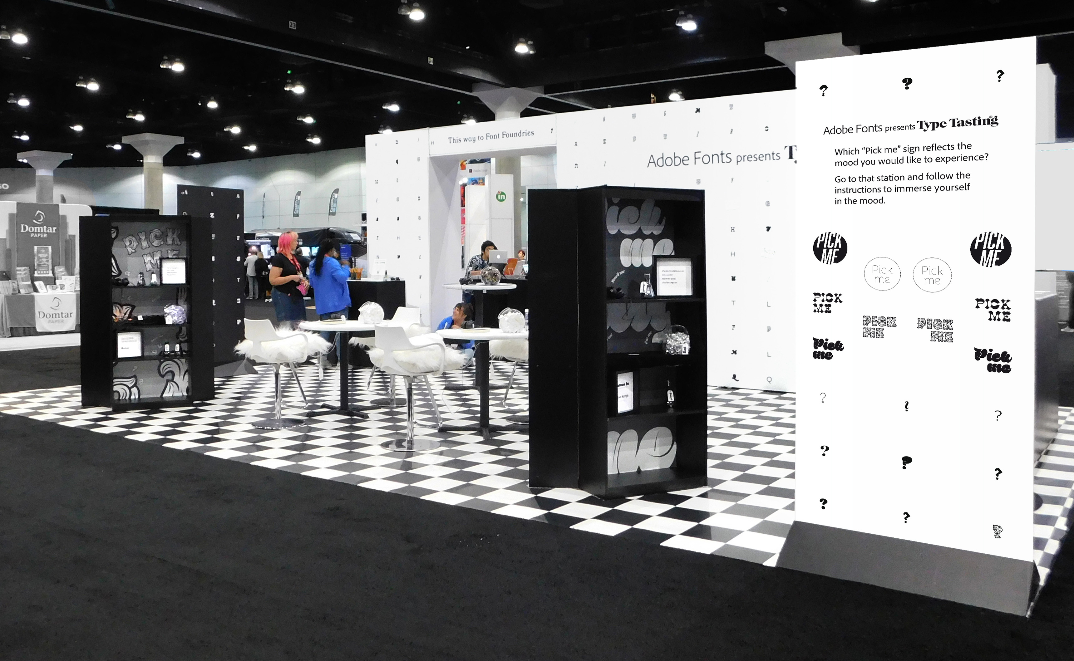
Type Tasting created a large-scale multisensory installation for Adobe Fonts at the Adobe MAX conference in Los Angeles from 2nd to 6th November 2019.
“F*!*ing genius!”
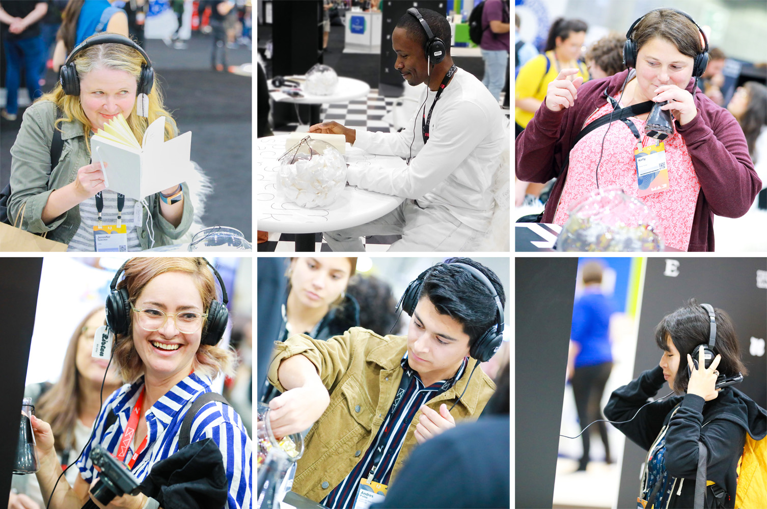
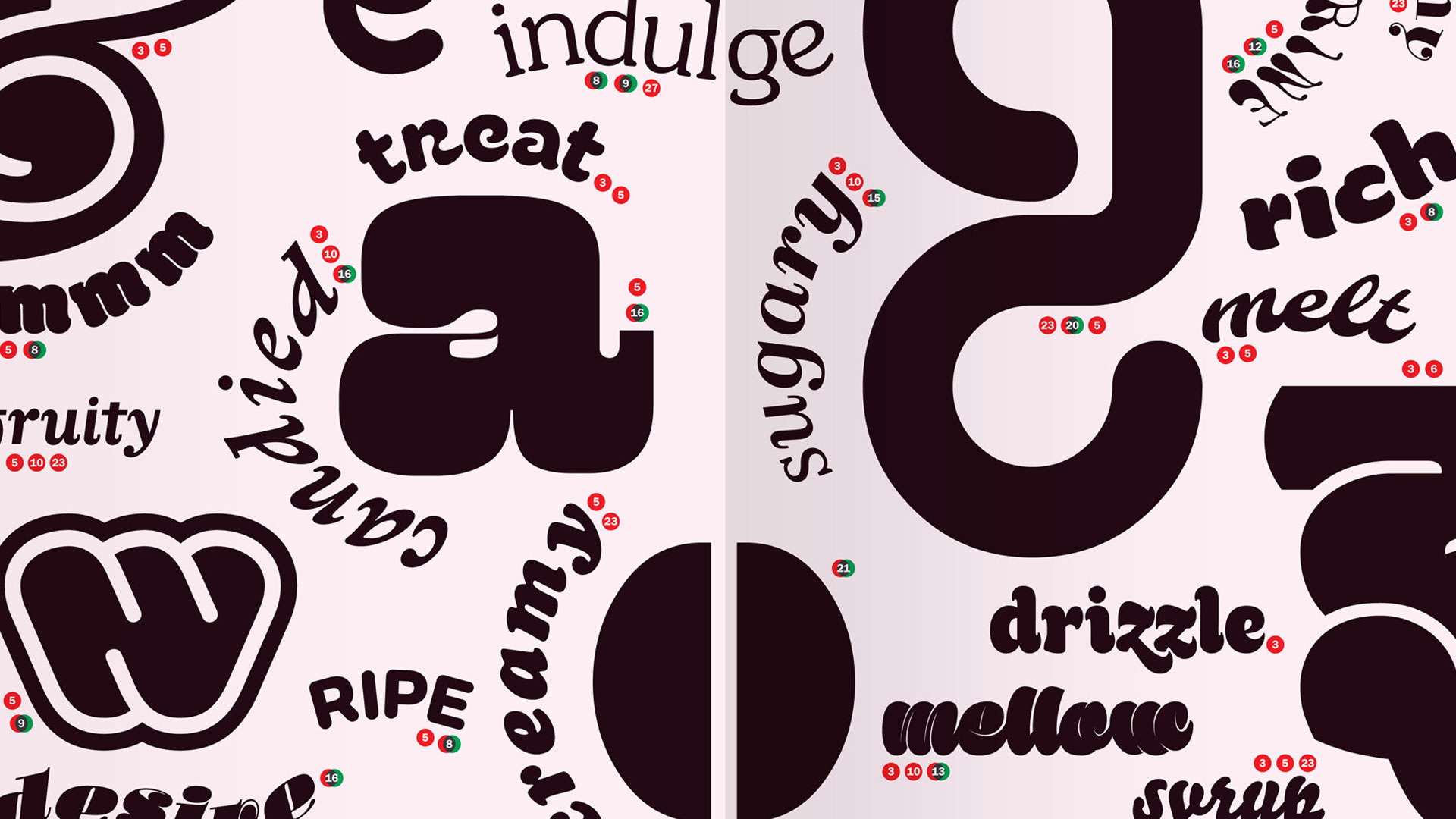
Visitors were immersed in the mood of different typefaces through all of their senses. At each station they were invited to put on headphones, to smell a scent in a jar or by flipping the pages of a book, to eat a small taster and to feel a texture. Each set of stimuli was designed to bring a mood to life in the participant’s imagination. There was curiosity and intrigue as the first visitors arrived and they were soon returning with groups of friends saying “you have to try this”.
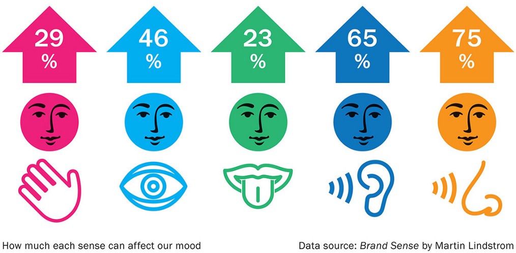
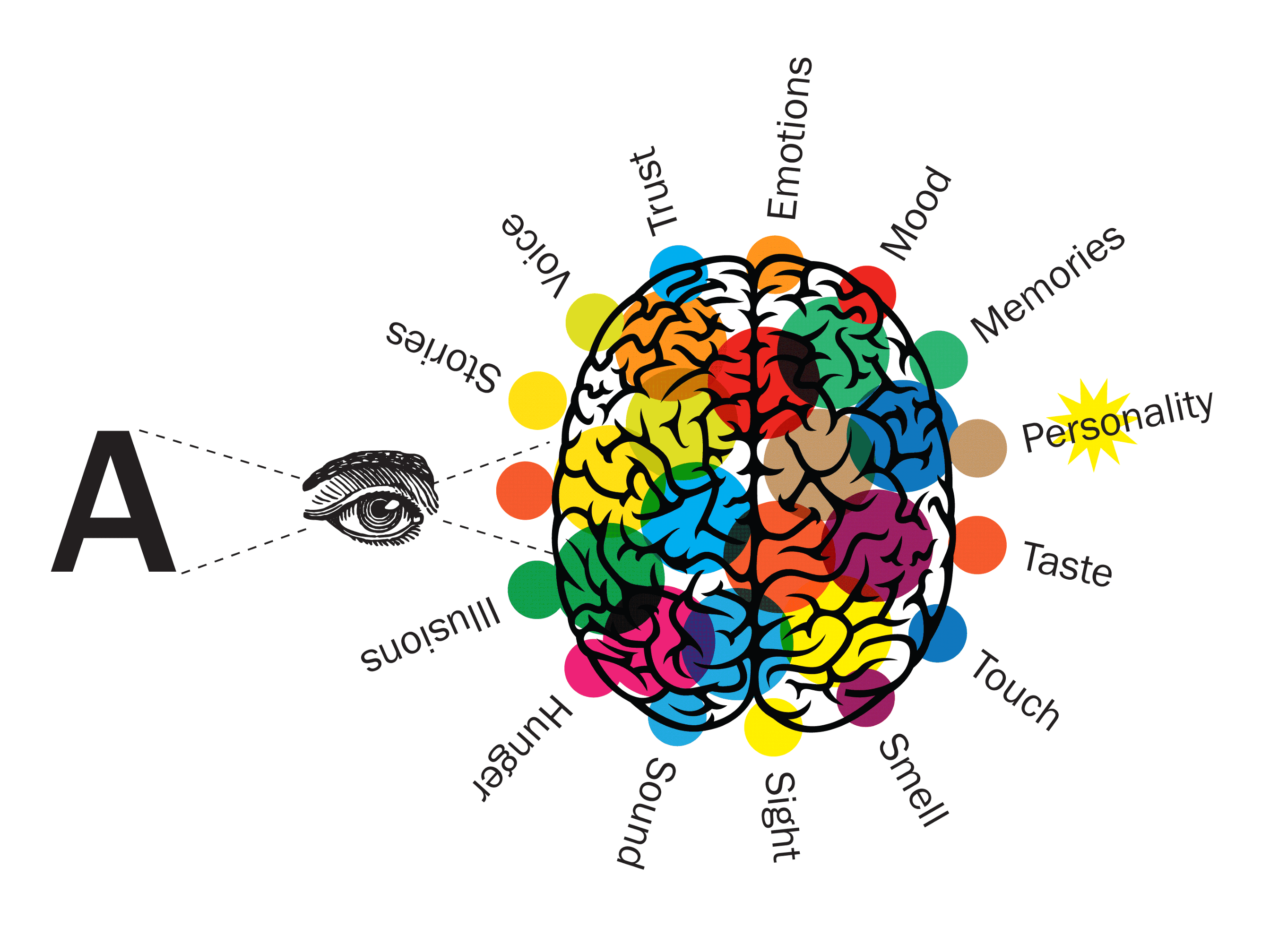
We absorb information through all of our senses simultaneously. This speeds up our ability to judge situations and react quickly and is fundamental to our ability to recognise signals and communicate. This played a vital role in human survival when our ancestors needed to respond to danger quickly, often relying on sound or smell when it was dark and a large proportion of our genes are still devoted to detecting odours.
Graphic designers and type consumers interact with typography in very different ways. Each is just as much of an expert in their own field of experience, but one interacts consciously and the other subconsciously.
With the release of her two new books, Design Week speaks to the graphic designer about our annotated world, crossing over into science and why she wants everyone to have the confidence to talk about type.
When Design Week catches up with Sarah Hyndman, she’s just coming to the end of a week’s stint at this year’s Adobe Max in LA. There, she has designed a multisensory installation in which she asks participants to associate the smell, sound, taste and feel of five different typefaces.
What is a typographic intervention? What if it’s not what it says on the tin? Can typography alter your experiences, or nudge you to change your behaviour?
This year we are exploring the potential for creating typographic interventions that initiate positive behaviour change. You are invited to take part in typographic research. Some of the experiments you will take part in are in their early proof of concept stages, for others data is being gathered potentially to be published as a future collaborative study.
This is the third and final instalment reviewing Type Tasting in 2017: judging, the Type Tasting pop-up lab, publications and interviews.
Type Tasting founder Sarah Hyndman has continued her mission to make typography relevant and engaging beyond the world of design, and continues to work on proof-of-concept ideas to show that design can create positive change. She has judged design awards, the Type Tasting pop-up lab has continued to gather data, both her latest book and a new collaborative study have been published and she has appeared in interviews from The Times to Channel 4’s Sunday Brunch.
This is the second instalment reviewing Type Tasting in 2017: corporate workshops, sponsored workshops and drop-in events (read part 3 here).
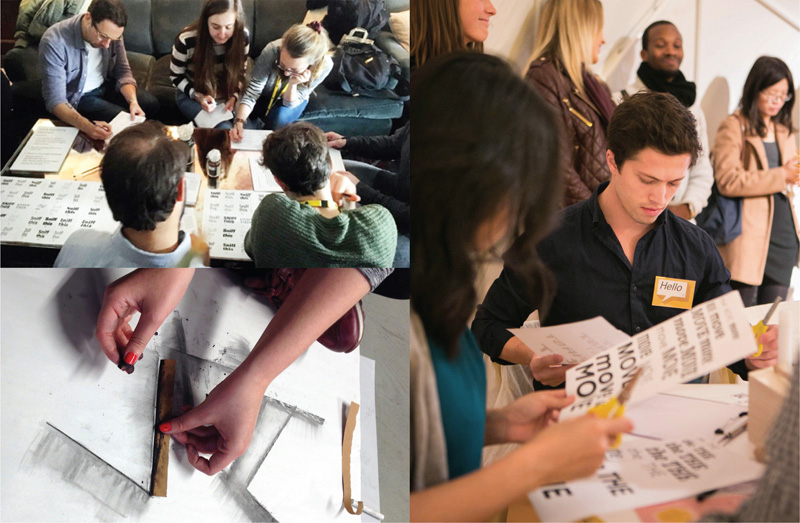
This year Type Tasting founder Sarah Hyndman has created workshops and events for a range of dynamic and innovative clients. Workshops have taken place at adidas HQ in Germany, for Design Thinkers in Toronto and at Tate Modern. Sessions have been created to launch the new BumbleBizz app with a workshop for entrepreneurs, as a teambuilding ‘Fight Club’ evening at WGSN, at the Wellcome Collection and for the D&AD.