Tag Archives: Psychology

Why does reading feel invisible?

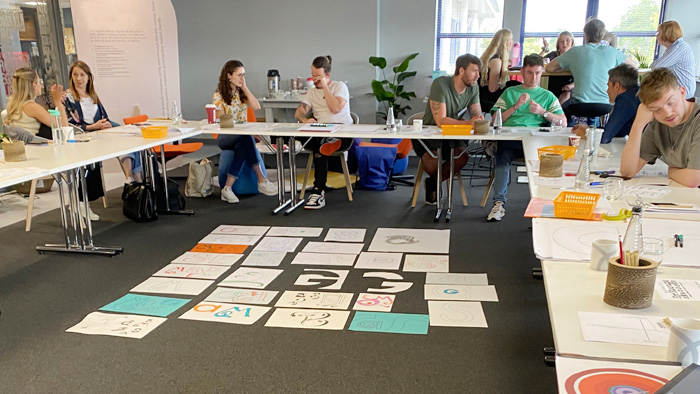
Three exciting new Typography intensive workshops have been created for designers and communications teams. These combine theory with hands-on explorations, activities and plenty of thought-provoking discussions.

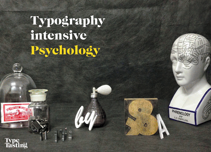
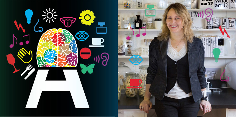
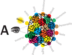
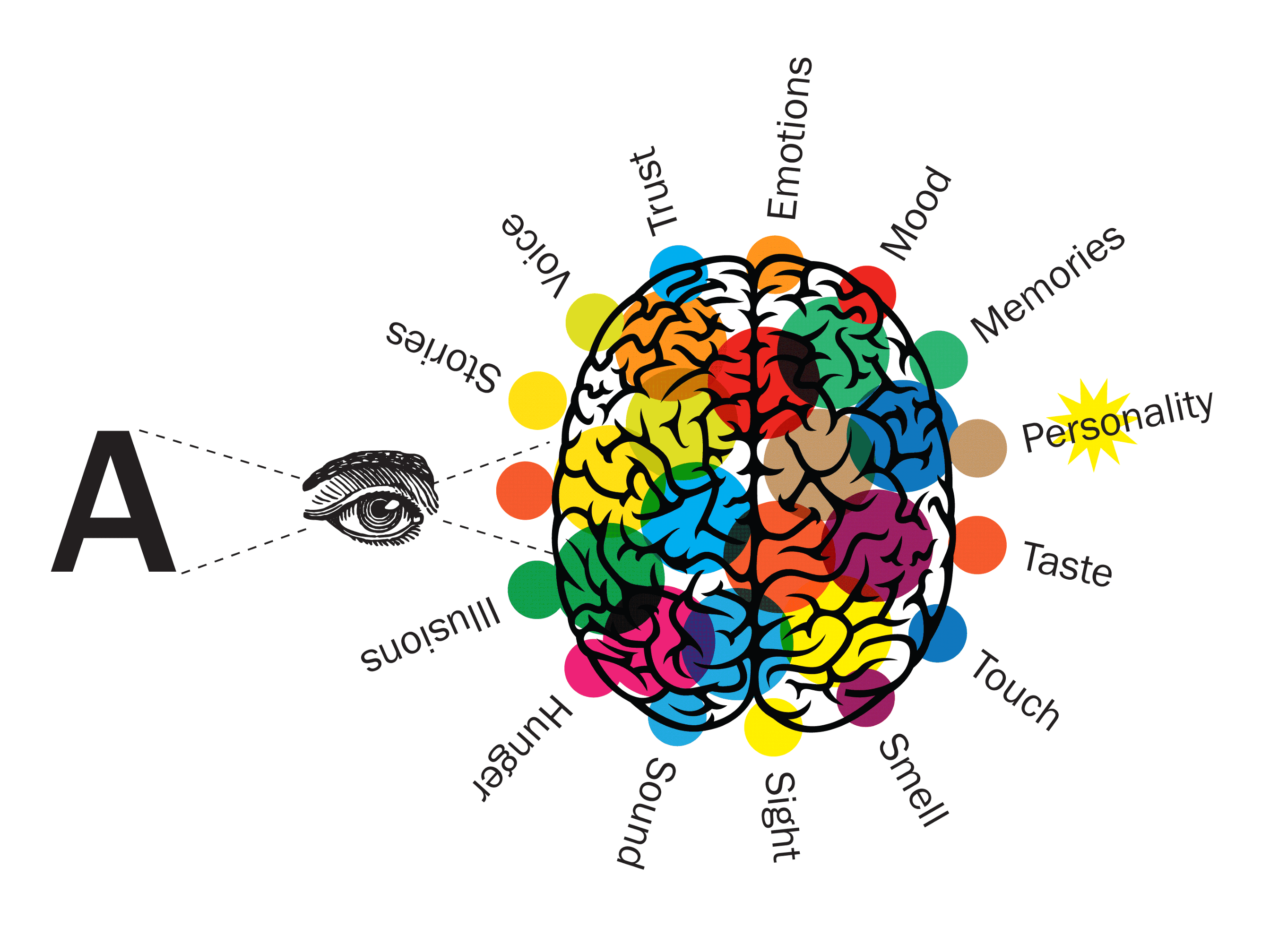
In session 1 you’ll explore the psychology of typography. This will take you back to the most important question of all: why does reading feel invisible? Understanding this is the key to unlocking how your brain responds as a type consumer. You’ll discover for yourself how much your subconscious is influenced by typography, backed up by innovative research by myself and others.

Get in touch here if you’d like to book a Typography intensive workshop for your clients or organisation.

Professional development typography masterclasses

Professional development typography masterclasses—not just for designers!

Invest in the professional development of your company with effective Zoom workshops that are engaging and fun with plenty of “aha!” moments.

Typography is the voice of your brand and it’s important for everybody in a company to understand some basics, not just graphic designers.

This is a series of Zoom masterclasses hosted by author, researcher and Type Tasting founder Sarah Hyndman. Sarah’s an expert in making learning fun and is on a mission to make typography exciting for everybody. Each masterclass focuses on an experiential area of typography with enlightening activities, engaging demonstrations and useful how-to guides. These are currently available as live Zoom sessions, which means you can join a masterclass from anywhere in the world.

Ideal for departments across the whole company, not just designers
These are interesting, inspiring and fun workshops with clear and empowering takeaways for people from all roles in a company. They’re ideal as a team-building session or to reinforce the importance of coherent use of language and fonts for your brand.

You can arrange a private session for your group or organisation, or come along as an individual to a public event. Private sessions are modified to suit the participants.

“Such a fun, interesting and inspiring workshop with clear and empowering takeaways. It reinforced the importance of coherent presentation of our brand for colleagues from all parts of our company, in all types of roles.” Nicky Borowiec, Springer Nature

Continue reading

Introduction to multisensory typography

LUNCH & LEARN / BREAKFAST

Introduction to multisensory typography

Learn the science of designing for all the senses to make your branding more memorable

A multisensory discovery session designed to stimulate all your senses. Ideal for designers and students of all levels who want to learn more about the science of communicating more effectively by harnessing all the senses.

As featured in Design Week’s Picks of the Month

Learn how typography interacts with all your senses and how it can even alter what you experience. Sarah will talk about some of her research and you’ll take part in multisensory demonstrations.

Multisensory

This is not just a font, it’s also an idea, a smell, a song, a memory, a feeling, a personality, a warning, a taste…

Continue reading

Sarah Hyndman: “Typography can be a tool for positive change”

With the release of her two new books, Design Week speaks to the graphic designer about our annotated world, crossing over into science and why she wants everyone to have the confidence to talk about type.

When Design Week catches up with Sarah Hyndman, she’s just coming to the end of a week’s stint at this year’s Adobe Max in LA. There, she has designed a multisensory installation in which she asks participants to associate the smell, sound, taste and feel of five different typefaces.

Continue reading

Using Typography to Hack Your Brain

The psychology of deliberately making a font hard to read

A central intention of design today is to reduce cognitive load, the amount of effort the brain needs to understand something, so that communication and comprehension are quick and easy. So it was a bit surprising when a typeface specifically designed to be hard to read recently made headlines in the design world. Why would anyone purposefully make a font difficult to read, you might ask, when developments in printing technology and type design have strived for centuries to make words more, not less readable?

Continue reading

Take part in the Typographic Interventions project

What is a typographic intervention? What if it’s not what it says on the tin? Can typography alter your experiences, or nudge you to change your behaviour?

This year we are exploring the potential for creating typographic interventions that initiate positive behaviour change. You are invited to take part in typographic research. Some of the experiments you will take part in are in their early proof of concept stages, for others data is being gathered potentially to be published as a future collaborative study.

Continue reading

Pop Up Type Tasting Typography Lab

Pop Up Type Tasting Typography Lab
Stoke Newington Literary Festival
2nd & 3rd June, 11am to 8pm, free.
Venue – Locations around the Town Hall

*** NEWS ***
One of the experiments we ran at this event has now been published: The role of typeface curvilinearity on taste expectations and perception by Carlos Velasco, Sarah Hyndman (Type Tasting), Charles Spence (University of Oxford), International Journal of Gastronomy and Food Science, January 2018.
***

Continue reading

i Newspaper “The science of Coca Cola’s ‘eat me’ font can make us eat healthily”

“If you see a “danger” sign written in the Comic Sans typeface, would you pay attention to the warning? What does Times New Roman taste like? Is a lemon fast or slow?” Paul Bignell for i Newspaper.

Continue reading