
The psychology of deliberately making a font hard to read
A central intention of design today is to reduce cognitive load, the amount of effort the brain needs to understand something, so that communication and comprehension are quick and easy. So it was a bit surprising when a typeface specifically designed to be hard to read recently made headlines in the design world. Why would anyone purposefully make a font difficult to read, you might ask, when developments in printing technology and type design have strived for centuries to make words more, not less readable?
The quest for legibility
Lots of research has focused on legibility. In the 1960s Margaret Calvert and Jock Kinneir tested road signs by placing them on a car that was then driven toward a test audience, who then noted at which point the different text styles and sizes could be read. The result was the creation of a new, highly readable British road and motorway signage system, which subsequently became a role model for modern road signage all over the world.
More recently, MIT and type foundry Monotype collaborated to improve the design and typography of interfaces we read with a “quick glance”—things like our smartphones, smartwatches, and car displays. They used much more sophisticated (and less nerve-wracking) technology than Calvert and Kinneir did, as they were able to monitor eye tracking to measure split-second response times.
Easy to read = easy to do?
As well as making signage clearer, it’s been shown that an easy-to-read typeface might convince your brain that a given task is easier to perform because information printed in a legible typeface ostensibly requires less mental effort to understand and process.
This idea could have a wide range of implications, such as encouraging people to exercise. For example, psychologists at the University of Michigan showed that a group of 20-year-old college students who read the written instructions for an exercise routine in an easy-to-read typeface were more motivated to exercise regularly than those who read it in a harder-to-read style. Both groups read exactly the same instructions; the only thing that changed was the font.

Those who read the easy-to-read style estimated the routine would take 8.2 minutes to complete, compared with the 15.1 minutes estimated by those who read the instructions in the brush style Mistral. The “easy to read” group was also more willing to incorporate the regime into their daily routine than the “hard to read” group.
Why would you want to make a typeface hard to read?
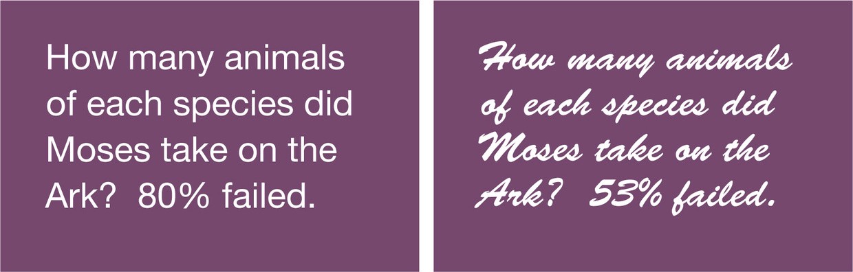
Question: How many animals of each species did Moses take on the Ark? Consumer neuroscientist Dr. David Lewis finds that when he poses this question in an easy-to-read typeface like Arial, around 80% of people get the answer wrong — because of course, it was Noah who built the ark, not Moses — but when it’s posed in a harder-to-read typeface like Brush Script, the percentage who fail to spot that tricky detail goes down to around 50%.
Lewis has found that when words are harder to process, you are taken off autopilot and have to pay more attention to what the words actually say. In his book The Brain Sell: When Science Meets Shopping, Lewis explains that making something less familiar and harder to read means you’re “obliged to invest greater time and attention in deciphering the words.”
This could be used to your advantage if you want to remember something: When students at a high school in Ohio studied from texts in an unfamiliar typeface, their exam results were higher than those students who studied from texts in a more familiar and readable one.
Sans Forgetica font
“When we make something unfamiliar or a bit different from what we are used to, our brain needs to put more effort in to process it and because of that, the memory trace becomes stronger.” — Stephen Banham, RMIT
To put this theory into practice, designers and psychologists at Australia’s Royal Melbourne Institute of Technology (RMIT) collaborated on a project to design a hard-to-read font. They named it Sans Forgetica, a take on one of the two main classifications of typefaces: Serifs (letters with “feet” on the terminals) and sans serifs (without serifs). Sans Forgetica means “without forgetting.”
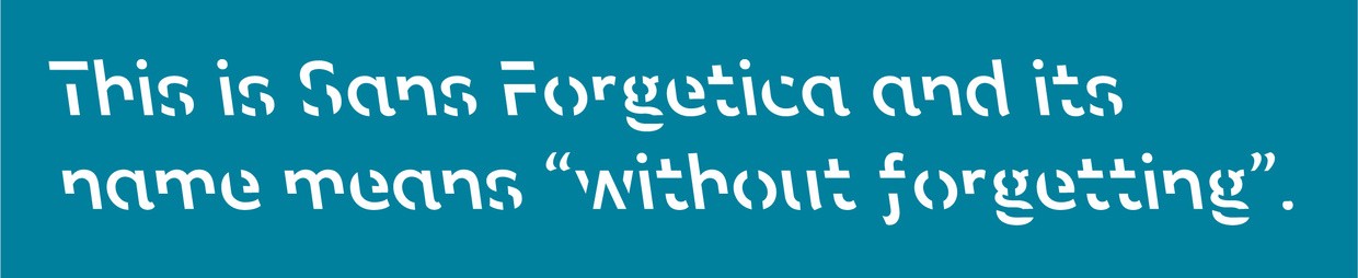
Sans Forgetica is designed with features such as back-slanting and little gaps in the letter strokes. AIGA’s Angela Riechers describes it as “an alphabet that’s forgotten how to behave. Letterforms take familiar shapes, then truncate abruptly — as if the capital M accidentally left behind its lower point, or the lowercase h just can’t quite recall how its curved form ends. The italics remember to slant, but they go the wrong way. The typical conventions of type design that ensure legibility are just barely there; Sans Forgetica is legible, but words take a bit longer to figure out. It’s almost like you’re relearning how to read.”
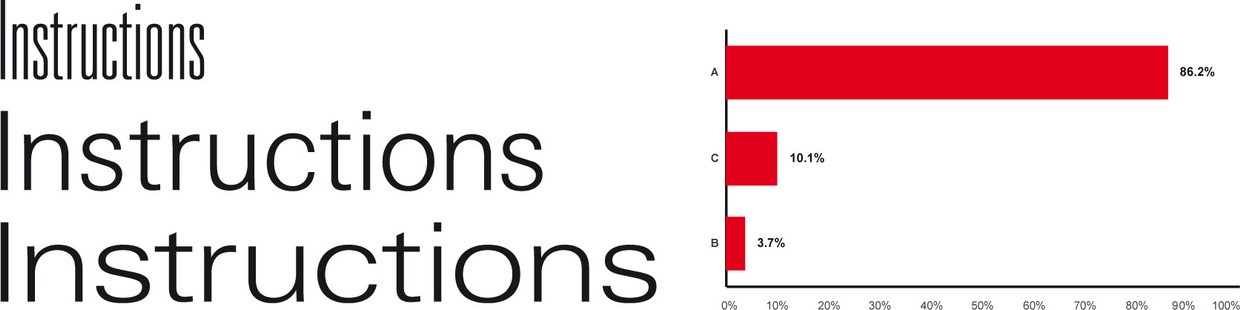
These features have been designed to slow your reading down so you spend more time absorbing the information, which should help you remember it. In tests on around 400 students, the participants retained information at a rate of 57% when it was typeset in Sans Forgetica. When the same information was presented in Arial, the retention rate dropped to 50%. With Sans Forgetica, the students had to pay closer attention and think more deeply about what they were reading, which made it more memorable.
The RMIT team calls this “desirable difficulty,” the addition of an obstruction to the learning process that requires you to put in just enough effort, which leads to better memory retention and deeper cognitive processing.
However, if a typeface is too different or too hard to read, the brain can’t process it and retain the information, or you might simply give up without even trying. According to Stephen Banham of RMIT, “Sans Forgetica lies at a sweet spot where just enough obstruction has been added to create that memory retention.”
Humans learn quickly
This is a fascinating development in what we know about typography and cognition, but I think that an unusual typeface like Sans Forgetica will work best if it’s used sparingly to highlight key words or phrases to be remembered. It’s a little like speed bumps or road markings that slow you down and force you to pay more attention when driving through a particularly hazardous area.
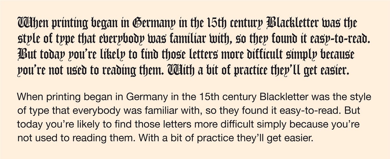
But humans learn quickly, and with a bit of practice you’ll become adept at reading what was initially a new and unfamiliar style, like breaking a code or learning a new language. Some proof? Dense Gothic Textura Blackletter was the style of the day when printing came to Europe in the 15th century. Familiarity made this easy to read at the time, but it takes practice for our modern eye to decipher it now.
The future
New and exciting technology is being developed that will enable a single font to morph and change shape fluidly. These are called variable fonts, and they’re causing a lot of excitement in the typography world.
By combining easy-to-read and hard-to-read typeface theories with the new variable font technology, words could be designed to keep you on your toes by constantly evolving as you read them. As unfamiliar material becomes easy enough to read for your word-per-minute rate to increase (determined perhaps by the camera in your reading device tracking your eye movement), the font could morph into new and unfamiliar shapes designed to slow your reading rate back down again.
Do it yourself
You can try making written information more memorable for yourself by downloading the Sans Forgetica font here and trying it out. Or you could experiment with mixing different fonts and treatments within a document or interface to help with retention. Here are two methods to experiment with.
1. Familiarity
Type designer Zuzanna Licko says, “we read best what we read most”—the easiest typefaces to read are the ones we are most familiar with. So how about mixing and matching fonts? Try highlighting small sections in material that’s a little more difficult to read or retain and apply a never-used font, a font you hate enough that it screams at you to pay attention to it. Extra tip: Early on in my design career I was given the advice to proofread my writing in an unfamiliar typeface because it makes it easier to spot the errors.
2. Distorting
Ugly typefaces have also been proven to be more memorable, so you could try something like committing the ultimate sin of squishing a font horizontally, or using ultra-condensed styles.Conversely, you could try making any motivating calls-to-action the easiest of all to read on the page so that action feels easier to take.
However, don’t forget that the effect relies on difference, so you’ll need to keep mixing it up. And you’ll likely prefer to revert to more conventional type styles before sending your document on to anybody else to read.
Also published on Medium.
