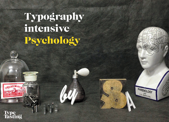
Three exciting new Typography intensive workshops have been created for designers and communications teams. These combine theory with hands-on explorations, activities and plenty of thought-provoking discussions.
In session 1 you’ll explore the psychology of typography. This will take you back to the most important question of all: why does reading feel invisible? Understanding this is the key to unlocking how your brain responds as a type consumer. You’ll discover for yourself how much your subconscious is influenced by typography, backed up by innovative research by myself and others.
An immersive, interactive journey through how typography changed the world. There will be activities, tasters, smells, sounds, stories and surprises. These are unique experiences that change what you think, feel and do.
I really enjoyed opening the doors and chatting to so many people at our recent open studios. After two years spent online feeling like I was living a cross between The Truman Show and Max Headroom, it’s been so good to create and host in-person events again. One of my favourite reasons is that I get to create props, smells and tasters designed to surprise unsuspecting audiences.
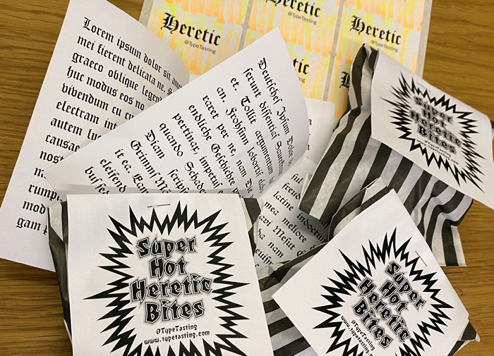
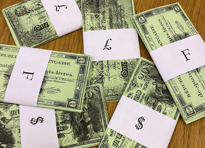
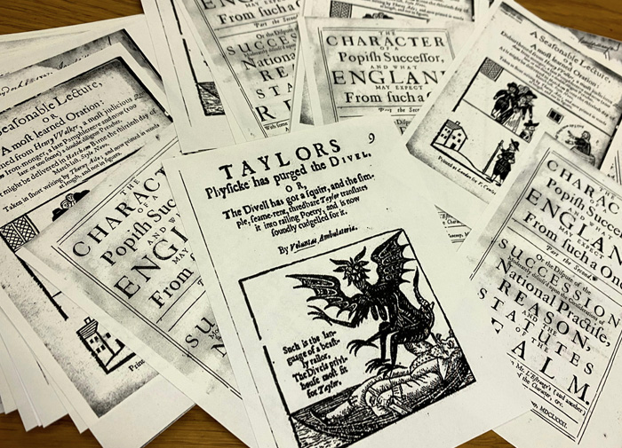
I’ve spent today making props for an event I’m running at the HQ of the Future Strategy Club for their members next week. This is an immersive, interactive journey through how typography changed the world. There will be activities, tasters, smells, sounds, stories and surprises. We’ll time travel through a few hundred years of type history getting a first hand taste of protest movements, pampleteers, social shifts and revolutions.
This is based on an event I created for the London Design Festival, which attendees described as “An immersive experience of storytelling and discovery”, “Brilliant”, “Sublime & crazy tales from the past”, “Wonderful”, “A roaring success”.
Get in touch here or by replying to this email if you’d like to book this event for your clients or organisation.
I really enjoyed chatting with Katy for the Creative Boom Podcast. It’s live now and you can listen to it here Creative Boom Episode 74.
We’ve already had some lovely feedback: “Articulate and engaging”; “Emphasis on us all being experts is generous”; “Knowledgeable, enthusiastic and assertively inclusive!”; “Covers great topics”.
My mum says “Wonderful. So clear and so interesting.” Thanks Mum.
The team from Google Fonts joined me to draw along with a Virtual London Type Safari. We explored the culture and history of a vibrant area in East London, discovering the secrets hidden in the signs over shops, pubs and buildings.
Some of the signs have been hidden for decades and tell stories about the area’s rich history. Many reflect the fashions of different eras—the 1800s, the 1920s, the 1970s and today. Some are practical and utilitarian, others are painted by hand. Look a little closer and many have revealing telltale characteristics for you to spot.
We paused at each sign to do a quick four-minute sketch of its letters. Each sign was paired with a song to bring its atmosphere to life. There were also sniffables and a surprise London-themed snack for one of the participants to try on-camera.
Would you like to book a draw-along Virtual London Type Safari with your team? Start your journey here
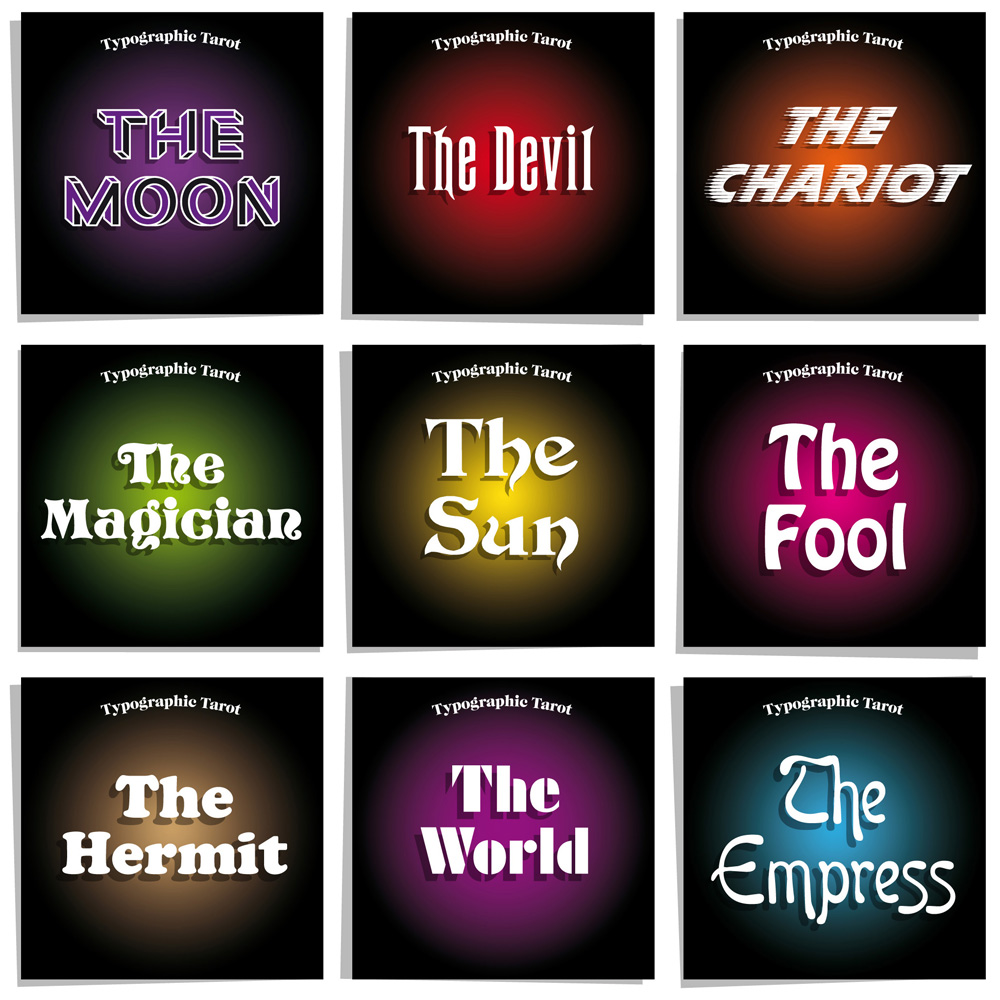
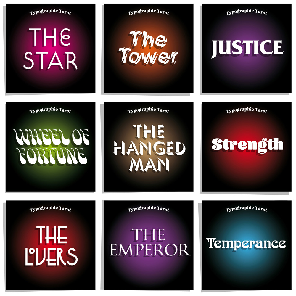
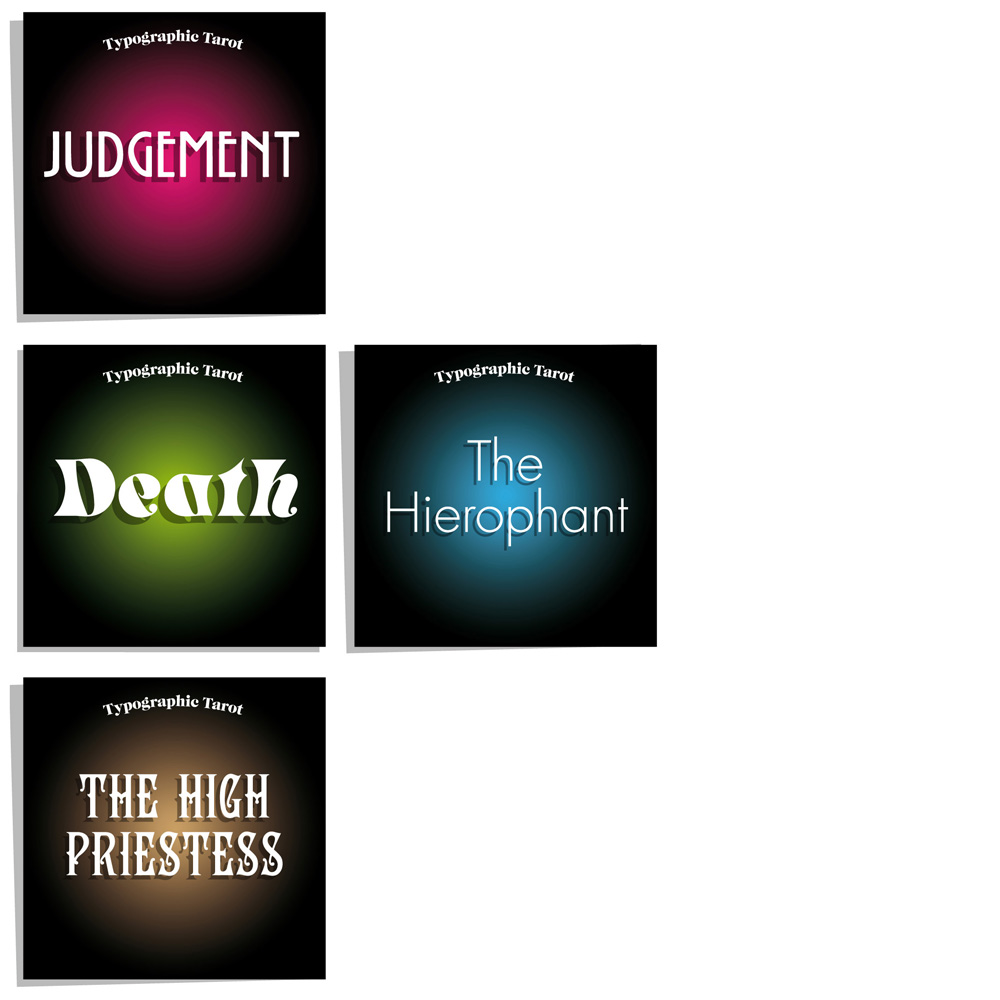
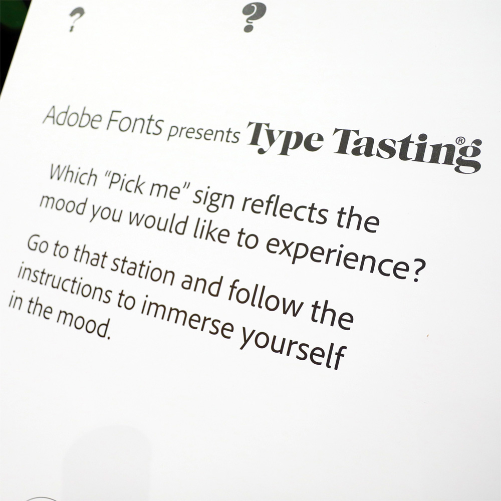
How does it make you feel? What smells and flavours would you pair with this mood?
**
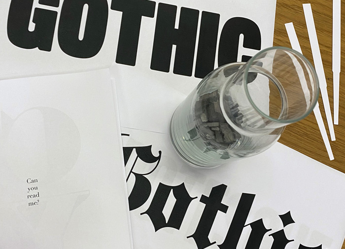
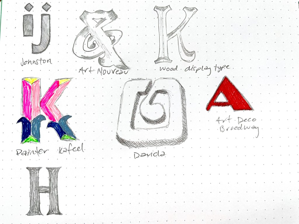
I first came across this weird looking type style in Rob Roy Kelly’s book of American Wood Type 1828–1900. It’s a crazy mashup of three styles: a gothic (sans serif) + tuscan (fancy bifurcated serifs) + Italienne (reverse contrast).
This is Cottonwood, designed by Barbara Lind, Joy Redick, and Kim Buker Chansler. From Adobe Originals.
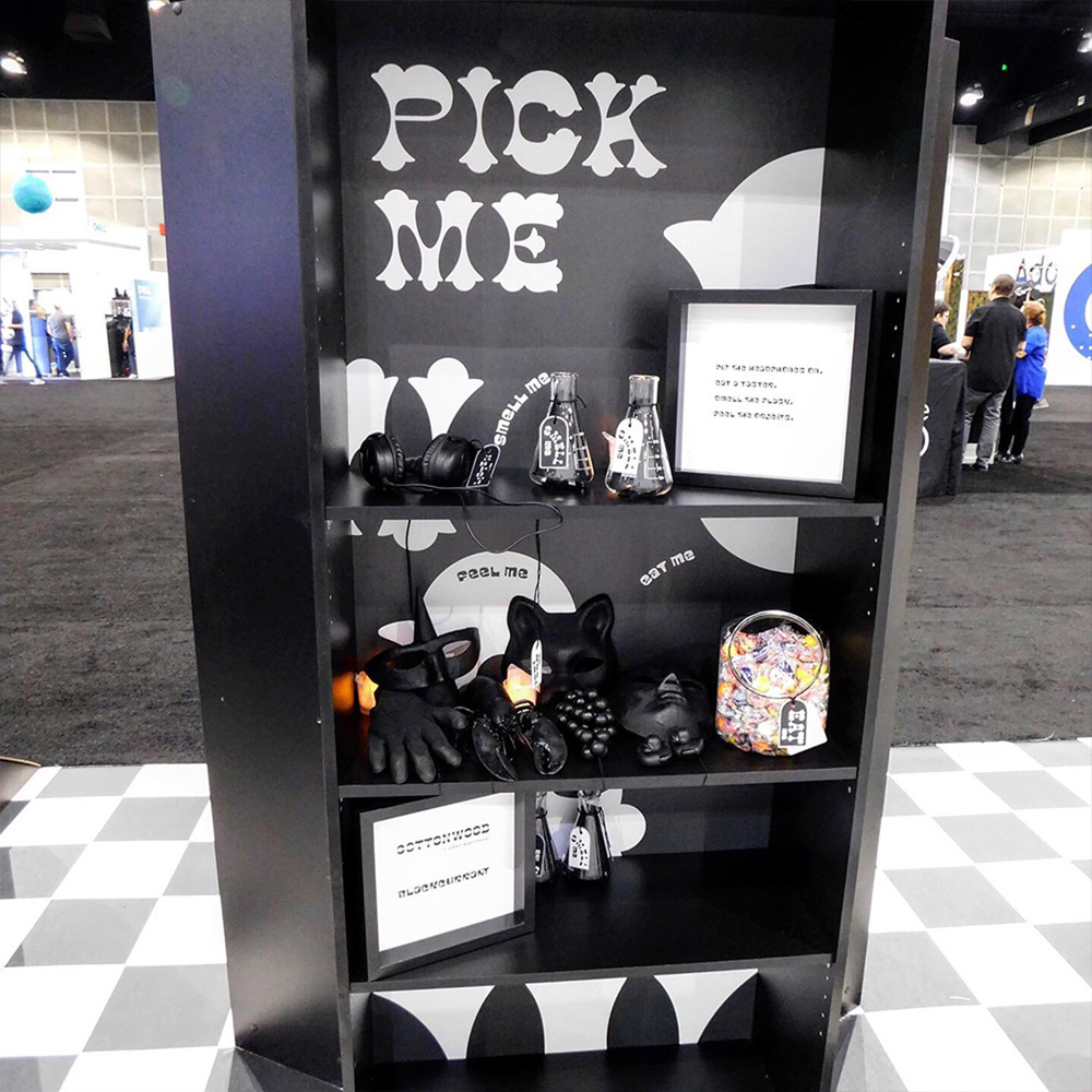
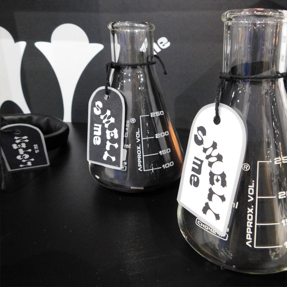
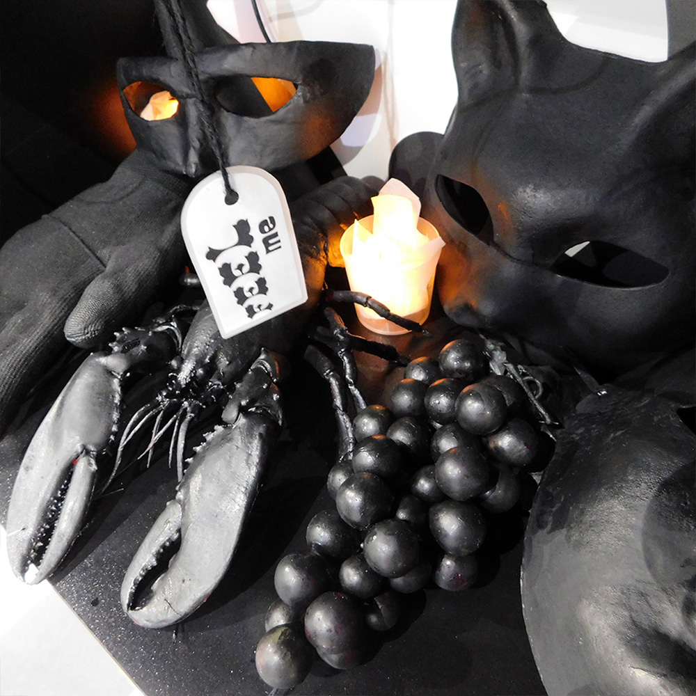
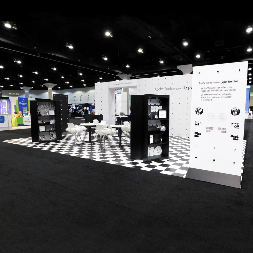
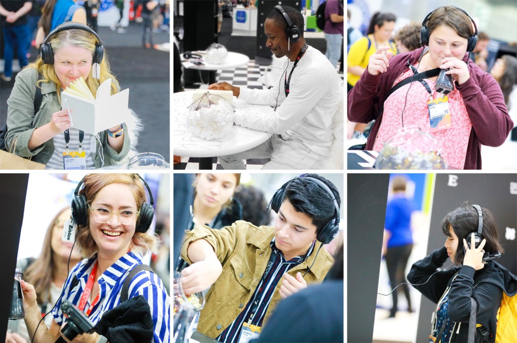
These photos are from the large-scale multisensory installation I created at the last in-person Adobe MAX at the L.A. Convention Centre in Los Angeles.
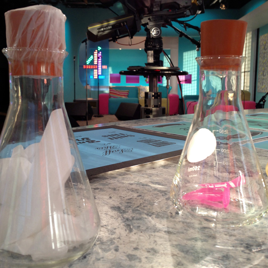
Visitors were immersed in the mood of different typefaces through all of their senses. At each station they were invited to put on headphones, to smell a scent in a jar or by flipping the pages of a book, to eat a small taster and to feel a texture. Each set of stimuli was designed to bring a mood to life in the participant’s imagination. There was curiosity and intrigue as the first visitors arrived and they were soon returning with groups of friends saying “you have to try this”.
“The experience that Type Tasting designed for the Adobe Fonts booth at Adobe MAX was such a fun, intriguing way for people to explore how their reactions to fonts relate to other sensations” Dan Rhatigan, Adobe Fonts
Sound designer Rob Taliesin Owen created bespoke sounds and a bespoke scent was created by 4160 Tuesdays. The installation was produced and run with the wonderful Adobe Fonts team.
“Font ‘tasting’, it was awesome! You could smell, hear and taste the fonts”, “F!ing genius!”.
*If the link doesn’t work listen to Suite Punta Del Este by Astor Piazzolla.
I’ve been creating immersive and multisensory installations for a number of years now. They’ve been on hold during Covid but plans are now underway for the future. This is the large-scale multisensory installation I created at Adobe MAX at the L.A. Convention Centre in Los Angeles.
Visitors were immersed in the mood of different typefaces through all of their senses. At each station they were invited to put on headphones, to smell a scent in a jar or by flipping the pages of a book, to eat a small taster and to feel a texture. Each set of stimuli was designed to bring a mood to life in the participant’s imagination. There was curiosity and intrigue as the first visitors arrived and they were soon returning with groups of friends saying “you have to try this”.
“The experience that Type Tasting designed for the Adobe Fonts booth at Adobe MAX was such a fun, intriguing way for people to explore how their reactions to fonts relate to other sensations” Dan Rhatigan, Adobe Fonts
Sound designer Rob Taliesin Owen created bespoke sounds and a bespoke scent was created by 4160 Tuesdays. The installation was produced and run with the wonderful Adobe Fonts team.
“Font ‘tasting’, it was awesome! You could smell, hear and taste the fonts”
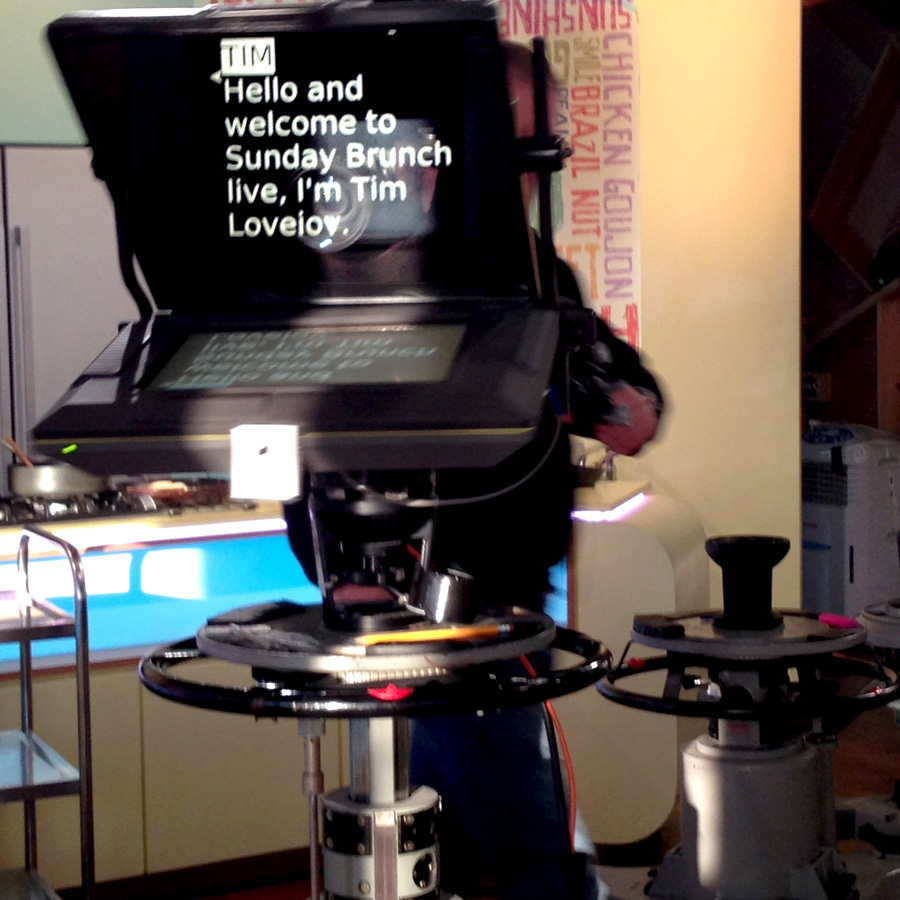
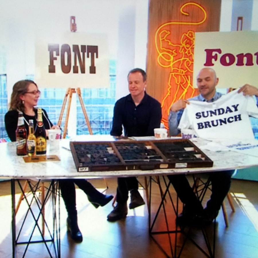
“Welcome to Sunday Brunch Live, Sarah welcome back to the show…”
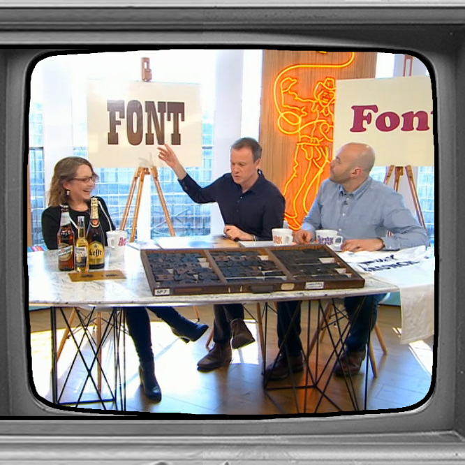
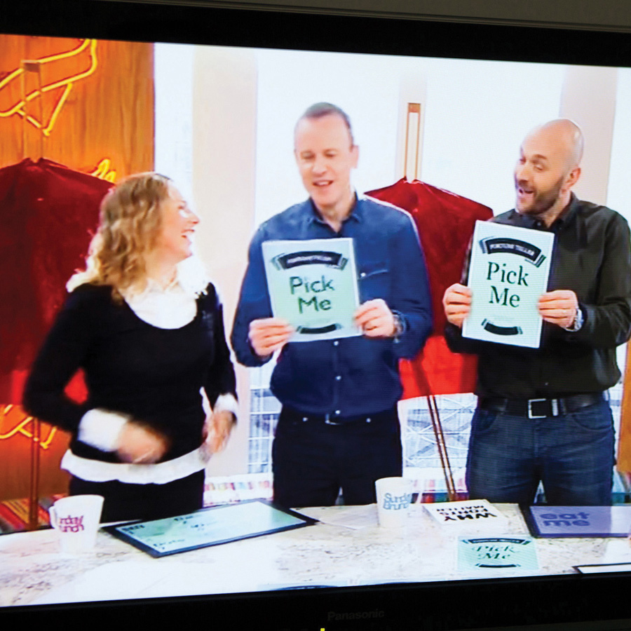
I love being the occasional typography expert for Sunday Brunch, Channel 4 Television’s live TV show here in the UK. It’s always an exciting opportunity to share my type-themed games and demonstrations with a mainstream audience, which is something I’ve specialised in since launching Type Tasting.
Knowing that well over half a million people watch each show really gets the adrenaline pumping while I’m sitting in the green room watching the time counting down. It’s a very surreal feeling. But the presenters are absolutely brilliant at making the guests feel relaxed—I think that’s their superpower. When my very first appearance was about to start, presenter Simon Rimmer leaned over and whispered “I love typography” to me with a big smile. This turned my nerves into enthusiasm, and you can tell that we were having fun when you watch.
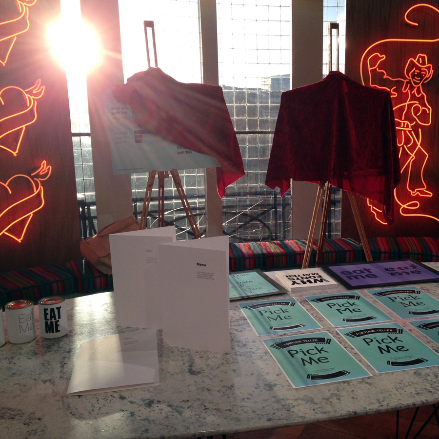
Presenters Simon and Tim Lovejoy have joined me for font sniffing, to chat about how menus can influence your appreciation of a meal and I’ve analysed their personalities from their font choices. I’ve talked about type trends in popular culture and where they come from. There are always lots of props and visuals. It’s fun preparing the content because the graphics team at the production company get excited about creating the visuals for the segment. After all, it’s all about typography!
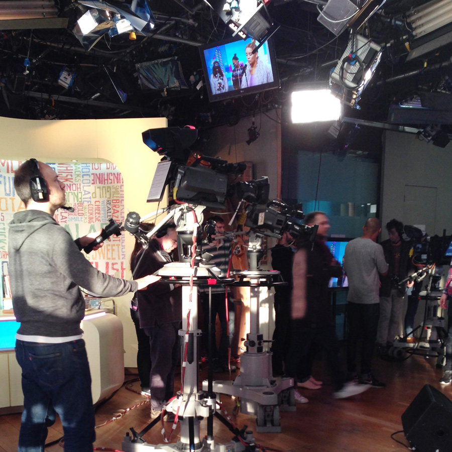
It’s fascinating to see behind the scenes of live television and to know just how much goes into creating a show. I was surprised to discover that the studio’s pretty small and not the spacious environment I used to imagine when I watched. The table for my interviews is right on the edge of the kitchen, so I wait very quietly for the cooking to end and hope my stomach doesn’t decide to growl from the smell of the food. Then I have to tiptoe quietly out of the studio as soon as my segment ends. The adrenaline shakes are setting in at that point so I have to be extra careful not to trip over cables and duck under lights carefully so I don’t knock them out of position. It’s interesting to see how different people calm their nerves in the green room beforehand, especially the really famous guests who must have done this so many times.
Thank you to my expert friends who help with the content. Especially beer writer Pete Brown for the beer label history and Pixel Press for loaning their stunning tray of “slab serif case number 7” letterpress wood type.
I look forward to popping up on television again soon, maybe on Sunday Brunch again.
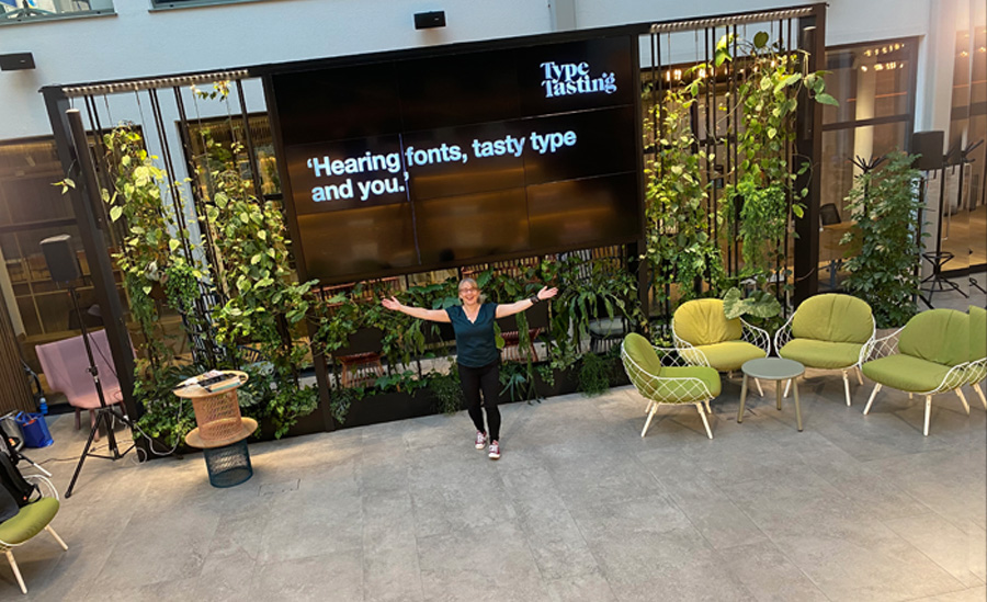
I’m delighted that live, in-person events are happening again after a very long break. It’s wonderful to be in the same room as all of you with the collective energy, banter and all those random post-event conversations. I’ve especially missed those.
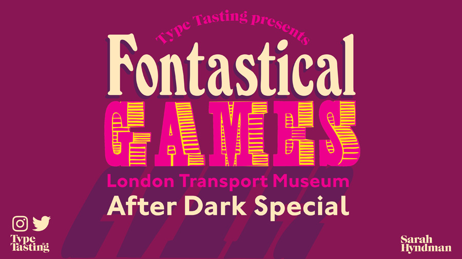
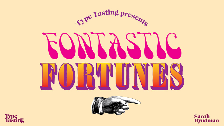
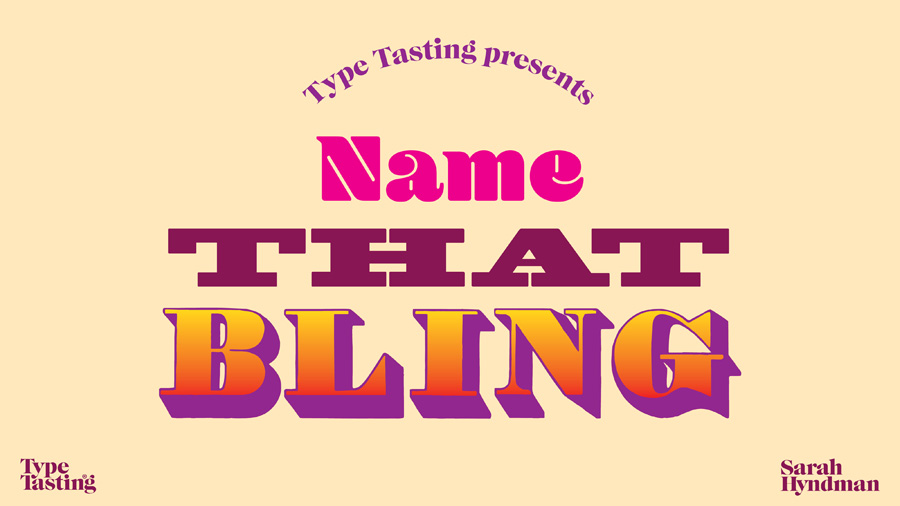
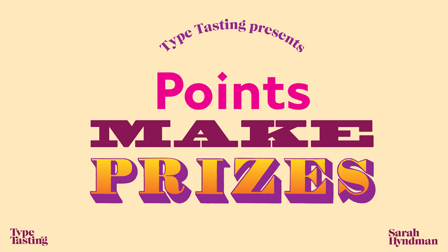
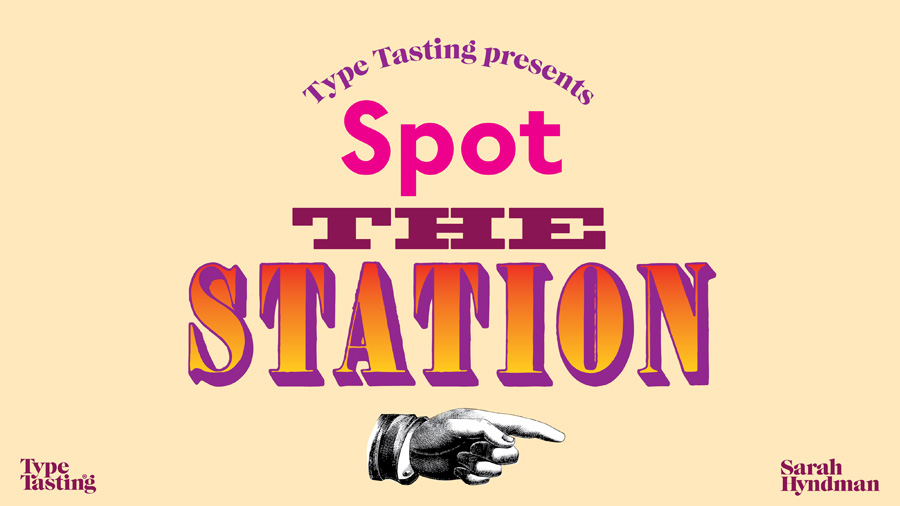
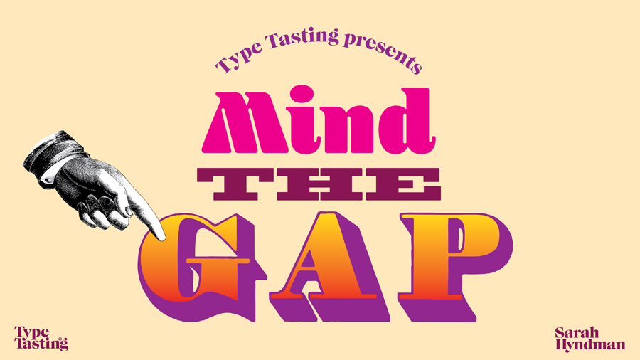
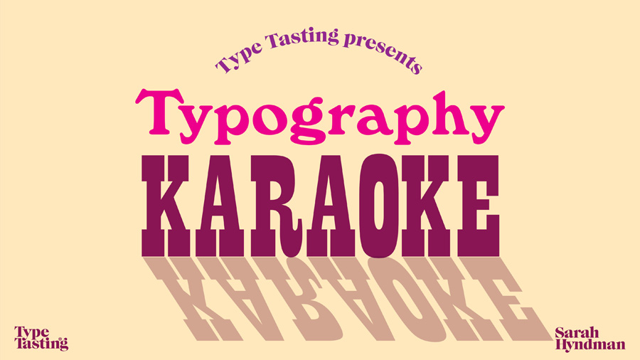
Recently I spoke at the incredibly inspiring TBD evening at Fora (you can see how happy I was to be there). Tonight I’ll be live at the London Transport Museum for a fun evening of Fontastical Games as part of their After Dark series. This will be part gameshow and part quiz. It’s heavily influenced by my love of 1970s gameshows full of laughter and things that will inevitably go wrong.
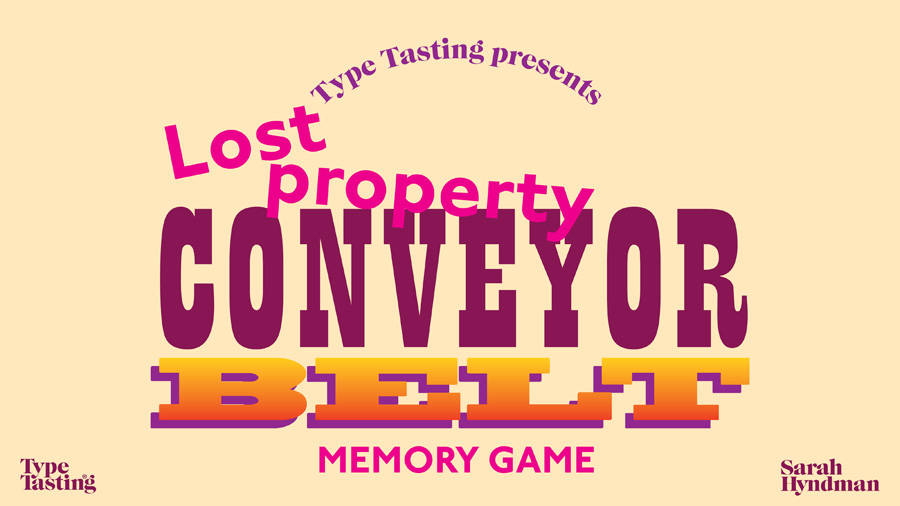
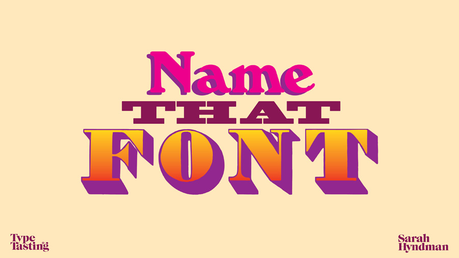
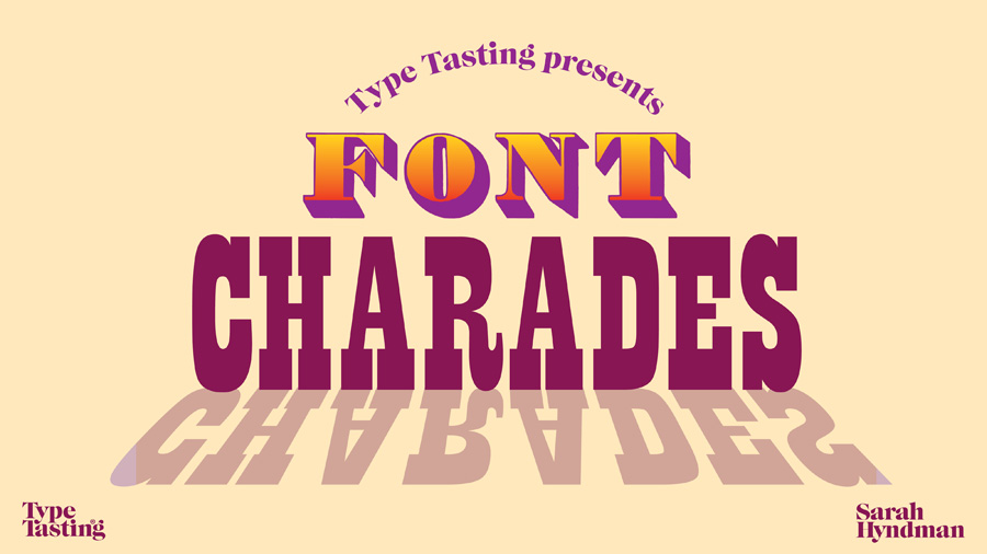
Roll up roll up for an evening of fonts, letters and signs. Can you guess the tube station from the font clues? Will you spot the real sign from the fake? Shout along with typography karaoke. Play along with font charades. And we’ll end with the classic lost property conveyor belt game.
You’ll have the chance to win spot prizes of my books and a set of Hidden London virtual tour tickets.
Friday 12th November Fontastical Games at the London Transport Museum After Dark 6.30–9pm, £10/£12 Come along and join me
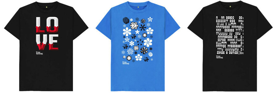
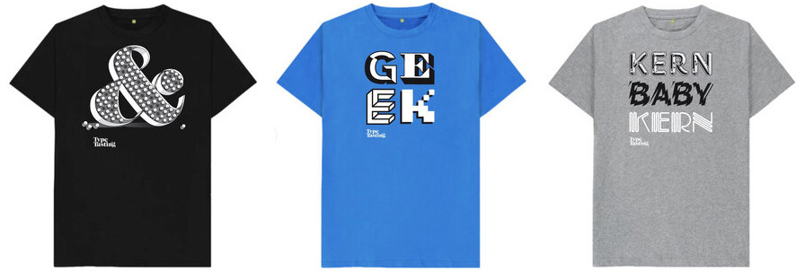
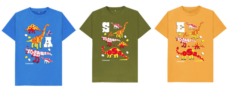
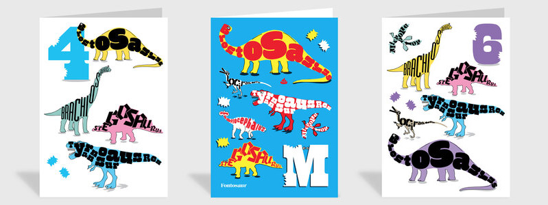
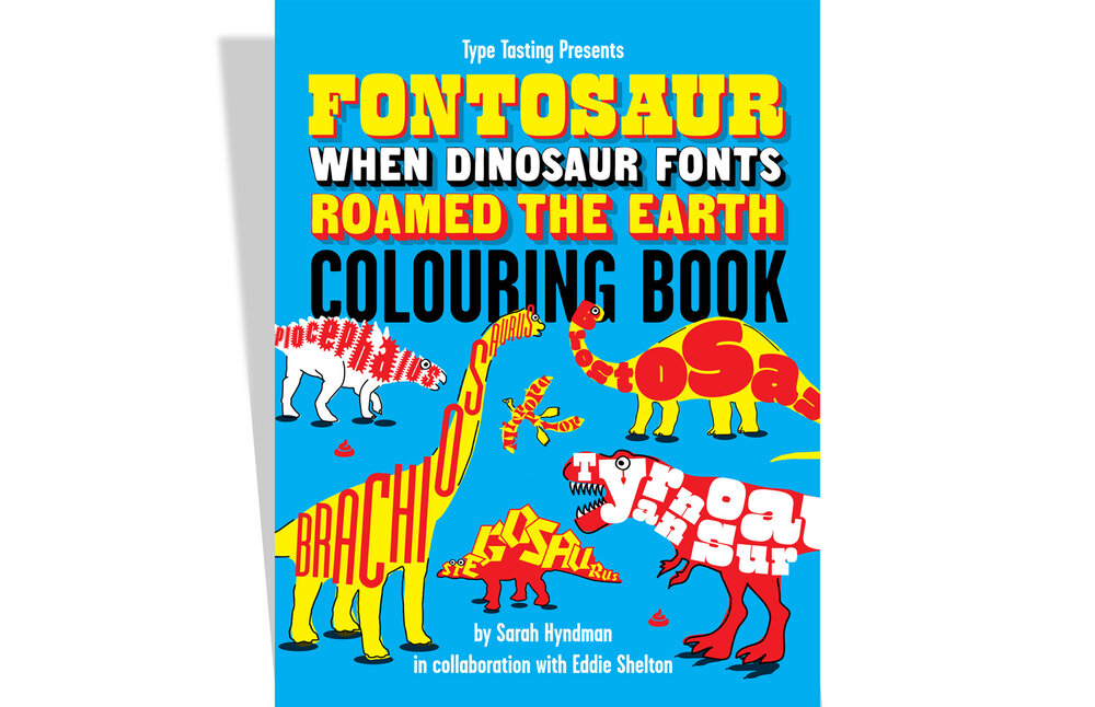
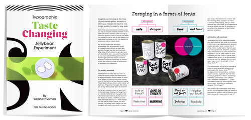
Are you looking for a unique gift for the graphic designer in your life? Or someone who loves typography? Are you searching for an unusual Secret Santa gift? Visit the Type Tasting Typography Emporium for a range of items created for font fans young and old. These are all designed by Sarah Hyndman and published by Type Tasting.
Vouchers • T-shirts • Cards • Books • Zines
(More items will be added over the next few weeks, get in touch if you have a request).
Typographic t-shirts
Exclusive Type Tasting t-shirts. Designs range from puns and ampersands to asterisk snowflakes and secret messages hidden in Letraset-inspired designs. The t-shirts are 100% organic cotton printed by Teemill in the UK in a renewable energy-powered factory. Worldwide shipping is available.
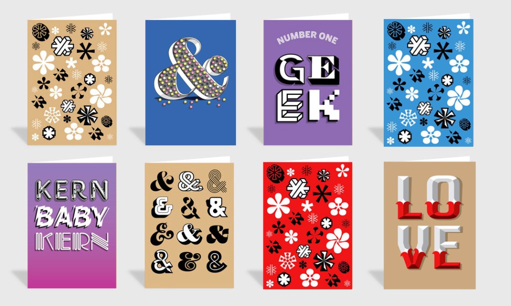
Send an exclusive typetastic card. The ampersand and asterisk cards are the current top sellers. Printed in the UK by Thortful with worldwide shipping on premium quality paper stock with a premium grey GF Smith embossed envelope. “Everything is lovely about them. Even the envelopes” Theo.
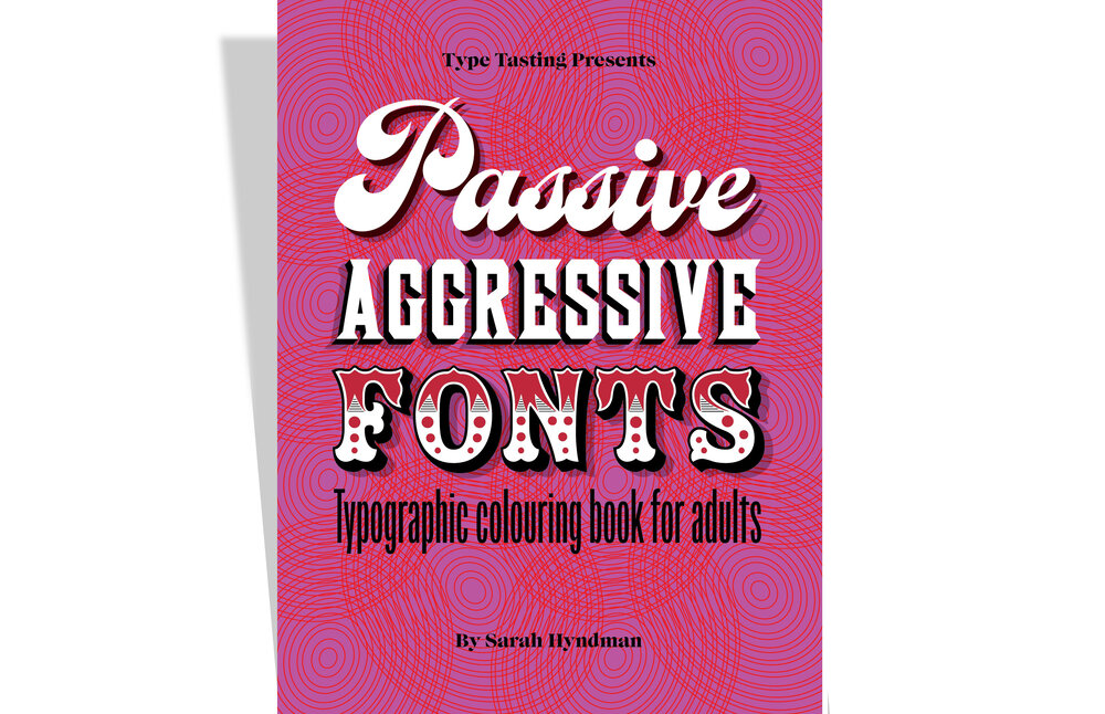
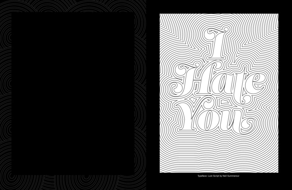
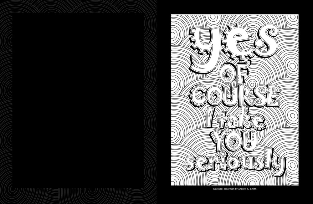
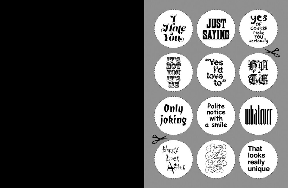
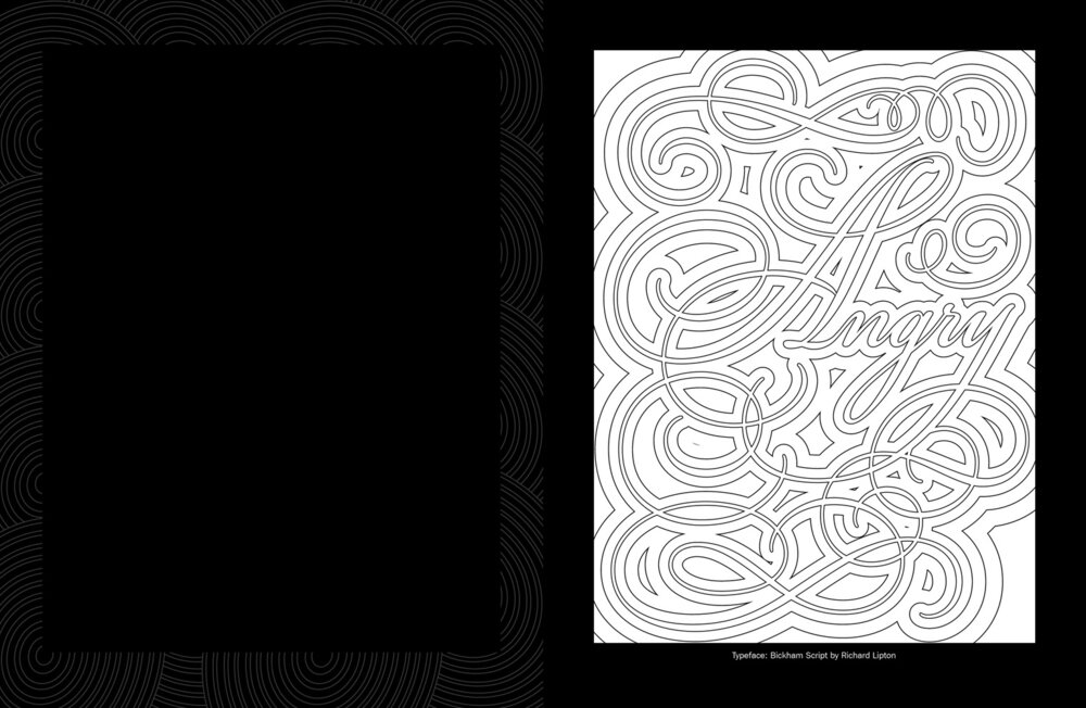
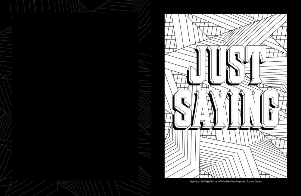
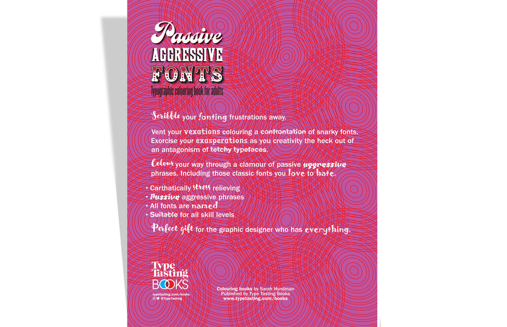
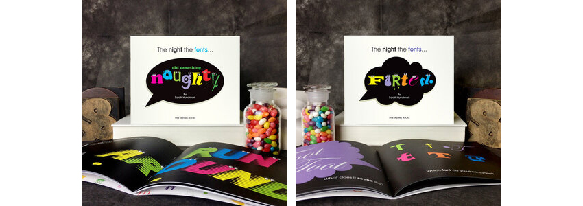
Passive Aggressive Fonts Typographic colouring book for adults By Sarah Hyndman
Colour your fonting frustrations away. Vent your vexations colouring a confrontation of snarky fonts. Exorcise your exasperations as you creativity the heck out of an antagonism of tetchy typefaces. Scribble your way through a clamour of passive aggressive phrases. Including those classic fonts you love to hate.
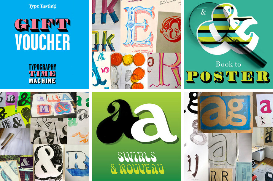
Typography time machine gift vouchers Draw & learn online workshop series Series gift voucher £40 / £190
Curious to know why there are so many typefaces? Intrigued by where the different styles come from? Fonts are like magical time machines. They transport you to different times and places. They conjure up stories of decadence, revolutions, transformation and ingenuity.
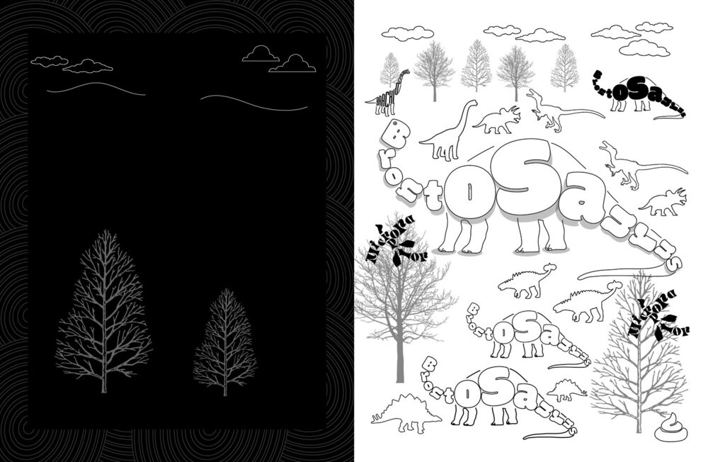
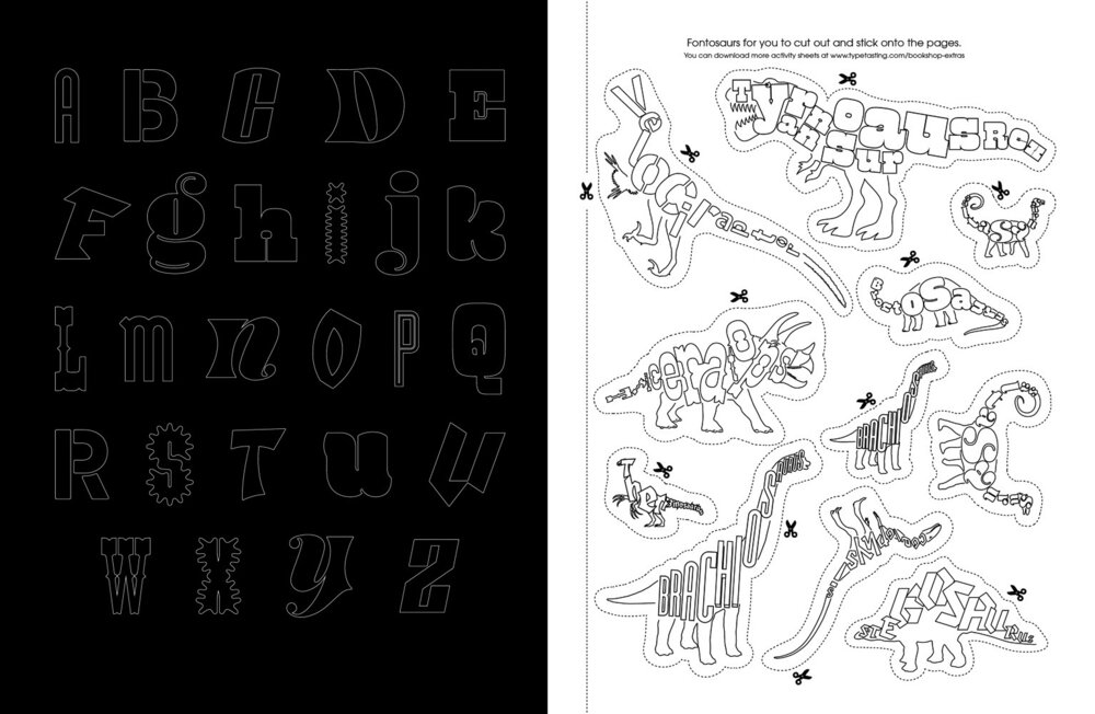
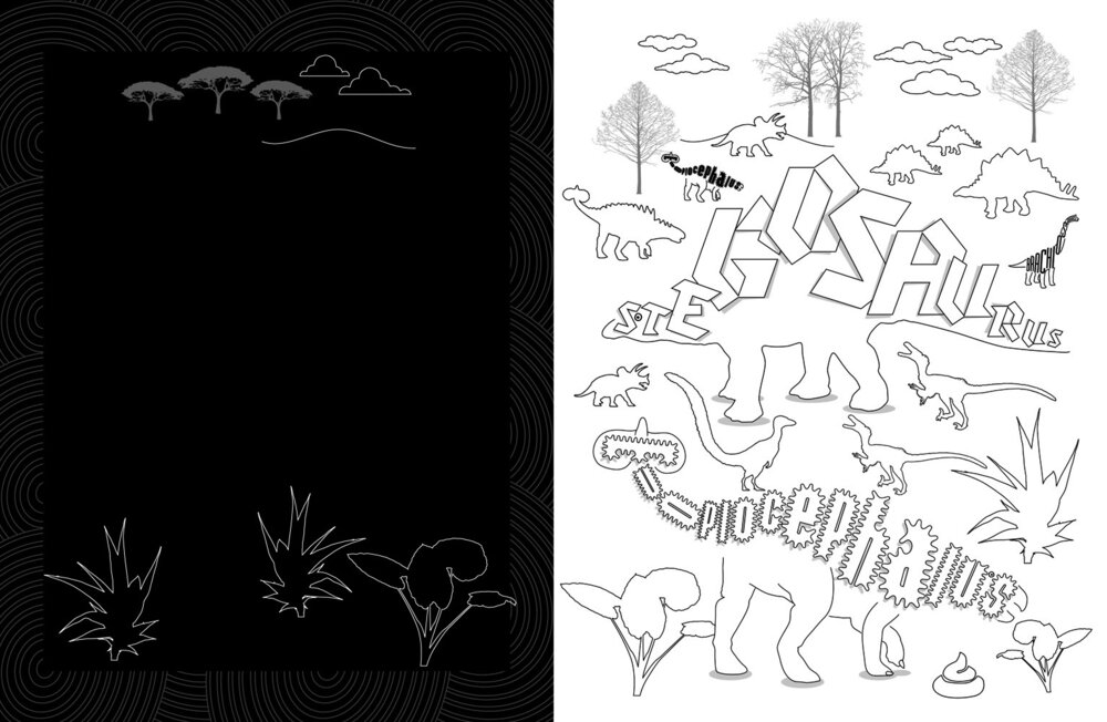
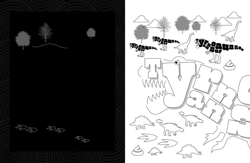
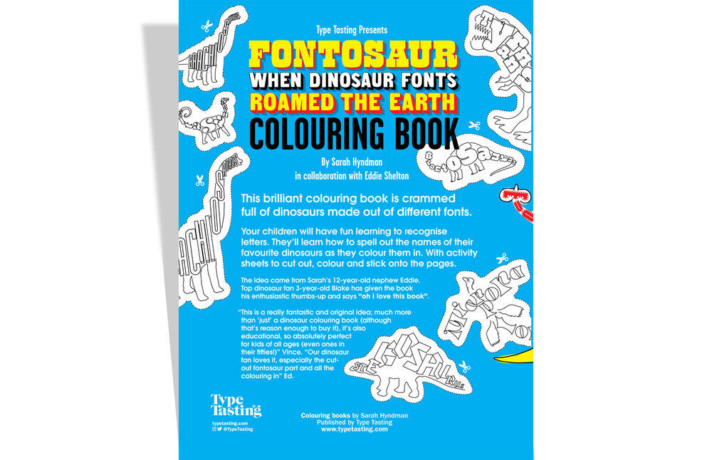
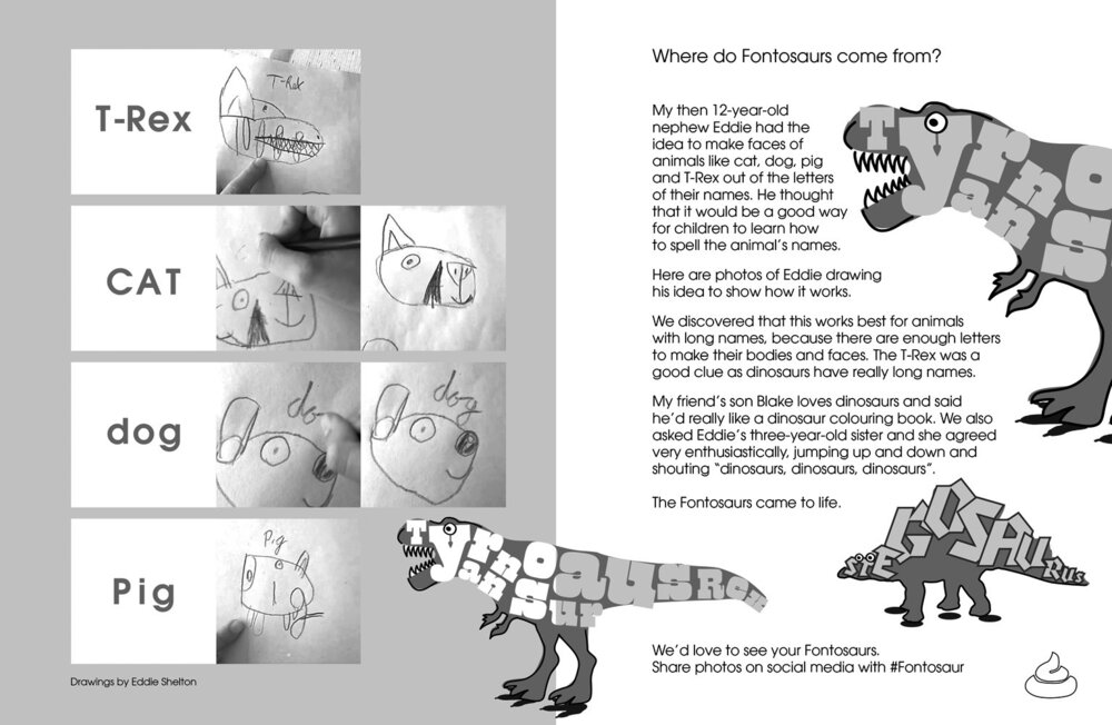
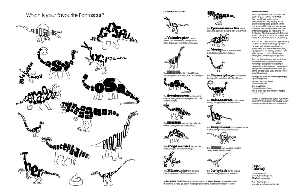
T-shirts, birthday cards and colouring books for the young dinosaur fans in your life. They’ll learn to recognise the letters in each dinosaur’s name with fonts matched to the personality of the each prehistoric creature. Fontosaurs evolved from a typographic collaboration between Sarah and her then 12-year-old nephew Eddie.
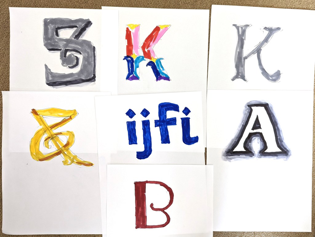
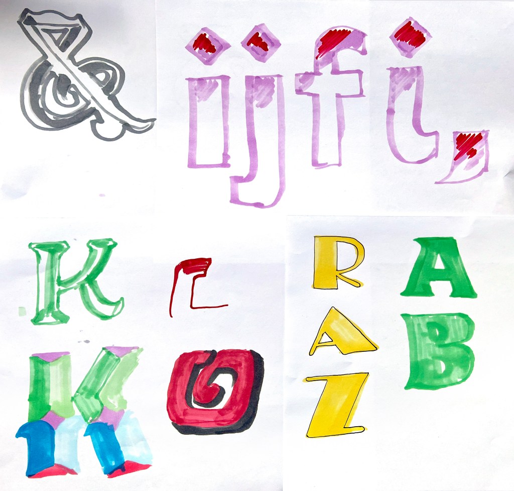
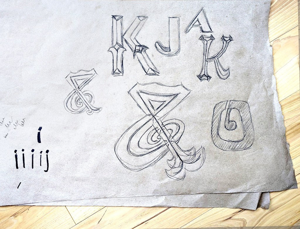
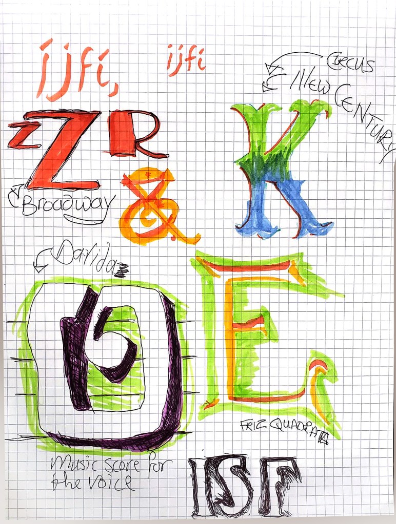
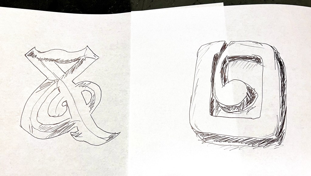
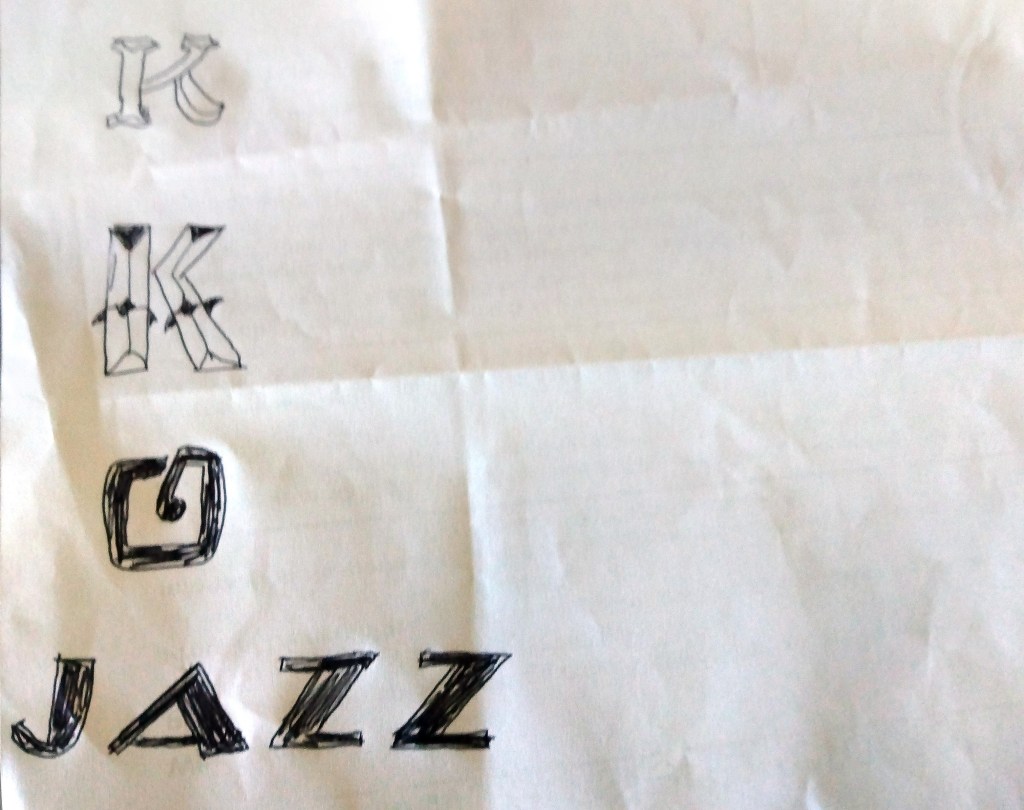
Typography Time Machine drawings shown (left to right, top to bottom). Terrific Tuscans drawings are by Olivia Krawczyk, @minarama, Sarah Wilson, Mina Bach, @stircreativenz and Kat Gaska. Book to Poster drawings are by Amy Muddle, @typographHer, @minarama, @jenna_b_design, @nicewriting, @thecreativeapes, @Jenna_b_design and @mycolourfullife.online. Sans (Serif) Seekers drawings are by Jenny Monds, Kat Gaska, @stonkingfidosetc, Olivia Krawczyk, Jitka Hrůzová.