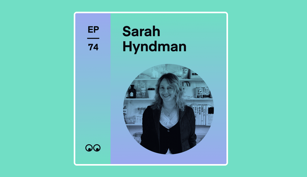
I really enjoyed chatting with Katy for the Creative Boom Podcast. It’s live now and you can listen to it here Creative Boom Episode 74.
We’ve already had some lovely feedback: “Articulate and engaging”; “Emphasis on us all being experts is generous”; “Knowledgeable, enthusiastic and assertively inclusive!”; “Covers great topics”.
My mum says “Wonderful. So clear and so interesting.” Thanks Mum.
I’ve been chatting to artist friends recently who’re interested in psychogeography. I always assumed that psychotypography would be a similar field, just with type instead of geography. Searching hasn’t turned much up but I think psychotypography describes what I do pretty well so I think it should be a thing.
Since psychogeography describes the effect of a geographical location on the emotions and behaviour of individuals (Tate), then I propose that psychotypography describes the effect of the typographic environment on the emotions and behaviour of individuals.
I love that an early influence was the flâneur, or urban wanderer. I think my Dalston Type Safaris could be considered a flâneur’s ramble through lettering in the urban environment.
Who’s experimenting in this space?
I made a psychotypography website ready for some experiments, it’s very empty right now.
This is a question I’ve been asking recently. Thank you for all your great answers, keep them coming.
Maybe it’s “I want to use more trending fonts” or “I want to know what font rules I can break, so I can have fun with fonts” or even “My teacher wants a simple design that is typeset in Arial. Is there any way I could secretly drop in another font without them noticing?”.
I recognise many as problems I had earlier in my career, when I also shared your feelings of anxiety and frustration.
By sharing your problems you’re joining me in my mission to change the way we think and talk about typography by making it exciting for everybody. Let’s all go from “overwhelmed” to “empowered”.
I’ll pick one a week to answer. You’ll also be helping me to make sure my books and workshops are really useful for you.
These are some of the problems you’ve written to me about, how many of them resonate with you?
“Finding the right fonts for client’s websites” • “I want to use more trending fonts” • “My teacher wants a simple design that is typeset in Arial. Is there any way I could secretly drop in another better font without them noticing?” • “How to choose the best font” • “I love fonts, but never know when to use serif or non-serif ones—what should guide this decision?” • “I’m struggling to find a consistent font theme for my sector” • “I can’t decide” • “I want to know what font rules I can break, so I can have fun with fonts”.
How these make you feel
“Screaming” • “Disoriented” • “Old fashioned and stuck” • “Overwhelmed about how to start” • “Frustrated” • “Unsure” • “Frustrated, apprehensive (did I get it right?) & unconfident” • “Anxious that the font we select may not resonate” • “Frustrated” • “Curious”.
How you would like to feel about choosing typefaces?
“Happy” • “Relaxed” • “Free” • “Successful and able to more clearly communicate” • “Really happy” • “Empowered & confident (& thus relaxed!)” • “A lot more confident” • “Empowered” • “Joyous”.
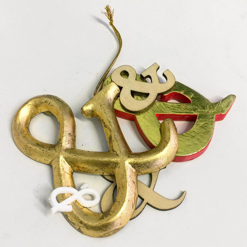
I think that an ampersand is an invitation to imagine what will come next. It’s a continuation of an idea, a conversation or a story. The ampersand is sometimes considered to be the 27th letter of the Latin alphabet, originating from the letters ‘et’, Latin for ‘and’, which have been combined to create a single glyph. It’s a character that there is wide affection for and it gives a glimpse of the personality of a typeface without the commitment of being a particular letter.
I asked you what the collective noun might be to describe them, here are some of your inventive suggestions…