Tag Archives: font

Kern Baby Kern

What’s the story behind the t-shirt?

This t-shirt is inspired by the song Disco Inferno by the Trammps. It’s a disco classic and almost impossible to listen to without dancing along.

🎵 Listen to the song (turn up the sound and dance)

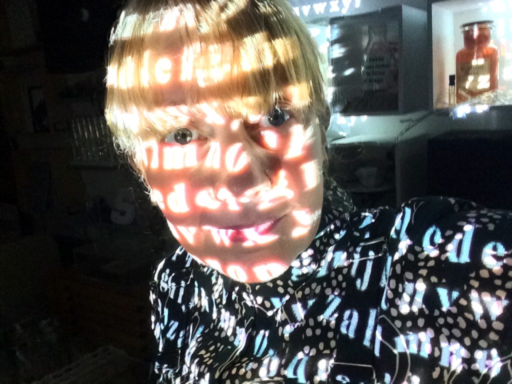
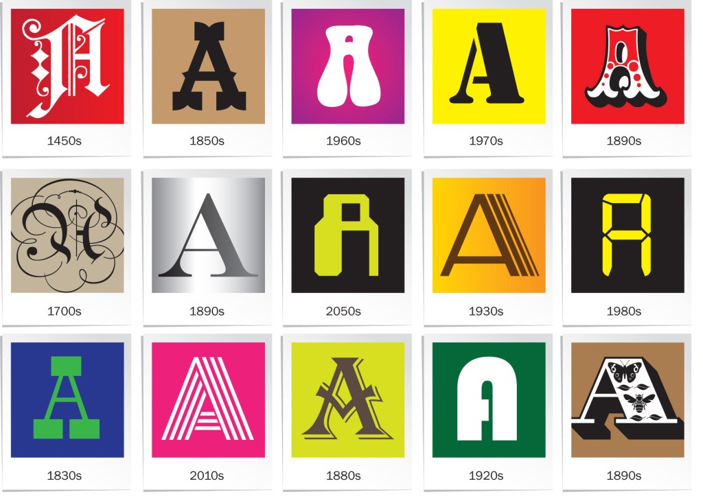
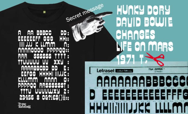
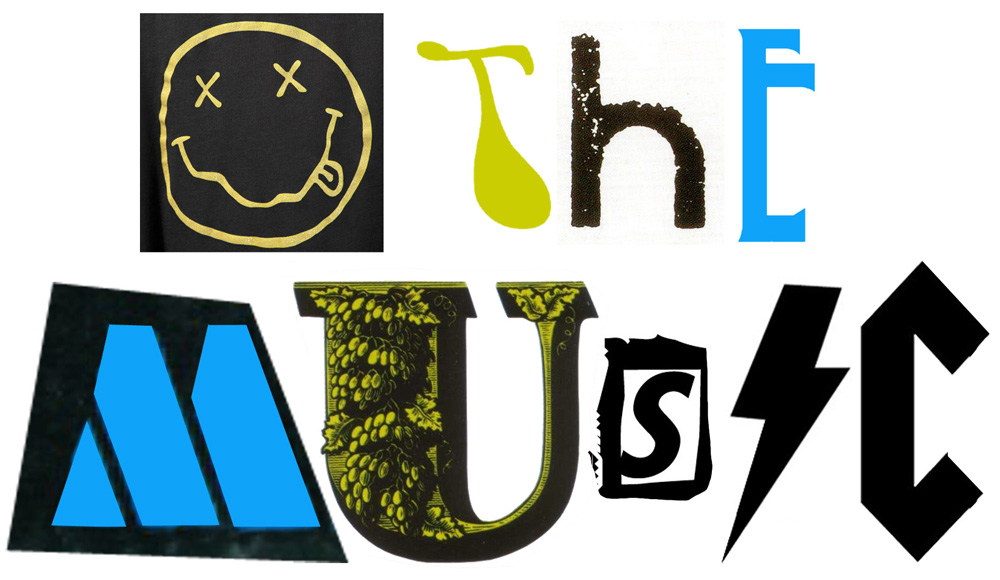
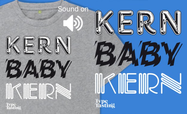
Kerning is a geeky typography term for the spacing between individual letters. There are lots of examples of when kerning goes wrong with unfortunate and amusing results. One of my near-misses was when I set the words FLICK THE PAGES on a scented book for an exhibition. I realised just in time that the close spacing between the L and I looked more like a U. Oops.

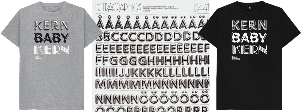
The three typefaces that feature on the Kern Baby Kern t-shirt were available as rubdown Letraset sheets. Chromium One was designed by David Harris in 1983. This was perfect for a decade of chrome and airbrushed posters. Shatter is an experimental typeface designed by Vic Carless in 1973. Carless literally smashed Helvetica up, which is what Punk did to Modernism in the 1970s. Piccadilly was designed by Christopher Matthews in 1973—this neon font is pure 1970s disco.

These are unisex t-shirts in regular men’s sizes (different colours and styles can be arranged on request). They’re printed on a 100% organic cotton t-shirt and printed in the UK in a renewable energy-powered factory. Worldwide shipping available.

Buy the dark grey & white print t-shirt, £19
(available worldwide)

Buy the white print t-shirt, £19
(available worldwide)

See all the t-shirt designs

(Buy t-shirts and support my book writing)

Fantastical Fonts with Sarah Hyndman: online live events

🔊Listen to the audio version

Not-to-be-missed interactive, funny and fantastical live events. Sarah’s on a mission to make typography exciting for everybody by inviting you to take part in games and demonstrations so you can make the discoveries for yourself.

Come along to this fun and irreverent online event with author Sarah Hyndman. Join in with games from her bestselling book Why Fonts Matter. She’ll answer as many of your questions as possible, no questions are too silly or too strange!

Ideal for beginners, students and anybody curious about reading fonts. We’re all font consumers in our everyday lives. Sarah will show you that you’re already an expert, even if you don’t realise it.

WHO’S THAT FONT?
Tuesday 14th September, 7pm to 8pm (BST)
Do fonts have personalities? Which would you date, ditch or just be friends with? What does a font reveal about your personality?

DO FONTS SMELL?
Tuesday 28th September 7pm to 8pm (BST)
What might different fonts smell like and what memories do they evoke? Can a font make your jellybean taste different? How do fonts interact with all your senses?
Bring a matching pair of jellybeans for an experiment.
£1.99 per person, only 25 tickets.
Book here

Once you’ve purchased your ticket you’ll be sent the Zoom details. Please tell your friends, let’s have some fun.

Are you ready to immerse yourself in the fantastical world of fonts?

About your host
Sarah Hyndman demystifies the amazing world of typography. She is the author of Why Fonts Matter. She is a TEDx speaker, a regular on radio (BBC Radio 4’s Word of Mouth with Michael Rosen, Saturday Live, Today.) and TV (Channel 4’s Sunday Brunch). Sarah is a multisensory typography expert and collaborates on studies with Professor Charles Spence of the University of Oxford.

What’s the secret message hidden in your t-shirt?

🎵 Listen to Hunky Dory on Spotify (and spot the Zipper font)

Many of you know about (and share) my love of Letraset—the sheets of rub-down lettering that often featured the fashionable fonts of the day. The first gig I went to was with my friend Caryl to see David Bowie. He was the soundtrack to our teenage years. My school books were adorned with meticulous drawings of lettering from his record covers. I was so excited when I found the Hunky Dory title typeface, called Zipper, as a sheet of Letraset. Now I could make my books look like Bowie merch with the official Hunky Dory font.

Your t-shirt is inspired by that sheet of Letraset. Letters have been removed to leave a secret message on your shirt. They spell out Hunky Dory, David Bowie, Changes, Life on Mars and 1971. (Geeky detail: the second ‘1’ in 1971 is made from a deconstructed ‘T’ because Letraset sheets don’t always have enough of the characters you need).

Buy the Zipper t-shirt

Visit the new Type Tasting shop

(Buy t-shirts and support my book writing)

What typography problem would you like solved?

🔊Listen to the audio version

This is a question I’ve been asking recently. Thank you for all your great answers, keep them coming.

Maybe it’s “I want to use more trending fonts” or “I want to know what font rules I can break, so I can have fun with fonts” or even “My teacher wants a simple design that is typeset in Arial. Is there any way I could secretly drop in another font without them noticing?”.

I recognise many as problems I had earlier in my career, when I also shared your feelings of anxiety and frustration.

By sharing your problems you’re joining me in my mission to change the way we think and talk about typography by making it exciting for everybody. Let’s all go from “overwhelmed” to “empowered”.

I’ll pick one a week to answer. You’ll also be helping me to make sure my books and workshops are really useful for you.

Take part

 👉 I’m an individual, take me to 3 quick questions  👈

 👉 I manage a team, take me to 3 quick questions  👈

These are some of the problems you’ve written to me about, how many of them resonate with you?

“Finding the right fonts for client’s websites” • “I want to use more trending fonts” • “My teacher wants a simple design that is typeset in Arial. Is there any way I could secretly drop in another better font without them noticing?” • “How to choose the best font” • “I love fonts, but never know when to use serif or non-serif ones—what should guide this decision?” • “I’m struggling to find a consistent font theme for my sector” • “I can’t decide” • “I want to know what font rules I can break, so I can have fun with fonts”.

How these make you feel

“Screaming” • “Disoriented” • “Old fashioned and stuck” • “Overwhelmed about how to start” • “Frustrated” • “Unsure” • “Frustrated, apprehensive (did I get it right?) & unconfident” • “Anxious that the font we select may not resonate” • “Frustrated” • “Curious”.

How you would like to feel about choosing typefaces?

“Happy” • “Relaxed” • “Free” • “Successful and able to more clearly communicate” • “Really happy” • “Empowered & confident (& thus relaxed!)” • “A lot more confident” • “Empowered” • “Joyous”.

Fontosaur: When dinosaur fonts roamed the Earth, a Christmas gift idea for children inspired by then 12-year-old Eddie

My nephew Eddie loves fonts. Those of you joining me for the Sunday Painting with fonts Zoom sessions know him because he joins us most weeks. If you’ve been to my other Zoom events you will know his voice from the Typography Karaoke game.

Last Christmas Eddie had the brilliant idea to make the faces of animals like cat, dog, cow, pig and T-Rex out of the letters of their name.

Continue reading

Creative Lockdown Project: Music alphabet

Creative Lockdown Project: Music alphabet

Challenge
What music has been the soundtrack to your time in lockdown? Draw, photograph or take screengrabs of the letters from the names of your favourite bands or album covers. Combine these to make up a word or phrase that describes how the music has made you feel at this time of social distancing.

Results
Share your finished project on social media with #CreativeLockdownProject. Tag #TypeTasting as I’ll be sharing some of the results.

These challenges are designed to be a bit of fun and to document our time collectively spent in lockdown. Please share it with friends and post your final results on social media with #CreativeLockdownProject. If you also tag #TypeTasting I’ll be sharing some of the results.

Continue reading

Creative Lockdown Project: Letter hunt

Creative Lockdown Project

Creative Lockdown Project: Letter hunt

We’re all starting to look forward again as we plan our way in a very changed world. At first, I really missed seeing everybody but I’m constantly amazed by how adaptable humans are as we find new ways to interact online.

This week’s challenge comes from Heidi Robinson of TGSA Creative Arts & Design technology, who also took all the photos.

These challenges are designed to be a bit of fun and to document our time collectively spent in lockdown. Please share it with friends and post your final results on social media with #CreativeLockdownProject. If you also tag #TypeTasting I’ll be sharing some of the results.

Continue reading

Creative Lockdown Project: You & me colouring together

Creative Lockdown Project: You & me colouring together

This week I’ve really missed being able to hug my family and friends. While it might not be the same as a hug, I’ve found that spending time doing something together creatively over Zoom or Facetime has really helped me to feel less separated from them. This is the inspiration for lockdown challenge number seven.

These challenges are designed to be a bit of fun and to document our time collectively spent in lockdown. Please share it with friends and post your final results on social media with #CreativeLockdownProject. If you also tag #TypeTasting I’ll be sharing some of the results.

Continue reading

Creative Lockdown Project: Rainbow alphabet

Creative Lockdown Project: Rainbow alphabet

This is the sixth creative lockdown challenge. These challenges are designed to be a bit of fun and to document our time collectively spent in lockdown, this one is also intended to say a huge THANK YOU to everybody who is working to keep us safe. Please share the project with friends and post your final results on social media with #CreativeLockdownProject. If you also tag #TypeTasting I’ll be sharing some of the results.

This week’s project is inspired by the wonderful rainbow alphabet (shown above) created by my very talented friend Miho Aishima for the children’s ward at Queen Elizabeth Hospital in Woolwich and community group @NunheadKnocks. She designed a rainbow typeface and created posters for kids who can’t get outside to see the rainbows out there. You can download Miho’s rainbow fonts here.

Continue reading

Creative Lockdown Project: Everyday display letter

Creative Lockdown Project: Everyday display letter

In the 1820s Louis John Pouchée created decoratively extravagant letters which were based on a fat-face style typeface. The letters featured imagery of things that were popular at the time like flowers, farmyard scenes, musical instruments and Masonic symbols.

Challenge
To create your own modern-day version of an ornamented letter that illustrates your everyday life while we’re in lockdown. Please share this project with your family and friends so you can all compare your letters.

Continue reading