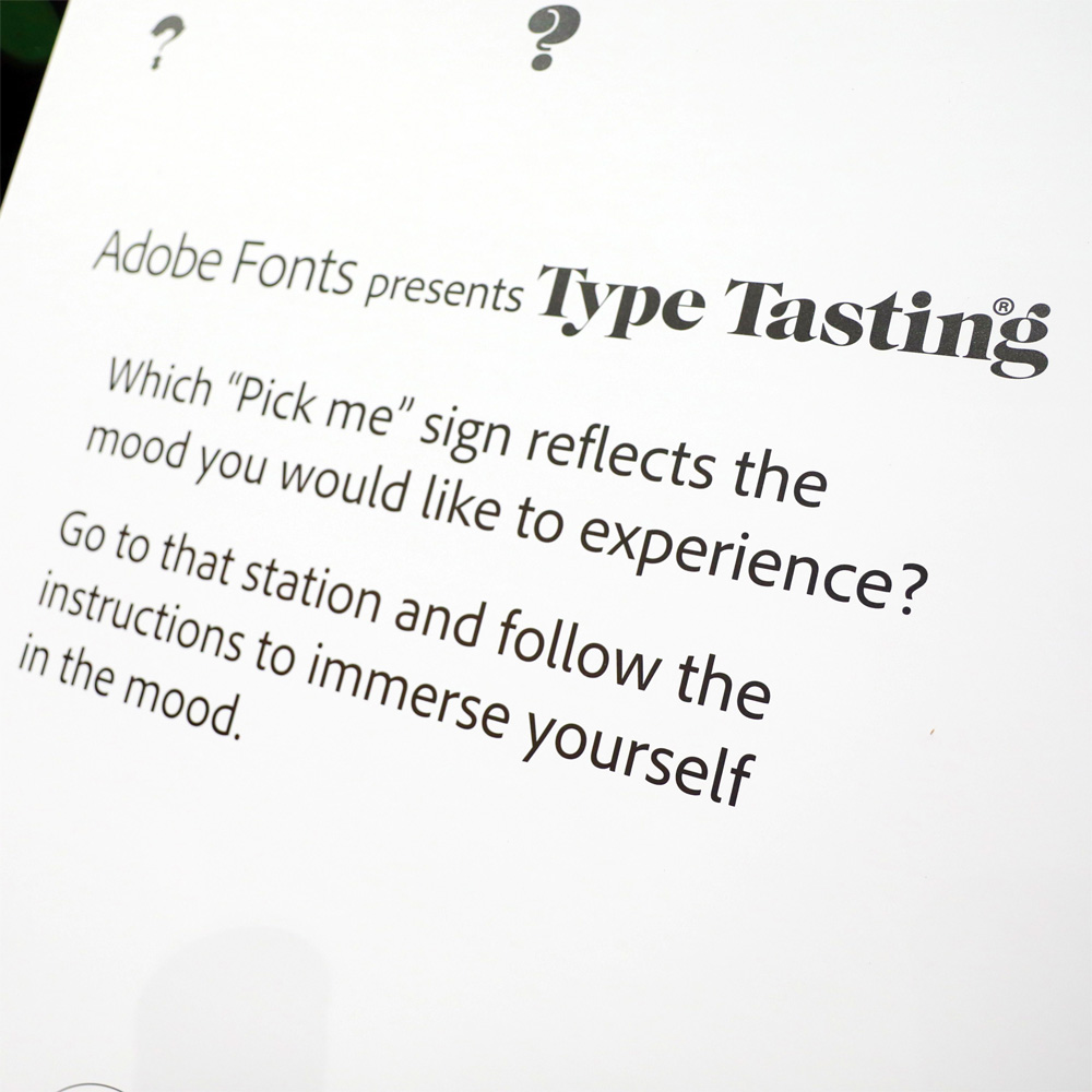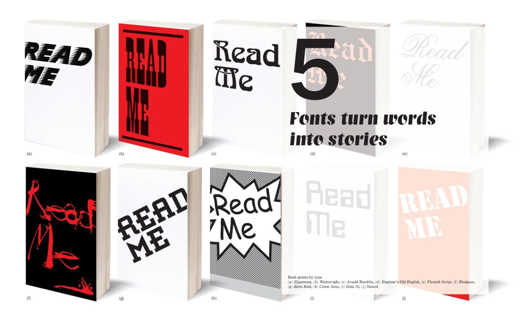

Join me to explore Mood 1 from the Adobe MAX immersive installation.
Put your headphones on and play this while you look at the photos*
Click here to play the sound.
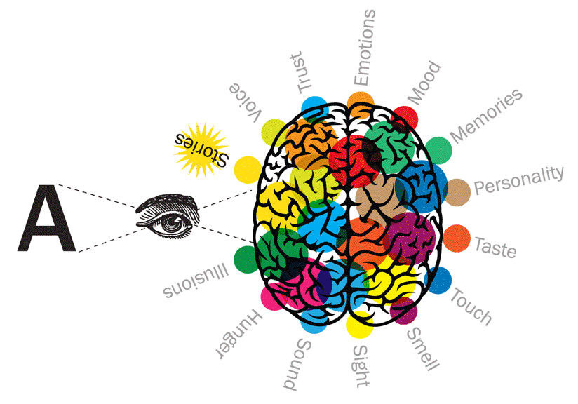
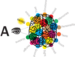
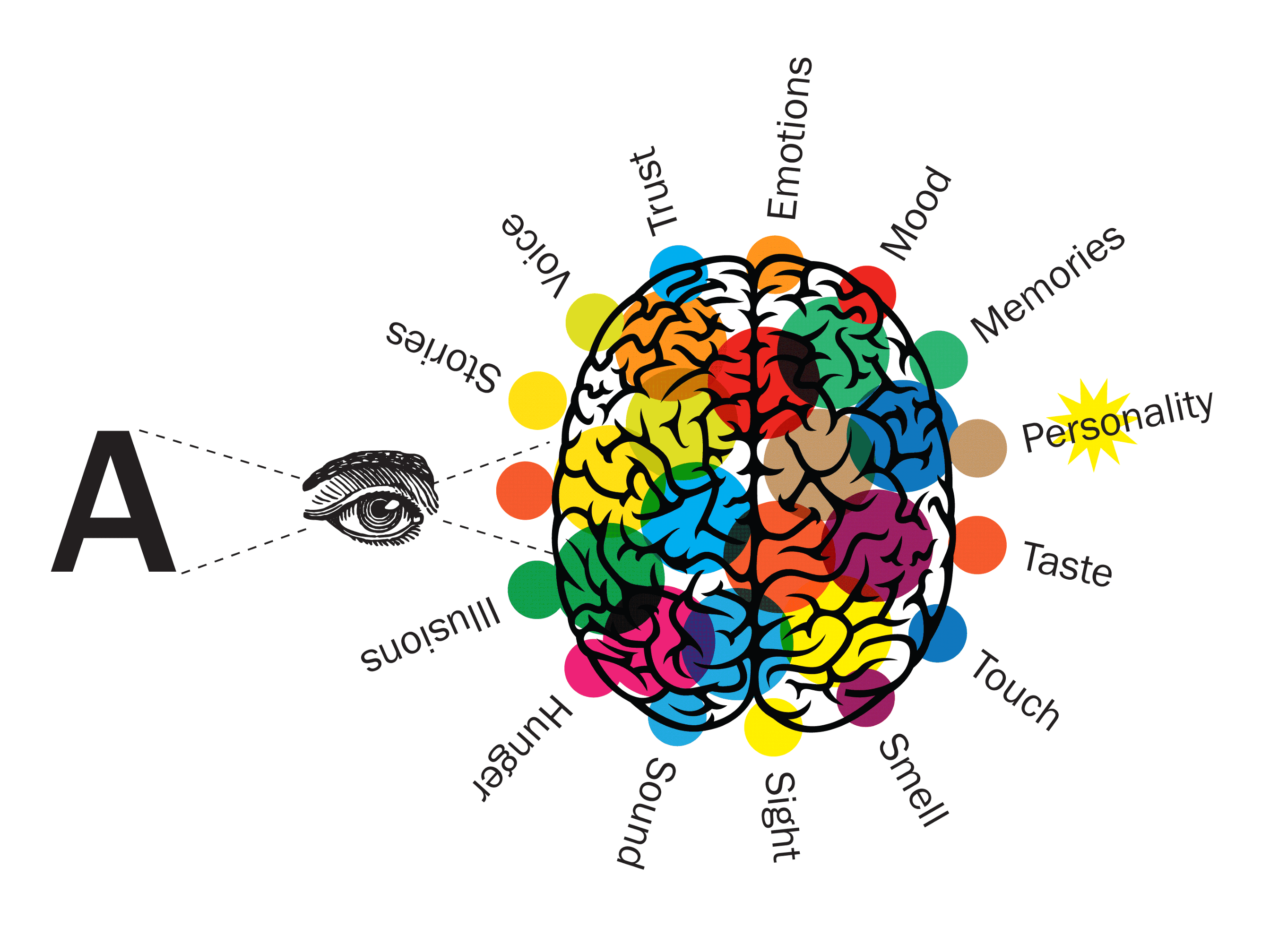
How does it make you feel? What smells and flavours would you pair with this mood?
**
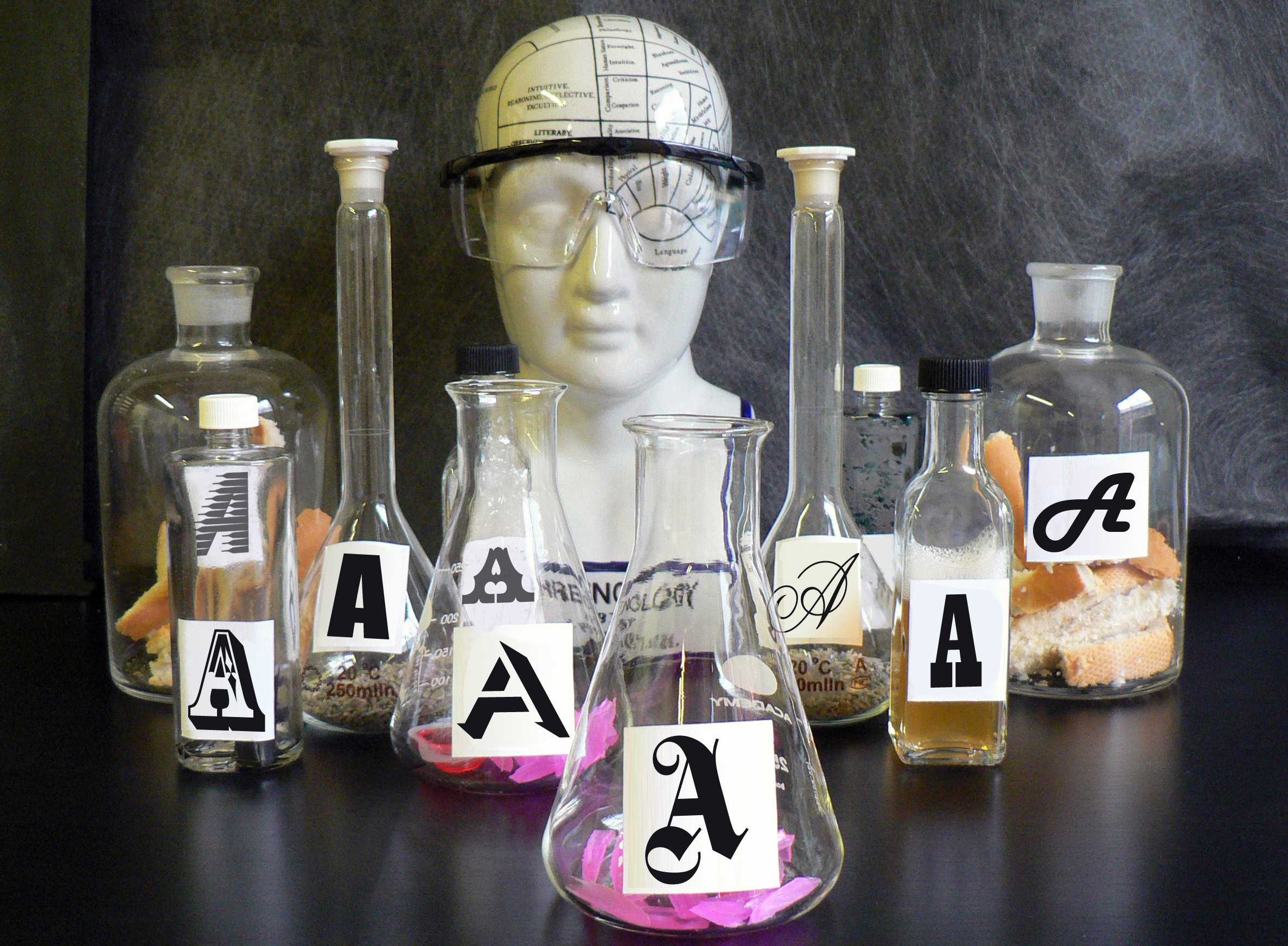
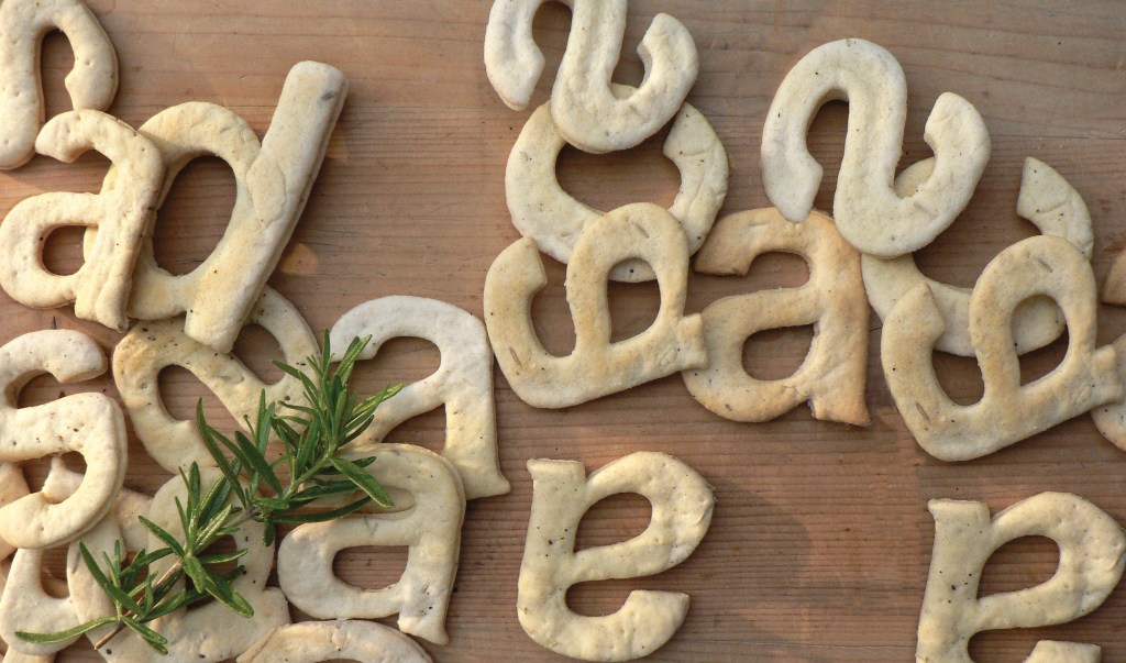
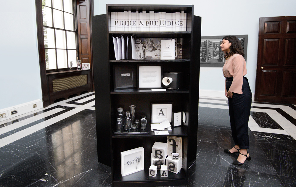
I first came across this weird looking type style in Rob Roy Kelly’s book of American Wood Type 1828–1900. It’s a crazy mashup of three styles: a gothic (sans serif) + tuscan (fancy bifurcated serifs) + Italienne (reverse contrast).
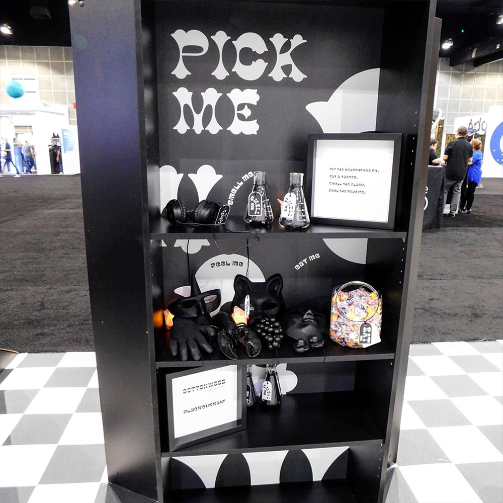
This is Cottonwood, designed by Barbara Lind, Joy Redick, and Kim Buker Chansler. From Adobe Originals.
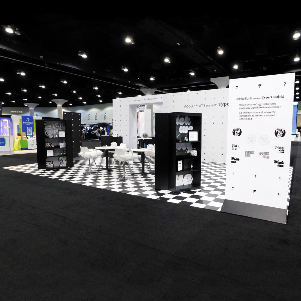
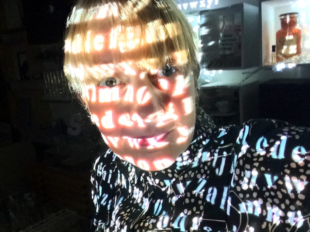
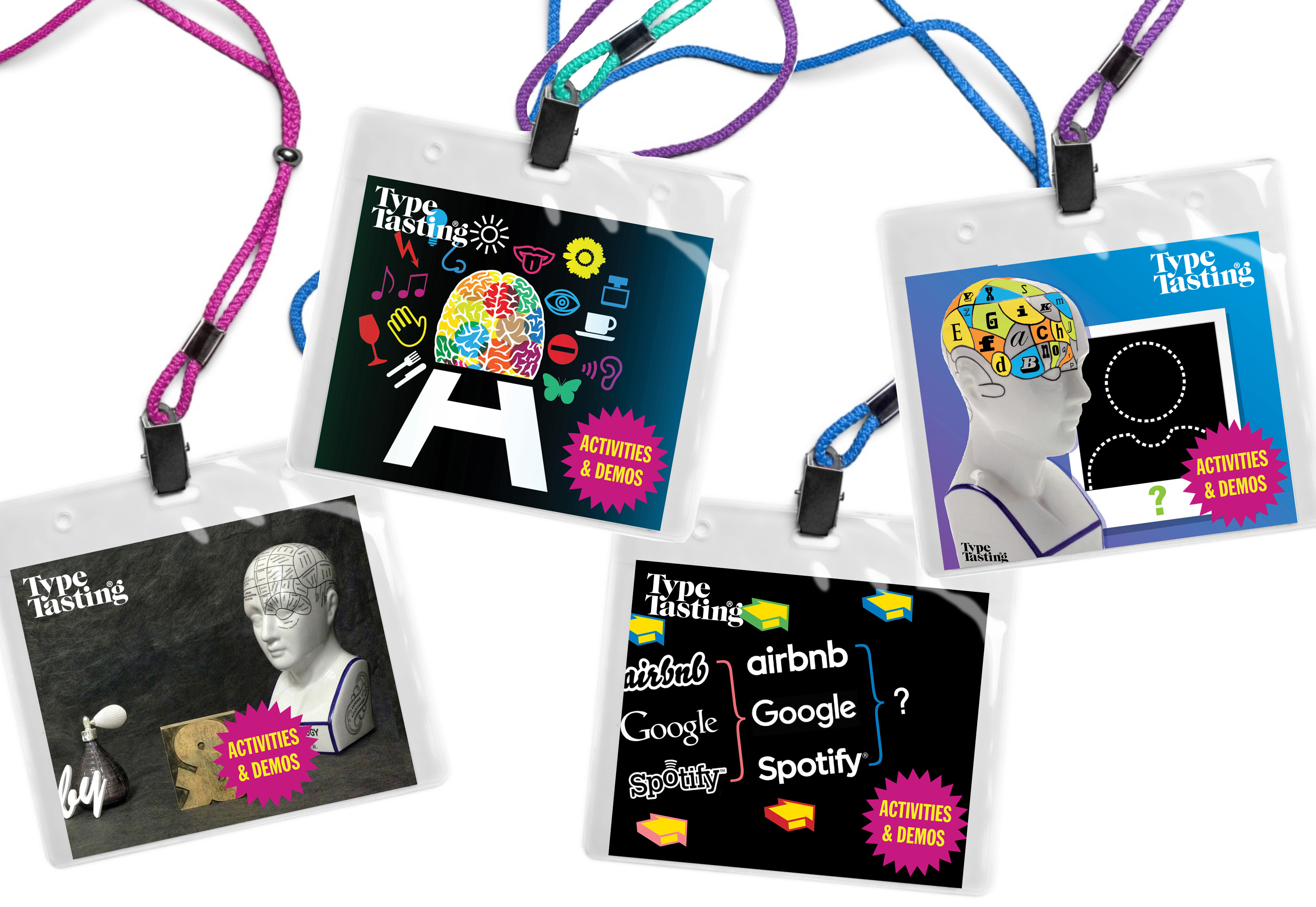
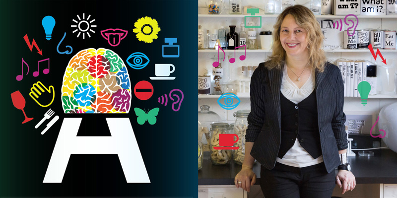
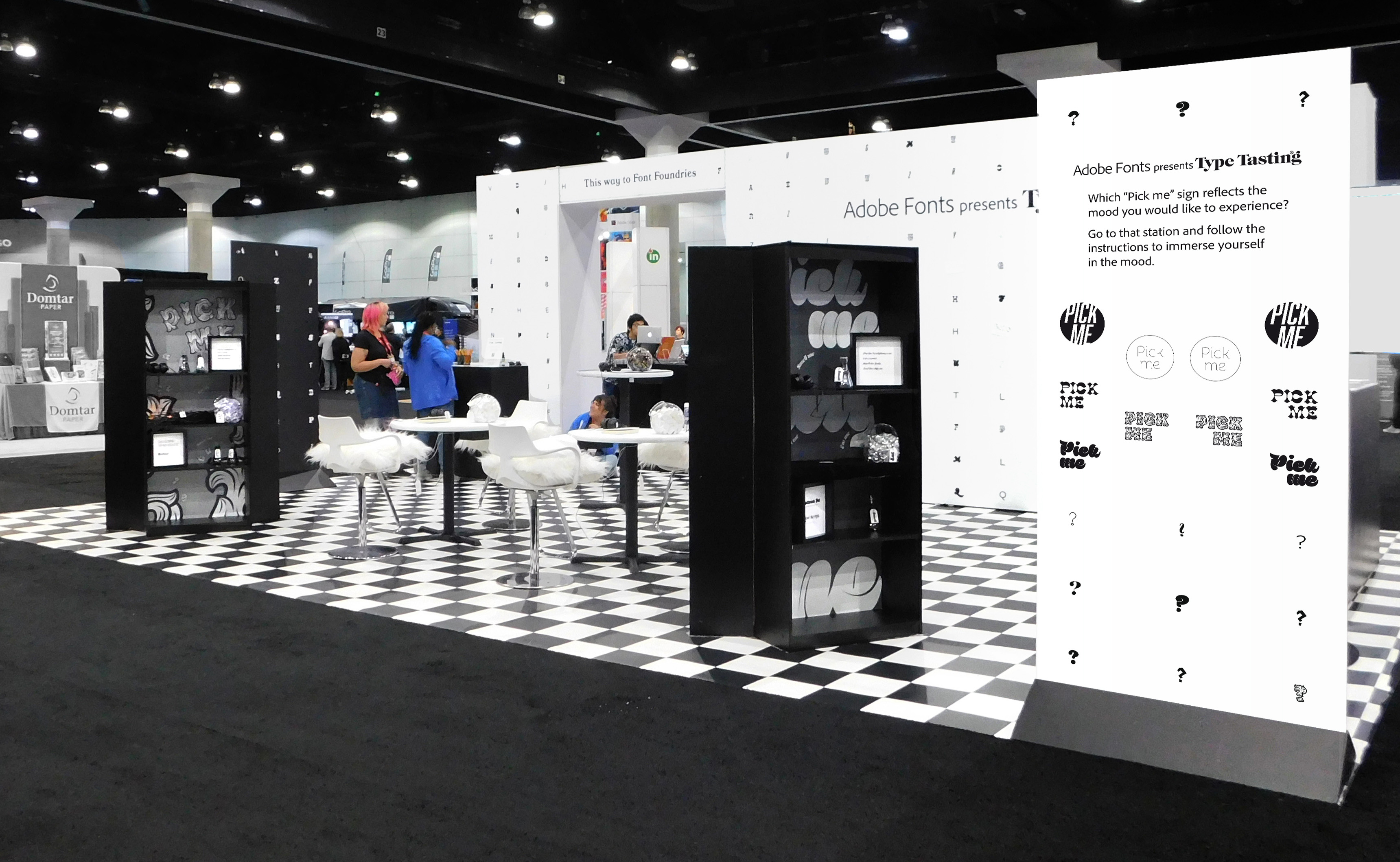
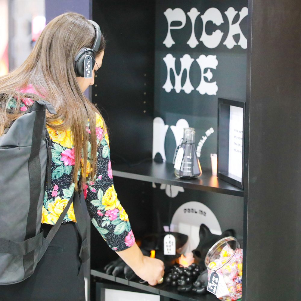
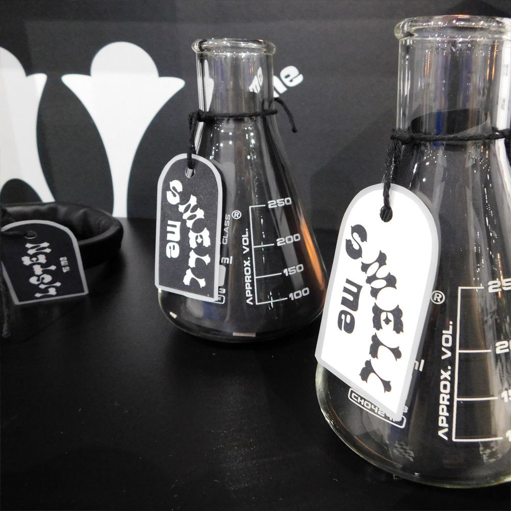
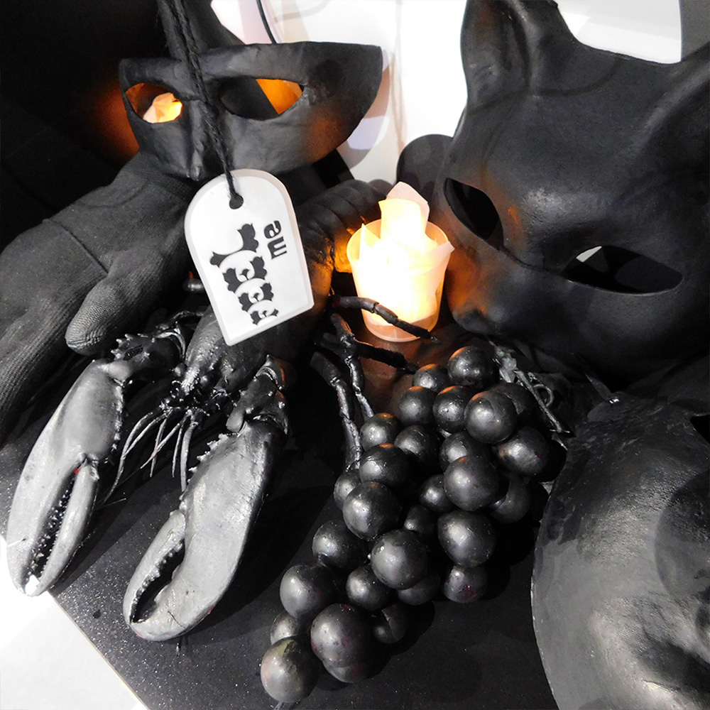
These photos are from the large-scale multisensory installation I created at the last in-person Adobe MAX at the L.A. Convention Centre in Los Angeles.
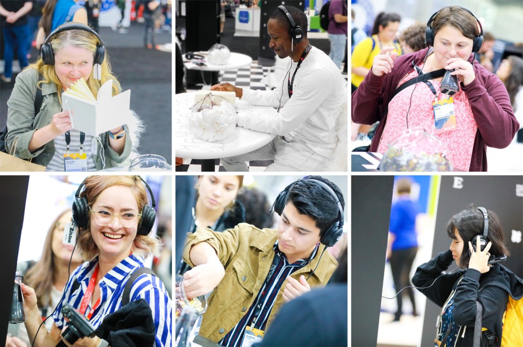
Visitors were immersed in the mood of different typefaces through all of their senses. At each station they were invited to put on headphones, to smell a scent in a jar or by flipping the pages of a book, to eat a small taster and to feel a texture. Each set of stimuli was designed to bring a mood to life in the participant’s imagination. There was curiosity and intrigue as the first visitors arrived and they were soon returning with groups of friends saying “you have to try this”.
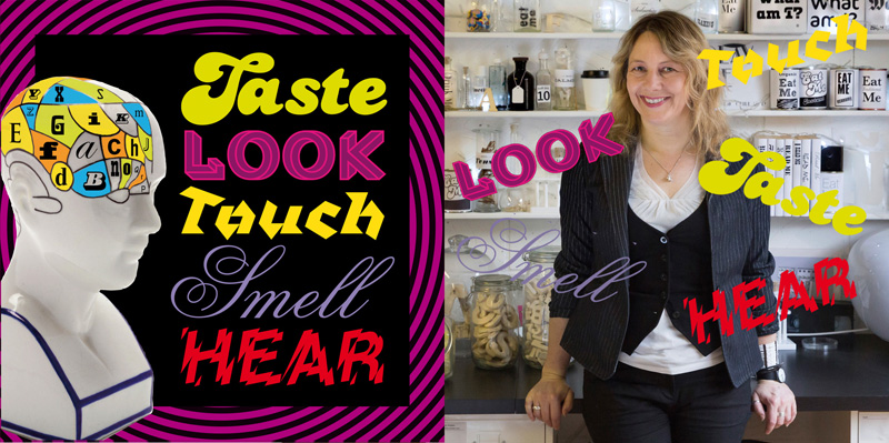
“The experience that Type Tasting designed for the Adobe Fonts booth at Adobe MAX was such a fun, intriguing way for people to explore how their reactions to fonts relate to other sensations” Dan Rhatigan, Adobe Fonts
Sound designer Rob Taliesin Owen created bespoke sounds and a bespoke scent was created by 4160 Tuesdays. The installation was produced and run with the wonderful Adobe Fonts team.
“Font ‘tasting’, it was awesome! You could smell, hear and taste the fonts”, “F!ing genius!”.
*If the link doesn’t work listen to Suite Punta Del Este by Astor Piazzolla.