Tag Archives: type

So you thought typography history was boring?

A selection of creative drawings

“Typography doesn’t exist in a history vacuum”

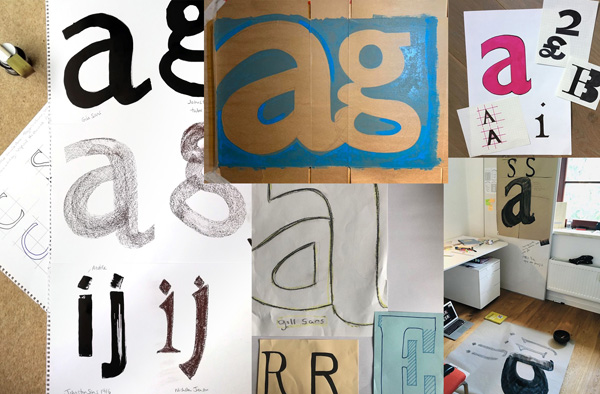
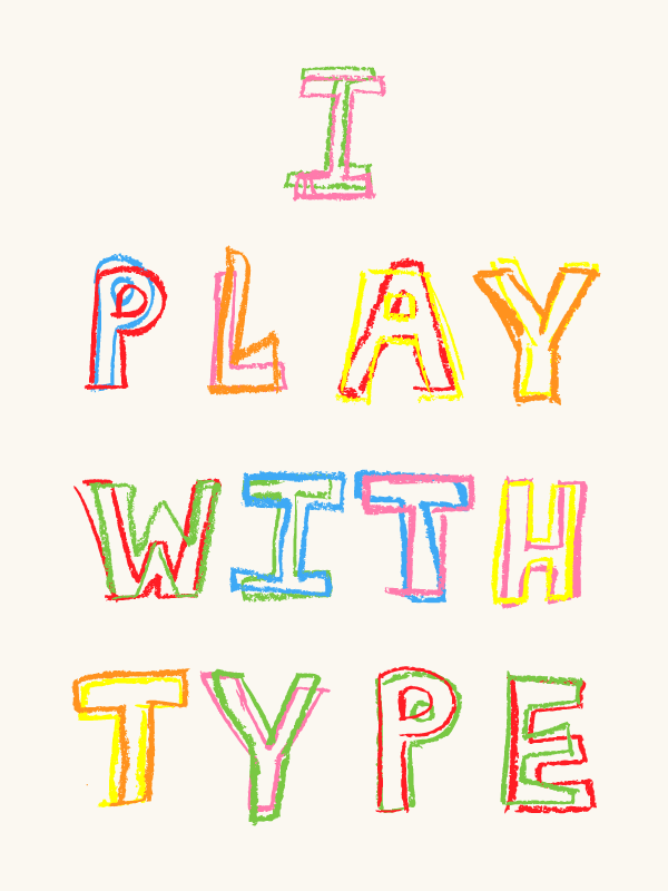
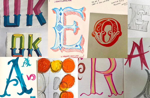
I’ve started a new online series based on the extremely popular activity from my in-person workshops called Typography Life Drawing. This article is a celebration of the results and feedback I’ve received so far, which you can see here are wonderful. A selection of the work is featured here or click here to visit the growing gallery.

This is an innovative new way to learn about type history through drawing, storytelling and music.

“It’s 3 x half-hour sessions a week but the sessions are recorded so you can do them in your own time. Brilliant!” Jan Lewis

There’s still plenty of time for you to join in. With a new topic each week you can just join in for the weeks that interest you or sign up for the whole series!

Typography Life Drawing with author Sarah Hyndman

Weekly £9.50 / £6 (students) book here
4-week subscription £33 book here
Full series subscription £65 (only available until Sunday 23rd August) book here

“Another incredible week of Typography Life Drawing. I can’t recommend these enough. Come for the drawing, stay for the history lessons.” @Minarama

👏🎉 Terrific Tuscans drawings shown above are by Olivia Krawczyk, @minarama, @stonkingfidosetc, @minarama, @stircreativenz and Kat Gaska (left to right, top to bottom) 👏🎉


Continue reading

Take part in the Typographic Interventions project

What is a typographic intervention? What if it’s not what it says on the tin? Can typography alter your experiences, or nudge you to change your behaviour?

This year we are exploring the potential for creating typographic interventions that initiate positive behaviour change. You are invited to take part in typographic research. Some of the experiments you will take part in are in their early proof of concept stages, for others data is being gathered potentially to be published as a future collaborative study.

Continue reading

Experience ‘Pride, Prejudice & Perceptions’ at the British Academy


Pride, Prejudice & Perceptions is an interactive sensory exploration of Jane Austen’s Pride & Prejudice, created by AVM Curiosities & Type Tasting for the British Academy’s Literature Week.

Taking inspiration from the typography found in three editions of this classic novel, Pride, Prejudice & Perceptions uses type, sound, sight and scent to serve one story three ways.

Continue reading

The Times: Using right fonts on labels could tackle obesity

“Some believe that smaller chocolate bars and sweets are the answer, others want a tax on sugary drinks or to encourage children to be more active. One expert, however, has come up with a novel solution to child obesity.

Sarah Hyndman, a graphic designer, says that the right typefaces can “nudge” people into healthier food choices, and this should start in schools…”

The article references the food can experiment that ran at the recent book launch at Tate Modern, and at the Type Tasting event at Shoreditch House for the D&AD Fringe Festival, were you there?

Pride, Prejudice & Perceptions at the British Academy

Pride, Prejudice & Perceptions

AVM Curiosities & Type Tasting present
Pride, Prejudice & Perceptions
British Academy Literature Week 2017: Adaptations and Transformations
15th–19th May, 9am to 6pm. Free, drop in, suitable for all.

Continue reading

Typographic Time Machine collection at the V&A

Typographic Time Machine workshop at the V&A #TimeType

Typographic Time Machine workshop at the V&A #TimeType Typographic Time Machine workshop at the V&A #TimeType

By Sarah Hyndman

The Typographic Time Machine collection popped up at the V&A at the weekend and we filled the space with amazing letters. A full blog post will come soon (after the festival has ended), meanwhile here is a glimpse of what happened.

Continue reading

What will your April Fools mystery font be?

Renaud Haslan luke curlz

Happy April Fools Day! All copies of The Type Taster: How Fonts Influence You books purchased today will arrive with an exclusive April Fools dust jacket featuring a surprise font.

Continue reading

South by Southwest here I come…

sxsw image

I’m looking forward to an exciting couple of weeks in Austin, Texas leaving next week. I’m honoured to be presenting a short talk on Saturday March 14th and then I get to spend the rest of the time being curious and inspired by the unfolding themes and ideas, many of which will be influencing us tomorrow. It’s an amazing event to be a part of so I’m delighted to be going back and it’s going to be great to meet up with the friends I made last time.

Continue reading

I play with type

play

Shreyansh Agarwal sent in this lovely animation with request to be considered for work experience. Type Tasting isn’t yet at a stage where work placements are possible, but his application caught our attention because he’d clearly researched what we do before getting in touch and had crafted an email tailored to us.

Shreyansh Agarwal is studying at the London College of Communication, click here to see more of his work on Behance.