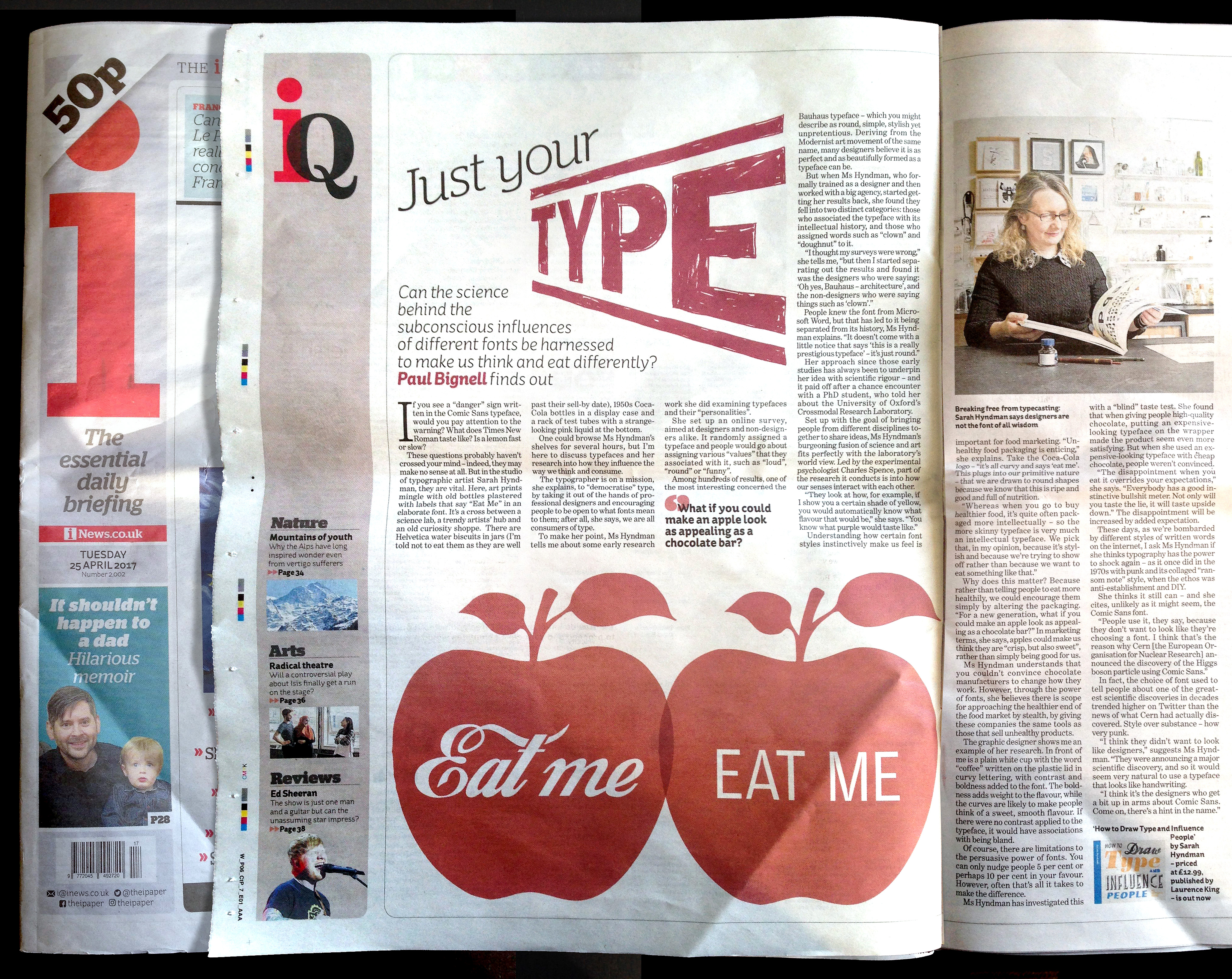
“If you see a “danger” sign written in the Comic Sans typeface, would you pay attention to the warning? What does Times New Roman taste like? Is a lemon fast or slow?” Paul Bignell for i Newspaper.
“If you see a “danger” sign written in the Comic Sans typeface, would you pay attention to the warning? What does Times New Roman taste like? Is a lemon fast or slow?” Paul Bignell for i Newspaper.
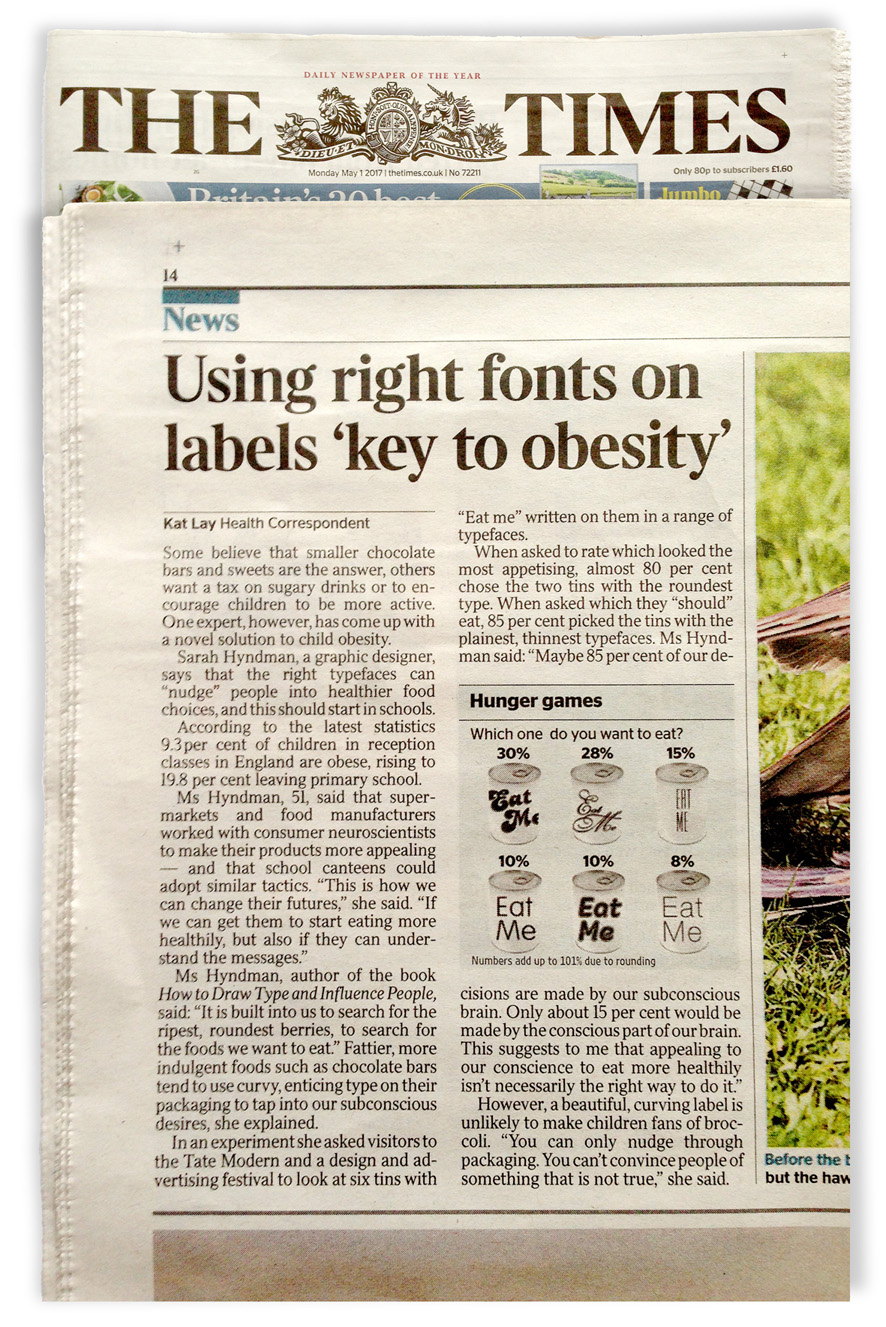
“Some believe that smaller chocolate bars and sweets are the answer, others want a tax on sugary drinks or to encourage children to be more active. One expert, however, has come up with a novel solution to child obesity.
Sarah Hyndman, a graphic designer, says that the right typefaces can “nudge” people into healthier food choices, and this should start in schools…”
The article references the food can experiment that ran at the recent book launch at Tate Modern, and at the Type Tasting event at Shoreditch House for the D&AD Fringe Festival, were you there?
