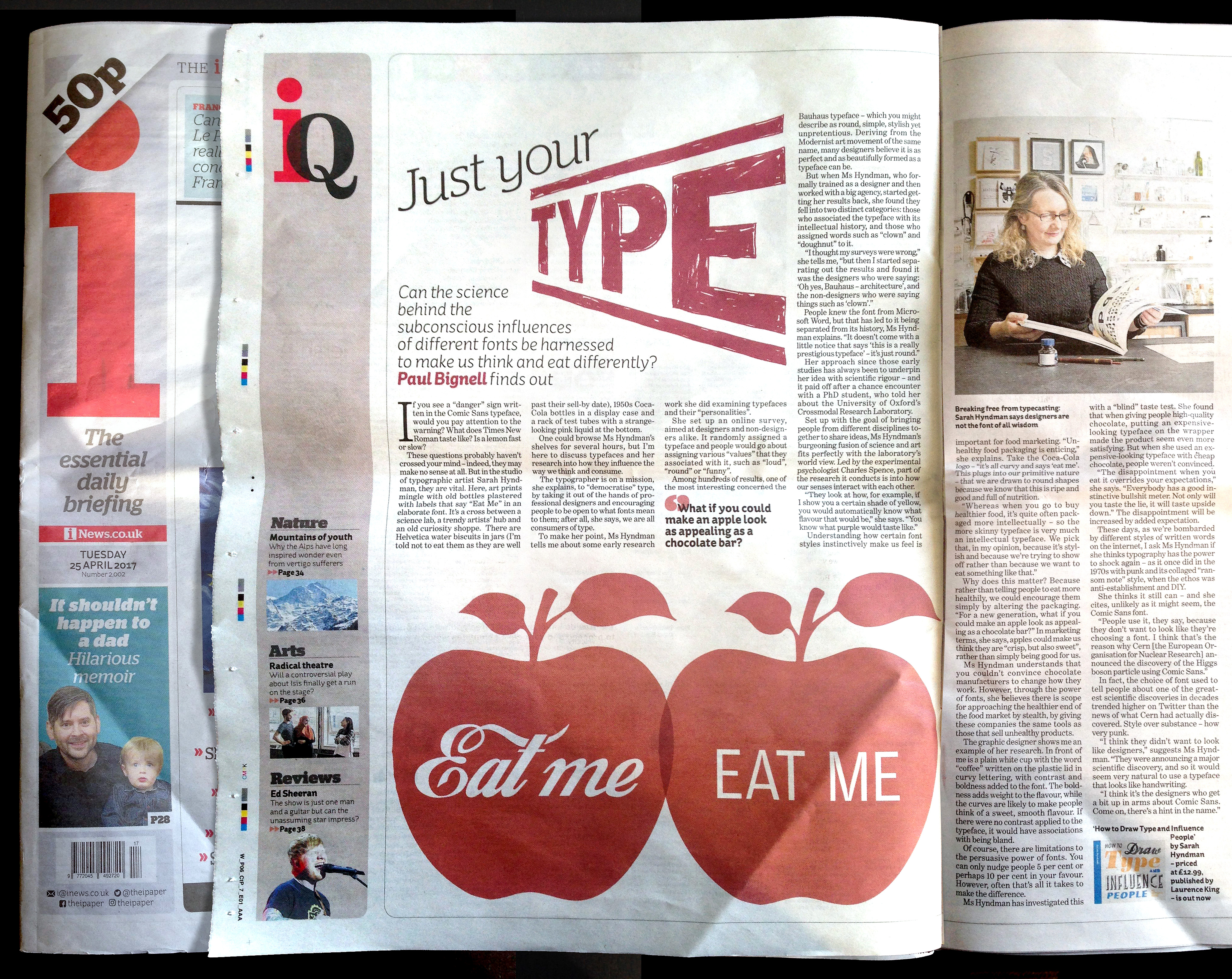
“If you see a “danger” sign written in the Comic Sans typeface, would you pay attention to the warning? What does Times New Roman taste like? Is a lemon fast or slow?” Paul Bignell for i Newspaper.
“If you see a “danger” sign written in the Comic Sans typeface, would you pay attention to the warning? What does Times New Roman taste like? Is a lemon fast or slow?” Paul Bignell for i Newspaper.


In celebration of the official launch of Why Fonts Matter in the US today:
Playing Type Karaoke with the Nicer Tuesdays audience for It’s Nice That (12 mins)
Interviewed on BBC Radio 4’s Saturday Live (4 mins)
TEDx talk Wake Up and Smell the Fonts (15 mins)
To see a list of all press and interviews click here. To book a talk or event click here.
![]()
In celebration of the official launch of Why Fonts Matter in the US today: Being interviewed by Extensis gave me the opportunity to explain why I set up Type Tasting back in 2013. “We spoke with Sarah about her work as a researcher and graphic designer, how she’s able to predict how you take your coffee, and more.”
Extensis
Tasting Type Like Wine: An Interview with TypeTasting’s Sarah Hyndman
In celebration of the official launch of Why Fonts Matter in the US today: Grafik asked how I chose the typfaces for Why Fonts Matter. “Choosing fonts for a book called Why Fonts Matter is always going to be tricky.”
(Please note, the competition date has passed).
![]()
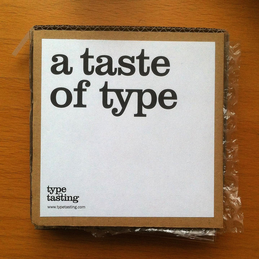
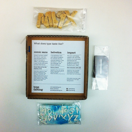
In celebration of the official launch of Why Fonts Matter in the US today: Creative Review ran a piece on the pop-up Type Tasting at the V&A for the London Design Festival. “Type Tasting’s series of multisensory experiments, for me, turned typography on its head.” Natalie Kelter
Creative Review
A taste of type, Natalie Kelter
![]()
(Photos David Owens)
In celebration of the official launch of Why Fonts Matter in the US today: The Financial Times reported on London’s lettering, giving Dalston Type Safaris a good mention. “Graphic designer Sarah Hyndman is on a mission to make typography more appealing.”
Financial Times
Font of inspiration: London’s lettering
By Rob Alderson
![]()
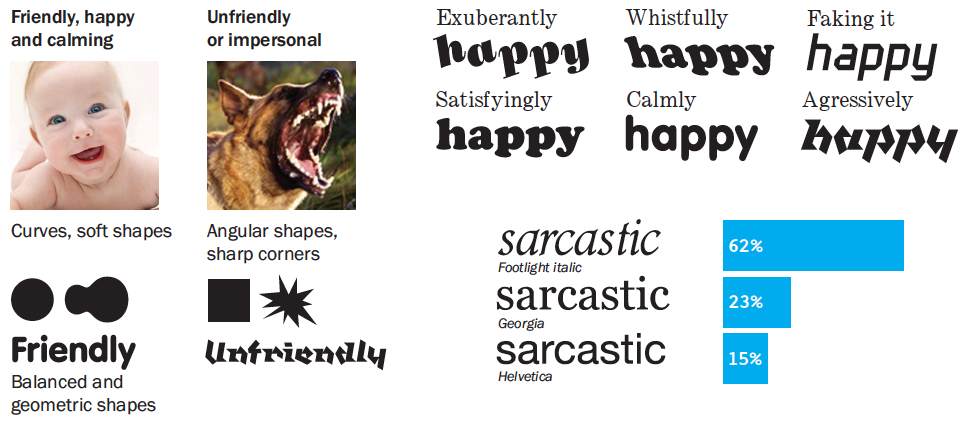
In celebration of the official launch of Why Fonts Matter in the US today: Eye’s panel checked out the taste of Helvetica, Impact and Comic Sans (as cooked up by Sarah Hyndman). “Perfect. Helvetica is too serious to be sweet.” “Tastes more like Akzidenz Grotesk”, “Comic Sans deserves better”
![]()
In celebration of the official launch of Why Fonts Matter in the US today: This post about fonts and mood became the most popular post on It’s Nice That in the first three months of 2016. “The one womantour-de-force behind Type Tasting … looks at the power typography has over our lives and senses.”
It’s Nice That
Why Fonts Matter, and how they impact your mood
![]()

In celebration of the official launch of Why Fonts Matter in the US today: Liz Stinson from Wired played the Type Dating Game via Skype. “20 percent of women said they’d pick Franklin Gothic as their typographic beau, the winner by a landslide. I know it sounds weird.”
Wired
If You Love That Font So Much, Why Don’t You Date It?
By Liz Stinson
![]()
In celebration of the official publication of Why Fonts Matter in the US today we’re looking back over articles and interviews that give a glimpse of the impression we’ve made on the world at large.
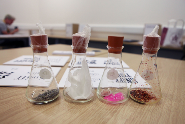
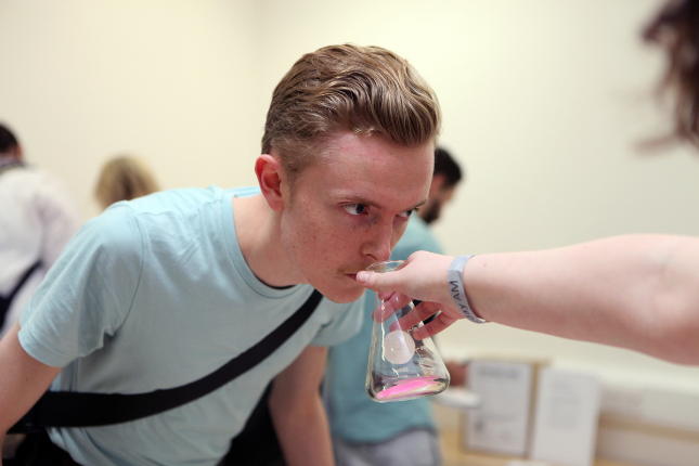
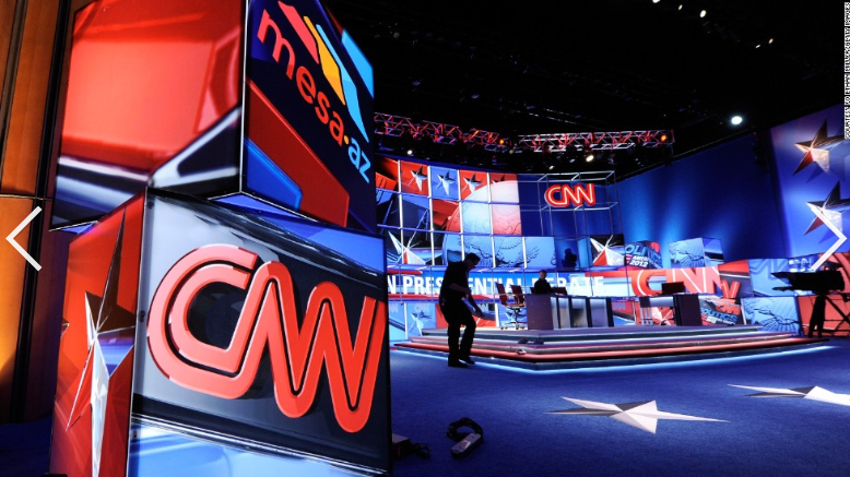
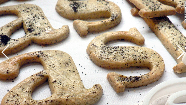
Jake Wallis Simons from CNN came to the Type Tasting studio and played a selection of Type Tasting Games. “As bizarre as it sounds, my job is to match up the bottles and fonts using only my sense of smell.”
CNN
What’s your type of lover? How fonts could help you find the perfect date
By Jake Wallis Simons
