“If you see a “danger” sign written in the Comic Sans typeface, would you pay attention to the warning? What does Times New Roman taste like? Is a lemon fast or slow?” Paul Bignell for i Newspaper.
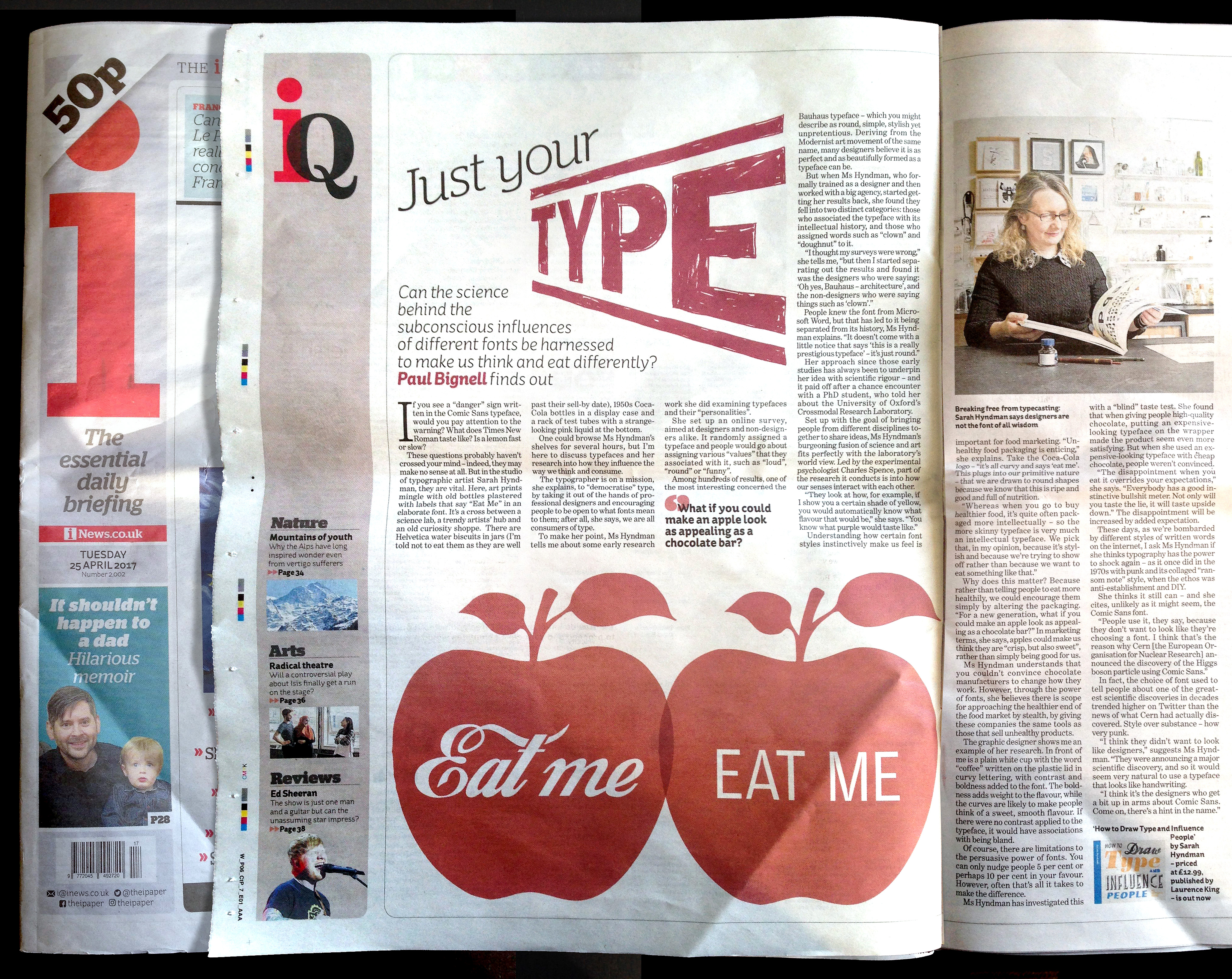
“These questions probably haven’t crossed your mind – indeed, they may make no sense at all. But in the studio of typographic artist Sarah Hyndman, they are vital. Here, art prints mingle with old bottles plastered with labels that say “Eat Me” in an elaborate font. It’s a cross between a science lab, a trendy artists’ hub and an old curiosity shoppe. There are Helvetica water biscuits in jars (I’m told not to eat them as they are well past their sell-by date), 1950s Coca-Cola bottles in a display case and a rack of test tubes with a strange-looking pink liquid at the bottom.”
“Stealth health – it’s all in the font Hyndman understands that you couldn’t convince chocolate manufacturers to change how they work. However, through the power of fonts, she believes there is scope for approaching the healthier end of the food market by stealth, by giving these companies the same tools as those that sell unhealthy products.”
