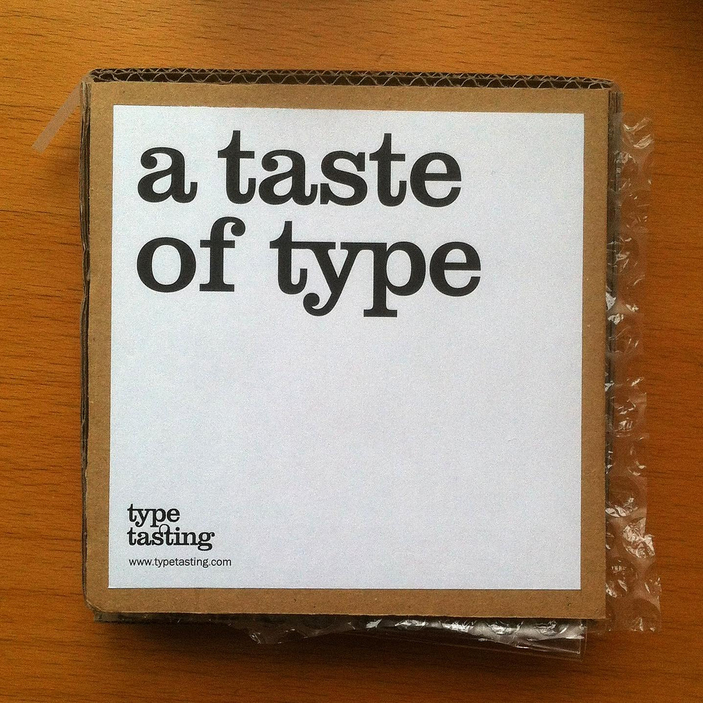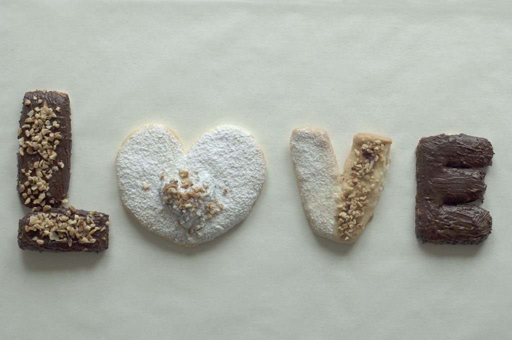
Creative Lockdown Project: Edible alphabet
This is the third creative lockdown challenge. These challenges are designed to be a bit of fun and to document our time collectively spent in lockdown. Please share this creative challenge with your friends and post your final results on social media.
Challenge
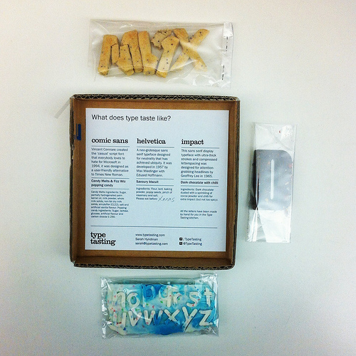
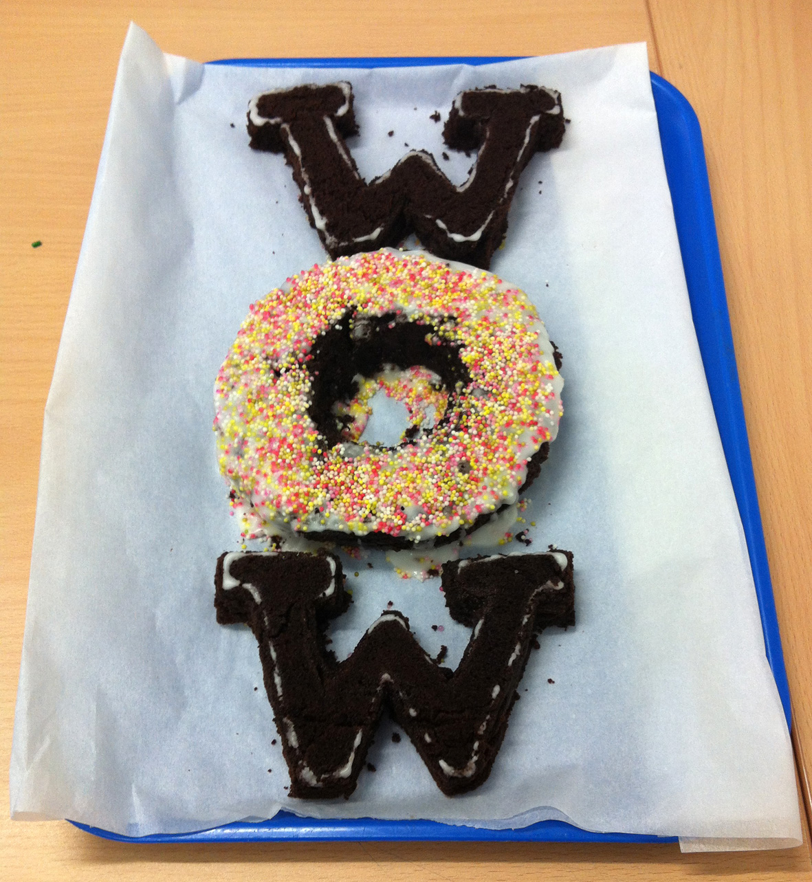
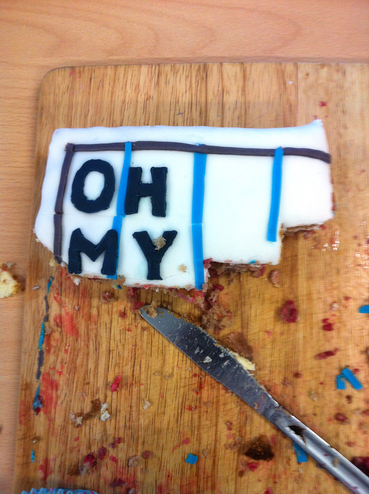
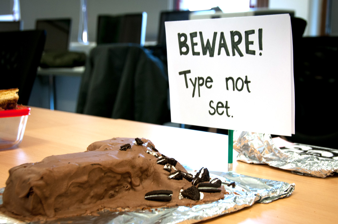
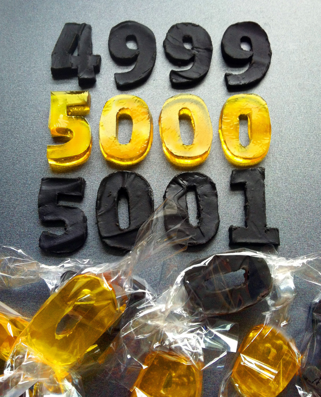
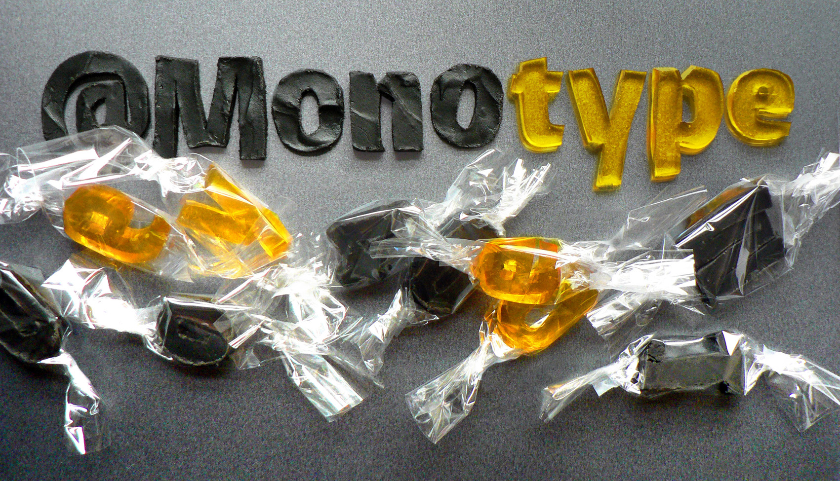
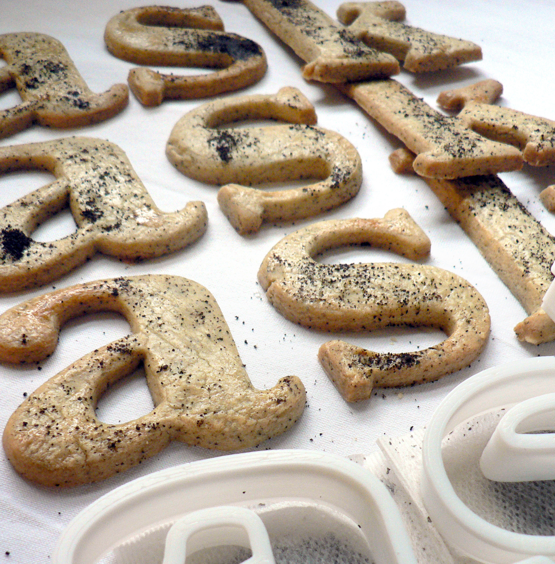
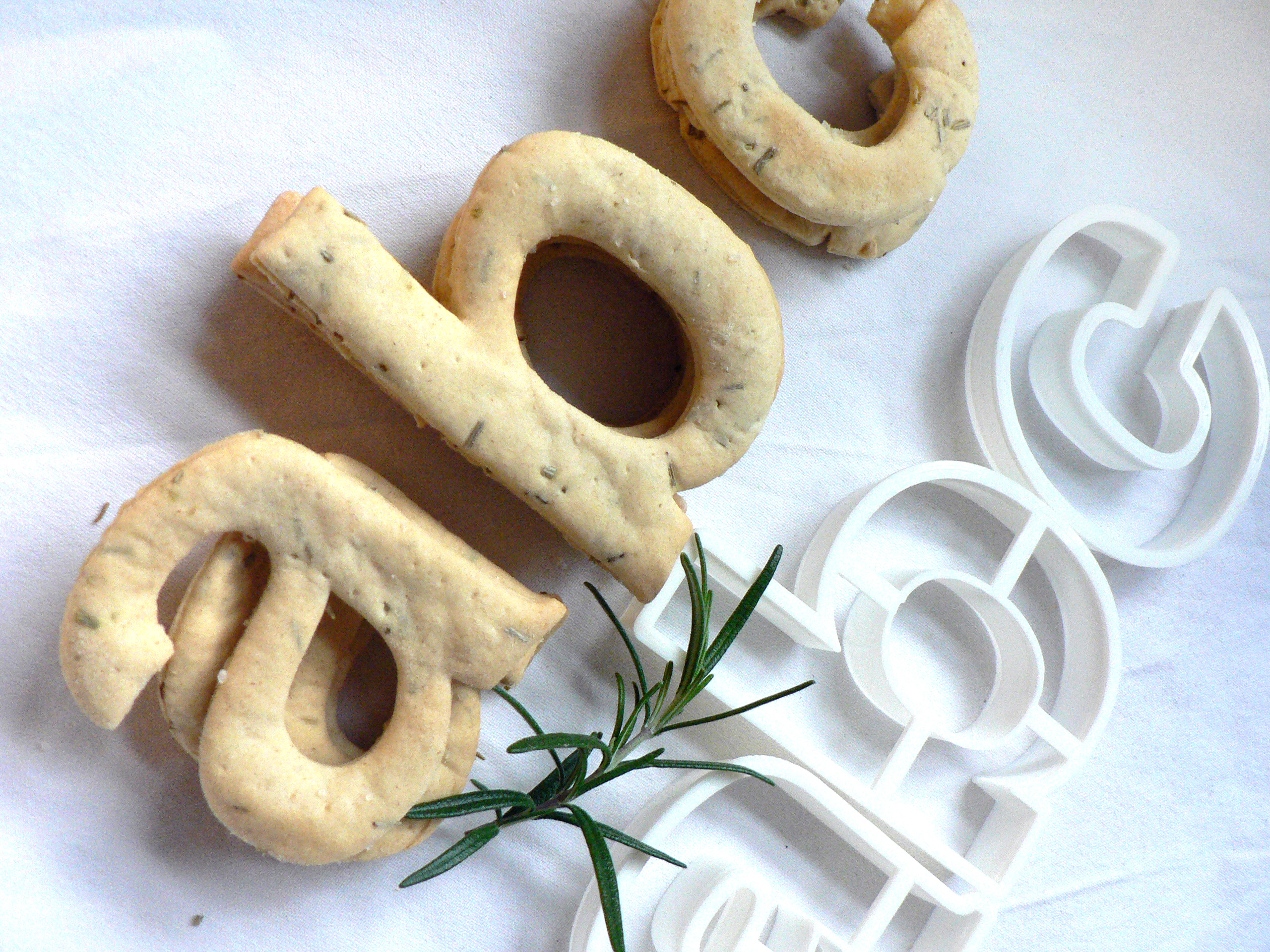
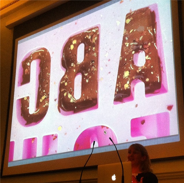
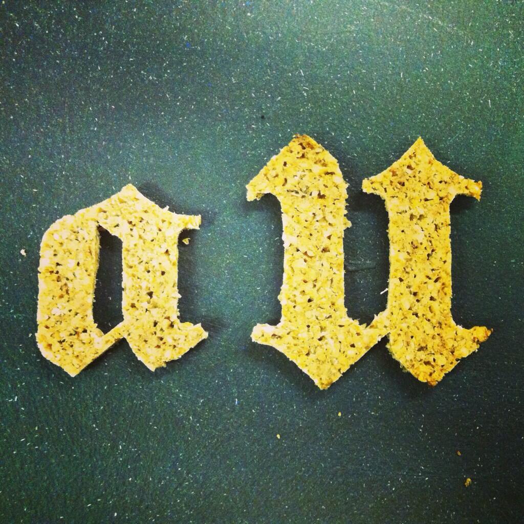
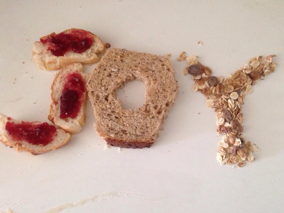
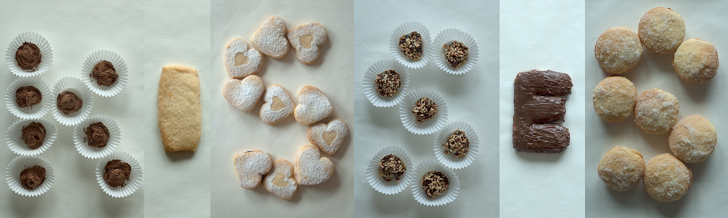
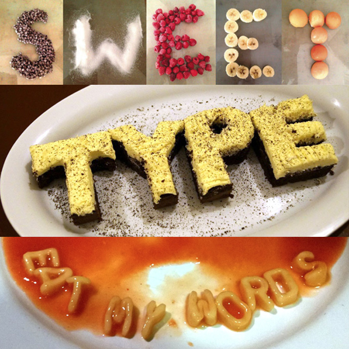
Use the food you have in your home to create an edible alphabet. Think about a word you would like to spell out and work out how to make the letters. Will you arrange the food you’re about to eat or would you like to bake something from scratch?
Don’t go out shopping to buy any extra ingredients, the challenge is to use what you can find in your kitchen. It would be great to see photos of the process as you bake or create your letters.