Tag Archives: recipe

What would Monotype’s Burlingame typeface taste like?

burlingame 5000B SHyndman
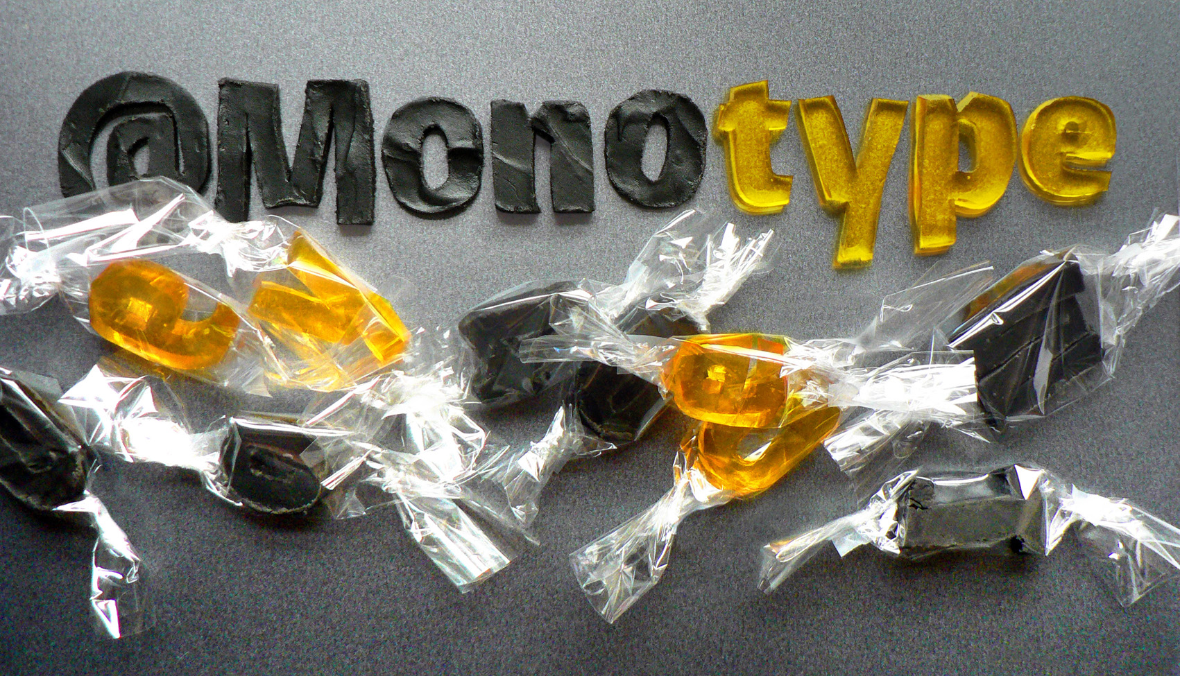
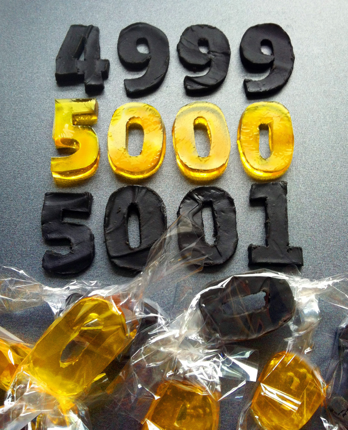
To celebrate their 5,000th Twitter follower, Monotype commissioned Type Tasting’s Sarah to create an edible version of their newest typeface release, Burlingame.

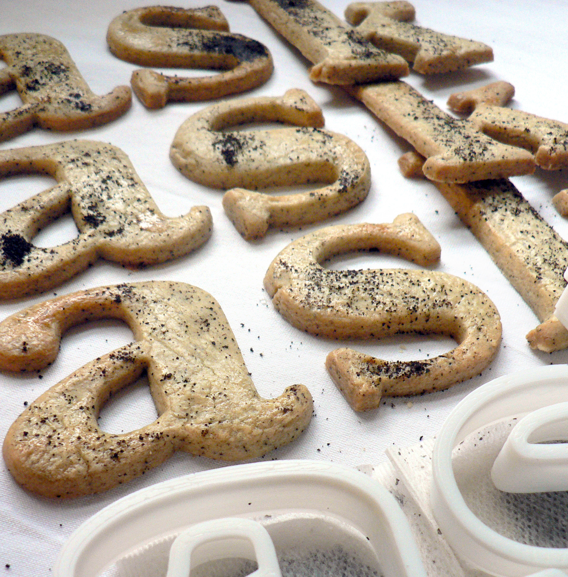
Burlingame was developed by Carl Crossgrove following pioneering investigations by Monotype into the legibility of vehicle displays. The research revealed a set of optimum criteria for dashboard display fonts: large counters and x-heights, simple shapes and a loose spacing of characters. It was found that a humanist sans serif typeface with these characteristics reduced male drivers’ glance time significantly.

burlingame MonotypeA SHyndman

Continue reading

Baskerville Earl Grey tea biscuits recipe

bask cooked 003 cropped

Baskerville Earl Grey tea biscuits recipe
Edible typography
Using food to describe the experience of typography

Baskerville is a transitional serif typeface that sits between the old style serif typefaces of William Caslon and the modern serifs created by Giambattista Bodoni & Firmin Didot. English printer and type designer John Baskerville developed a typeface with more defined angles and greater stroke contrast. This was a refined face with improved legibility which also took advantage of the improvements in technology happening in the 1750s. Baskerville is a recognisably English typeface that has stood the test of time as a legible, everyday text face.

My interpretation of Baskerville are Earl Grey tea biscuits for an authentic eighteenth century flavour. At this time improved technology and transport allowed foods to be enjoyed throughout the country. Tea had become the national drink and the tea leaves would be dried, rolled and used again. I had initially thought that Baskerville should be savoury, since it’s an everyday ‘jobbing’ typeface, but sweet biscuits tasted better.

Recipe

Continue reading

Helvetica water biscuits recipe

helv cooked 003

Helvetica water biscuits recipe
Edible typography
Using food to describe the experience of typography

The typeface Helvetica was created to be neutral and to have great clarity, but to have no intrinsic meaning of its own. It was intended that it could communicate any message, but without it being influenced by the style of the font in any way. i.e. clear enough to be used across a wide range of applications, but plain and neutral enough that that its sole purpose is to support the message.

My interpretation of Helvetica is to create it from savoury water biscuits which are plain enough that they can be included in a wide range of meals but take on the flavour and style of the food that they accompany. They have a sprinkling of salt to make them tasty enough to eat, and a dash of rosemary for a Swiss Alpine touch. Serve them with cheese, ham or a tasty dip.

Recipe

Continue reading