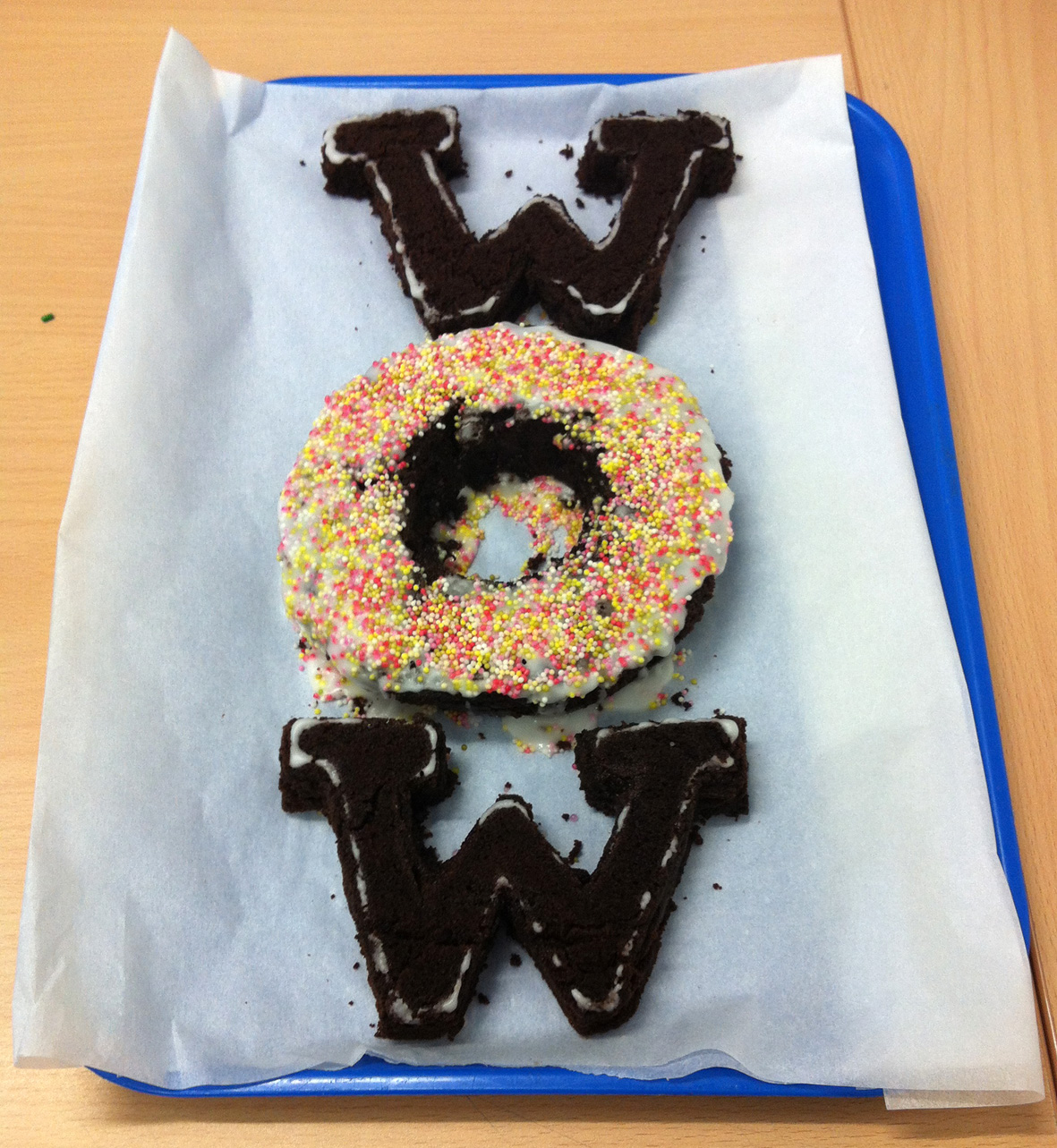
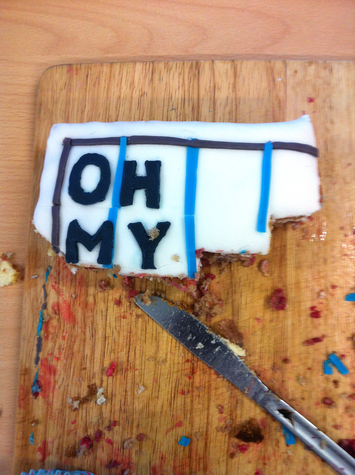
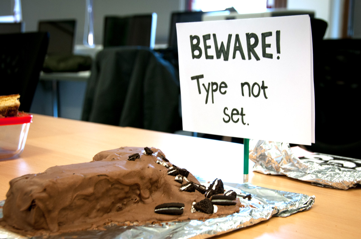
I recently gave a talk to the Visual Communication (VisCom) students at the Arts University Bournemouth. After the talk I was delighted to accept the invitation to be one of the judges of their third annual Type & Cake bake off.
I recently gave a talk to the Visual Communication (VisCom) students at the Arts University Bournemouth. After the talk I was delighted to accept the invitation to be one of the judges of their third annual Type & Cake bake off.
“The next typeface you use, what would it taste like?” was the question I posed at the end of the talk on Edible Typography at Eye Magazine’s Type Tuesday. Here are some of the suggestions…

Angela Lamb’s first typeface of the day was Lavanderia which she describes as “delicate – it tastes of spun sugar. sweet, but brittle”. Lavenderia is designed by James T. Edmondson and is based on lettering found on Laundromat windows of San Francisco’s Mission District.

Karina Monger and the Ferrier Pearce design team came up with the following list:
Museo: Bacon wheat crunchies
Arial Rounded: Spaghetti
WC Roughtrad: Flaky Pastry…
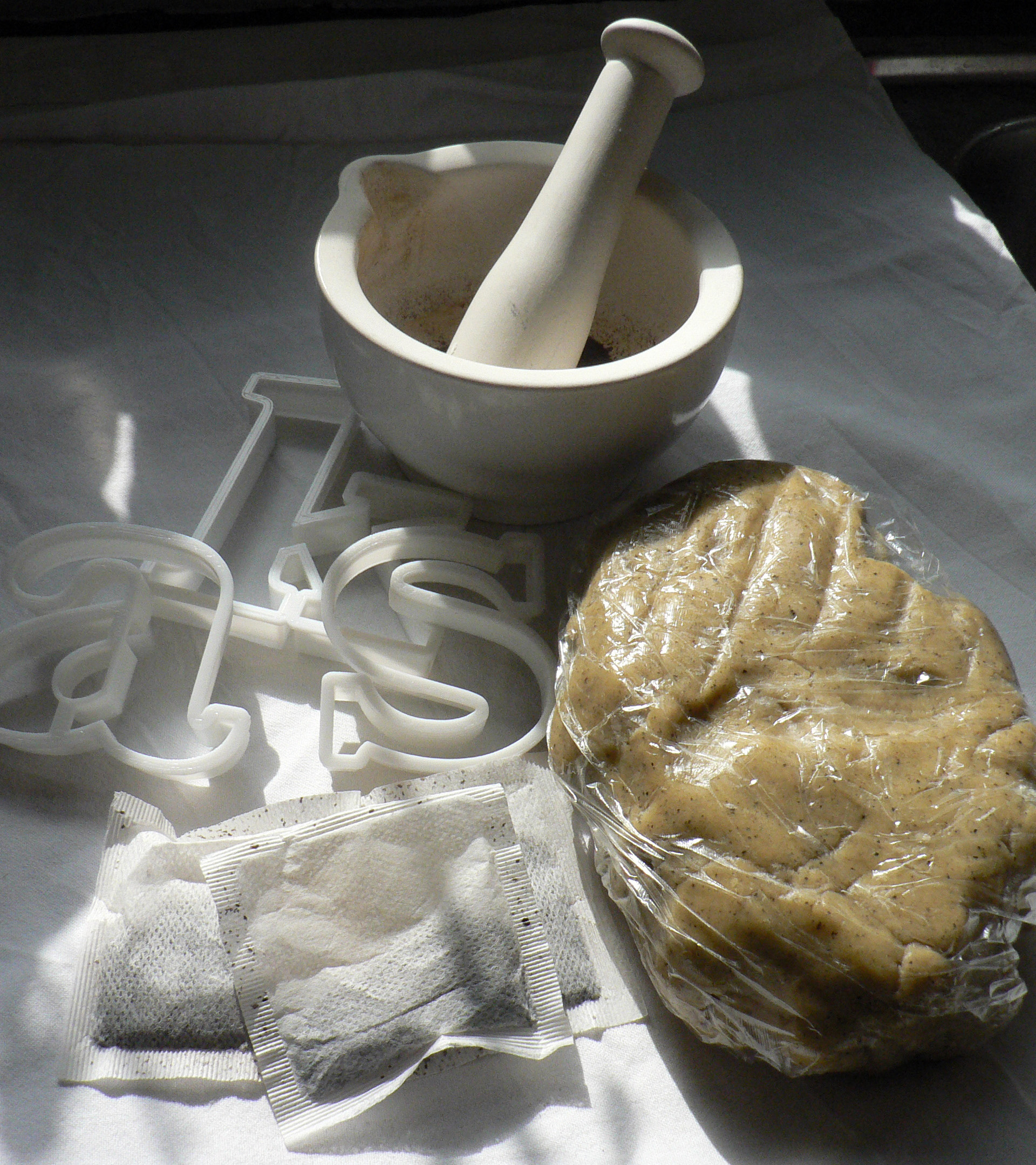
Baskerville Earl Grey tea biscuits recipe
Edible typography
Using food to describe the experience of typography
Baskerville is a transitional serif typeface that sits between the old style serif typefaces of William Caslon and the modern serifs created by Giambattista Bodoni & Firmin Didot. English printer and type designer John Baskerville developed a typeface with more defined angles and greater stroke contrast. This was a refined face with improved legibility which also took advantage of the improvements in technology happening in the 1750s. Baskerville is a recognisably English typeface that has stood the test of time as a legible, everyday text face.
My interpretation of Baskerville are Earl Grey tea biscuits for an authentic eighteenth century flavour. At this time improved technology and transport allowed foods to be enjoyed throughout the country. Tea had become the national drink and the tea leaves would be dried, rolled and used again. I had initially thought that Baskerville should be savoury, since it’s an everyday ‘jobbing’ typeface, but sweet biscuits tasted better.
Recipe
Helvetica water biscuits recipe
Edible typography
Using food to describe the experience of typography
The typeface Helvetica was created to be neutral and to have great clarity, but to have no intrinsic meaning of its own. It was intended that it could communicate any message, but without it being influenced by the style of the font in any way. i.e. clear enough to be used across a wide range of applications, but plain and neutral enough that that its sole purpose is to support the message.
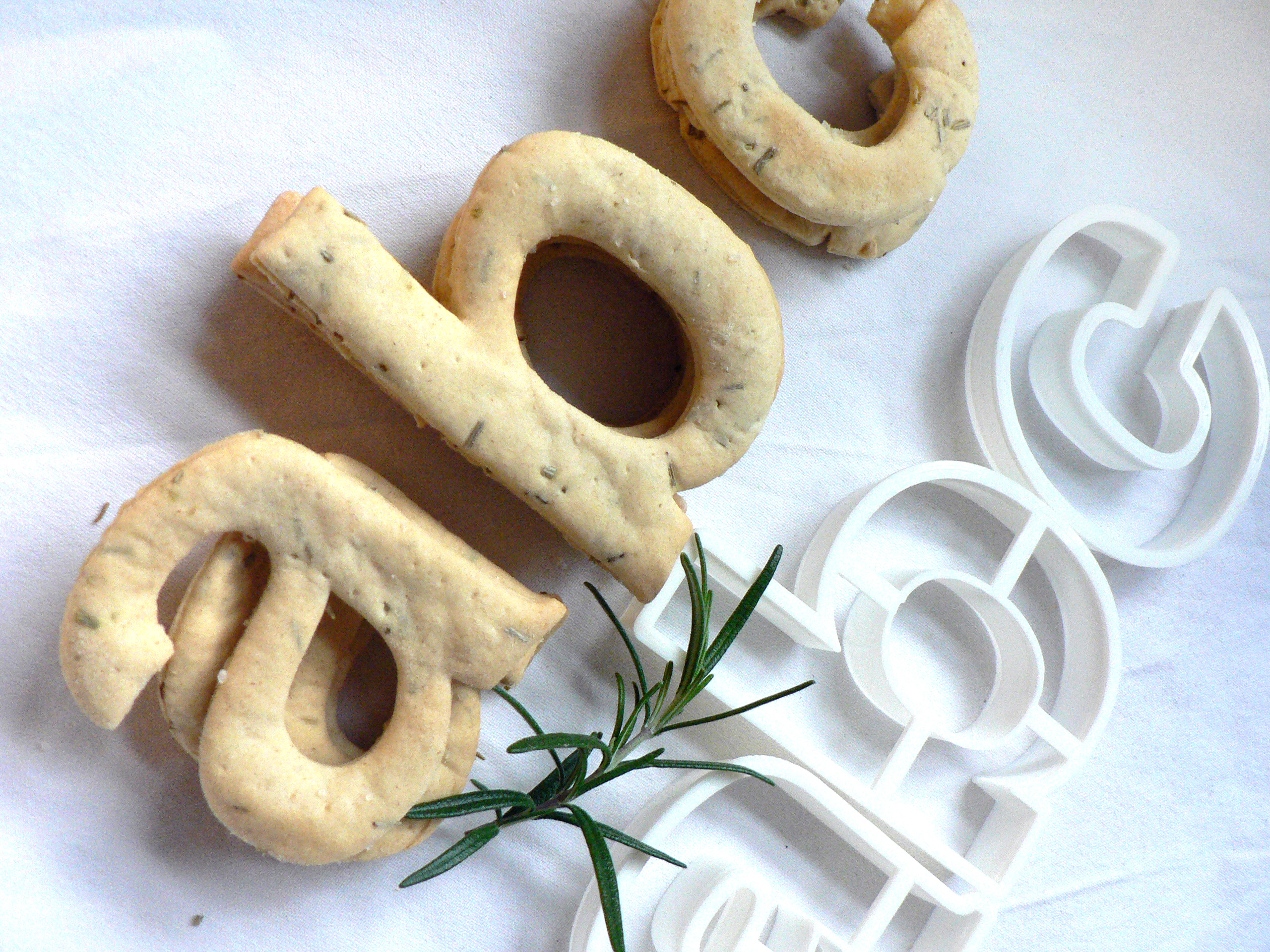
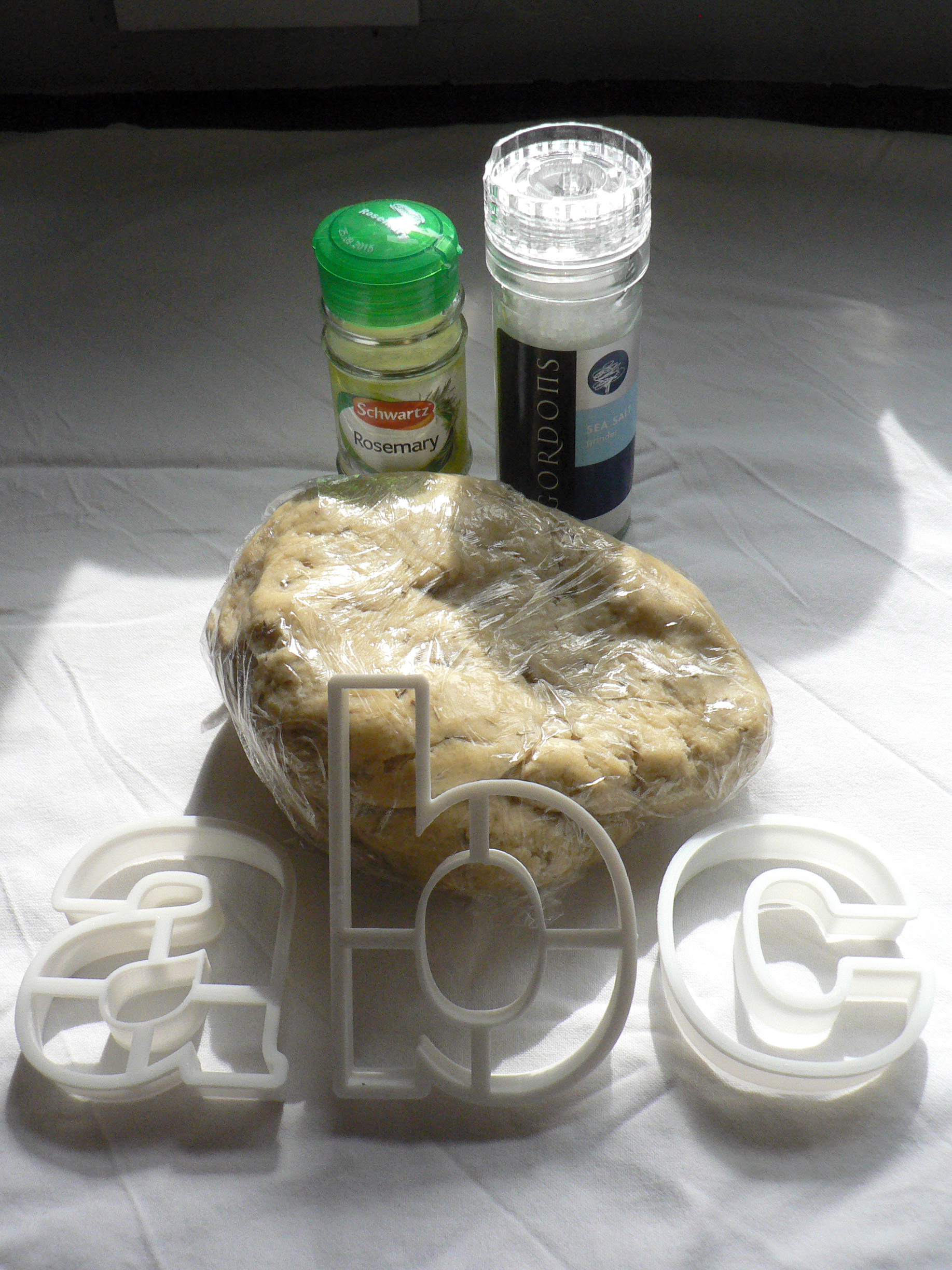
My interpretation of Helvetica is to create it from savoury water biscuits which are plain enough that they can be included in a wide range of meals but take on the flavour and style of the food that they accompany. They have a sprinkling of salt to make them tasty enough to eat, and a dash of rosemary for a Swiss Alpine touch. Serve them with cheese, ham or a tasty dip.
Recipe
Here at Type Tasting I’ve been having conversations about how we respond to different typefaces. Whether we’re type designers, graphic designers or nothing to do with the design industry, all of us are type consumers. We interact with typefaces constantly in our everyday lives and, although it happens on an instinctive level, when we read a word the choice of font also has an effect on us.
A day of baking edible fonts for Type Tuesday hosted by Eye Magazine at St Brides on Tuesday April 1st. I’m one of the speakers and I’ll be explaining how my edible type is all about starting conversations about typography around how different fonts evoke associations. I’ll be bringing the freshly baked biscuits with me.
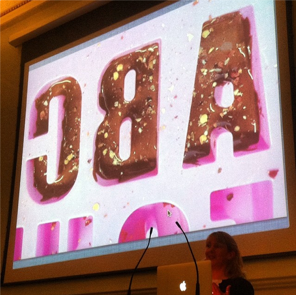
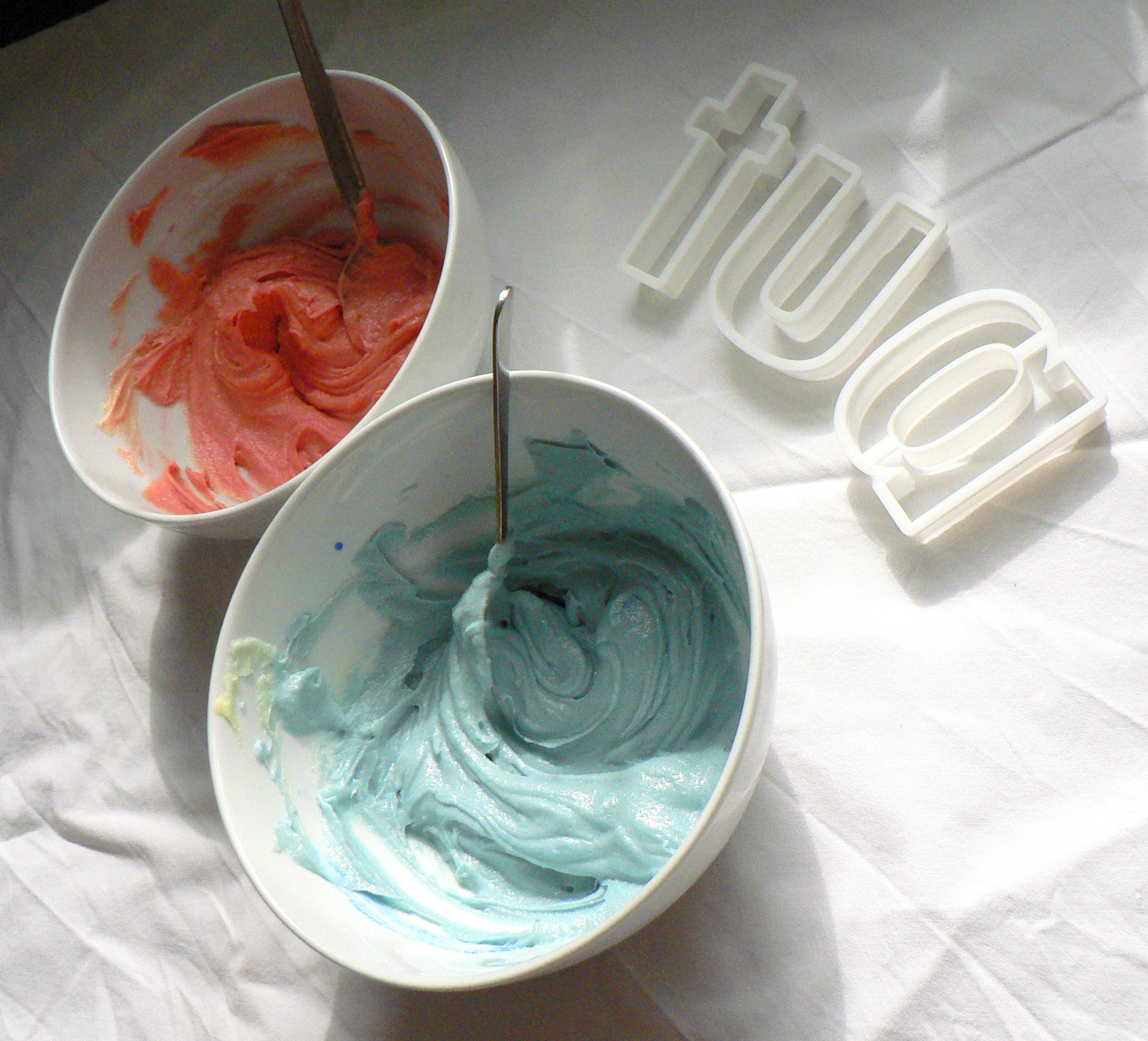
Above is Futura in progress: sweet & brightly coloured cookies, coloured icing if I have time. Below are Baskerville in progress: tea infused biscuits for authentic 1700s flavour, and Helvetica in progress: plain water biscuits with a dash of rosemary & salt. If you have any ideas or comments please join the conversation with @TypeTasting on Twitter.
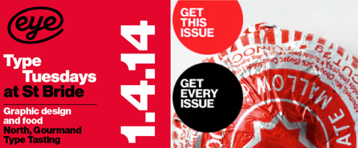
Tuesday 1st April 7pm- 9.30pm
Type Tasting founder Sarah Hyndman is one of the speakers at the next Type Tuesday at St Bride hosted by Eye Magazine…
