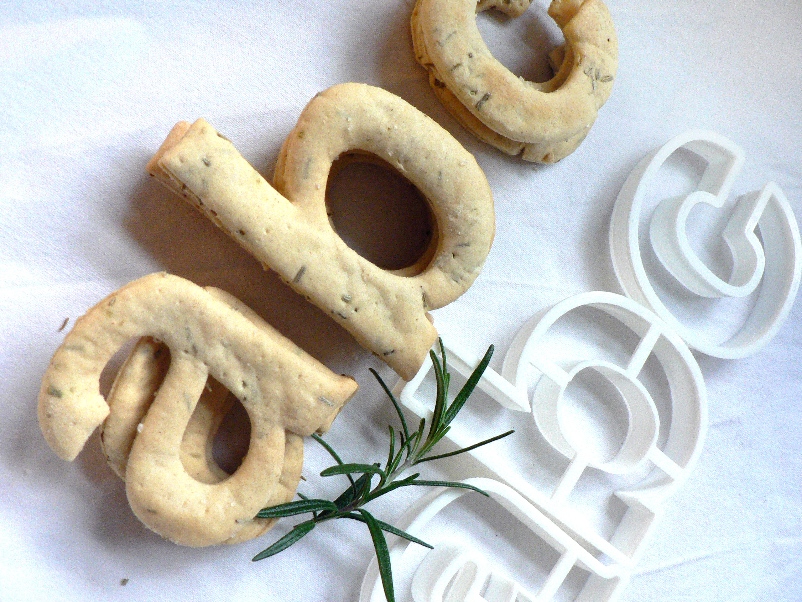
Helvetica water biscuits recipe
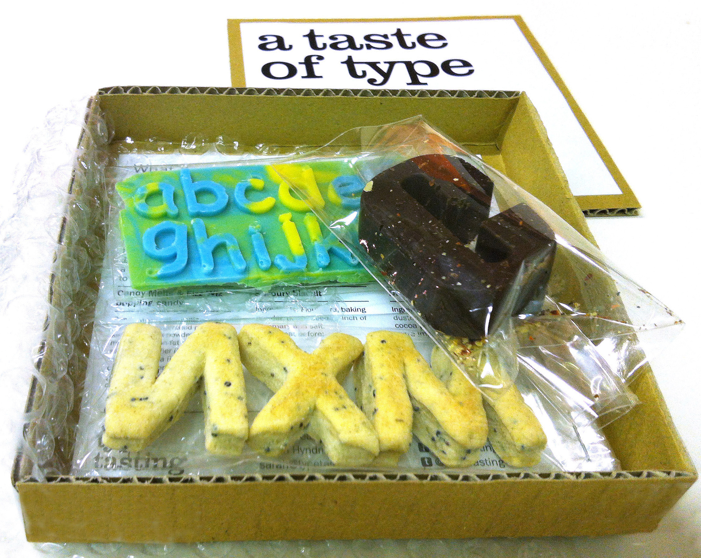
Edible typography
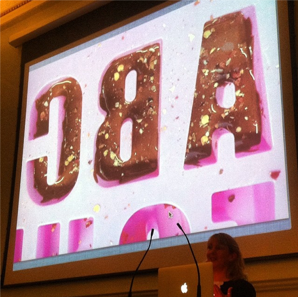
Using food to describe the experience of typography
The typeface Helvetica was created to be neutral and to have great clarity, but to have no intrinsic meaning of its own. It was intended that it could communicate any message, but without it being influenced by the style of the font in any way. i.e. clear enough to be used across a wide range of applications, but plain and neutral enough that that its sole purpose is to support the message.
My interpretation of Helvetica is to create it from savoury water biscuits which are plain enough that they can be included in a wide range of meals but take on the flavour and style of the food that they accompany. They have a sprinkling of salt to make them tasty enough to eat, and a dash of rosemary for a Swiss Alpine touch. Serve them with cheese, ham or a tasty dip.
Recipe