Here at Type Tasting I’ve been having conversations about how we respond to different typefaces. Whether we’re type designers, graphic designers or nothing to do with the design industry, all of us are type consumers. We interact with typefaces constantly in our everyday lives and, although it happens on an instinctive level, when we read a word the choice of font also has an effect on us.
In the film short Font Men, type designer Jonathan Hoefler from type foundry H+FJ explains how he and Tobias Frere-Jones feel there’s a “poverty of descriptive terms” for the experience of typography and instead they use qualitative terms that are purely descriptive or that “reference cultural milestones”. He gives the example of describing a typeface as being “too Steven Segal and not Steve McQueen enough”.
I’ve found that an effective parallel is to use food as a way to describe the experience of typography. Doing this has started a well debated conversation and introduced a lexicon of sensory descriptions and metaphors. It interests me that, although the discussions revolve around food, they still sound authentically ‘typography’ and reveal a great deal about our experiences with fonts.
I was invited to talk about this at the recent Type Tuesday at St Bride hosted by Eye Magazine on the topic of Food and Design, the theme of the current issue of Eye. The main speaker was North’s Sean Perkins who took us on an inspiring tour of North’s design for food and hospitality. David Lane and Marina Tweed spoke about creating new alternative food magazine The Gourmand. I explained that Type Tasting began as my ‘grown up gap year’ and was initially based on the idea of wine tastings. I talked about the edible typography project and how it had come about, taking the audience through the ideas behind some of the recipes. After the panel discussion I handed out the edible Helvetica, Baskerville and Futura that I’d baked earlier and answered questions.

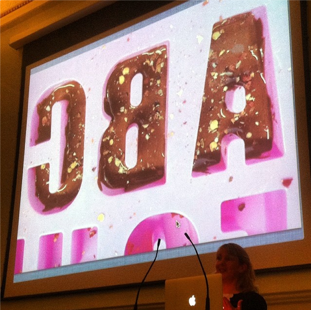
Top: Sarah Hyndman talking edible typography under a photo of the font Impact made from dark chocolate and chilli, photo by Eye Magazine.


Type Tuesday photos above by Karina Monger. Baskerville biscuits laced with with tea for that authentic C18th England flavour, photos by Sarah Hyndman.


Above left: “The last of the Baskervilles. Aftermath of #TypeTasting at Eye’s #TypeTuesday, St Bride Library.” courtesy of Eye. Above right: “Broken biscuit lettering leftover from #typetuesday” by Scispy

RECIPES:
Helvetica water biscuits
Baskerville Earl Grey tea biscuits

Yum yum, sorry I missed it, look forward to the next bake off.