Tag Archives: eat your words

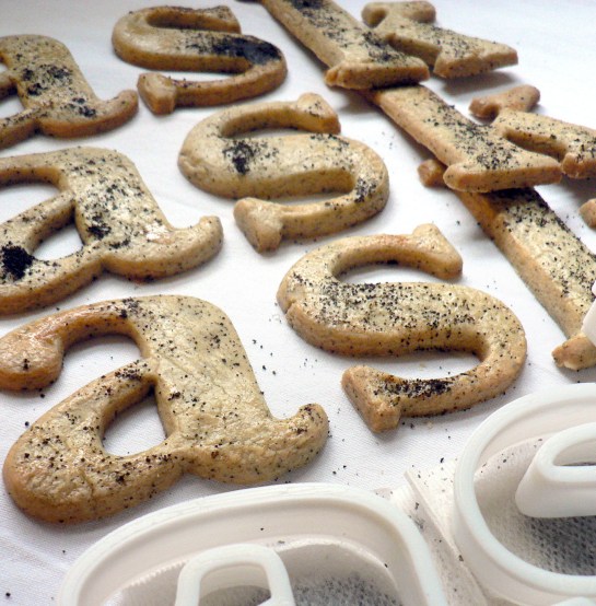
Baskerville Earl Grey tea biscuits recipe

bask cooked 003 cropped

Baskerville Earl Grey tea biscuits recipe
Edible typography
Using food to describe the experience of typography

Baskerville is a transitional serif typeface that sits between the old style serif typefaces of William Caslon and the modern serifs created by Giambattista Bodoni & Firmin Didot. English printer and type designer John Baskerville developed a typeface with more defined angles and greater stroke contrast. This was a refined face with improved legibility which also took advantage of the improvements in technology happening in the 1750s. Baskerville is a recognisably English typeface that has stood the test of time as a legible, everyday text face.

My interpretation of Baskerville are Earl Grey tea biscuits for an authentic eighteenth century flavour. At this time improved technology and transport allowed foods to be enjoyed throughout the country. Tea had become the national drink and the tea leaves would be dried, rolled and used again. I had initially thought that Baskerville should be savoury, since it’s an everyday ‘jobbing’ typeface, but sweet biscuits tasted better.

Recipe
Continue reading

Helvetica water biscuits recipe

helv cooked 003

Helvetica water biscuits recipe
Edible typography
Using food to describe the experience of typography

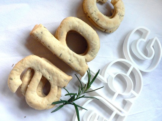
The typeface Helvetica was created to be neutral and to have great clarity, but to have no intrinsic meaning of its own. It was intended that it could communicate any message, but without it being influenced by the style of the font in any way. i.e. clear enough to be used across a wide range of applications, but plain and neutral enough that that its sole purpose is to support the message.

My interpretation of Helvetica is to create it from savoury water biscuits which are plain enough that they can be included in a wide range of meals but take on the flavour and style of the food that they accompany. They have a sprinkling of salt to make them tasty enough to eat, and a dash of rosemary for a Swiss Alpine touch. Serve them with cheese, ham or a tasty dip.

Recipe

Continue reading

A Type Tasting birthday celebration of edible type

nathan dye3 Helen Rawlinson BgcNtzdIQAAL2Iq.jpg-large
We celebrated Type Tasting’s first birthday with a day of edible type on Friday 14th February. Here’s a selection of the gastronomic typography and lettering created to mark the occasion.

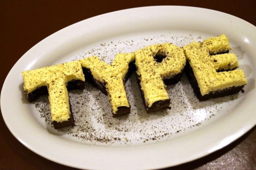
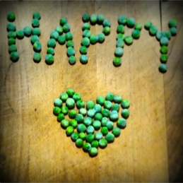
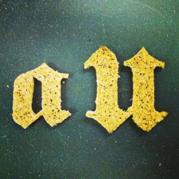
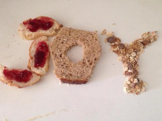
Above: Nathan Dye’s chocolate TYPE cake, Helen Rawlinson’s peas thawing to the occasion, Sarah Hyndman’s edible rye bread Blackletter type “delicious with hummus” and Julie Muaro’s JOY in Breakfast Light, Regular & Extra Jam.

Julie Mauro

Continue reading

‘Edible Type Friday’ eat letters & celebrate Type Tasting’s first birthday

comp

Edible Type Friday on Feb 14th
To celebrate Type Tasting’s first birthday you’re invited to share your love of typography by taking edible type to work. Please photograph it before (or while) it’s being eaten.

Tweet your photos to @TypeTasting with #ILoveType
Or email them to sarah@typetasting.com and I’ll blog the photos next week.

It would also be great to see any ‘making of’ photos if you bake or create the type yourself. Cake? Jelly? Sweets from the local sweetshop? …What would a font taste like?

Read the Type Tasting newsletter here…

Follow @TypeTasting on Twitter

What does Typography taste like?

Type Tasting pack

At Type Tasting I’ve been posing the question “what would type taste like?” I’ve put together a tasting pack to kickstart the discussion featuring Impact as dark chocolate laced with chilli, Helvetica as plain biscuits and Comic Sans as candy melts with popping candy.

The tasting pack comes complete with a chocolate box style description sheet introducing each typeface along with the suggested flavours. What do you think? What would your favourite typefaces taste like? Details of my suggestions with recipes are below…

Continue reading

Eat your Words: Food as a System of Communication, by Sarah Hyndman

eat your words cover

Eat your Words: Food as a System of Communication and its role in a Post-culinary Society, by Sarah Hyndman

Sarah Hyndman, MA Typo/graphic Studies Thesis, February 2001 (Distinction). London College of Communication, University of the Arts London.

Author’s note on the ‘post-culinary society’ of 2000/2001: At the time of writing there were concerns about the rise in popularity of convenience food and a generation who had not been taught how to cook. However, Jamie Oliver had just published The Naked Chef and Britain was soon to fall in love with cooking again.

Eat Your Words illustration of iced biscuits

“The ideal celebratory meal had a structure that started off with an appetising hot and messy dish of gravy over meat and potatoes (without which a meal is not a dinner), and became more of an architectural achievement as it went on through pudding (on a smaller plate), and tea with an optional small coloured biscuit (on a still smaller plate).” Michael Nicod

final piece

Continue reading