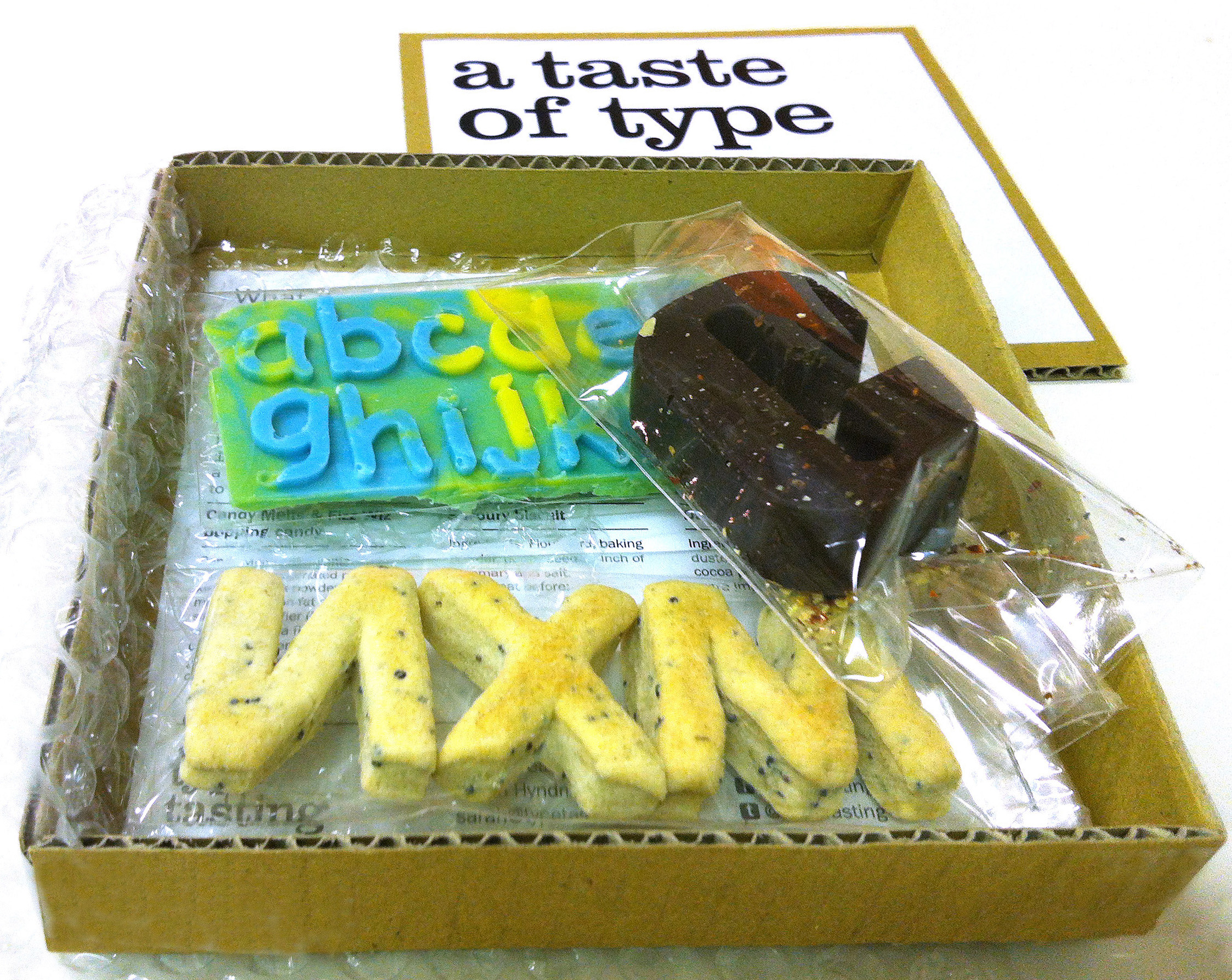
At Type Tasting I’ve been posing the question “what would type taste like?” I’ve put together a tasting pack to kickstart the discussion featuring Impact as dark chocolate laced with chilli, Helvetica as plain biscuits and Comic Sans as candy melts with popping candy.
The tasting pack comes complete with a chocolate box style description sheet introducing each typeface along with the suggested flavours. What do you think? What would your favourite typefaces taste like? Details of my suggestions with recipes are below…![]()
————————-
Impact: Dark chocolate laced with chilli

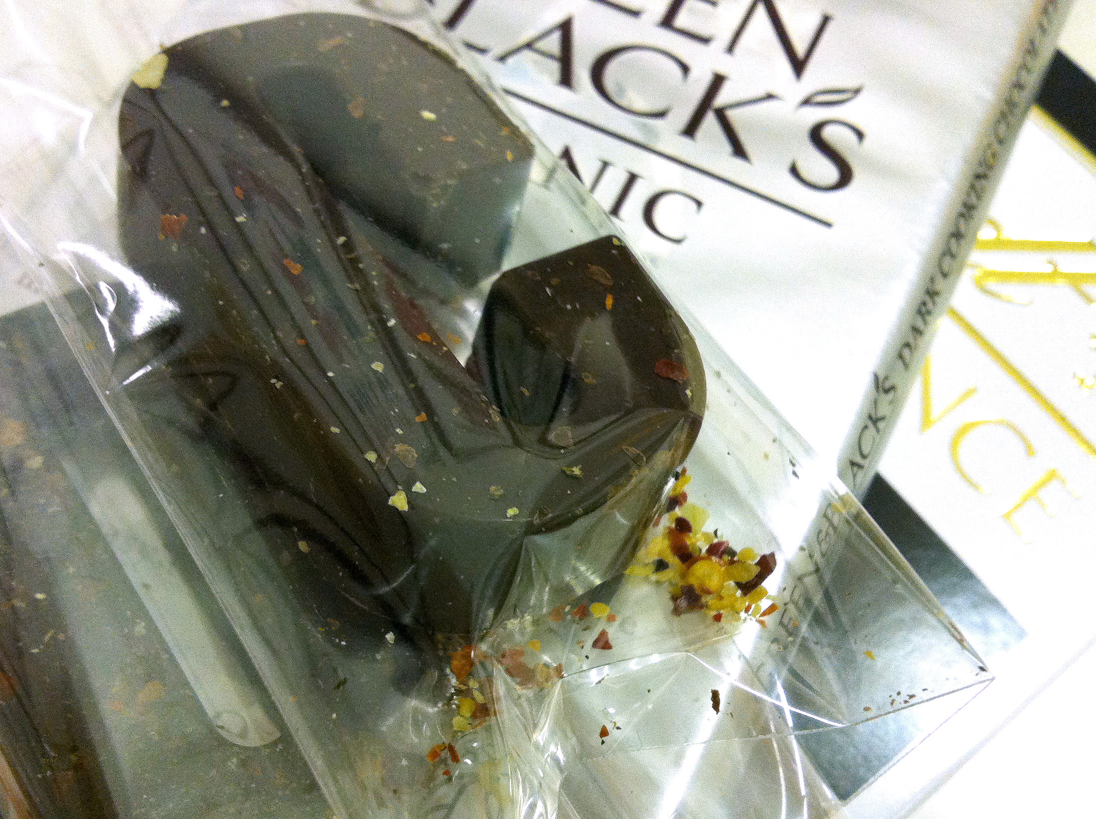
Impact is a sans serif display typeface with ultra-thick strokes and compressed letterspacing which was designed for attention-grabbing headlines by Geoffrey Lee in 1965. I’ve chosen dark chocolate with chilli because it’s bold and it packs an in-your-face punch.
Recipe
Dark chocolate (try Lindt Excellence dark chocolate with chilli)
Cocoa powder
Dried chilli flakes
Melt the chocolate gently in a bowl over a gently simmering saucepan of water, or in a microwave on defrost setting. Sprinkle dried chilli flakes into the letter mould. Gently pour the melted chocolate into each letter and top with another sprinkling of chilli flakes. Once the letters have set dust them with cocoa powder to give them an antique-looking finish.
————————-
Helvetica: Savoury biscuits


Helvetica is a neo-grotesque sans serif typeface designed for neutrality that has achieved ubiquity. It was developed in 1957 by Max Miedinger with Eduard Hoffmann. Helvetica is like plain biscuits which are tasty given the right setting, but too dry and bland just to reach for all the time.
Recipe
60g lard
250g plain flour
2 tbsp poppy seeds
1 tsp rosemary
1 tsp baking powder
1/2 tsp fine sea salt
4 – 5 tbsps cold water
Pre-heat the oven to 180C
Sift the flour and baking powder into a bowl, with the sea salt. Rub in the lard until it looks like fine breadcrumbs. Stir in the poppy seeds and the rosemary.
Sprinkle the cold water into the mix, and bring everything together to form a firm dough without over-working it. Knead briefly until smooth, then flatten it into a disc, wrap in clingfilm and chill it in the fridge for 20 mins.
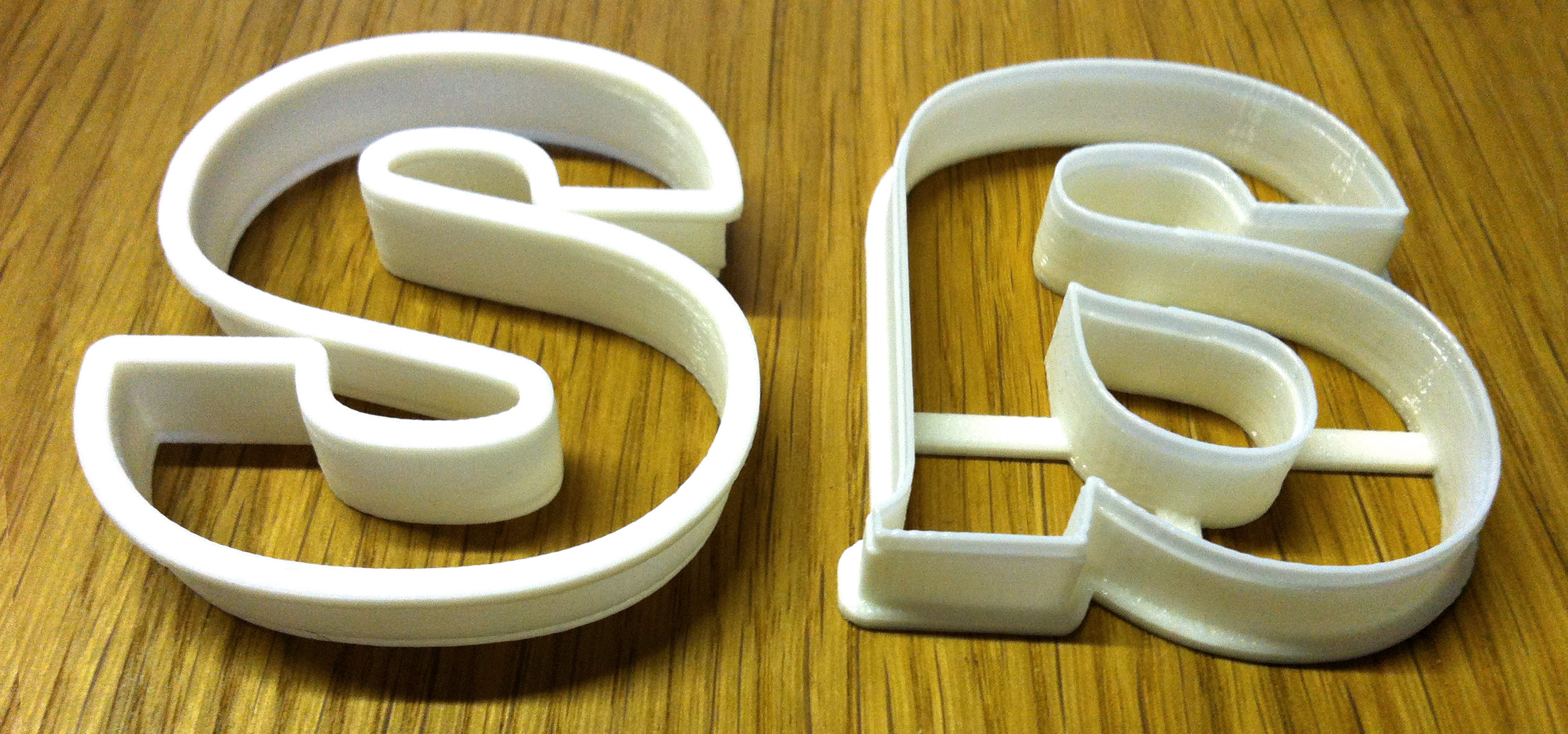
When the dough is chilled, roll it out on a lightly floured surface, to about 2mm thick. Cut out letters with Helvetica pastry cutters. Lay the letters on a greased and lined baking tray and prick them all over with a fork.
Bake for 10 to 15 minutes, or until they edges are pale golden and crisp, then cool on a wire rack. These will keep for up to two weeks in an airtight container.
The next batch will be made with the newly arrived lowercase Helvetica cookie cutters:
————————-
Comic Sans: Candy Melts & Fizz Wiz popping candy

Vincent Connare created Comic Sans, the ‘casual’ script font that everybody loves to hate, for Microsoft in 1994. He based his design on comic book lettering and intended it to be a user-friendly alternative to Times New Roman. I’ve made Comic Sans out of brightly coloured, sweet candy with an extra popping surprise because it’s comic books on an impetuous sugar rush—either a childish pleasure or the thought of eating it revolts you.
Recipe
Candy Melt buttons in assorted colours
Fizz Wiz popping candy
Melt the Candy Melt buttons in a microwave on the defrost setting. Work the melted candy into the letters and sprinkle with popping candy before leaving it to set in a cool place.
I’d love to know what you think, add your comments here or tweet @TypeTasting
![]() ‘Type on the tongue’ Eye’s panel checks out the taste of Helvetica, Impact and Comic Sans (as cooked up by Sarah Hyndman). Read the article here…
‘Type on the tongue’ Eye’s panel checks out the taste of Helvetica, Impact and Comic Sans (as cooked up by Sarah Hyndman). Read the article here…
–

I really like this, relating type characteristics to food is always a good thing.