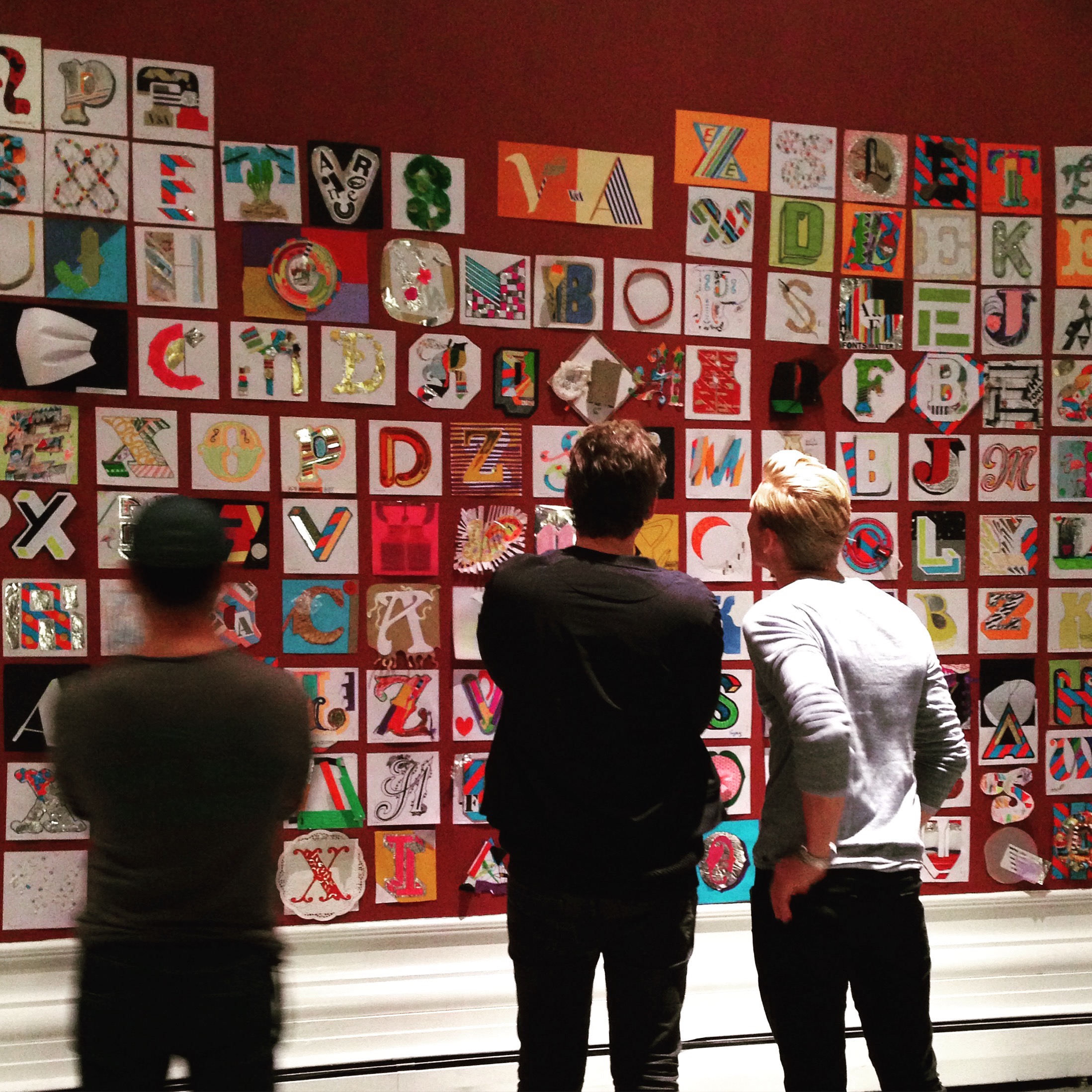

By Sarah Hyndman
The Typographic Time Machine collection popped up at the V&A at the weekend and we filled the space with amazing letters. A full blog post will come soon (after the festival has ended), meanwhile here is a glimpse of what happened.
By Sarah Hyndman
The Typographic Time Machine collection popped up at the V&A at the weekend and we filled the space with amazing letters. A full blog post will come soon (after the festival has ended), meanwhile here is a glimpse of what happened.
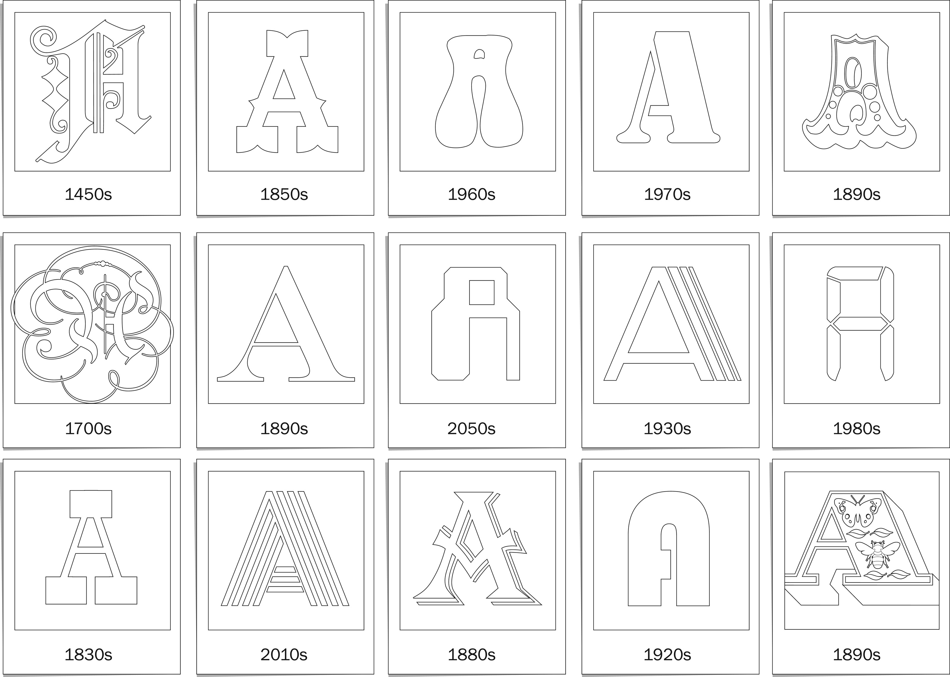
Typographic Time Machine #TimeType
Take part in the Typographic Time Machine project anywhere in the world, you don’t need to be in London to participate.

Typographic Time Machine #TimeType
Drop-in and get creative with letters at the V&A
Sat 17th and Sun 18th September, 11am-5pm
Free, drop in workshop, suitable for all ages
Design Studio, Learning Centre, Level 3, V&A, London SW7 2RL
Unknown Outcomes
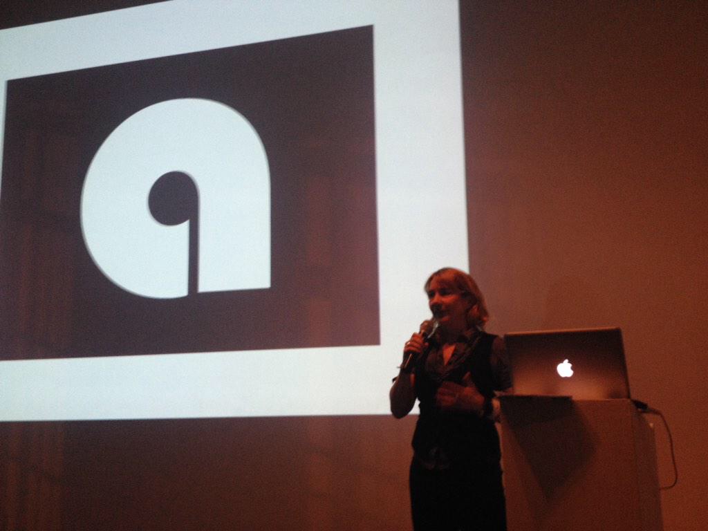
Type got experimental at last week’s Letterform Live, with a fascinating set of talks from our crack line up of speakers. Theo Inglis reports for Grafik…
Last Wednesday night saw the third event in Grafik’s Letterform Live series of events, presented in partnership with Monotype and the ISTD, and hosted by Protein Studios in Shoreditch, East London. The audience enjoyed five different speakers, each giving a short but rich and image-filled presentation, kicking off with a single typographic letterform of their choice and spiralling outwards from there. Our chosen theme for the night was ‘Experimental’, something very much open to individual interpretation. As the American designer and theorist Buckminster Fuller once said “There is no such thing as a failed experiment, only experiments with unexpected outcomes”.

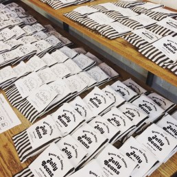
The theme of Grafik’s Letterform Live this week was ‘Experimental’, and it was an exciting evening to be a part of. My aim for the evening was to bring a bit of ‘bonkers and magic’ at a time of so much anxiety. We filled the bar with jellybeans and asked the 130 audience members to guess each flavour from the style of the typeface on the label. If you weren’t at the event you can still take part in this experiment here.
I spoke about how amazing the human brain is for the skilful way it creates a ‘sub-programme’ to perform the complex task of reading, which your subconscious performs automatically. Your eyes simply glance over a series of marks in a huge array of shapes and sizes and—as if by magic—stories, ideas, memories, songs, smells are conjured up right there in your mind.
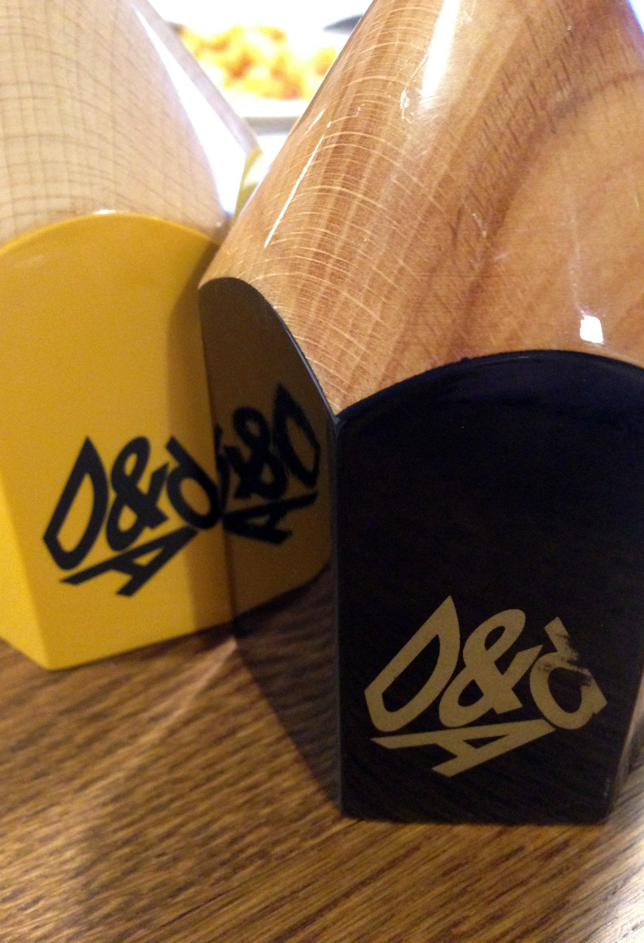
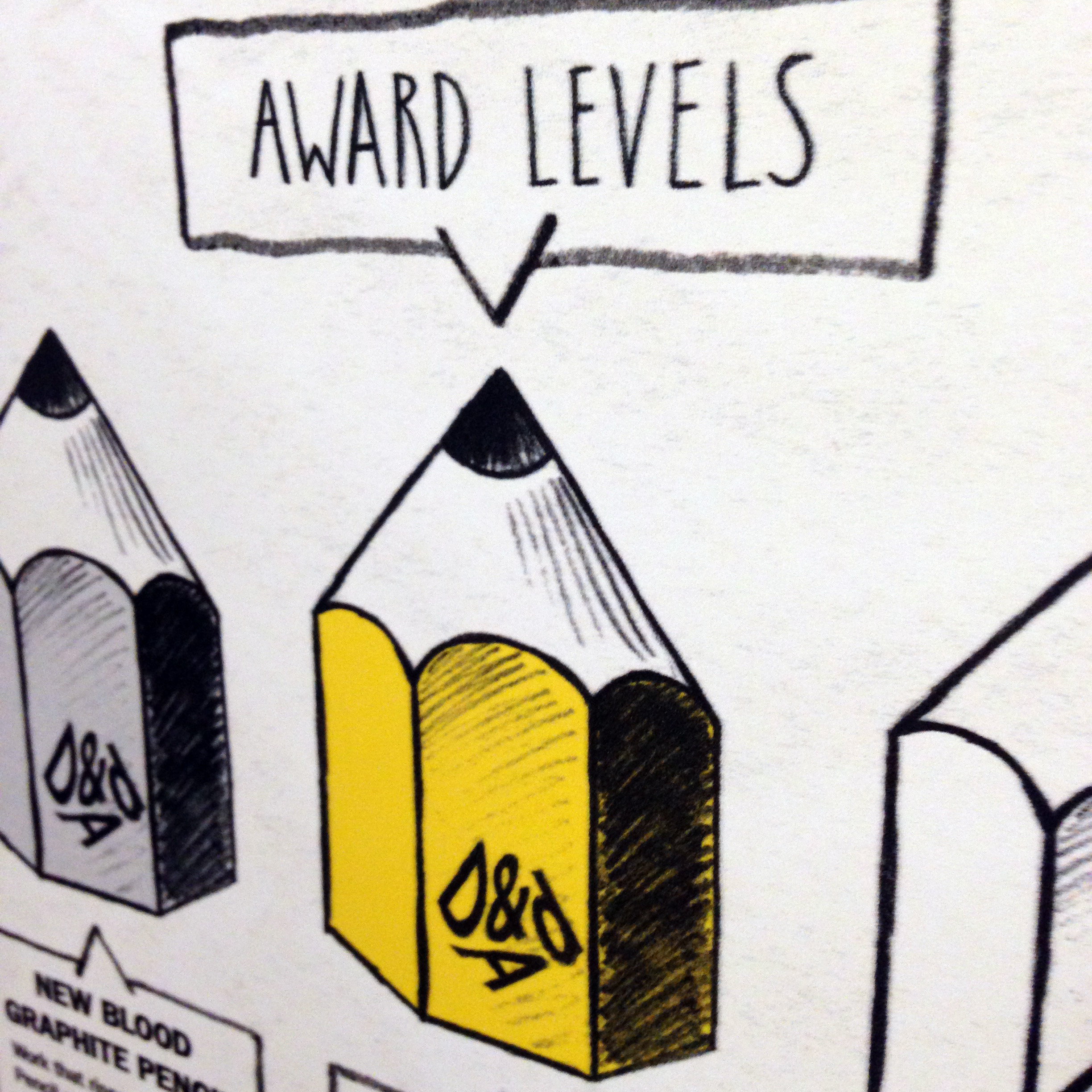
Yesterday was a thought provoking and inspiring day judging the Monotype brief for the D&AD New Blood Awards. The brief was to take a cause they believed in and to use the power of type to make a difference. The winning entries were pulled apart by seven of us to reveal surprising layers of creativity, they changed the way we thought about something, and they made us care about the cause. Some causes were big and powerful ones, others were gentle and quiet, articulated in an incredible array of different voices.
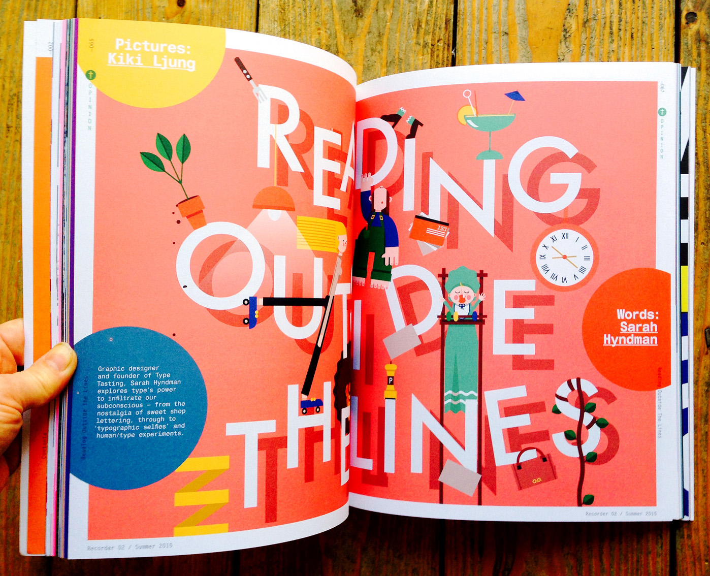
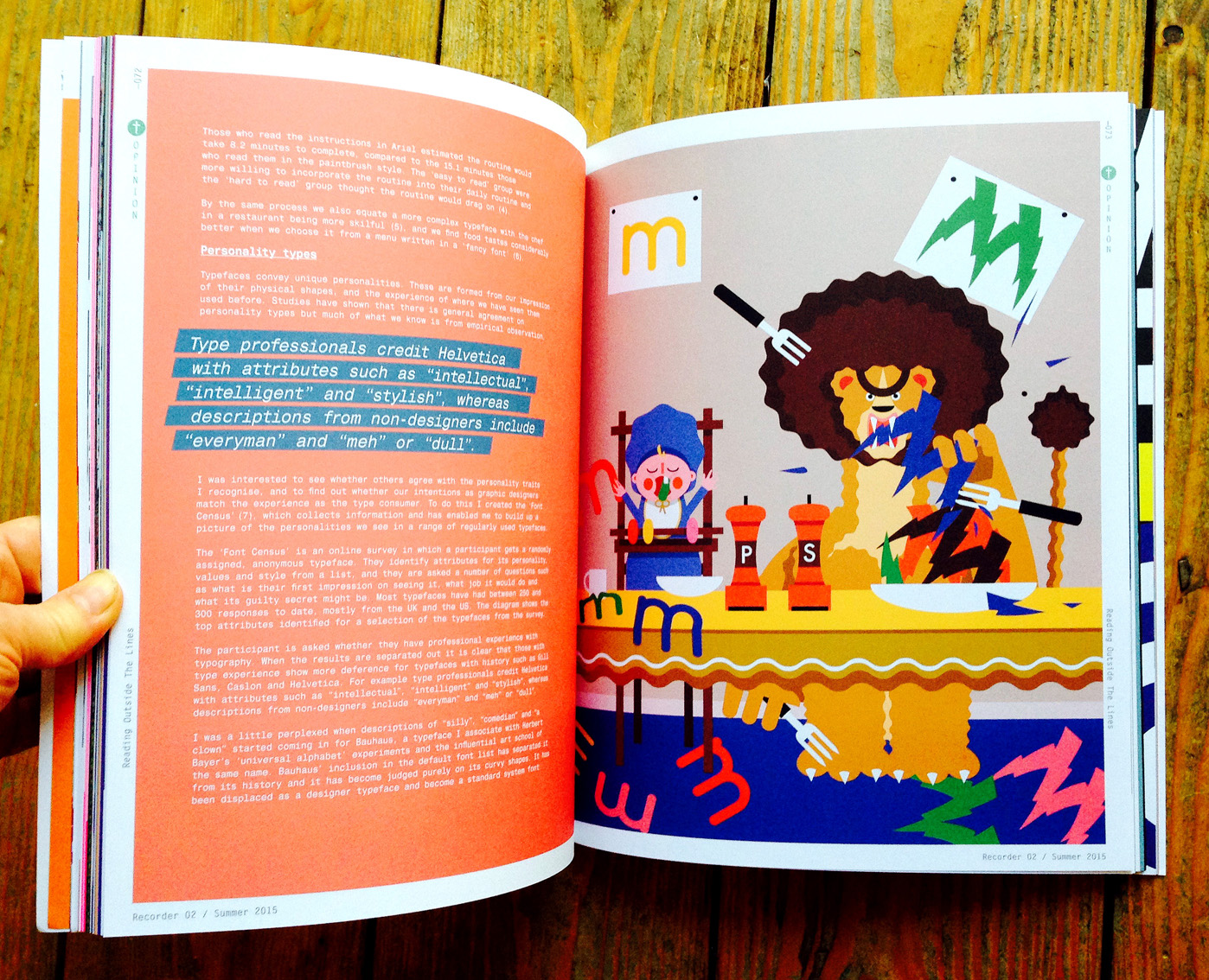
Delighted to have a piece in the latest Monotype Recorder illustrated by Kiki Ljung. Buy your copy of this beautiful magazine directly from Monotype.
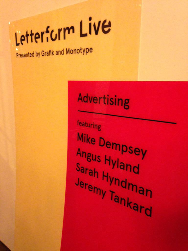
Letterform Live with Grafik and Monotype
January 28th 2015
‘Advertising’ with Mike Dempsey, Angus Hyland, Sarah Hyndman, Jeremy Tankard
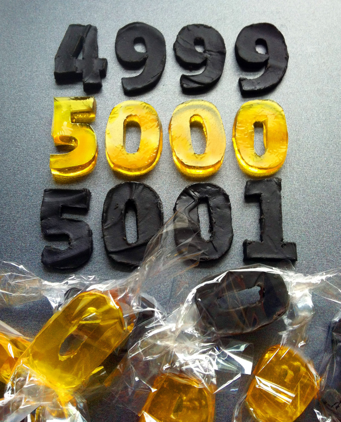
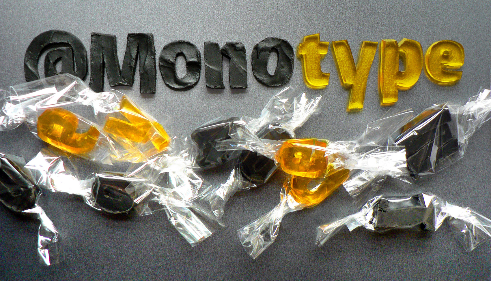
To celebrate their 5,000th Twitter follower, Monotype commissioned Type Tasting’s Sarah to create an edible version of their newest typeface release, Burlingame.
Burlingame was developed by Carl Crossgrove following pioneering investigations by Monotype into the legibility of vehicle displays. The research revealed a set of optimum criteria for dashboard display fonts: large counters and x-heights, simple shapes and a loose spacing of characters. It was found that a humanist sans serif typeface with these characteristics reduced male drivers’ glance time significantly.