Are you looking for a unique gift for the graphic designer in your life? Or someone who loves typography? Are you searching for an unusual Secret Santa gift? Visit the Type Tasting Typography Emporium for a range of items created for font fans young and old. These are all designed by Sarah Hyndman and published by Type Tasting.
Vouchers • T-shirts • Cards • Books • Zines
(More items will be added over the next few weeks, get in touch if you have a request).
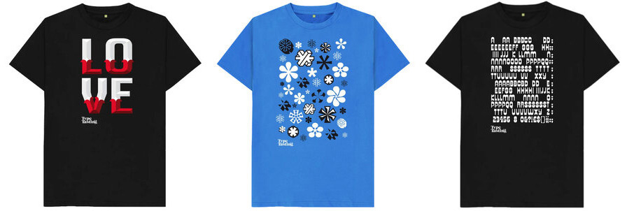
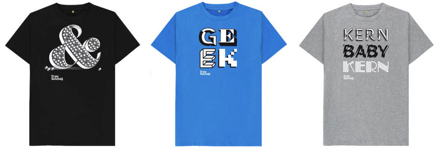
Typographic t-shirts
Exclusive Type Tasting t-shirts. Designs range from puns and ampersands to asterisk snowflakes and secret messages hidden in Letraset-inspired designs. The t-shirts are 100% organic cotton printed by Teemill in the UK in a renewable energy-powered factory. Worldwide shipping is available.
Check out the full range of t-shirts
.
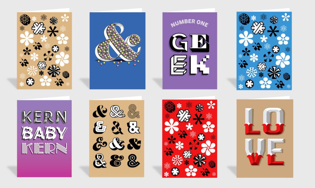
Typographic greetings cards
Send an exclusive typetastic card. The ampersand and asterisk cards are the current top sellers. Printed in the UK by Thortful with worldwide shipping on premium quality paper stock with a premium grey GF Smith embossed envelope. “Everything is lovely about them. Even the envelopes” Theo.
.
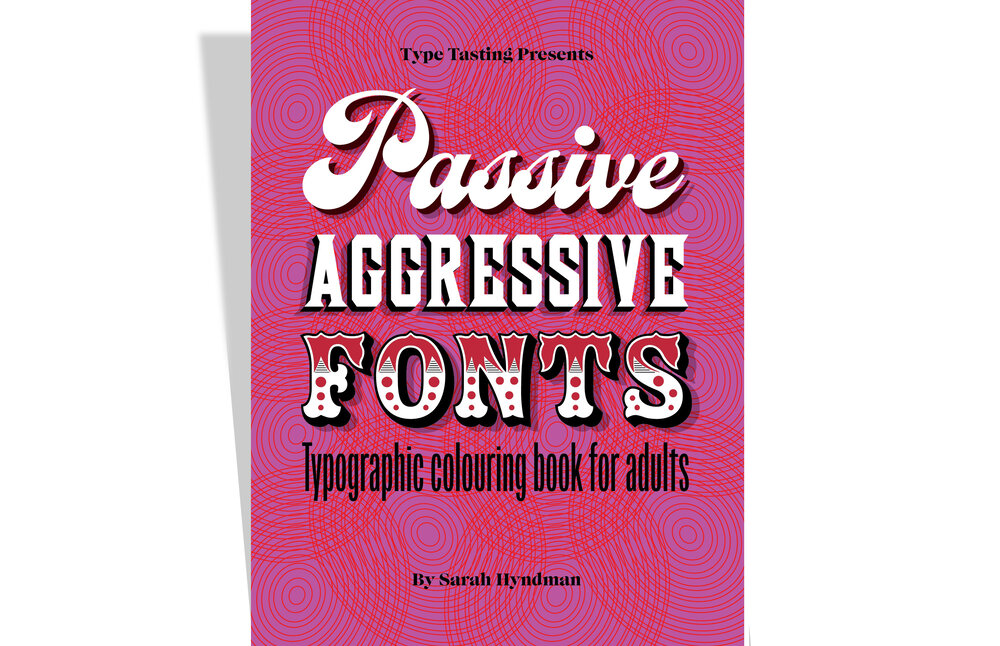
Typographic colouring books
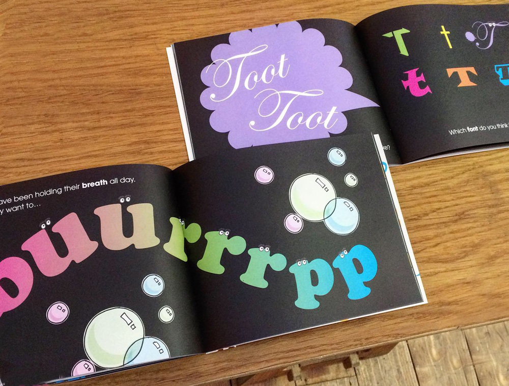
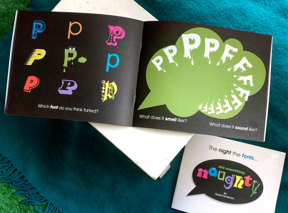
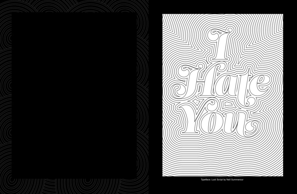
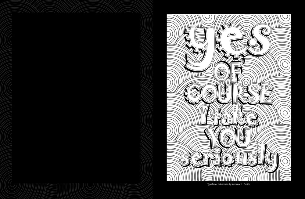
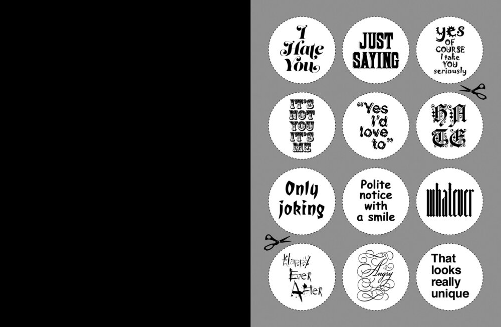
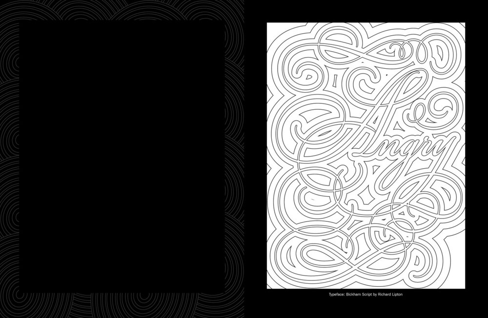
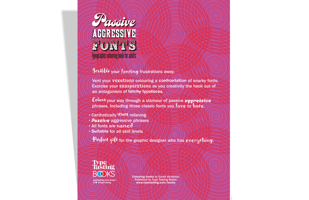
Passive Aggressive Fonts
Typographic colouring book for adults
By Sarah Hyndman
Colour your fonting frustrations away. Vent your vexations colouring a confrontation of snarky fonts. Exorcise your exasperations as you creativity the heck out of an antagonism of tetchy typefaces. Scribble your way through a clamour of passive aggressive phrases. Including those classic fonts you love to hate.
Buy on Amazon.co.uk £4.99
Buy on Amazon.com $5.99
Also available on Amazon worldwide, choose your local territory
.
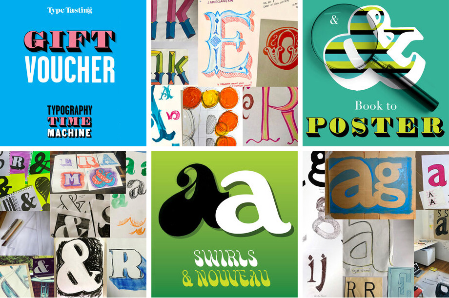
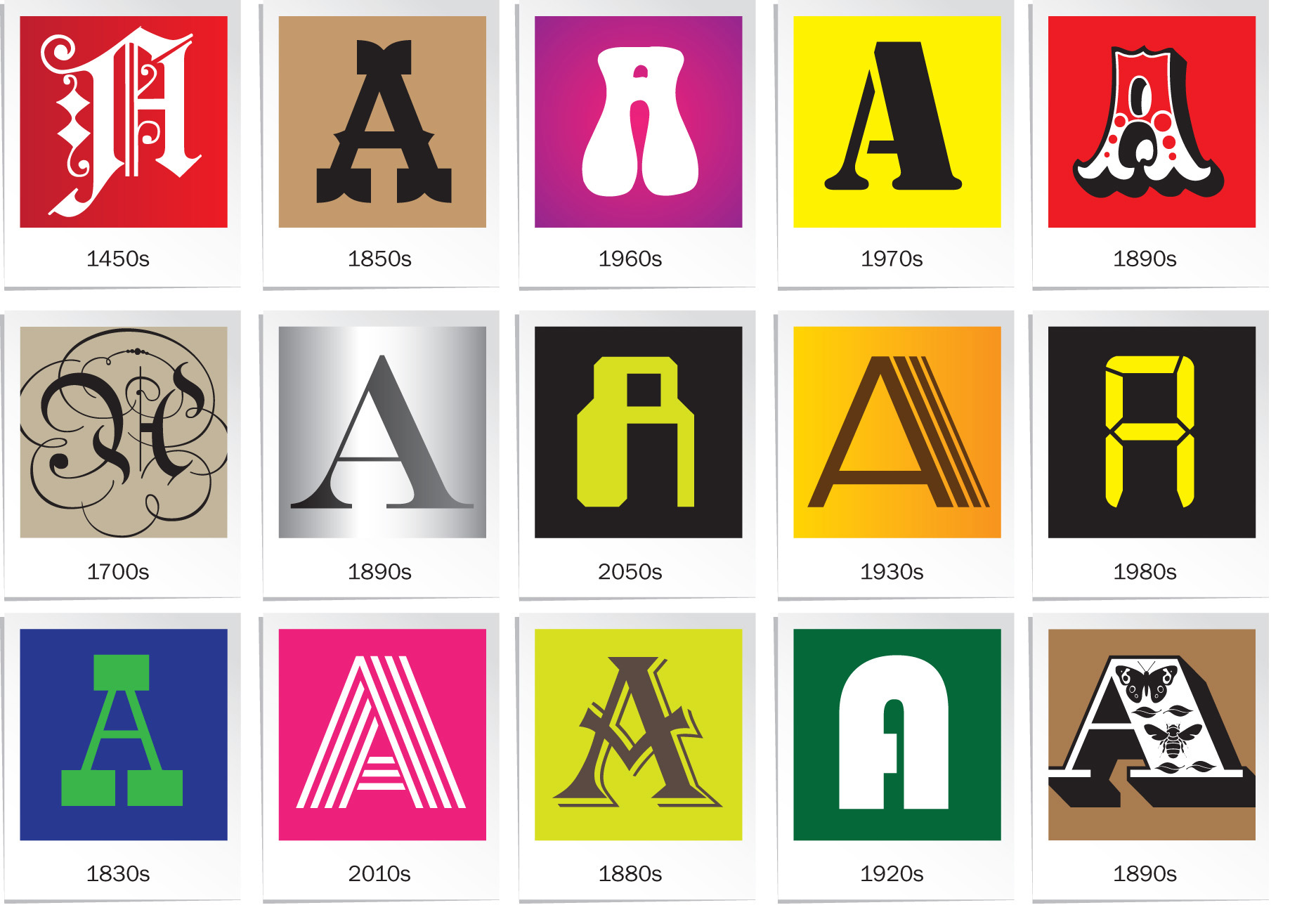
Typography time machine gift vouchers
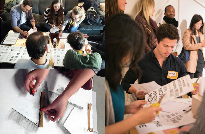
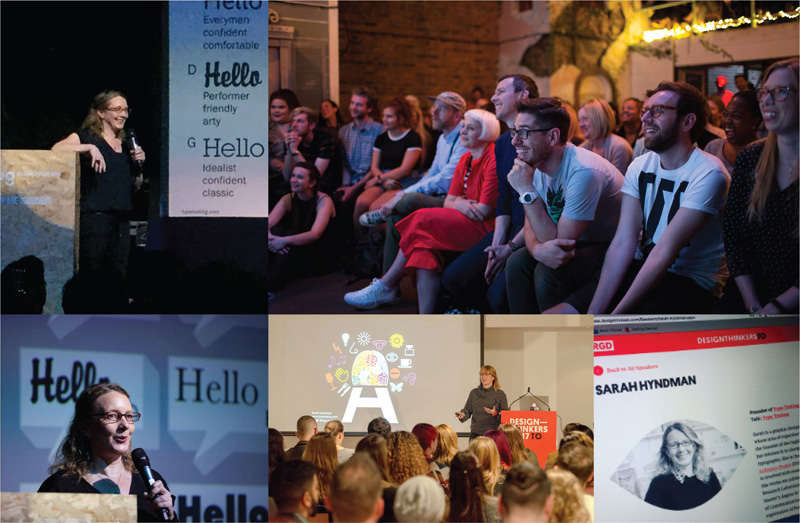
Draw & learn online workshop series
Series gift voucher £40 / £190
Curious to know why there are so many typefaces? Intrigued by where the different styles come from? Fonts are like magical time machines. They transport you to different times and places. They conjure up stories of decadence, revolutions, transformation and ingenuity.
Check out the series & buy a gift voucher
.
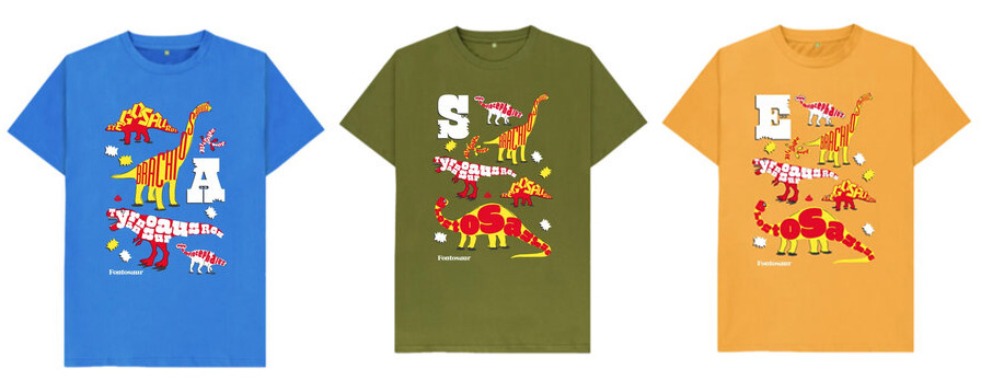
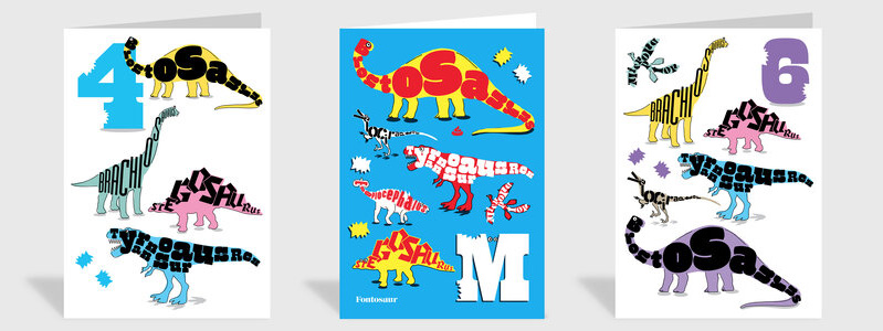
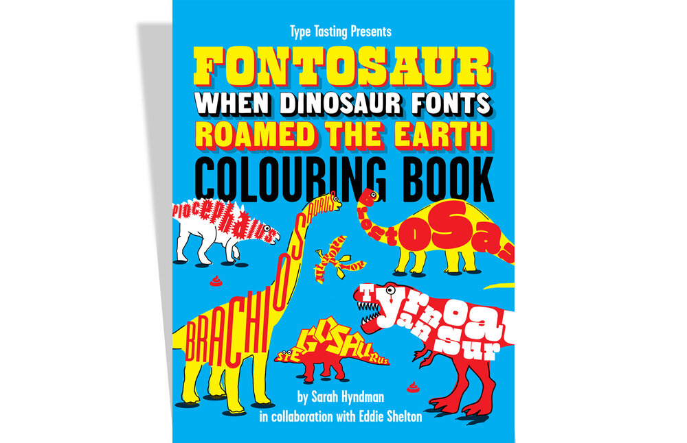
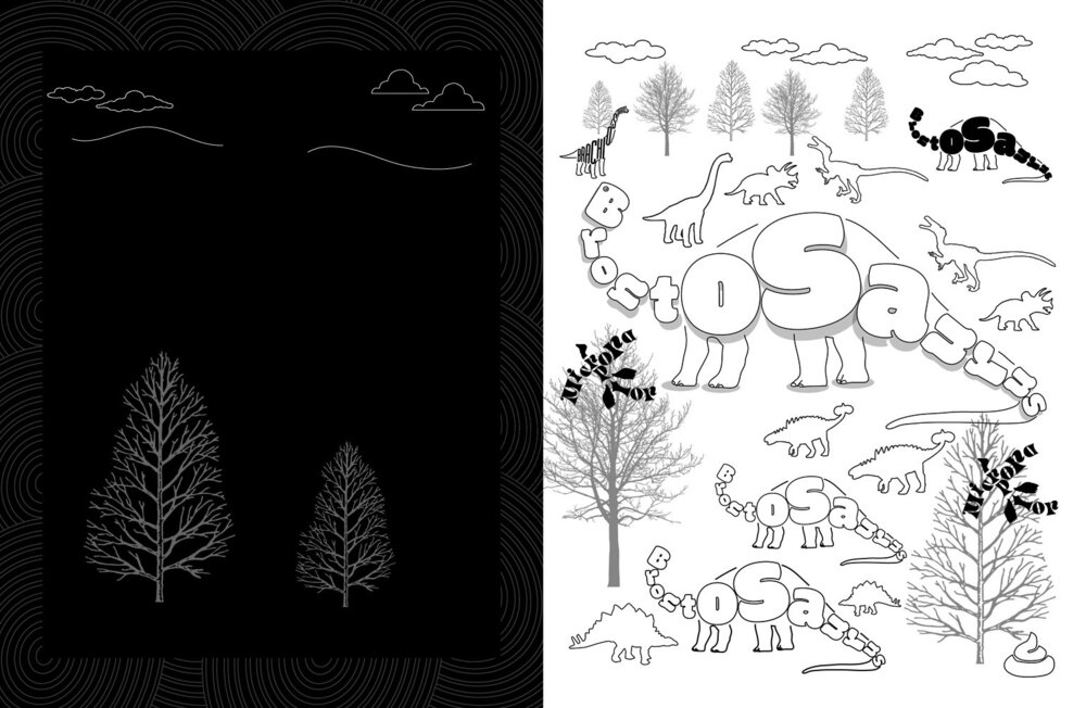
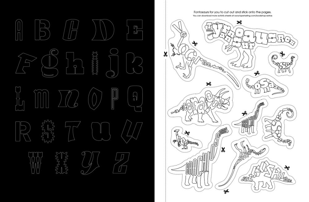
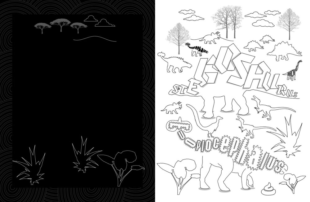
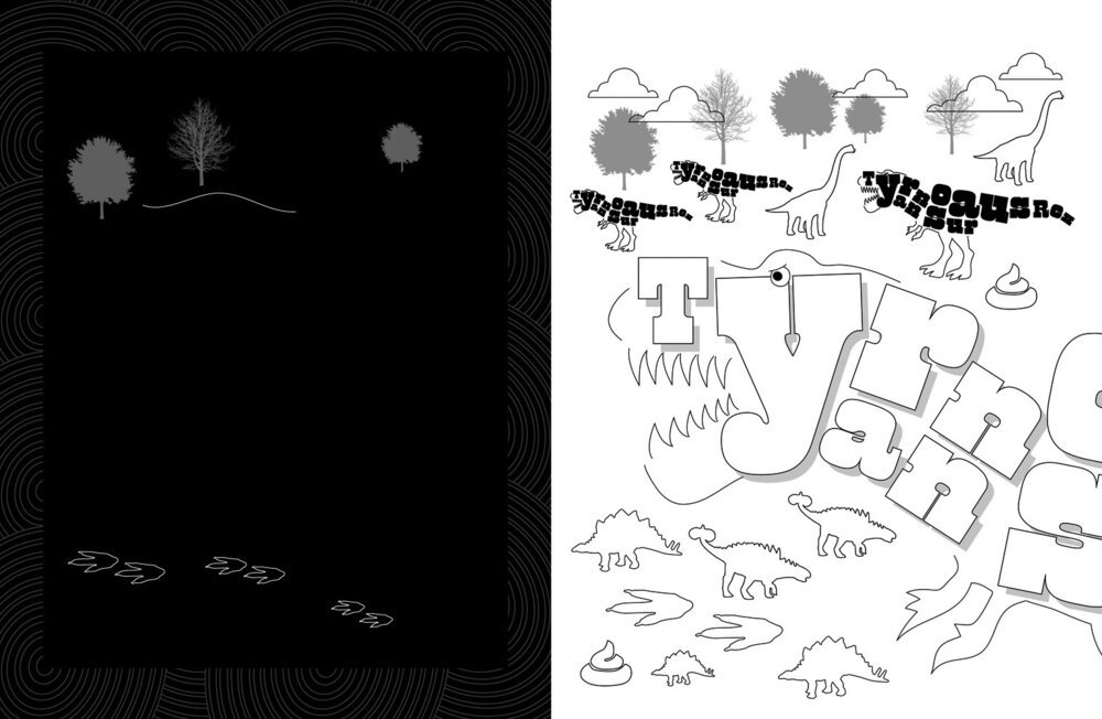
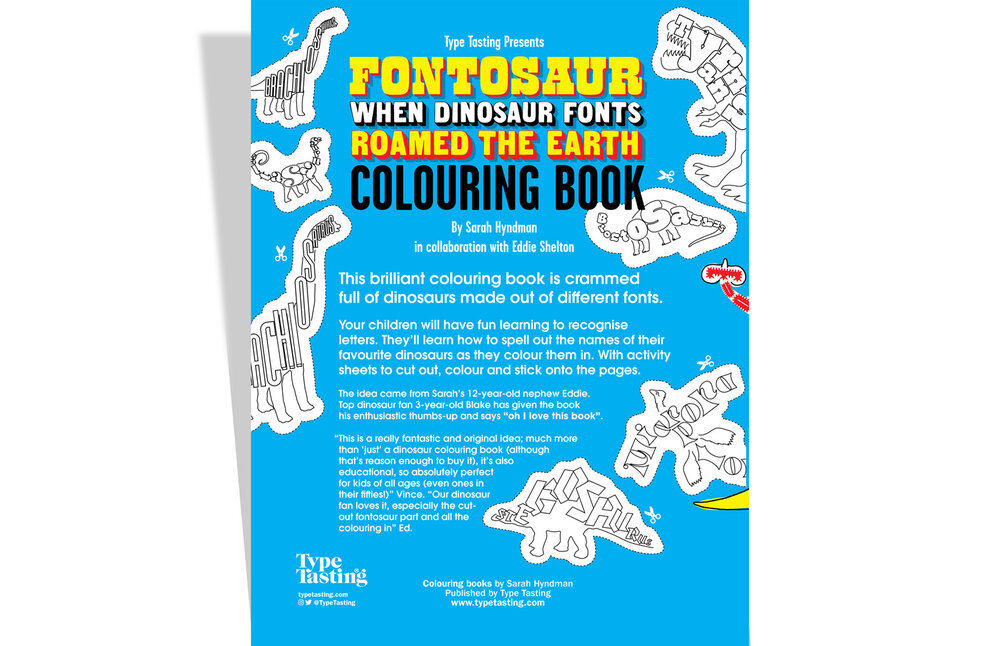
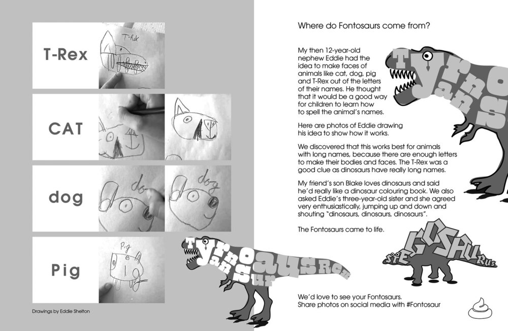
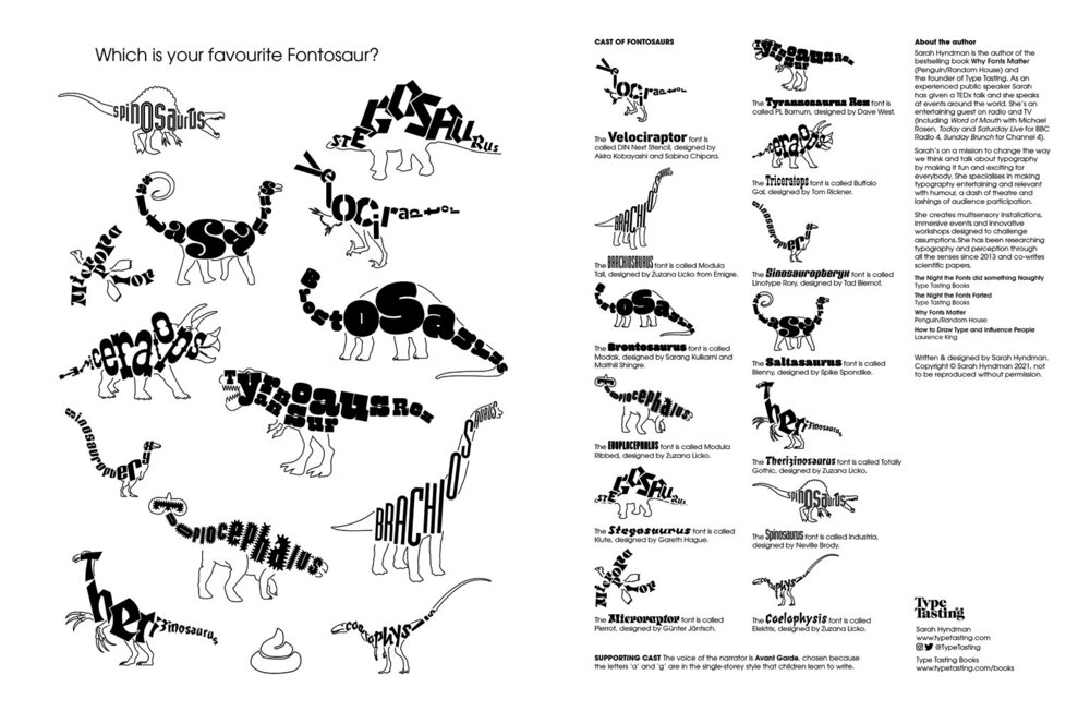
Fontosaurs, when dinosaur fonts roamed the earth
T-shirts, birthday cards and colouring books for the young dinosaur fans in your life. They’ll learn to recognise the letters in each dinosaur’s name with fonts matched to the personality of the each prehistoric creature. Fontosaurs evolved from a typographic collaboration between Sarah and her then 12-year-old nephew Eddie.
Check out all the prehistoric items in the shop
.
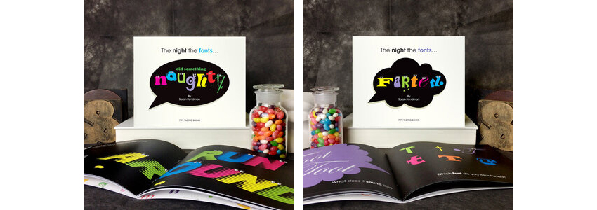
Books and zines
From the bestselling Why Fonts Matter, the Type Dating Card Game to zines that accompany published scientific studies.
Visit the Type Tasting Typograpy Emporium
.
.
Typography Time Machine drawings shown (left to right, top to bottom). Terrific Tuscans drawings are by Olivia Krawczyk, @minarama, Sarah Wilson, Mina Bach, @stircreativenz and Kat Gaska. Book to Poster drawings are by Amy Muddle, @typographHer, @minarama, @jenna_b_design, @nicewriting, @thecreativeapes, @Jenna_b_design and @mycolourfullife.online. Sans (Serif) Seekers drawings are by Jenny Monds, Kat Gaska, @stonkingfidosetc, Olivia Krawczyk, Jitka Hrůzová.