Tag Archives: learn about fonts

Typography workshops for school students

I had the privilege of running workshops at the Design Museum last week for the next generation of talented designers. The museum runs an annual competition for schools to design a product to be sold in the Design Museum shop. I had a brilliant day running one-hour workshops for the ten schools shortlisted in this Design Ventura competition.

The students from years 9, 10 and 11 took part in activities including personality name badges, supermarket sweep, what’s the product? and ended with typography karaoke, which they designed and performed. They were all fantastic and I hope a few went away with a newfound love of typography.

Why teach young children about fonts?

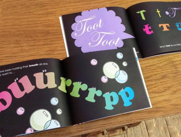
Introducing your children to the fantastical world of fonts will give them a head start towards a future career in the creative industries.

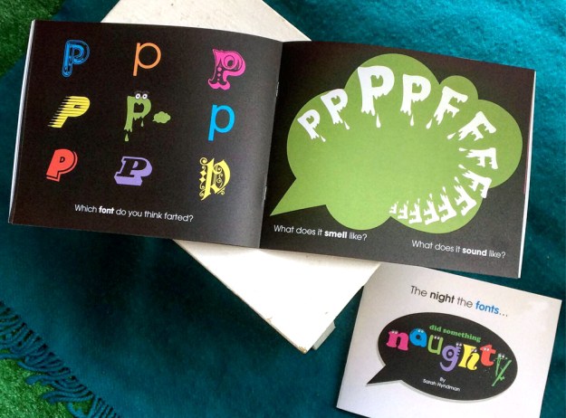
My 11-year-old nephew Eddie was excited to see me last Christmas because he wanted to talk about fonts. Hed started to learn about the topic at school and had lots of brilliant questions like “why are there so many?” The two of us have been hatching plans to create a book together and Ive also been asking lots of other children what they think. My initial proposal had been rejected by a number of mainstream children’s publishers—the main feedback is that “children aren’t interested in fonts”. I disagree with this because the children Ive spoken to are very interested in the topic. In response, Im publishing these books as part of the new Type Tasting Books venture. This is how I published my first book The Type Taster, which is now published by Penguin/Random House as the bestselling Why Fonts Matter.

Continue reading

Typography resources for graphic design students

subconscious

Are you a graphic design student? Would you like to know more about the power of typefaces and how exciting typography can be?

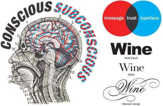
Type is both functional and evocative
Type functions as a carrier of words. It displays these efficiently so that the reader’s eyes can glide seemingly effortlessly across the page as they read. It is sometimes considered that type should be ‘invisible’ and not intrude on the reading experience. The title of American typographic expert Beatrice Warde’s 1930 essay, ‘The Crystal Goblet’ refers to her opinion that type should function like a clear wine glass and purely ‘carry but not obstruct’ the content. Much research into typefaces explores their legibility, focusing on the mechanics of letter shapes and how they function. Testing includes eye-tracking and monitoring response times. An example is the research Monotype type foundry has done with MIT into legibility of typefaces on car dashboards. There are rules for legible typography, scroll down to the resources section below for nine of the important rules.

However there is more to typography than legibility…

Screen Shot 2015-09-28 at 10.19.49

patrick

Continue reading

Learn about fonts: register your interest for a new series of e-learners

Learn ebook-all

Would you like to learn about type/fonts the Type Tasting way?

The Type Tasting approach takes the viewpoint of the type consumer and explores fonts through experiences and observations from everyday life. The e-learners will feature questions and challenges throughout and at the end there will be a short test which you can submit to have marked. Those who pass will receive a certificate and a virtual button to wear on their website or Facebook page with pride. These are aimed at curious font consumers, no prior typography experience is needed.

Titles in this series of e-learners are planned for later in the year. Each will guide you through learning about an area of type and you can vote for the first titles to be published. Choose which ones you would like when you register your interest*, and the most popular will be the first launched:

Sensory type: From a DIY Type Tasting.
History of type: Told through 10 record covers.
Type classification: From a Dalston Type Safari.
Type & perception: From font personality profiling.

Click here to register your interest in Type Tasting e-learners.


Learn ebook-history of typeLR  Learn ebook-type classificationLR  Learn ebook-type & perceptionLR

*There is no obligation to buy when you register your interest.

#LDF13: London =

PMU3 600X390

#LDF13: London =

A collection of creative typography created for Type Tasting at the V&A with the London Design Festival? Click here to find out more.

Continue reading

Blog: What is the future of type?

type_evolution_technology-wording

Blog: What is the future of type?
By Sarah Hyndman

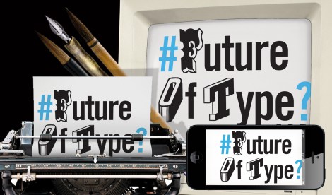
‘What is the future of type?’ This is a question that was posed a few weeks ago which prompted a diverse range of responses. The discussion played out via email, Twitter, Design Week and the Creative Review blog and subsequently formed the basis for an event at the St Bride Library.

The main themes that arose included the evolution of type and whether words may ultimately become obsolete as technology and globalisation progress? Physical print is still in demand; independent type foundries are appearing, there has been a resurgence in letterpress, and an Adana press is back in production in Japan. Whether this is a new trend or a final swansong remains to be seen.

Continue reading

Blog: Balmy Friday evening in Dalston

ready for pia

It’s turned into a lovely day, perfect for a balmy Dalston Type Safari with Pia and her 13 graphic design students from Denmark. We’re looking forward to seeing the photographs they take tonight and will post them here soon…

Blog: History of type update

Layout 1 (Page 5) AmyFreeborn2 Blackletter_Alice_WilsonLR

Humanist vs Garalde_Alice Wilson  Image Layout 1 (Page 20)

The test pilots on the History of type correspondence course are producing some wonderfully creative examples of lettering while they research and learn about the history of typography and type classification.

Continue reading

Blog: London Design Festival at the V&A

ldf at v&a

Event: London Design Festival at the V&A

We’ve just been on a site visit to the V&A to see the fantastic space we’ll be in for 14-19 September during the London Design Festival 2013. It’s the Design Studios in the Sackler Centre and it’s huge so we’d better get creating. More soon on how you can take part…

Continue reading