Are you a graphic design student? Would you like to know more about the power of typefaces and how exciting typography can be?
Type is both functional and evocative
Type functions as a carrier of words. It displays these efficiently so that the reader’s eyes can glide seemingly effortlessly across the page as they read. It is sometimes considered that type should be ‘invisible’ and not intrude on the reading experience. The title of American typographic expert Beatrice Warde’s 1930 essay, ‘The Crystal Goblet’ refers to her opinion that type should function like a clear wine glass and purely ‘carry but not obstruct’ the content. Much research into typefaces explores their legibility, focusing on the mechanics of letter shapes and how they function. Testing includes eye-tracking and monitoring response times. An example is the research Monotype type foundry has done with MIT into legibility of typefaces on car dashboards. There are rules for legible typography, scroll down to the resources section below for nine of the important rules.
However there is more to typography than legibility…


Type is evocative
There is more to type than just being an invisible transmitter of words. The different shapes and styles of the typefaces themselves stimulate responses independently of the words they spell out, and before we even read them. Type triggers our imaginations, evokes our emotions, prompts memories and links to all of our senses. We automatically recognise attributes from the physical world, like how loud it looks, whether it is heavy or light, fast or slow, or what it would feel like to touch. We have also learned a great deal from our shopping experiences, which include knowing whether something is expensive, aimed at children, or how it might taste.
It is easy to measure how readable a font is, but it is less straightforward to measure how it makes people feel. As a result, there is less public domain research in this area and much of what we know as designers comes from personal observation and experience. How a typeface functions is practical. It could be compared to building and fine-tuning a car engine for optimum performance. What a typeface evokes is about the experience of being a type consumer and using it. This is like taking the car out for a drive on the open road, turning up the music and enjoying how it makes you feel.
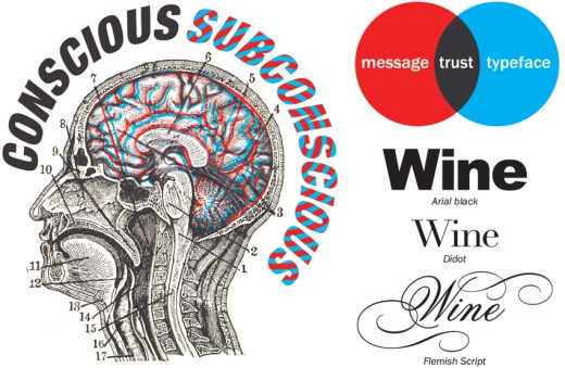
A typeface creates a first impression, much like the outfit a person is wearing. It can convince you that a bottle of wine is more expensive and so you will not only pay more for it, but you might actually enjoy it more. Which of the examples at the top do you think will be the most expensive, and the cheapest?
How do fonts influence you?
Type appears right in front of your eyes and is clear for you to see. It is your choice not to pay attention to it consciously and to focus on reading what the words actually say. The type itself is still transmitting plenty of information, it is just communicating it directly to your subconscious.
Font Goggles (you need a pair of red/blue 3D glasses for this)
Typefaces/fonts prime you with a great deal of information and set the scene for the words you are about to read. They give words a back story, a personality, clue you in to whether or not you can trust them, whether they will be serious or light hearted, academic or childish. Generally, well-set type is designed so that you ‘look past’ the typeface and focus on the words themselves—unless of course the font does not match, like somebody with a bad haircut or a miscast actor in a film. At any time you can choose to pay attention and look at the fonts themselves.

(a) Cover (or close) one eye so that you are looking through the blue lens. Through this lens you will simply read what the words spell out.
(b) Now look through the red lens and join me in ‘type wonderland’ where you will see what the fonts themselves might be telling you.
Can a font improve your grades?
When student Phil Renaud was nearing the end of his third year at university he noticed that his grade average had improved. He wondered why, since he did not think he was putting any more effort into studying or writing. He realised that the one thing he had changed over time was his choice of font and so he looked back at the 52 essays he had submitted and compared the grades and typefaces. He found that when he used Georgia his grade average was A whilst the essays written in Trebuchet only averaged at a B-minus.
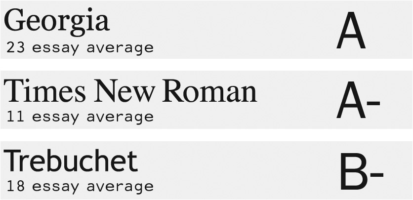
Serif typefaces are associated with academia and knowledge so Trebuchet does not convey as much gravitas. Out of the two Serif style typefaces the difference may be due to readability. Times New Roman was designed to fit into the narrow column widths of ‘The Times’ newspaper but reads less comfortably when spread across the full width of a page. The more open letters of Georgia flow better across a wide page and read more smoothly. I suggest that Georgia was favoured because it combines appropriateness for the context with being a good reading experience. Try this out for yourself: open up two identical text documents, set one in Times New Roman and the other in Georgia and compare the reading experience of each.
Renaud’s results could be considered subjective as there are many unknown variables that may have influenced the marks. However, he does illustrate the importance of considering both context and readability when choosing a typeface.
WHY FONTS MATTER
The information in this post is taken from the book Why Fonts Matter by Sarah Hyndman published by Virgin Books (Penguin/Random House).


This is a book about typography from the type consumer’s point of view; how it communicates directly with our subconscious and can alter our interpretation of what we read. This interactive book takes you through the science of how type influences us and is packed with illustrations and games so you become part of the discovery process. The right typeface creates trust, but use the wrong one and you can commit a typographic faux pas. This could leave the reader having less faith in your message or not purchasing your product. This was previously self-published as The Type Taster: How Fonts Influence You.
“You have really opened my eyes to such a brilliant subject. It’s already making me view design work from such a different view point and I have now become excited by the possibilities typefaces present while experimenting with them.” Design student Jessica Dutton. (Read more reviews here)
TYPOGRAPHY RESOURCES
‘Typeface’ or ‘font’?
The typeface is the design, an example is Helvetica, this includes the entire family of sizes, styles and weights. A font is the format you experience the typeface in. Traditionally this would have been a set of metal type in a specific size, style and weight: for example 12-point Helvetica bold. Today we access typefaces through many more formats and the meaning of the word ‘font’ has evolved to encompass them. The term now includes the files we access via the font menus on our computers, mobile devices and websites.
I recently explained this to somebody who concluded that ‘a typeface is like my collective family, the Greenes, and the fonts would be the individual Greene family members.’
Nine rules of good typography
1 The ideal point size for body copy is between 8.5–12 points (print) or 15–25 pixels (web).
2 Line length should be a maxiumum of around 80 characters (including spaces); if your lines are longer then consider more columns.
3 Buy good typefaces for professional work, don’t use free ones as you get what you pay for.
4 Body copy can be difficult to read when centred or justified.
5 Use all caps sparingly: it is less readable and looks like you’re shouting.
6 Combining multiple display typefaces can look like you’re throwing a fancy dress party.
7 Pale text reversed out of a dark background may fill in when printed and can be hard to read.
8 Never artificially stretch or compress type; choose an extended or condensed font.
9 Beware of bad kerning (the spacing between letters). This can look unprofessional and has been known to create unexpected swear words.
Reading list
Why Fonts Matter by Sarah Hyndman (Penguin/Random House 2016)
Stories about fonts and type
Fifty Typefaces That Changed the World: Design Museum Fifty by John L Walters (Conran)
Just My Type: A Book About Fonts by Simon Garfield (Profile Books)
Type: The Secret History of Letters by Simon Loxley (I.B. Tauris)
Creative typography
The 3D Type Book by FL@33, Tomi Vollauschek and Agathe Jacquillat (Laurence King)
Typography Sketchbooks by Stephen Heller & Lita Talarico (Thames and Hudson)
Typoholic: Material Types in Design by Viction Workshop (Victionary) (2012-04-12)
Type in the environment
Culture+Typography: How Culture Affects Typography by Nikki Villagomez
The Field Guide to Typography, Typefaces in the Urban Landscape by Peter Dawson (Thames & Hudson)
Sign Painters by Faythe Levine
Practical typography
Thinking with Type by Ellen Lupton (Princeton Architectural Press)
Type and Typography by Phil Baines & Andrew Haslam (Watson-Guptill)
Using typography as a graphic designer
Stop Stealing Sheep and find out how type works by Erik Spiekermann & E.M. Ginger (Adobe Press)
The Geometry of Type by Stephen Coles (Thames & Hudson)
Typography by Gavin Ambrose & Paul Harris (AVA Publishing)
Science
Reading in the Brain: The New Science of How We Read by Stanislas Dehaene
Websites
Creative Review
Design Week
Eye (International Review of Graphic Design)
Ghostsigns archive
Grafik
I Love Typography
It’s Nice That
Type Tasting
Typographica
Watch Sarah Hyndman’s TEDx talk Wake Up and Smell the Fonts
![]()
![]()
All images and information in this post is all taken from the book Why Fonts Matter by Sarah Hyndman. Please do not reproduce this without permission.
