Tag Archives: learn about typography

“Sublime & crazy tales”: a new immersive typography workshop

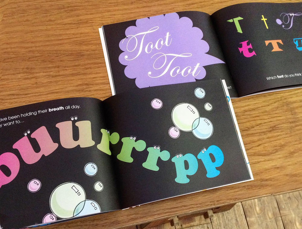
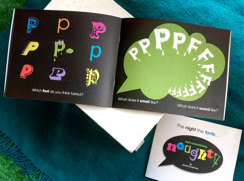
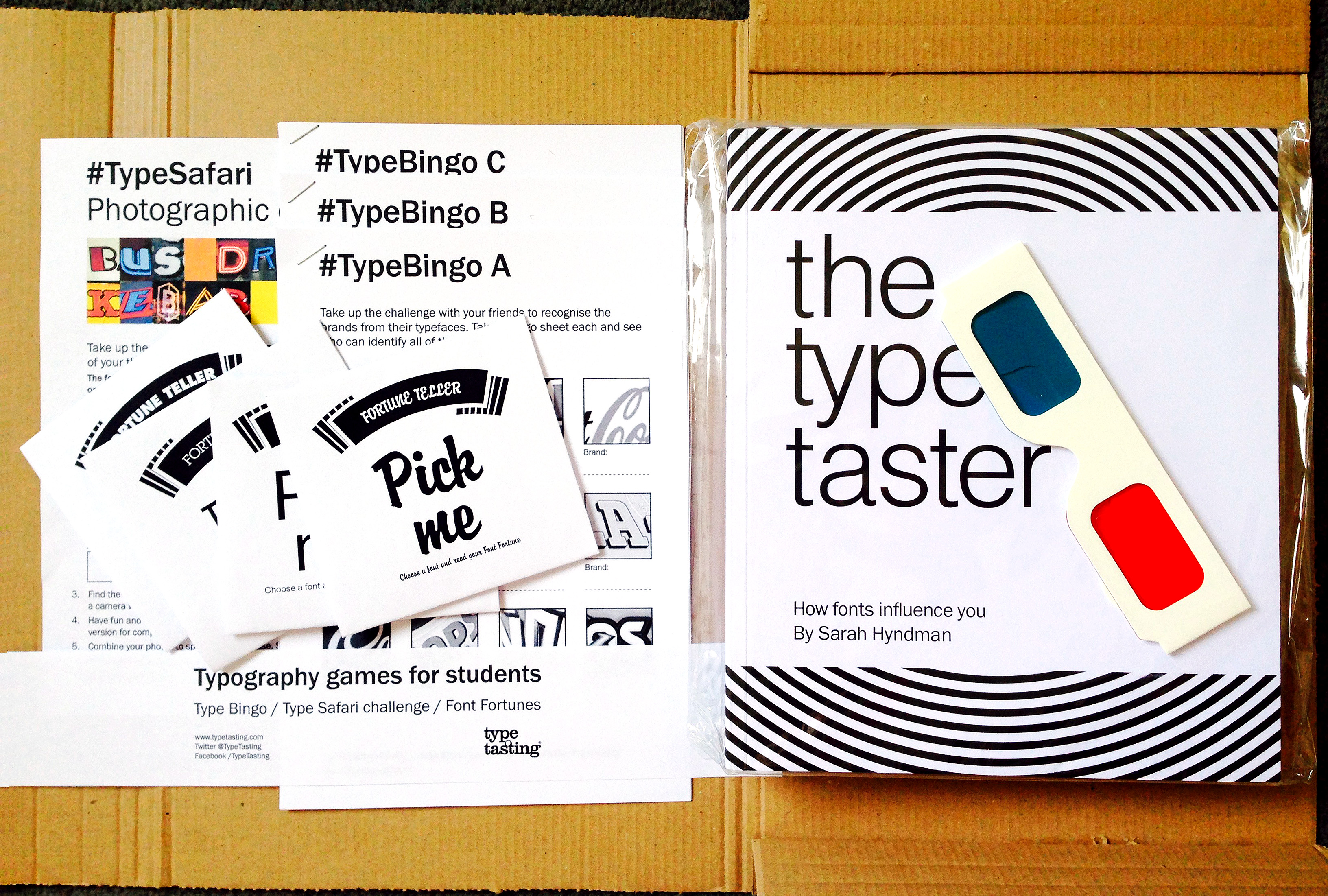
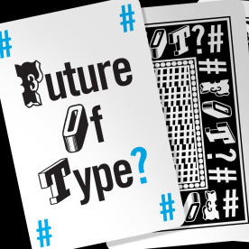
An immersive, interactive journey through how typography changed the world. There will be activities, tasters, smells, sounds, stories and surprises. These are unique experiences that change what you think, feel and do.

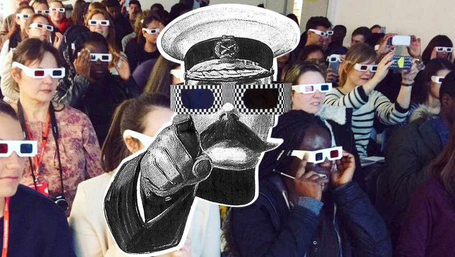
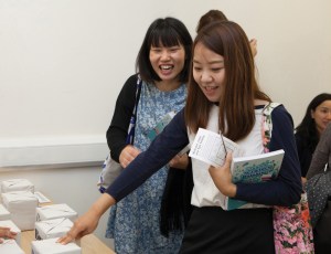
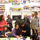
I really enjoyed opening the doors and chatting to so many people at our recent open studios. After two years spent online feeling like I was living a cross between The Truman Show and Max Headroom, it’s been so good to create and host in-person events again. One of my favourite reasons is that I get to create props, smells and tasters designed to surprise unsuspecting audiences.

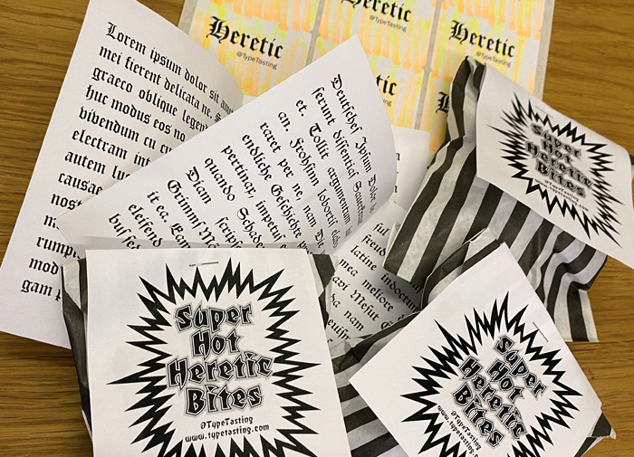
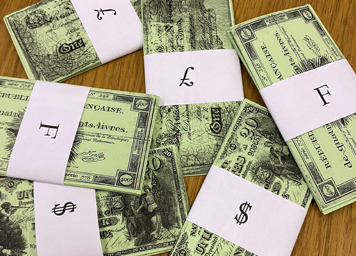
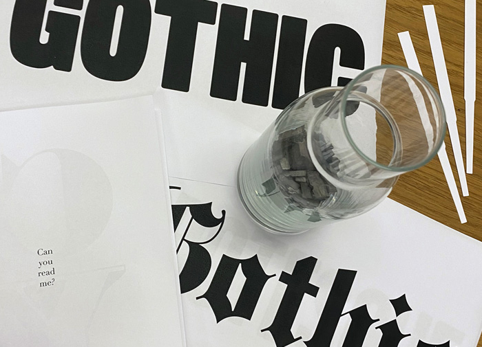
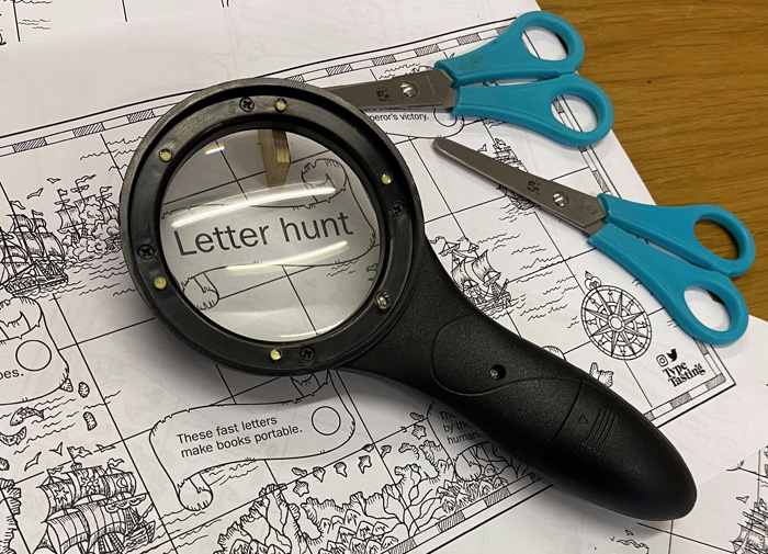
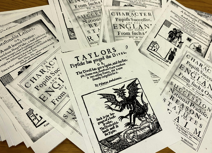
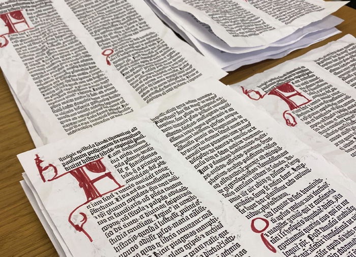
I’ve spent today making props for an event I’m running at the HQ of the Future Strategy Club for their members next week. This is an immersive, interactive journey through how typography changed the world. There will be activities, tasters, smells, sounds, stories and surprises. We’ll time travel through a few hundred years of type history getting a first hand taste of protest movements, pampleteers, social shifts and revolutions.

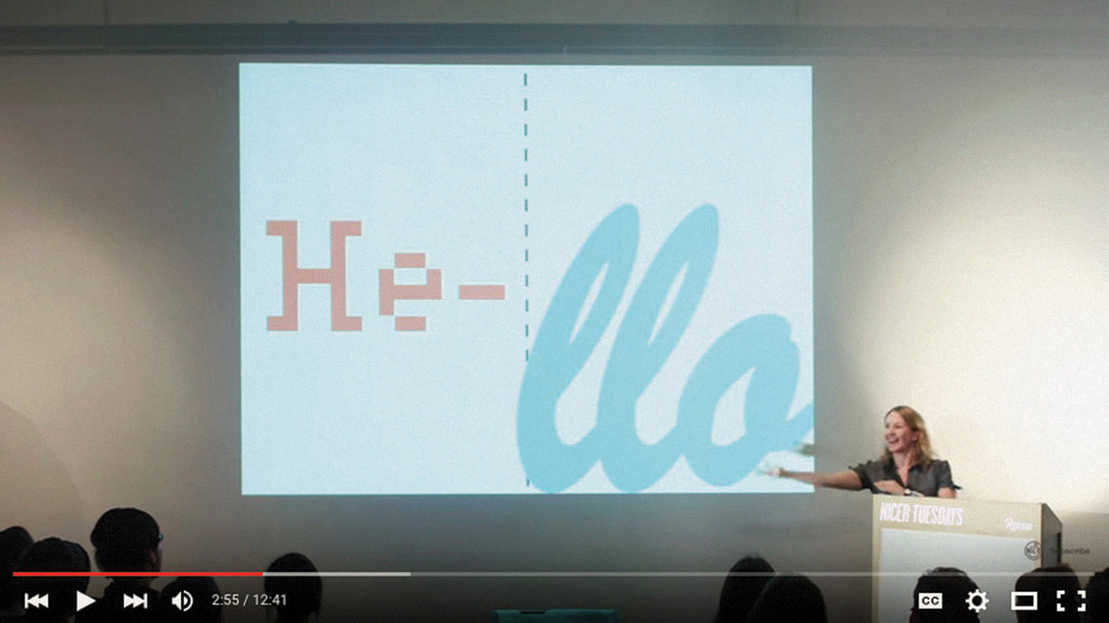
This is based on an event I created for the London Design Festival, which attendees described as “An immersive experience of storytelling and discovery”, “Brilliant”, “Sublime & crazy tales from the past”, “Wonderful”, “A roaring success”.

Get in touch here or by replying to this email if you’d like to book this event for your clients or organisation.

Typography workshops for school students

I had the privilege of running workshops at the Design Museum last week for the next generation of talented designers. The museum runs an annual competition for schools to design a product to be sold in the Design Museum shop. I had a brilliant day running one-hour workshops for the ten schools shortlisted in this Design Ventura competition.

The students from years 9, 10 and 11 took part in activities including personality name badges, supermarket sweep, what’s the product? and ended with typography karaoke, which they designed and performed. They were all fantastic and I hope a few went away with a newfound love of typography.

Why teach young children about fonts?

Introducing your children to the fantastical world of fonts will give them a head start towards a future career in the creative industries.

My 11-year-old nephew Eddie was excited to see me last Christmas because he wanted to talk about fonts. Hed started to learn about the topic at school and had lots of brilliant questions like “why are there so many?” The two of us have been hatching plans to create a book together and Ive also been asking lots of other children what they think. My initial proposal had been rejected by a number of mainstream children’s publishers—the main feedback is that “children aren’t interested in fonts”. I disagree with this because the children Ive spoken to are very interested in the topic. In response, Im publishing these books as part of the new Type Tasting Books venture. This is how I published my first book The Type Taster, which is now published by Penguin/Random House as the bestselling Why Fonts Matter.

Continue reading

It’s time for a type revolution

It's time for a Type Revolution

It’s time for a type revolution. It’s time to change the way we think and talk about type: for non-experts to join the conversation. 

Type Tasting delivers talks, ice-breaker sessions, masterclasses and workshops that make the complex topic of typography accessible and relevant beyond the design studio. We take the type consumer’s point of view and explore the experience of type—how it influences our perception and can alter our decisions. 

“Clever, insightful and original, left a lasting buzz and excitement behind!” Charlotte Godfrey, BBC Bristol.

Playing Type Karaoke How you say it

It’s time for typography to be demystified. Design tools are becoming everyday applications and they are used by all of us both at work and at home. Typography—the choice of fonts and how they are arranged—is a fundamental element of design because it is what the voice looks like. Yet it is wrapped up in the language of a specialist discipline and this makes it intimidating for those outside the profession to join in the conversation.

“Sarah brings the power of fonts to everyone” Patrick Burgoyne, Editor of Creative Review.

Type Tasting experiments Type Tasting surprise1

It’s time for typography to become visible. We live in a time of increasing design awareness and we now ask questions about the messages we are bombarded with in our everyday lives. Each font/typeface has a personality that influences our interpretation of the words we read by evoking our emotions and setting the scene. We all understand this instinctively but it happens on a subconscious level. Conscious awareness of the emotional life of fonts can give us more control over the decisions we make.

Continue reading

Typography resources for graphic design students

subconscious

Are you a graphic design student? Would you like to know more about the power of typefaces and how exciting typography can be?

Type is both functional and evocative
Type functions as a carrier of words. It displays these efficiently so that the reader’s eyes can glide seemingly effortlessly across the page as they read. It is sometimes considered that type should be ‘invisible’ and not intrude on the reading experience. The title of American typographic expert Beatrice Warde’s 1930 essay, ‘The Crystal Goblet’ refers to her opinion that type should function like a clear wine glass and purely ‘carry but not obstruct’ the content. Much research into typefaces explores their legibility, focusing on the mechanics of letter shapes and how they function. Testing includes eye-tracking and monitoring response times. An example is the research Monotype type foundry has done with MIT into legibility of typefaces on car dashboards. There are rules for legible typography, scroll down to the resources section below for nine of the important rules.

However there is more to typography than legibility…

Screen Shot 2015-09-28 at 10.19.49

patrick

Continue reading

Learn about typography: The Type Taster student discount offer

student pack of games

Are you a UK design student? Prepare yourself for the new year with a discounted copy of The Type Taster and free postage (save £5). This is a book about typography from the point of view of the type consumer and takes you through the associations and science behind fonts influence you as a reader.

Buy it quickly! This edition is only available until 25th October.*
Student copies of the book will also include a selection of typography games (shown above).

subconscious

You have really opened my eyes to such a brilliant subject. It’s already making me view design work from such a different view point and I have now become excited by the possibilities typefaces present while experimenting with them.” Design student Jessica Dutton

“This alongside the typography bible (Robert Bringhurst’s elements of typographic style) should become a staple in everyone’s collection.” James (Via Creative Review blog)

“This is no boring instructional tome on the correct use of ligatures, rather it takes a look at the emotional lives of fonts, and examines how their distinct personalities create (often subconscious) emotional responses.” Grafik

Continue reading

A Type Tasting thank you and here’s to 2014

Thank you to everybody joined in with Type Tasting’s first year…

To all of you test pilots who threw yourselves into the unknown so enthusiastically, the brilliant volunteers, everybody who came along to the big public Type Tastings, or booked bespoke tastings for your organisations. To those of you who submitted such beautiful work for the exhibition at the V&A, and everybody who tweeted, blogged, reviewed and wrote about it. Thank you also for all the encouragement, enthusiasm, commissions, challenges and the invitations. Cheers! Sarah.

christine swearing sqB72 hh2+ dalston safari square pmu square

Type Tasting launched officially on Valentine’s Day 2013 with an evening of Typographic Swearing ‘n’ Cussing. By contrast 50 year six kids participated in a typographic tour of Hoxton Hall’s history in with Hackney Wow.

You’ve taken Type Safaris through Islington and Dalston, talking typography and booze making for a perfect combination. And at the busy workshop at Pick Me Up at Somerset House we created a wall of inventively customised letters which had great feedback.

fot sq OLYMPUS DIGITAL CAMERA ralph_steadman_sq 72 ldf workshop 72

The question ‘what’s the future of type?‘ prompted diverse responses on Twitter, in Design Week, Creative Review and at the event at the St Bride Library. The next event was Type Tasting with the London Design Festival at the V&A with stunning submissions for the exhibition.

Continue reading

#LDF13: London =

PMU3 600X390

#LDF13: London =

A collection of creative typography created for Type Tasting at the V&A with the London Design Festival? Click here to find out more.

Continue reading

Blog: What is the future of type?

type_evolution_technology-wording

Blog: What is the future of type?
By Sarah Hyndman

‘What is the future of type?’ This is a question that was posed a few weeks ago which prompted a diverse range of responses. The discussion played out via email, Twitter, Design Week and the Creative Review blog and subsequently formed the basis for an event at the St Bride Library.

The main themes that arose included the evolution of type and whether words may ultimately become obsolete as technology and globalisation progress? Physical print is still in demand; independent type foundries are appearing, there has been a resurgence in letterpress, and an Adana press is back in production in Japan. Whether this is a new trend or a final swansong remains to be seen.

Continue reading

Blog: Balmy Friday evening in Dalston

ready for pia

It’s turned into a lovely day, perfect for a balmy Dalston Type Safari with Pia and her 13 graphic design students from Denmark. We’re looking forward to seeing the photographs they take tonight and will post them here soon…