Tag Archives: typography training

Type Idol

Icon_TShirts©SarahHyndman

Type Idol

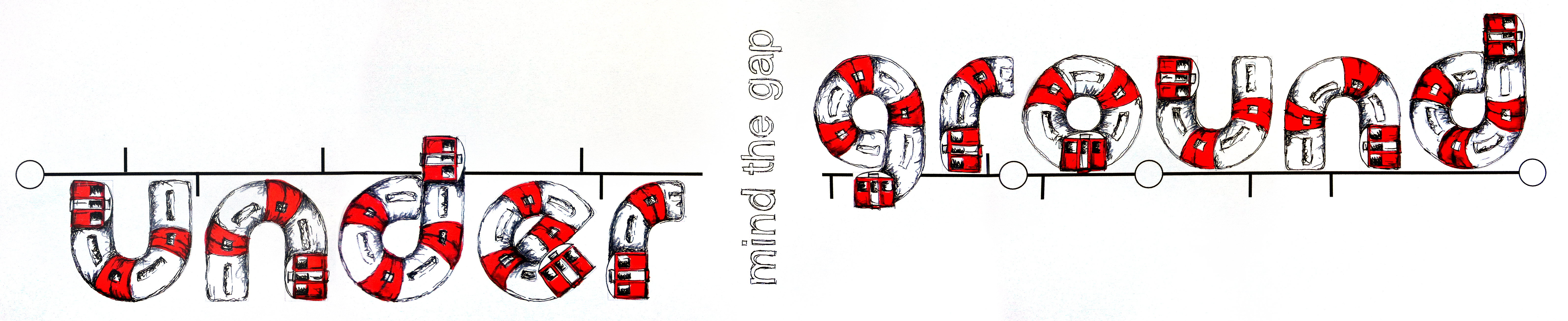
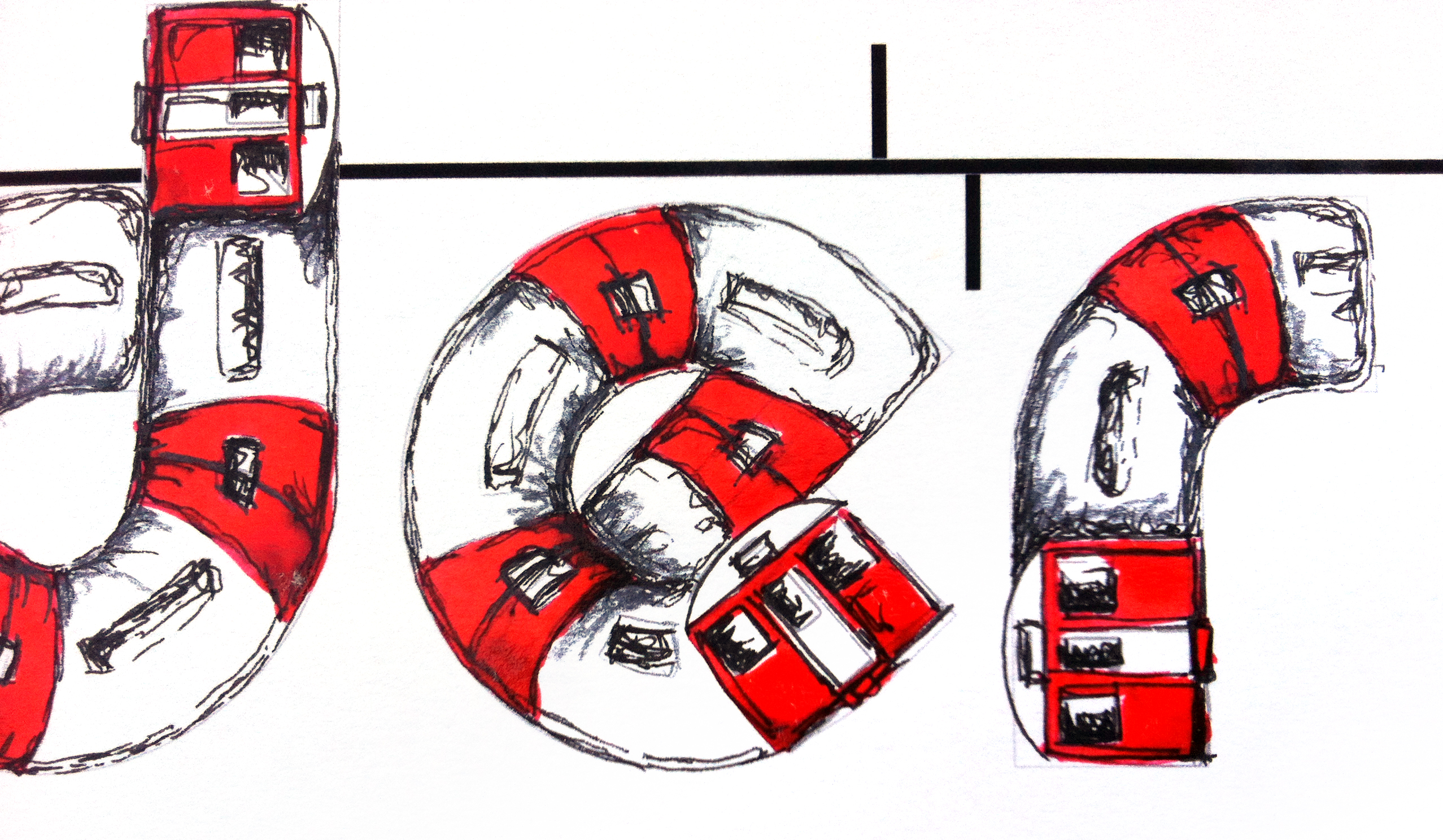
Band logos or album covers become iconic and result in a herd of spin off merchandising. We scribbled the logos on our school books, have the poster on our walls, wear the t-shirt, get the tattoo. They become so familiar that they become idols in their own right and can be reduced down to a simple typographic element and still be recogniseable.

How many do you recognise?

Continue reading

#LDF13: ‘Unique’ by Evelin Kasikov

UNIQUE-by-EvelinKasikov-5crop
UNIQUE-by-EvelinKasikov-2

#LDF13: ‘Unique’ by Evelin Kasikov

Kasikov’s eclectic mix of letters is designed in true London style—trash, glam, techno, kitsch, vintage and super-modern all happily mixed together. Each letter is different and unique; one is reminiscent of blackletter, there’s a neon-sign letter and kitsch diamond shapes.The letters are embroidered onto paper.

Continue reading

#LDF13: ‘Underground’ by Maria Cox

underground maria cox

maria cox under2

#LDF13: ‘Underground’ by Maria Cox

Maria Cox chose the word ‘Underground’ because she has an ongoing fascination with this London icon. For her Type Tasting piece she initially looked at fonts with a curve to them and thought about drawing a train running on railway tracks to create the typeface. She came up with the final idea after sketching thumbnails with different ideas of trains and tracks, and playing with the meaning of the word so that part of the word appeared below ground level.

An accident involving a colleague and some spilt ink led to an unscheduled delay (well it is the underground), but we really like the resulting Hitchcockian blood red ink splattered over the ‘Mind the Gap’ warning.

Continue reading

#LDF13 ‘Retro’ by Kate Clift

retro_kate clift

#LDF13 ‘Retro’ by Kate Clift

Clift explains that the concept behind the word is as much about the process as the aesthetic. First she letterpress printed the word on an Adana 8×5 press using type made in the 1960s. This was scanned, enlarged and cut out to create a template. Clift then spray painted the fluorescent pink onto 1960s/80s inspired tie dye fabric.

Her piece is influenced by retro from different periods, from the timelessness of letterpress printing through to the more contemporary decades of the 1960s/80s.

Continue reading

Blog: Tatty Devine made by hand

PYSCHEDELIC-LOVE NK-AW13-9-LR

Blog: Tatty Devine made by hand

We’re delighted to give you an exclusive, behind the scenes look at the making of the Tatty Devine ‘Love’ necklace…

Tatty Devine creates original designs from scratch, almost all of their jewellery is made by hand in their workshops and they stick to their principles of keeping production in the UK. You can see here just how much detail goes into making each necklace, from choosing the separate shapes and assembling them by hand to match the diagram through to removing the protective coverings and revealing the final piece. We especially like the big, yellow pot of ‘Magic Glue’.

Continue reading

Workshop: Type Tasting at Cass Art Islington

images for cass 2

Workshop: Type Tasting at Cass Art Islington
Sunday September 1st, 3-5pm
Cass Art Islington
Prior booking necessary via the Cass Art website, maximum group size 8 people.
Experience: all levels (16+)

Take part in a Type Tasting creative typography workshop at Cass Art Islington hosted by Type Tasting founder Sarah Hyndman. Get away from the computer to get your hands dirty experimenting with typography and exploring its expressive qualities. We will explore the topic of ‘creative London’ through typography, mark making and materials. At the end of the session you are invited to submit your work to be considered for inclusion in Type Tasting with the London Design Festival at the V&A.

Continue reading

Workshop: Type Tasting at the Dalston Eastern Curve Garden

curve garden

Workshop: Type Tasting at the Dalston Eastern Curve Garden
Creative typography workshops for children
Thursday August 22nd
Drop in workshops at 1pm, 2pm and 3pm, each session lasts for an hour.
No prior booking necessary
(the workshop will accommodate 10-15 children at a time)

Children are invited to draw words about creativity and playing in a session led by Type Tasting founder Sarah Hyndman. The children will choose words and then create them so that the letterforms are inspired by the meaning of the words.

Continue reading

Blog: British summer

summertime_are we there summertime_living easy

Blog: British summer

Summer’s coming at last—according to the Evening Standard we’re set to bask in a mini heat wave this week as the mercury could reach up to 30c.

Continue reading

#LDF13: London =

PMU3 600X390

#LDF13: London =

A collection of creative typography created for Type Tasting at the V&A with the London Design Festival? Click here to find out more.

Continue reading

Blog: What is the future of type?

type_evolution_technology-wording

Blog: What is the future of type?
By Sarah Hyndman

‘What is the future of type?’ This is a question that was posed a few weeks ago which prompted a diverse range of responses. The discussion played out via email, Twitter, Design Week and the Creative Review blog and subsequently formed the basis for an event at the St Bride Library.

The main themes that arose included the evolution of type and whether words may ultimately become obsolete as technology and globalisation progress? Physical print is still in demand; independent type foundries are appearing, there has been a resurgence in letterpress, and an Adana press is back in production in Japan. Whether this is a new trend or a final swansong remains to be seen.

Continue reading