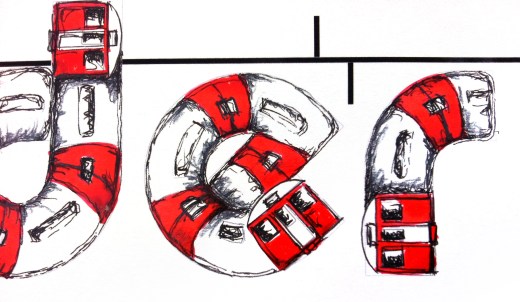
#LDF13: ‘Underground’ by Maria Cox
Maria Cox chose the word ‘Underground’ because she has an ongoing fascination with this London icon. For her Type Tasting piece she initially looked at fonts with a curve to them and thought about drawing a train running on railway tracks to create the typeface. She came up with the final idea after sketching thumbnails with different ideas of trains and tracks, and playing with the meaning of the word so that part of the word appeared below ground level.
An accident involving a colleague and some spilt ink led to an unscheduled delay (well it is the underground), but we really like the resulting Hitchcockian blood red ink splattered over the ‘Mind the Gap’ warning.
Cox previously created The Face behind the Station, for which she visited each of the London Underground’s 264 currently operating stations and photographed a member of staff at each one. “There is more to the London Underground than getting from A to B,” she says, “there is a friendly face at every station, often ambiguous and lost in the hurly burly of working life.”
Maria Cox is a freelance graphic designer/artist, follow her on Twitter @ladiebirdy77.
‘Underground’ by Maria Cox is one of the words that will be displayed at Type Tasting with the London Design Festival 2013 at the V&A.
Display: 14 – 19 September 2013
Drop in workshops: 10am – 5pm, 14 & 15 September 2013
London Design Festival Hub
Design Studio, Sackler Centre
V&A
Cromwell Road
London SW7 2RL
Type Tasting workshops and type safaris. Typography training with a creative twist.


