Design student typographic survival kit
Here is some advice for students starting a new term on how fonts can help your studies, from Sarah Hyndman’s book Why Fonts Matter.
1. Use fonts to give your words a personality
Helvetica, Times New Roman and Comic Sans walk into a bar. The barman turns to Comic Sans and says ‘sorry we don’t serve your type in here’.
This familiar joke demonstrates that fonts have personalities that we recognise easily. Some are unassuming, whilst others are larger-than-life like Mike Lacher’s version of Comic Sans, who says, ‘People love me. Why? Because I’m fun. I’m the life of the party’, then goes out and gets drunk with Papyrus.
2. A font could make you appear more intelligent
When student Phil Renaud was nearing the end of his third year at university he noticed that his grade average had improved. He wondered why, since he did not think he was putting any more effort into studying or writing. He realised that the one thing that had changed over time was his choice of font, and so he looked back at the 52 essays he had submitted and compared the grades and typefaces. He found that when he used Georgia his grade average was A, with Times New Roman it was A-minus, whilst the essays written in Trebuchet only averaged B-minus.
3. Change the font to improve your memory
An unfamiliar typeface slows our reading down and makes us pay attention, which takes us off autopilot and our brain invests greater time and attention in what we are reading. A high school in Ohio discovered that when students studied from texts in an unfamiliar font, their exam results were higher than those who had been given the books in a more familiar and readable one. Try switching your notes into a difficult-to-read font when you are trying to memorise them.
4. Use a font to make a difficult task seem easier
Psychologists at the University of Michigan ran an experiment to see if they could motivate a group of 20-year-old college students to exercise by giving them instructions for an exercise routine printed in one of two typefaces. They found that those who read the instructions in Arial, the easy-to-read typeface, estimated the exercise routine would take around half the time to do, and said they would be more likely to incorporate it into their daily routine than those who read the instructions in Mistral, a hard-to-read font. The participants misread the ease of reading the instructions for the ease of actually doing the exercises.
When you are working on a topic you find difficult, try selecting an easy-to-read font while you work, like copywriter Michael Everett who creates his invoices in Century Gothic because this makes the task seem less of a chore.
5. Avoid font faux pas
Select the ‘wrong’ typeface and you can unwittingly commit a font faux pas with the potential to overshadow, or even undermine, the credibility of your message. In 2012 CERN announced the discovery of the Higgs boson, or ‘God’ particle. This was a momentous scientific event but, within hours of the news, “Comic Sans”, the font in which the announcement was made, was trending higher on Twitter than the discovery itself. It became a major talking point that such an important scientific breakthrough should be announced in a style inspired by comic books.
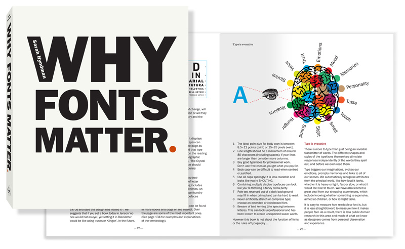
Find out more in Why Fonts Matter by Sarah Hyndman, Penguin/Random House.
Win a student survival kit
Head over to Type Tasting on Instagram to win a design student survival kit containing a signed copy of Why Fonts Matter and essential goodies including a typographic tea towel, sketchbook and stickers to tag your belongings. September 2017.
