Tag Archives: experiments

Review: Type Tasting masterclass at the D&AD Festival Fringe

Wake up and Smell the Fonts, a Type Tasting masterclass with Sarah Hyndman at Shoreditch House for the D&AD Festival Fringe

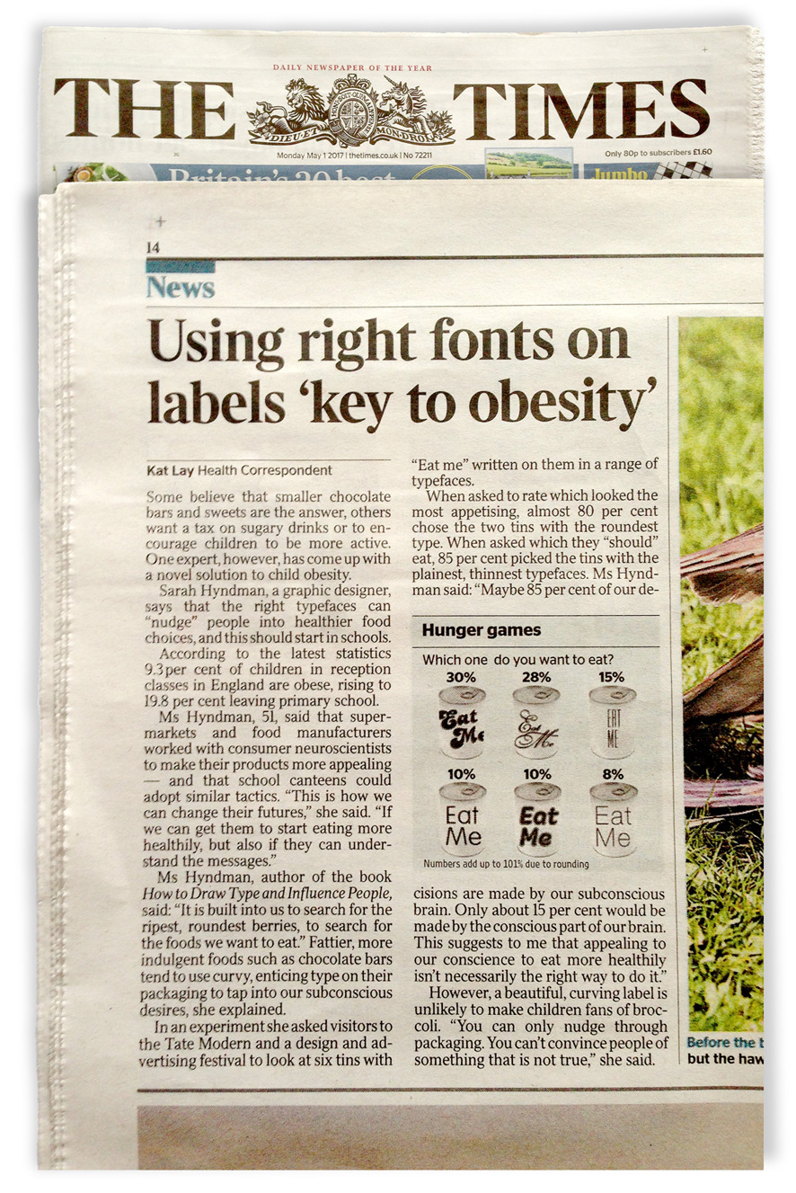
It was exciting to be a part of the D&AD Festival Fringe at Shoreditch House on the 26th April. We filled the exclusive private club’s Library with games and experiments involving typography and all the senses. This was followed by a talk and a lively Q&A session and everybody went home with a pile of Monotype goodies. A preview of results from one of the experiments were published in The Times newspaper.

Continue reading

Wired on how typography impacts human perception

Franklin_Gothic_1-01

If You Love That Font So Much, Why Don’t You Date It?
By Liz Stinson for Wired

“If I were going to date a typeface, it would probably be something like Franklin Gothic bold condensed. The font is undeniably masculine—sans-serif, solid, reliable. If it were a human, it’d be the type of guy who would fix my broken sink and play football in the backyard on Thanksgiving. I’m not alone here. Lots of women find Franklin Gothic to be a total dreamboat.”

“Some proof: When graphic designer Sarah Hyndman asked women to choose between dating nine fonts including Franklin Gothic, Futura Light, Helvetica, and Arial bolded round, 20 percent of women said they’d pick Franklin Gothic as their typographic beau, the winner by a landslide. I know it sounds weird, but let me explain. Hyndman’s dating question is part of Tasting Type, a series of online experiments she’s been performing to gather data on how typography impacts human perception.”

wired logo LR
Read the full article…