
Wake up and Smell the Fonts, a Type Tasting masterclass with Sarah Hyndman at Shoreditch House for the D&AD Festival Fringe
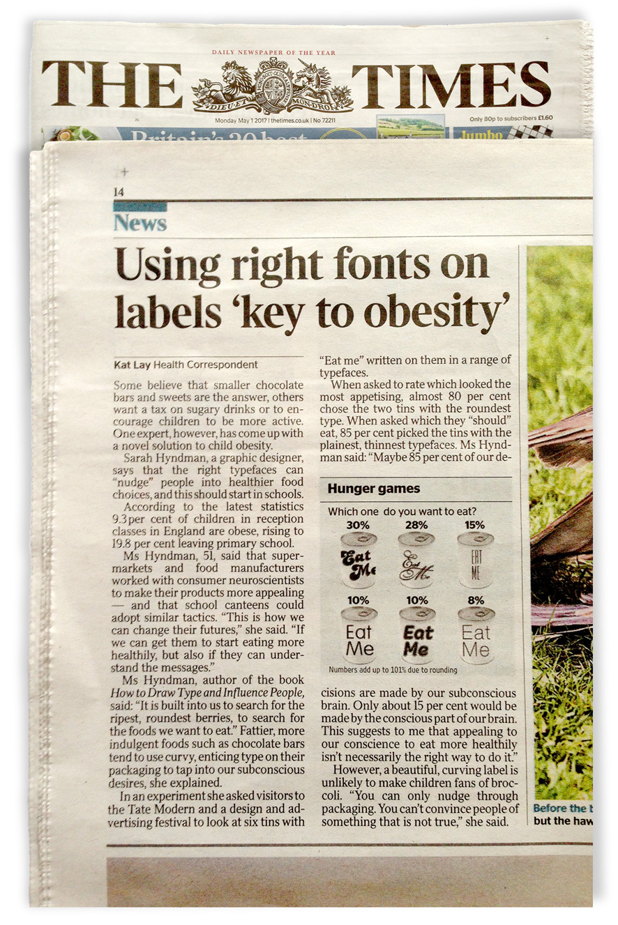
It was exciting to be a part of the D&AD Festival Fringe at Shoreditch House on the 26th April. We filled the exclusive private club’s Library with games and experiments involving typography and all the senses. This was followed by a talk and a lively Q&A session and everybody went home with a pile of Monotype goodies. A preview of results from one of the experiments were published in The Times newspaper.
“Tasting, smelling, listening to and even saying type! Mind blowing workshop from Sarah Hyndman #mindblown” Micklegate Design via Twitter.
“So interesting, so brilliantly delivered and such a clever structure. It was fabulous. My festival highlight.” Ruth Yearley, Partner. Director Of Insight & Strategy, Ketchum.
VBAT posted a fantastic write up of the D&AD Festival on their blog, read the full blog post here.
Extract from ‘Exploring the D&AD Festival 2017’
Blog post by Graham Sturt, Creative Director at VBAT
My second day at the festival started early with a visit to one of it’s Fringe Events — ‘Wake Up and Smell the Fonts: Type Tasting with Sarah Hyndman’. Offsite from the main festival, it was held in the library of Shoreditch House, a member’s club with a rooftop pool and refreshing ‘no suits’ policy in a converted East London warehouse. Arriving well before the rush of other participants I took a seat at the front and got comfortable while Sarah prepared for the session.
Sarah Hyndman is a graphic designer, writer and public speaker known for her interest in the psychology of type, whose area of expertise is multi sensory typography. Sarah is the founder of the highly innovative Type Tasting studio; and her mission is to change the way we think and talk about typography through her writing, typography workshops and events. Author of two books on typography: Why Fonts Matter and How to Draw Type and Influence People much of Sarah’s work is focused on research into typography and perception. To this end she has worked on several collaborative studies over the last 4 years with the Crossmodal Research Laboratory at University of Oxford.
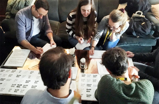
Typographic games, photo by Graham Sturt.
By 8:50 the library was already full to capacity with a mixture of students and design professionals, Sarah soon happily embraced the popularity of the session and gave a short introduction about her work and started the session. To begin with Sarah asked us to play some type-based games, the results of which would aid her in her research into typography and perception. These games the ‘Sweet or sour experiment’, the ‘Naughty of nice experiment’, the ‘Typographic coffee percolator’ and the ‘VinylType interactive game’ all centred on giving responses to first impressions of specific typefaces when paired with words or letters.
For instance the ‘Sweet or sour experiment’ asked participants to judge, on a scale of Sweetest to Least Sweet, Sourest to Least Sour the flavour of a sweet based on 10 different typefaces all spelling the words ‘Eat me’. Another game the ‘VinylType interactive game’ challenged gamers to guess the genres of music on vinyl records by the single letter type styles used i.e. Formal serif, Decorative brush script, Blackletter etc. A record player set up in the room allowed gamers to hear if their choice was correct.
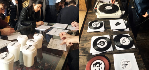
Coffee predictor and the VinylType interactive game, photos by Graham Sturt.
An interesting outcome of this specific game, as Sarah pointed out later, was to clearly show the age gap in the room. This was illustrated by Sarah with the use of a Blackletter font on a record. She explained that when she generally asked what type of music people expected to hear on this record the split was always usually between Heavy Metal (people 30+) and Hip Hop (18–30). The reason? People’s perception of this gothic type of lettering has changed over time from it’s use in the 1970’s and 80’s by bands such as Iron Maiden and ACDC to it’s modern day adoption by Kanye West for his Life of Pablo merchandise.
With an emphasis in her work on attempting to demystify typography for non-designers Sarah made many interesting and though provoking points throughout her presentation. ‘Typography is what your voice looks like’ hilariously illustrated by a short session of Typography Karaoke amongst the audience; ‘Type is a Chameleon’; ‘Typefaces have gender stereotypes’; ‘You know what fonts taste like’; ‘Type can make you look cheap or expensive’ and perhaps my favourite ‘Good type makes food taste better’. This she explained was due to typography contributing towards a scientific term called superadditivity, which is when the five senses work together to create a more enjoyable flavour.
Overall Sarah’s talk was highly engaging, stimulating and delivered a much needed dose of fun to the start of a Wednesday morning.
Read Graham Sturt of VBAT’s full blog post of all the sessions he attended at the D&AD Festival here.
Get in touch with Sarah at sarah(a)typetasting.com.
