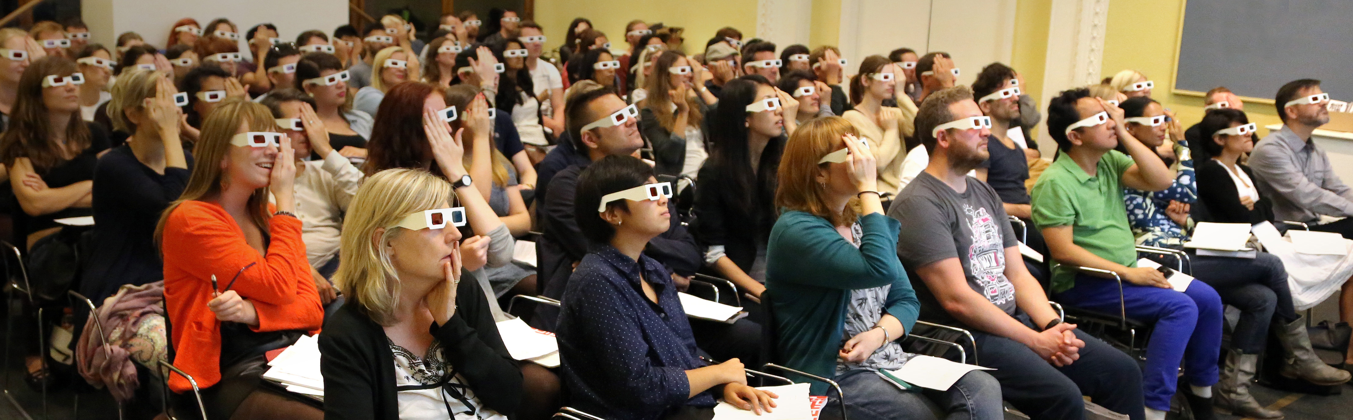
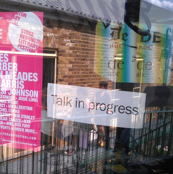
A great photo of the audience at the Type Tasting talk at the V&A with the London Design Festival at the weekend. More photos and results to come soon…
A great photo of the audience at the Type Tasting talk at the V&A with the London Design Festival at the weekend. More photos and results to come soon…
Join graphic designer Sarah Hyndman for an interactive Type Tasting talk full of demonstrations about how typefaces influence what we read.
14th September 2014
2-3.30pm
Seminar Room 3, Learning Centre, (Level 3)
V&A
London


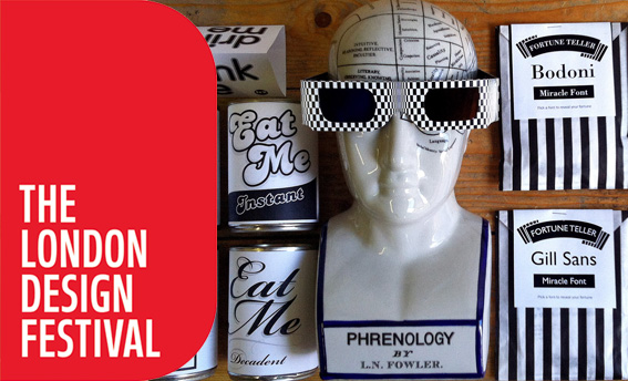
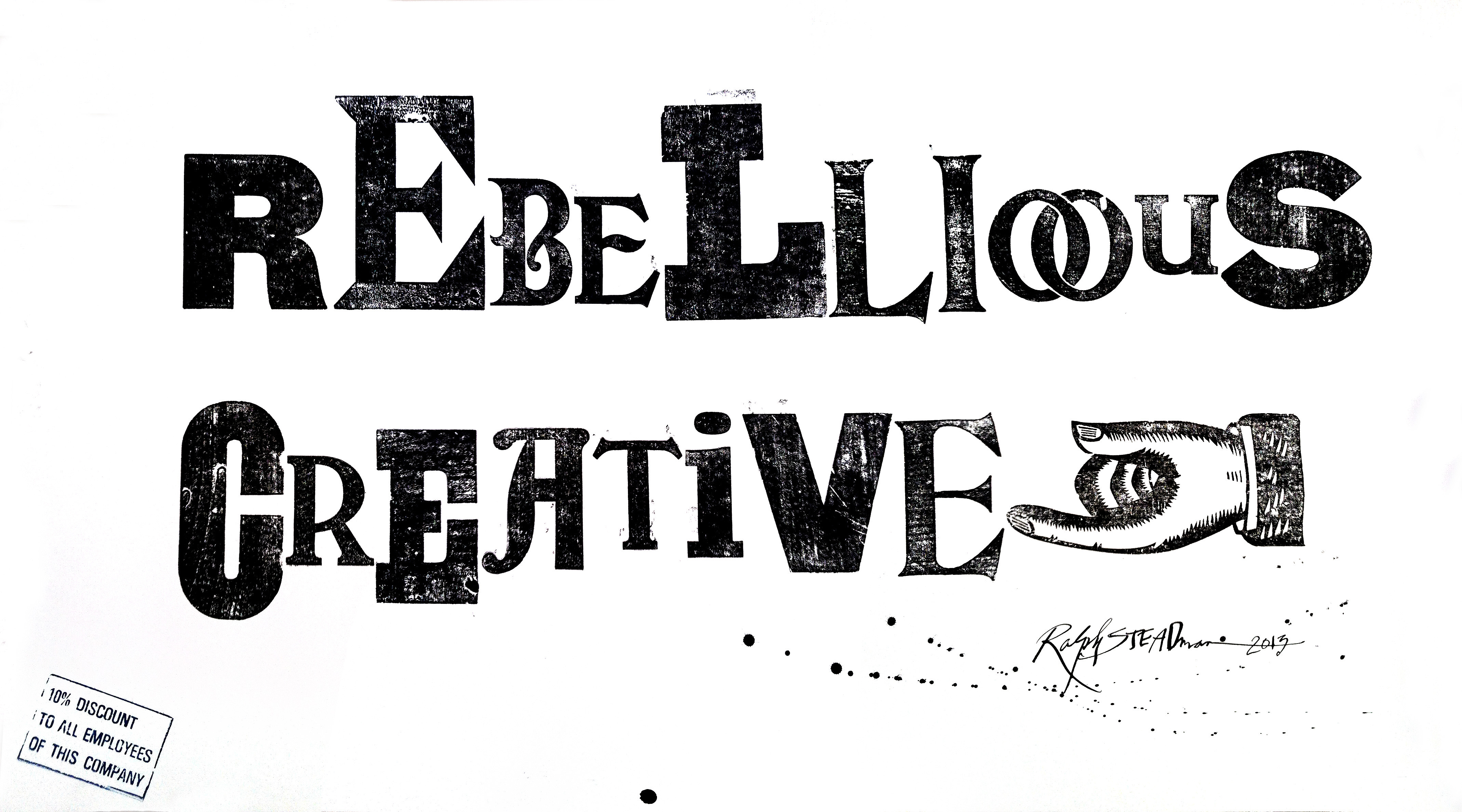
For the London Design Festival a year ago, Type Tasting posed the question “what’s your creative London?”. Stunning words were created for the exhibition by a wide range of designers and non designers of all ages and from around the world. We were delighted that Ralph Steadman and Alan Kitching created words in their own inimitable styles. All of the words were displayed at the V&A.
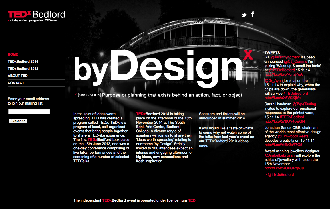
Sarah Hyndman, Wake Up and Smell the Fonts at TEDxBedford
TEDxBedford 2014 is taking place on the afternoon of the 15th November 2014 at The South Bank Arts Centre, Bedford College. A diverse range of speakers will join us to share their ‘ideas worth spreading’ relating to our theme ‘by Design’.
Designer Sarah Hyndman explores typography as we experience it in our every day lives under the banner of Type Tasting. Since the launch in 2013 she’s curated an exhibition at the V&A for the London Design Festival, been interviewed on Radio 4’s Today, taken Type Tasting to South by Southwest in Austin, Texas and has been commissioned to write a book.
Sarah has been a graphic designer for over 15 years, working in agencies before setting up design company With Relish. After studying an MA in Typo/Graphics at the London College of Communication she was invited back as a guest tutor.
Sarah will share with us a story of type and invite us to consider our emotional response to the printed word. Each font/typeface has a personality that influences our interpretation of the words we read by evoking our emotions and setting the scene. We all understand this instinctively but it happens on a subconscious level. Sarah will show us that conscious awareness of the emotional life of fonts can be entertaining and ultimately give us more control over the decisions we make.
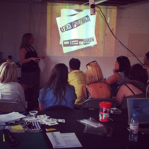
It was a weekend of talking typography with four Type Tasting talks, three of which were sold out ahead of time. The talks were 45 minutes with slides, props and quizzes which revealed how typography evokes associations long before the words have been read. For those of you who came along thank you for being so interactive and for asking great questions, the links and references are below.
On Saturday Sarah Hyndman shared her observations on the typography seen in Dalston, London, and explained what this reveals about the area and how signage is the visual DNA of an area.
“Thank you for the very enjoyable Dalston Type Safari talk on Saturday. A unique & interesting way to ‘read’ the city.” Sophie Nellis
Type Tasting founder Sarah Hyndman explains why she thinks fonts and typefaces matter, how they add richness to our lives but can also be used to influence us. She does this by telling stories of her experiences from being a child to growing up and becoming a ‘typography professional’ in this entertaining 10 minute talk.
“…as a bit of a type geek myself, your take on the topic is pitch perfect and inspirational” Daphne D
Sarah explains that “I first fell in love with type in the 1970s, an era I remember as being in faded Polaroid colours and always hot like that summer of ’76”. She describes how, as a child, she was transfixed in a sweet shop looking at the words popping and fizzing with excitement on the sweet wrappers. How she later went on to become a ‘typography professional’ or a graphic designer, which is where she learned how type evokes emotions and that these can transform the meaning of a word. Also that type can enchant, inspire wonder…and coerce.

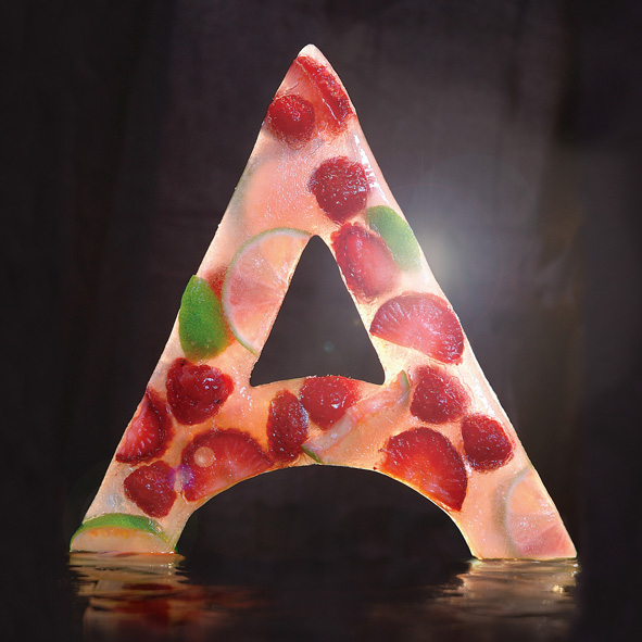

The making of the fire and ice ‘A’s.
The ice ‘A’ was an idea I had while walking along on a hot summer day, I was thirsty and really fancied an ice lolly. I started by building a 20 x 20cm silicon mold created by pouring the model making mixture over a cardboard reconstruction. This was then filled with water and fruit and left to set in the freezer (which took the best part of a weekend). I photographed it myself in my studio by suspending on fishing twine, back lit against a black background. The photo shoot had to be quick as I used a hairdryer to make the ice shiny, but this also meant that the ‘A’ melted quickly. Then it was just a case of Photoshopping out the twine and any background clutter.
“The next typeface you use, what would it taste like?” was the question I posed at the end of the talk on Edible Typography at Eye Magazine’s Type Tuesday. Here are some of the suggestions…

Angela Lamb’s first typeface of the day was Lavanderia which she describes as “delicate – it tastes of spun sugar. sweet, but brittle”. Lavenderia is designed by James T. Edmondson and is based on lettering found on Laundromat windows of San Francisco’s Mission District.

Karina Monger and the Ferrier Pearce design team came up with the following list:
Museo: Bacon wheat crunchies
Arial Rounded: Spaghetti
WC Roughtrad: Flaky Pastry…
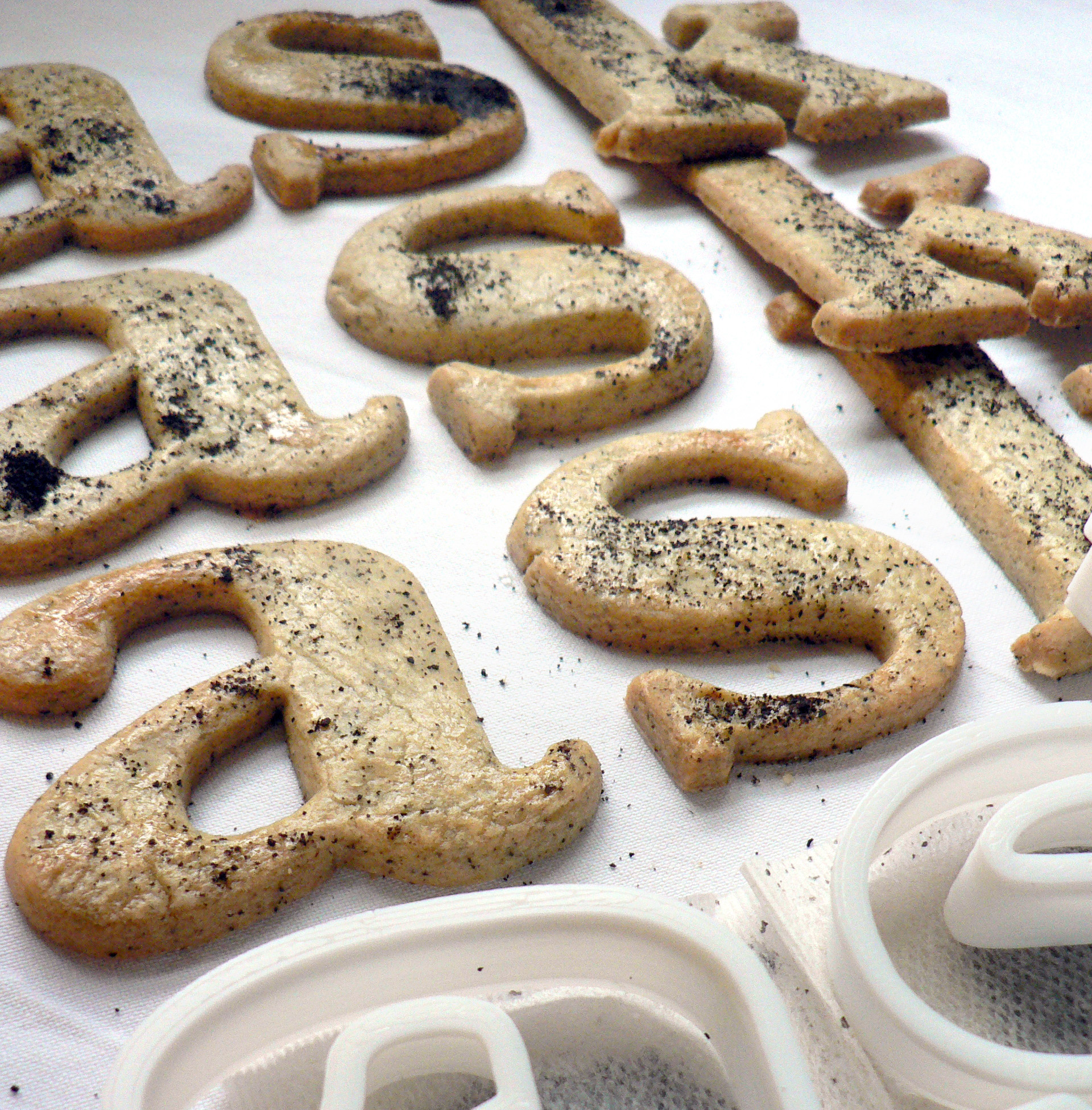
Baskerville Earl Grey tea biscuits recipe
Edible typography
Using food to describe the experience of typography
Baskerville is a transitional serif typeface that sits between the old style serif typefaces of William Caslon and the modern serifs created by Giambattista Bodoni & Firmin Didot. English printer and type designer John Baskerville developed a typeface with more defined angles and greater stroke contrast. This was a refined face with improved legibility which also took advantage of the improvements in technology happening in the 1750s. Baskerville is a recognisably English typeface that has stood the test of time as a legible, everyday text face.
My interpretation of Baskerville are Earl Grey tea biscuits for an authentic eighteenth century flavour. At this time improved technology and transport allowed foods to be enjoyed throughout the country. Tea had become the national drink and the tea leaves would be dried, rolled and used again. I had initially thought that Baskerville should be savoury, since it’s an everyday ‘jobbing’ typeface, but sweet biscuits tasted better.
Recipe
