
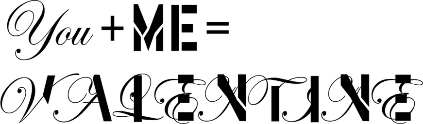
This challenge was prompted by a conversation about the Valentine’s mash up of Edwardian Script and Stencil created by Type Tasting’s Sarah Hyndman earlier this year. It was inspired by Barbie Doll and Action Man packaging and the question of whether typefaces reflect gender. When shown this Mr Cromso’s reaction was “You chose two VERY VERY different fonts: a script and a sans serif … It’s like a wedding between a ballet dancer and a fat rapper!”
Why did Mr Chromso start his Mixtype project?
“Since more than 10 years, I play with the letters in the streets. So as street artist, I am accustomed to play with the letters: Make it move, dance, create dynamics, express the personality of a letter. In fact I understood quickly that I treated the letters as human characters. This year, I chose to turn my creation toward typography and calligraphy. I thought that It would be a good Idea to do my first Typographic series on that subject!”
And which does he think is his most successful combination?
“I think my favorite one is the combination between Gotham and Baskerville: “GothamSkerville”. Because the result is a compromise between Typography and Calligraphy. And in that piece I allowed myself to add curves and lines which are typical of my work in graffiti art.”

Above: Avant Garde + Garamond, below: Clarendon + Cooper Black.

See ‘GothamSkerville’ and Mr Cromso’s other Mixtype pieces here.
