
The making of the fire and ice ‘A’s.
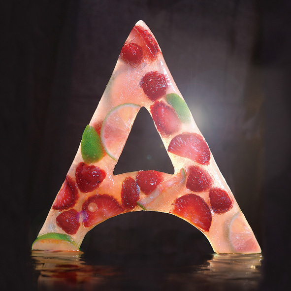
The ice ‘A’ was an idea I had while walking along on a hot summer day, I was thirsty and really fancied an ice lolly. I started by building a 20 x 20cm silicon mold created by pouring the model making mixture over a cardboard reconstruction. This was then filled with water and fruit and left to set in the freezer (which took the best part of a weekend). I photographed it myself in my studio by suspending on fishing twine, back lit against a black background. The photo shoot had to be quick as I used a hairdryer to make the ice shiny, but this also meant that the ‘A’ melted quickly. Then it was just a case of Photoshopping out the twine and any background clutter.


The fire ‘A’ is an overlay of a series of letters I photographed using a tripod and long exposure photography. This was done during the day and the only place it was dark enough was in the hallway in my flat. The layers are created from a series of ‘A’s that I traced out in the air using a torch and packet of indoor fireworks. They were then overlaid and recoloured in Photoshop to create the final energetic letter, with any traces of my hand or face removed.


 Both images were originally commissioned by the Almeida Theatre and created by Type Tasting’s Sarah Hyndman. The ‘A’ shapes are reinterpretations of the theatre’s logo which were created for the brochure covers and rolled out across the season promotional materials.
