It was a weekend of talking typography with four Type Tasting talks, three of which were sold out ahead of time. The talks were 45 minutes with slides, props and quizzes which revealed how typography evokes associations long before the words have been read. For those of you who came along thank you for being so interactive and for asking great questions, the links and references are below.
On Saturday Sarah Hyndman shared her observations on the typography seen in Dalston, London, and explained what this reveals about the area and how signage is the visual DNA of an area.
“Thank you for the very enjoyable Dalston Type Safari talk on Saturday. A unique & interesting way to ‘read’ the city.” Sophie Nellis

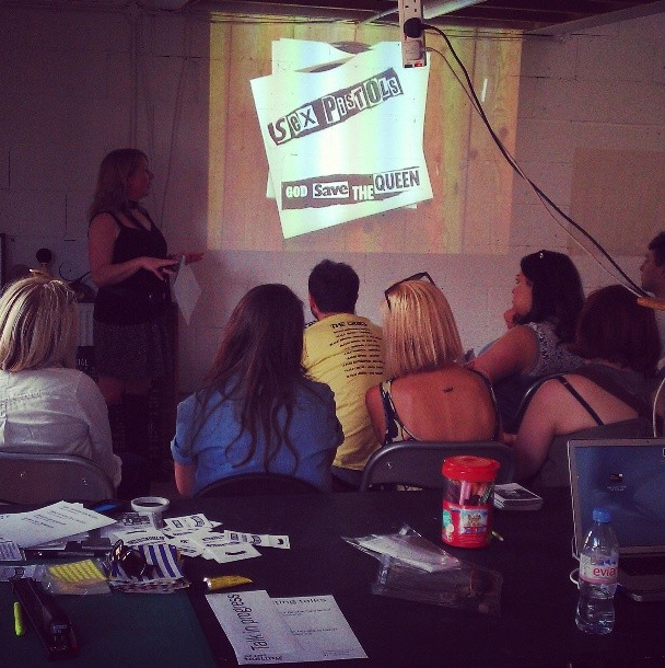
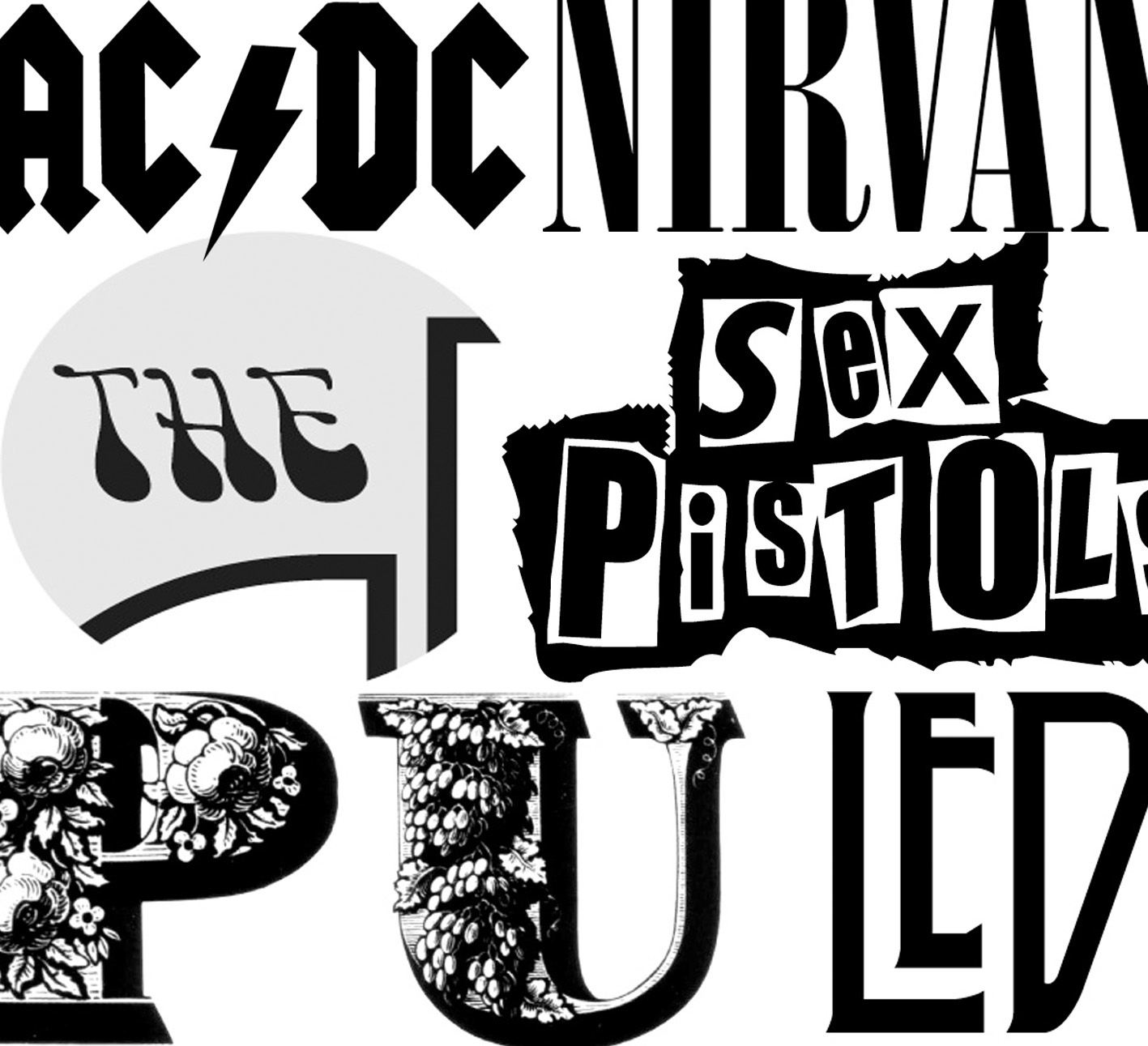
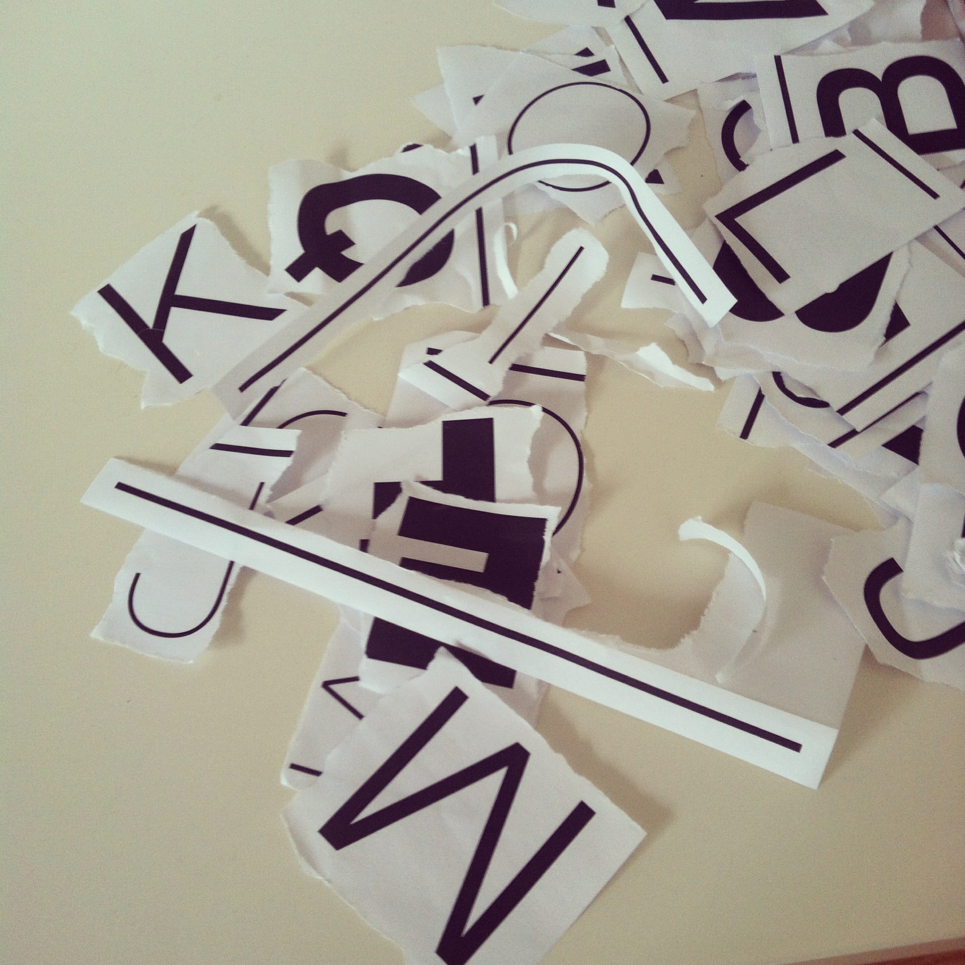
On Sunday Sarah told the history of type using ten album covers to tell the story. This began with Blackletter, the first printed type style, and moved through the evolution of typography ending with the audience ripping up sheets of neatly aligned Helvetica to make an impromptu punk poster.
“Loved your talk on album cover fonts yesterday” Brian Mulhall
“Fascinating talk” Eric Huang

Thank you to the amazing Syd Hausmann for backing me up and doing the most amazing ‘Challenge Anneka’ mission when the projector went kaput. You’re a superstar! And thank you also new-to-London Chelsea Herbert for giving up your weekend to help out and for being enthusiastic and full of initiative throughout.
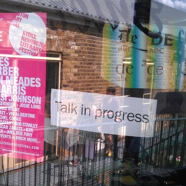
The talks were held during Open Studios Weekend as part of the Stoke Newington Literary Festival.
![]()
Photos by Helen Rawlinson and Eric Huang.
Links and references
1. AC/DC logo is designed by Gerard Huerta in 1977, he based the type on the Blackletter style lettering used in the Gutenberg Bible.
2. Ramones’ presidential seal in Caslon which was designed by English gunsmith and bookbinder William Caslon in the 1700s. His types were distributed throughout the British Empire and used for the Declaration of Independence and the Presidential Seal.
3. Nirvana logo designed by Lisa Orth, typesetting by Grant Alden, in 1989. The typeface is Onyx by Jerry Powell.
4. Pulp’s We Love Life is designed by Peter Saville who used the display type of Louise Jean Pouchée from the 1830s.
The St Bride Library on Bride Lane off Fleet Street has the Pouchée print samples in its amazing collection, a visit is highly recommended.
5. The Led Zeppelin logo is designed by Storm Thorgerson & Aubrey Powell in 1973. It’s in the Art Nouveau style very popular in the 1970s.
6. Franz Ferdinand’s logo is designed by by Paul Thompson in 2004. Their logo and visual style are heavily influenced by Russian Constructivist Movement of the early 20th century.
7. The Doors logo was designed in 1967 and combines a geometric typeface, inspired by Bayer and the Bauhaus, with lettering created by 1960s psychedelic artist Victor Moscoso.
8. The Beatles logo is by by Ivor Arbiter in 1963, apparently created by a local sign writer on the sponsored drum kit. Learn more about sign writing.
9. ABBA references the ubiquitous Helvetica which is designed by Max Miedinger with Eduard Hoffmann and became the face of 1950s Modernist movement.
10. The Sex Pistols logo was created by Jamie Reid in 1976, Punk was how the Postmodernist movement was embodied in the UK.
Future events
Join: the mailing list to find out about future talks and events
