Category Archives: Press

A day of baking edible fonts

fut 002b

A day of baking edible fonts for Type Tuesday hosted by Eye Magazine at St Brides on Tuesday April 1st. I’m one of the speakers and I’ll be explaining how my edible type is all about starting conversations about typography around how different fonts evoke associations. I’ll be bringing the freshly baked biscuits with me.

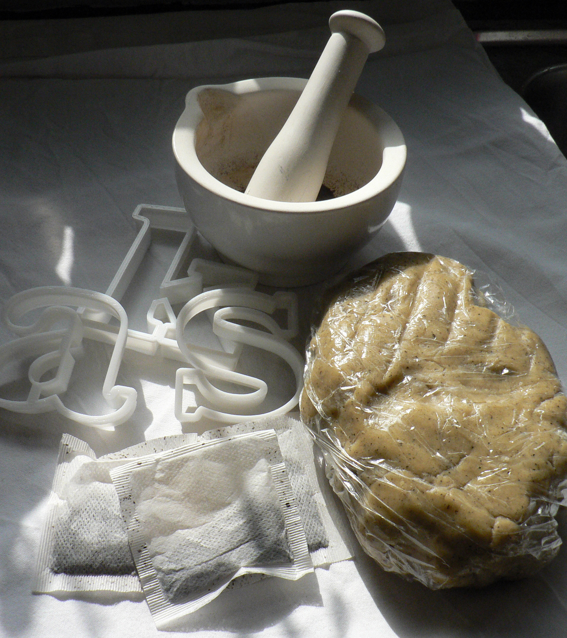
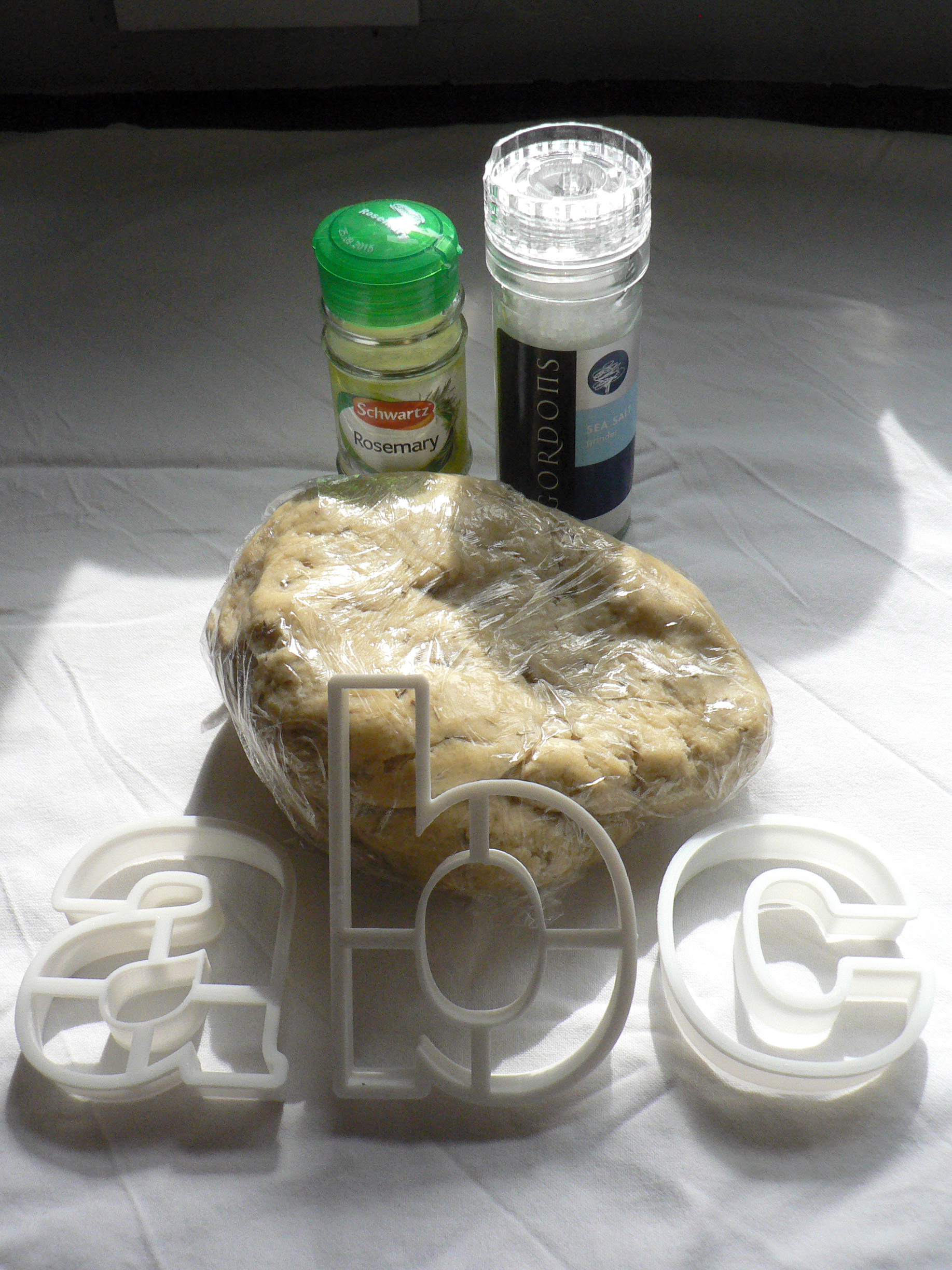
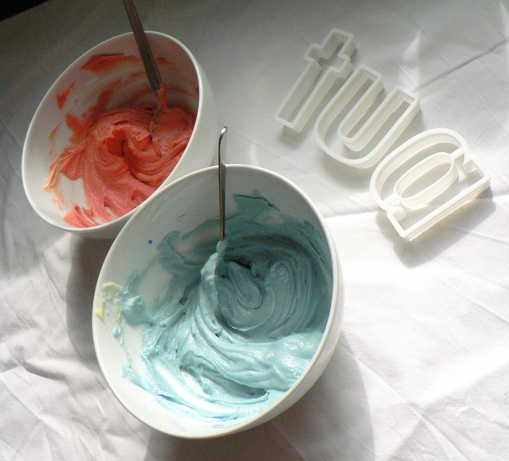
Above is Futura in progress: sweet & brightly coloured cookies, coloured icing if I have time. Below are Baskerville in progress: tea infused biscuits for authentic 1700s flavour, and Helvetica in progress: plain water biscuits with a dash of rosemary & salt. If you have any ideas or comments please join the conversation with @TypeTasting on Twitter.

bask 001 crop helv 001

Continue reading

Eye: Type on the tongue

Screen Shot 2013-12-24 at 10.16.15

Eye: Type on the tongue

Eye’s panel checks out the taste of Helvetica, Impact and Comic Sans (as cooked up by Sarah Hyndman)

Designer Sarah Hyndman is known for her Type Tasting workshops – popular events at Pick Me Up and London Design Festival this year. For Hyndman’s latest project, A Taste of Type, she has reversed the approach by asking, ‘what does type taste like?’

The resulting edible letters, still in the prototype phase, boxed and mailed to a few associates, have been taste-tested and reviewed by Eye staff in our Shoreditch office: Jay Prynne (art editor), Janet South (editorial administrator), Simon Esterson (art director), John L. Walters (editor) and Sarah Snaith (editorial assistant). You can read about Hyndman’s intentions and recipes in her article ‘What does typography taste like?’

Continue reading

‘Typeface at the Rock Face’ Artrocker 134

Print

‘Typeface at the Rock Face’
By Sarah Hyndman

Originally published in Artrocker Magazine issue 134
ARTROCKER3

In our everyday lives we are surrounded by fonts and use them to navigate through our environment, understanding instinctively that they communicate a great deal of the information before we’ve even read the words. We choose typefaces to express our personal style or to demonstrate our allegiance to a philosophy, music style or band.

This is possible because there is such a diversity of font designs which have absorbed a multitude of references and intended messages during their centuries of development. Type we use today is influenced by everything from stone carving, handwritten manuscripts, the evolution of the printing industry and now the plethora of designs available online. When we look at type we don’t just see the words, we also see the letter shapes which—much like fashion or cars—are loaded with associations.

Typefaces absorb layers of references and designers continue to use them in a way that reinforce these to help them communicate their message. We all interpret these meanings readily, often on an instinctive level, and we’ve been learning to do this all our lives.

Continue reading

How Punk changed Graphic Design

SexPistols

How Punk changed Graphic Design
Sarah Hyndman on Punk, which first exploded in the 1970s and, at the time, looked like youthful rebellion.

In actuality it was part of the Postmodernist movement which began as a reaction to the rigid restrictions of Modernism. Its DIY ethos encapsulated the anti-establishment mood of the mid 1970s, a time of political and social turbulence. The former British Empire was dissolving and a new era in British music, fashion and design was beginning.

Taking the stage to articulate the feelings of a dissatisfied generation calling for change were the Sex Pistols, who played their first gig in 1975 at St Martins College of Art. Their outrageous behaviour and contempt for established conventions announced the beginning of Punk. The DIY ethos and uncontrolled, home made style was revolutionary at the time and launched a new era in British music, fashion and design.

sex pistols 1 sex pistols 5

(A side-note from the author: Be more Punk, a call to action in 2016.)

Continue reading

Typography is the new Rock ‘n’ Roll

typography is the new rock n roll

Type Tasting has been touring the streets of Dalston exploring the signs that illuminate our social rituals, rummaging around in record shops* looking at type on album covers, and next year we’re off to take part in SXSW in Austin, Texas. Typography is the new Rock ‘n’ Roll. We’ll tell you more soon…

*Read the article in the next issue of Artrocker Magazine

Top 5 spots for a typographic day out in London

B0042P 0006

Top 5 spots for a typographic day out in London
By Sarah Hyndman

1. London Transport Museum
This museum in Covent Garden is crammed with the informative typography that we have used every day for almost a century to navigate our way around the city. The buses and signage date from the 1920s to the present day and sit side by side, enabling us to compare the lettering and how it has changed over the years.

Photo ©TfL, from the London Transport Museum collection. http://www.ltmuseum.co.uk

©Kath Tudball

2. Highgate Cemetery
The inscriptions on the gravestones in this beautiful North London cemetery give a view of London’s social history dating back to 1839, with many prominent figures buried there. The lettering to be seen ranges from ornate Victorian script to the typographic simplicity of Patrick Caulfield’s headstone (above). Tours are open to the public all year round.

Photo by Kath Tudball

Continue reading

Type Tasting’s Sarah Hyndman on the BBC’s The Arts Hour

me on arts hour

Type Tasting’s Sarah Hyndman on the BBC’s The Arts Hour

“We hear from Sarah Hyndman about how new sign design in London is reflecting the cultural and economic changes in the city.” Interviewed by Nikki Bedi. Listen to the interview.

Continue reading

BBC Radio 4 ‘Today’ interview with Type Tasting’s Sarah Hyndman

542253_10151695647431723_369642843_nScreen shot 2013-09-17 at 15.46.27

BBC Radio 4 ‘Today’ interview with Type Tasting’s Sarah Hyndman
John Humphrys and Justin Webb
Broadcast on Saturday 14 September 2013 at 07.18am
“Typefaces, they don’t really matter do they?” John Humphrys

“There is going to be a celebration at the London Design Festival this year to honour typefaces. Sarah Hyndman, a graphic designer who is involved in the festival, evaluates the promotion of London as the design capital of the world.” Listen to the interview…

Continue reading

Blog: Future of Type ‘Results are in…’

fot leaflet_CR

Blog: Future of Type ‘Results are in…’
Results are in on the future of type

By Rachael Steven, Creative Review 13 May 2013

Earlier this month, designer Sarah Hyndman hosted a St Brides workshop asking: “What is the Future of Type?” The question provoked mixed reactions on Twitter ahead of the event: on the day, Hyndman says, some common themes emerged.

Continue reading