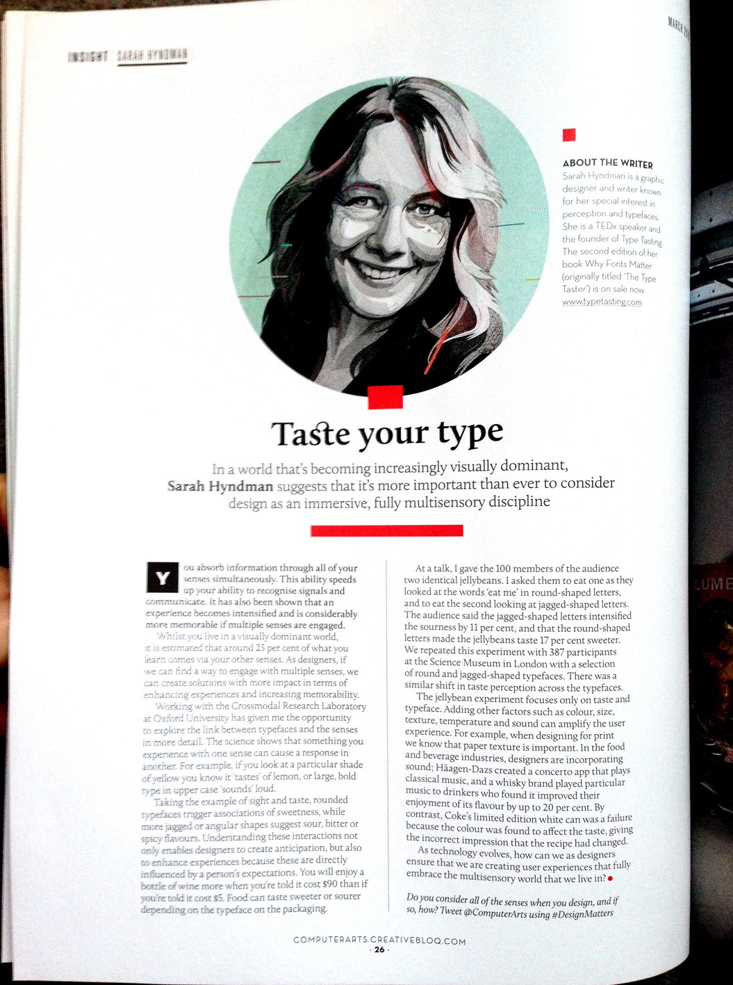
In a world that’s becoming increasingly visually dominant, Sarah Hyndman suggests that it’s more important than ever before to consider design as an immersive, fully multisensory discipline.
Computer Arts, March 2016 (20th anniversary edition)
In a world that’s becoming increasingly visually dominant, Sarah Hyndman suggests that it’s more important than ever before to consider design as an immersive, fully multisensory discipline.
Computer Arts, March 2016 (20th anniversary edition)
‘Typeface at the Rock Face’
By Sarah Hyndman
Originally published in Artrocker Magazine issue 134

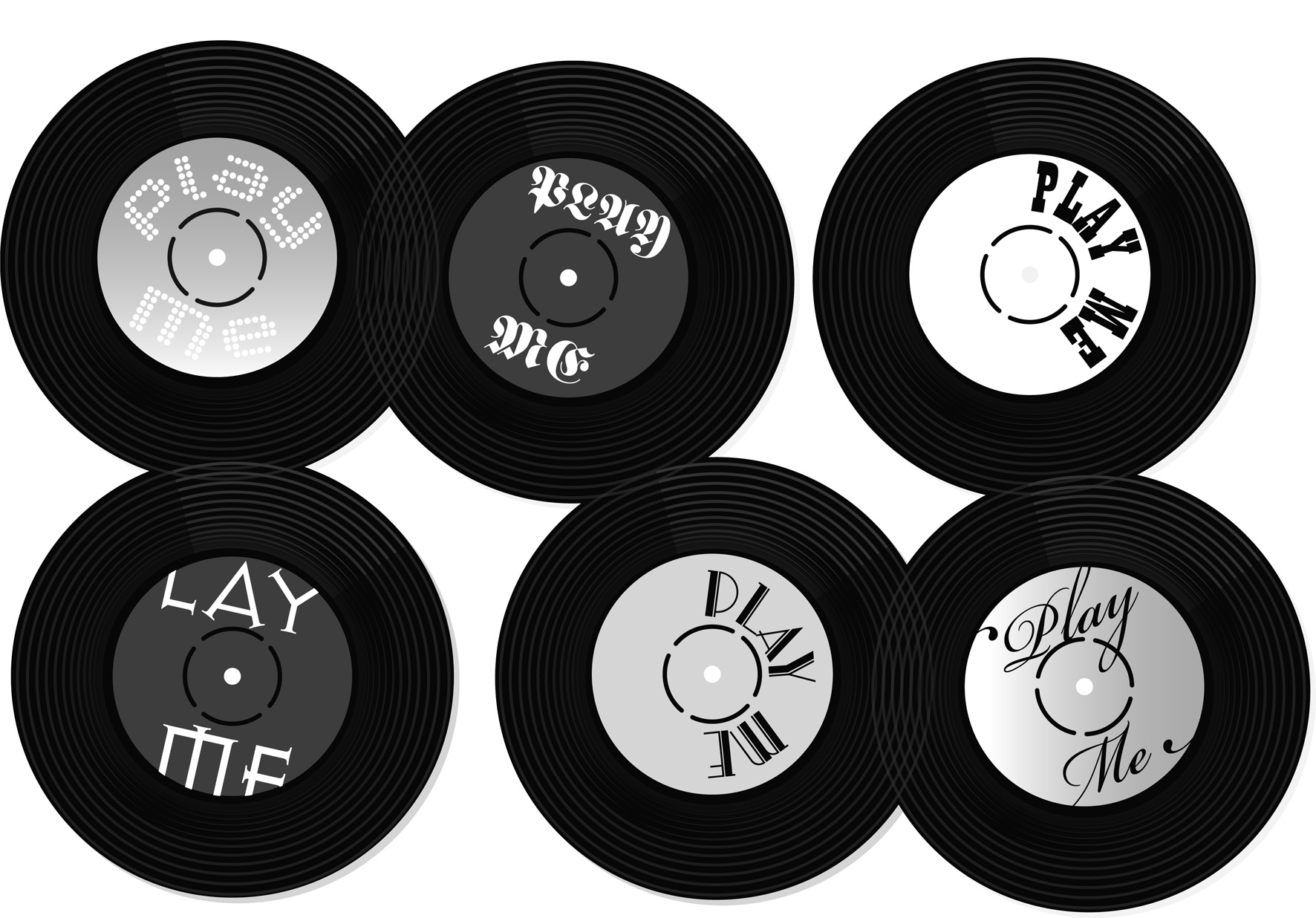
In our everyday lives we are surrounded by fonts and use them to navigate through our environment, understanding instinctively that they communicate a great deal of the information before we’ve even read the words. We choose typefaces to express our personal style or to demonstrate our allegiance to a philosophy, music style or band.
This is possible because there is such a diversity of font designs which have absorbed a multitude of references and intended messages during their centuries of development. Type we use today is influenced by everything from stone carving, handwritten manuscripts, the evolution of the printing industry and now the plethora of designs available online. When we look at type we don’t just see the words, we also see the letter shapes which—much like fashion or cars—are loaded with associations.
Typefaces absorb layers of references and designers continue to use them in a way that reinforce these to help them communicate their message. We all interpret these meanings readily, often on an instinctive level, and we’ve been learning to do this all our lives.
