
How Punk changed Graphic Design
Sarah Hyndman on Punk, which first exploded in the 1970s and, at the time, looked like youthful rebellion.
In actuality it was part of the Postmodernist movement which began as a reaction to the rigid restrictions of Modernism. Its DIY ethos encapsulated the anti-establishment mood of the mid 1970s, a time of political and social turbulence. The former British Empire was dissolving and a new era in British music, fashion and design was beginning.
Taking the stage to articulate the feelings of a dissatisfied generation calling for change were the Sex Pistols, who played their first gig in 1975 at St Martins College of Art. Their outrageous behaviour and contempt for established conventions announced the beginning of Punk. The DIY ethos and uncontrolled, home made style was revolutionary at the time and launched a new era in British music, fashion and design.

(A side-note from the author: Be more Punk, a call to action in 2016.)
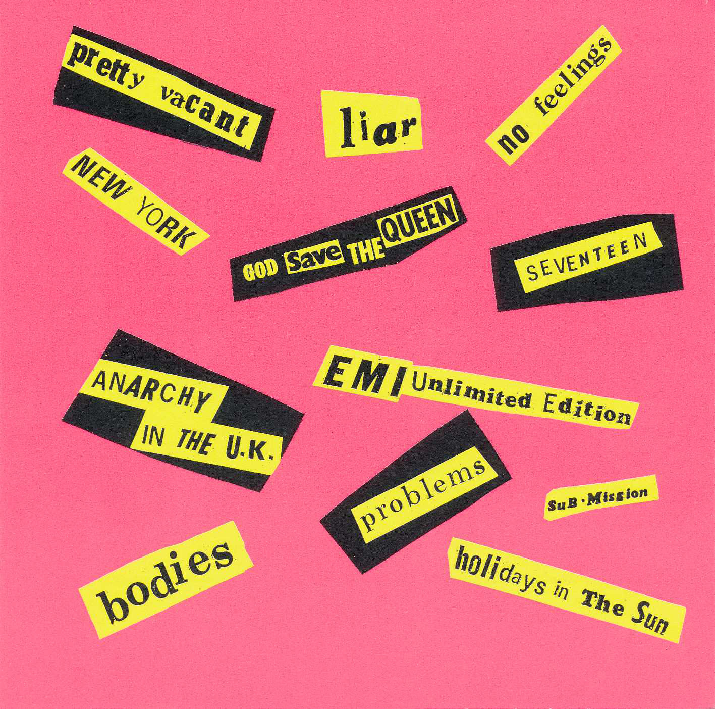
The band’s style of music was well represented by art student and anarchist Jamie Reid who had developed his unique collaged ‘ransom note’ typography whilst art directing a radical political magazine. In the ’70s graphic designers needed to commission a typesetter to create the type and they wouldn’t see what it looked like until it came back as finished copy printed out on a sheet. Instead Reid cut letters out of newspapers and magazines, collaging them together to be photographed. By doing this he could see what he was creating as he went along, trying out different font styles and sizes and seeing the results instantly. Treating type as if it was a photograph also freed him from the restrictions of typesetting within a structured grid. Reid designed the band’s logo and many of their record covers.
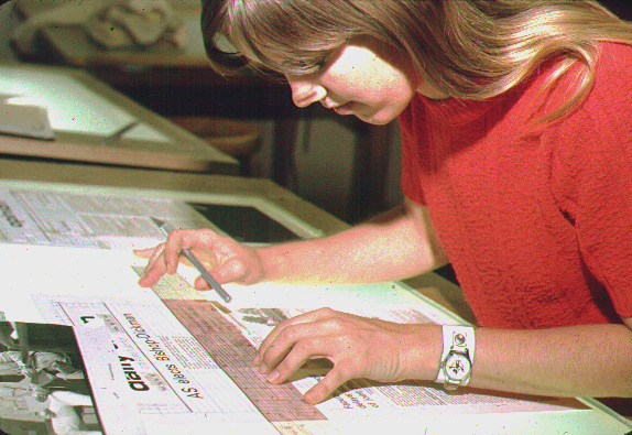
Above ‘Typesetting and paste-up, 1970 style’, by Wayne Overbeck, click on the title to see the full typesetting process.


At the time Reid’s DIY style was considered shocking and uncontrolled but the influence on design has been far reaching and subsequently widely emulated.
Vinyl records were mass produced, disposable items (although treasured by their owners), a 45″ Sex Pistols single cost about 70p. We didn’t realise at the time that they would go on to become such significant pieces of work, charting the start of a major art and design movement which would change the face of Britain.
Barney Bubbles (Colin Fulcher) was also subverting the Modernist style in his work as the Stiff Records designer where he created record sleeves for Elvis Costello, Ian Dury & the Blockheads and the Damned.
Elsewhere Postmodernism was taking the form of New Wave Design which was championed in Switzerland by Wolfgang Weingart and in Holland by Gert Dumbar. The DIY design ethos gained new impetus with the arrival of the Apple mac in the 1980s which gave designers direct access to typefaces and started a whole new debate about ‘ugly’ design.
Below the contrast between the clean structure of Modernist design and DIY style of Punk.


2019 update
Is history repeating itself?
Punk emerged as a reaction to the rigid restrictions of Modernism and its style ripped up the rules of Swiss minimalism and neutral sans serif typography. As traditional attitudes came to be considered outdated, society rebelled against the mainstream and demanded change. It feels like we are at a similar turning point today, both culturally and typographically. Can we look to history for parallels in how graphic design and cultural attitudes are changing today?
Trends today
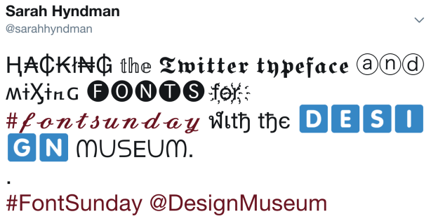
The clean structure of Modernist design from the 1950s and 60s is a style that returned and has become pretty ubiquitous in the last decade, especially in the world of typography. We’re now reaching a point where the dominance of minimalist or “app style” sans serif type is starting to wane and a new aesthetic is emerging. Take a look around and there is plenty of evidence to suggest that history is repeating itself. 1970s curvaceous type with swashes and Herb Lubalin inspired ligatures are becoming increasingly popular from Instagram to branding. And a DIY punk attitude is emerging from the ground up as design tools are becoming ever more democratised; from slapping ‘instant’ fonts onto Instagram stories and Snapchat, to hacking your Twitter and Insta feeds with custom fonts made possible by emoji technology.
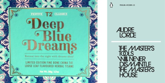
Above: 2018 T2 tea packaging, 2019 book cover, both using 1970s style typography.
Sarah Hyndman is the founder of Type Tasting, which she launched on February 14th 2013 with an evening of ‘Typographic Swearing ’n’ Cussing’, as an antidote to the saccharine sweet commercial romance of Valentine’s Day. She has been interviewed on the topic by Dazed & Confused “How to start a revolution with Comic Sans” and Design Week “Punk was the anti-Helvetica”.
