Tag Archives: typography

The surprising story of the ampersand & its multiple personalities

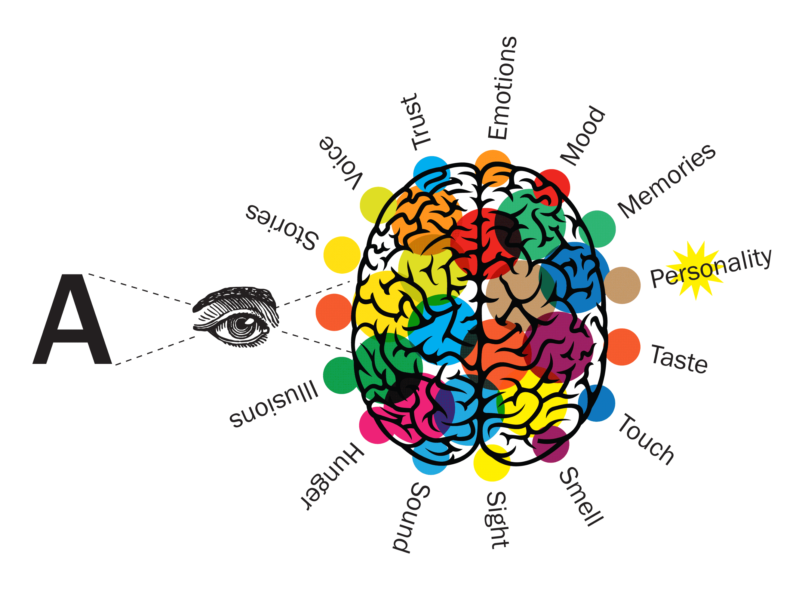
An ampersand is an invitation to imagine what will come next. It is a continuation of a conversation or story, but without the context of knowing what went before you can choose where you would like it to go. When the symbol stands alone it is still communicating a huge amount of information from its form and its shapes; is it hand-written, is it old-fashioned and traditional, is it minimalist and modern? Every typeface tells a story independently of the words it spells out.

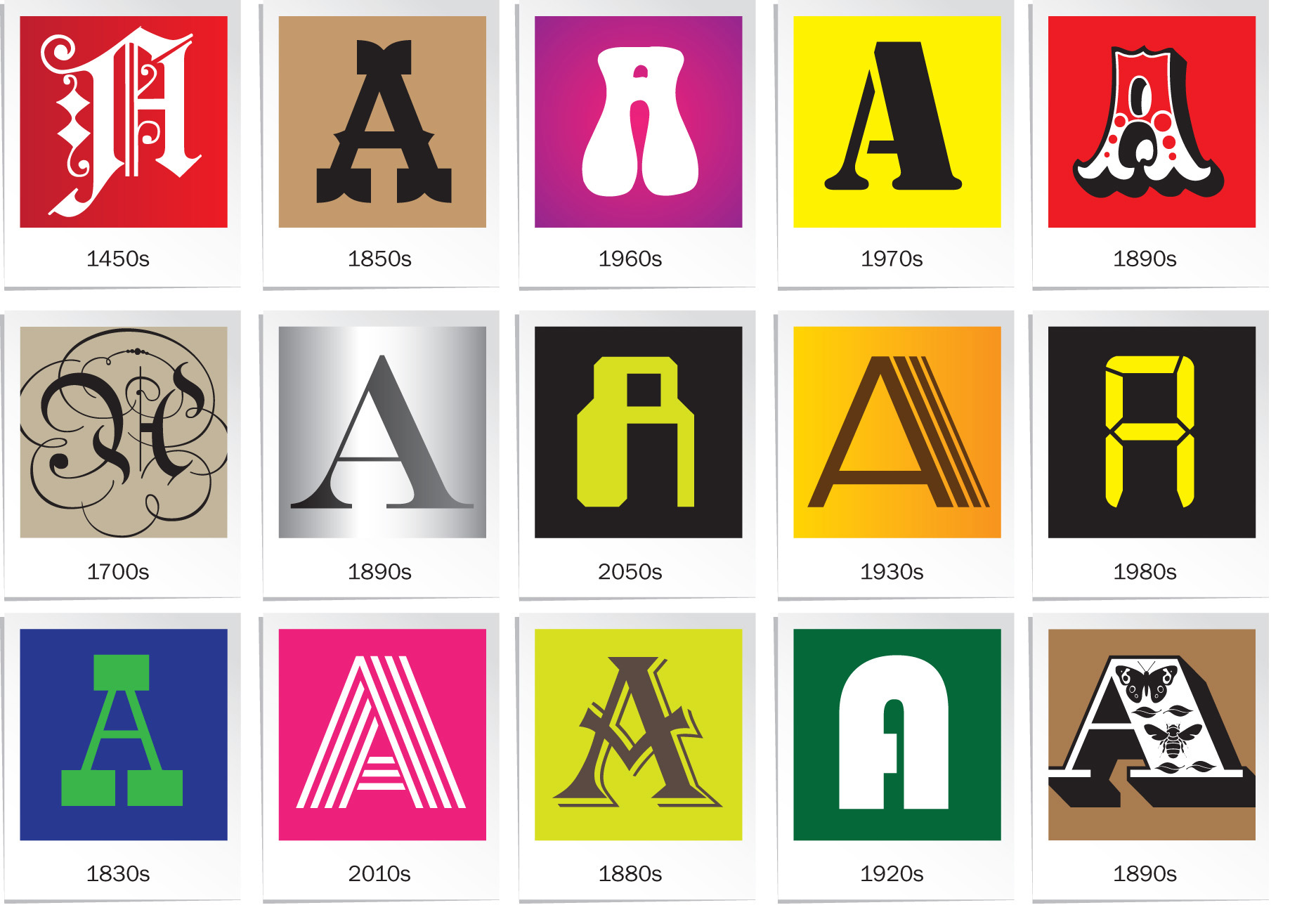
The ampersand is sometimes considered to be the 27th letter of the Latin alphabet. It comes from the letters ‘et’, Latin for ‘and’. It’s a character that there is wide affection for and it gives a glimpse of the personality of a typeface without committing to be a particular letter. The ampersand takes a wide range of shapes and forms, and it is the skill of the human brain that enables us to recognise that each of these still says ‘and’.

Continue reading

Experience the emotional impact of type: Mood at MAX multisensory installation

Type Tasting installation at Adobe MAX in Los Angeles

Type Tasting created a large-scale multisensory installation for Adobe Fonts at the Adobe MAX conference in Los Angeles from 2nd to 6th November 2019.

“F*!*ing genius!”

Visitors were immersed in the mood of different typefaces through all of their senses. At each station they were invited to put on headphones, to smell a scent in a jar or by flipping the pages of a book, to eat a small taster and to feel a texture. Each set of stimuli was designed to bring a mood to life in the participant’s imagination. There was curiosity and intrigue as the first visitors arrived and they were soon returning with groups of friends saying “you have to try this”.

This is a multisensory installation featuring a selection of booths designed for participants to experience the emotional impact of type. Each booth immerses you in the mood of a typeface with sound, smell, texture and taste.

Continue reading

How Punk changed Graphic Design and is history repeating itself?

Punk emerged as a reaction to the rigid restrictions of Modernism and its style ripped up the rules of Swiss minimalism and neutral sans serif typography. As traditional attitudes came to be considered outdated, society rebelled against the mainstream and demanded change. It feels like we are at a similar turning point today, both culturally and typographically. Can we look to history for parallels in how graphic design and cultural attitudes are changing today?

Continue reading

How designing for all the senses has more impact on mood

We absorb information through all of our senses simultaneously. This speeds up our ability to judge situations and react quickly and is fundamental to our ability to recognise signals and communicate. This played a vital role in human survival when our ancestors needed to respond to danger quickly, often relying on sound or smell when it was dark and a large proportion of our genes are still devoted to detecting odours.

Continue reading

Using Typography to Hack Your Brain

The psychology of deliberately making a font hard to read

A central intention of design today is to reduce cognitive load, the amount of effort the brain needs to understand something, so that communication and comprehension are quick and easy. So it was a bit surprising when a typeface specifically designed to be hard to read recently made headlines in the design world. Why would anyone purposefully make a font difficult to read, you might ask, when developments in printing technology and type design have strived for centuries to make words more, not less readable?

Continue reading

Take part in the Typographic Interventions project

What is a typographic intervention? What if it’s not what it says on the tin? Can typography alter your experiences, or nudge you to change your behaviour?

This year we are exploring the potential for creating typographic interventions that initiate positive behaviour change. You are invited to take part in typographic research. Some of the experiments you will take part in are in their early proof of concept stages, for others data is being gathered potentially to be published as a future collaborative study.

Continue reading

Experience ‘Pride, Prejudice & Perceptions’ at the British Academy


Pride, Prejudice & Perceptions is an interactive sensory exploration of Jane Austen’s Pride & Prejudice, created by AVM Curiosities & Type Tasting for the British Academy’s Literature Week.

Taking inspiration from the typography found in three editions of this classic novel, Pride, Prejudice & Perceptions uses type, sound, sight and scent to serve one story three ways.

Continue reading