
An ampersand is an invitation to imagine what will come next. It is a continuation of a conversation or story, but without the context of knowing what went before you can choose where you would like it to go. When the symbol stands alone it is still communicating a huge amount of information from its form and its shapes; is it hand-written, is it old-fashioned and traditional, is it minimalist and modern? Every typeface tells a story independently of the words it spells out.
The ampersand is sometimes considered to be the 27th letter of the Latin alphabet. It comes from the letters ‘et’, Latin for ‘and’. It’s a character that there is wide affection for and it gives a glimpse of the personality of a typeface without committing to be a particular letter. The ampersand takes a wide range of shapes and forms, and it is the skill of the human brain that enables us to recognise that each of these still says ‘and’.
The combination of two letters to create a new, single character is known as a ligature. This is something that can be seen in the handwriting of scribes who would combine frequently used letter combinations to speed up the writing process. With the advent of printing, the use of ligatures continued because it made the printing process more efficient — one single printing block could be used instead of two, speeding up the laborious process of setting every letter by hand. Some ligatures, for example the ‘fi’ ligature, create beautiful new combinations where the individual letterforms sit next to each other uncomfortably.
Every typeface has a personality that we are able to recognise instinctively. We learn about a typeface’s personality every time we see it used, from the context we see it used in. For example traditional, serif style type has been around since the 1400s when books were expensive and the domain of scholars. As a result we might associate these styles with knowledge, wisdom and timelessness.
The personality of a typeface creates a first impression of the words we are about to read. This tells us the style in which to read them, and might clue us into whether we can trust them or how urgent it is that we act on them now. This is a form of non-verbal communication similar to the clothes a person wears, their body language and their tone of voice.
An ampersand offers a glimpse of a typeface’s personality, distilling it down to a simple and graphic icon.
Sarah Hyndman, author of the bestselling ‘Why Fonts Matter’ created the Type Tasting Font Census survey, which enables her to profile the personalities of a range of typefaces. Each has received between 250 and 350 responses, mostly from the UK and the US.

Although these two typefaces were designed four centuries apart, both ligatures are true to the origins and the ‘e’ and the ‘t’ can be clearly seen. For other typefaces the ampersands become more stylised and take on a new form of their own.
The italic form of Garamond mirrors the cursive, handwritten scripts of the Renaissance. This ampersand takes centre stage as it announces the combining of two parties with an ornate flourish, (you can easily imagine the hand-gesture that would accompany it). Type Tasting Font Census results show Garamond Italic is rated as “artistic, a performer, classic, arty”
The more practical and minimalist appearance of the conjunction in Trebuchet contrasts with Garamond Italic. Type Tasting Font Census results show Trebuchet is considered to be “an everyman, practical, and honest”

The typeface Trajan is inspired by the carvings on the Trajan’s column in Rome, which dates back to around 110 AD. The combination of its classic shapes and its recurring use in situations of ‘epic’ status such as movie posters (the titles for many epic Roman movies are set in Trajan) convey the personality traits of a leader, a thinker who is classic and formal.
In contrast to the timeless, flowing curves of Trajan, Cinema Italic is a typeface constructed from angles that gives the impression it is made by, or for, machines. It is described as having the personality of a commander, a doer, somebody who is self-controlled and logical. To me its ampersand looks like a figure out of a sci fi movie.

Bauhaus is a typeface that many graphic designers associate with the influential art school of the same name; of Herbert Bayer’s universal alphabet experiments and an ideology that inspired Modernist design and architecture. Imagine my surprise when the Type Tasting Font Census survey results started to come back describing it as a jester, friendly, silly and a clown? I realised that its inclusion in the default Microsoft font menu has separated it from its history, leaving it to be judged purely on its stylised shapes. The typeface is based on geometry and this is perfectly represented by its ampersand.
Comic Sans is the typeface everybody loves to hate and the cause of many font faux pas. For example when CERN announced the discovery of the Higgs Boson particle ‘Comic Sans’ trended on Twitter higher than the discovery itself. It’s often chosen as the closest option to everyday handwriting in situations when choosing a more formal font might feel like overdressing. It has a personality that conveys qualities of a comedian, an everyman, it is considered a novelty and comfortable. I think the slightly lop-sided and hand drawn ampersand represents this well.

Typefaces like Didot first appeared in the late 1700s. Their fine serifs and hairlines were made possible by advances in both printing technology and paper quality; it would not have been possible to print these on the coarse textured paper of earlier times. They have been seen on the mastheads of fashion magazines such as Vogue and Harpers Bazaar and this has given them associations with fashion and elegance. The personality of Didot is well represented by the ampersand, it is considered to be sophisticated, polished, and intellectual.
A new advertising industry was born out of the Industrial Revolution in England, which required the delicate typefaces previously used on the pages of books to be used at a new and huge size that could be seen from a distance on a poster or an advert. Type designers took the delicate Didot-style typefaces of the day and expanded them to create Fat Face fonts such as Bodoni Poster. These have a larger-than-live personality that comes across as a performer, someone who is confident and dramatic.
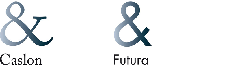
William Caslon created typefaces in London in the 1700s which travelled the world and settled in the colonies and trading posts of the British Empire: Caslon was used for the first Declaration of Independence and appeared on the Presidential Seal in the White House. Its serifs and letterforms, which nod to the hand-written origins of typefaces, convey a personality that is trustworthy, informed, knowledgeable and traditional.
Futura is a geometric typeface and its style is reflected in its well-balanced ampersand. It was designed in Germany in the 1920s and at the time it was intended to reflect efficiency and forward thinking. Now, almost a century on, it still has associations with modernity and it makes a regular appearance in sci fi movies. The Type Tasting Font Census survey reveals it conveys the personality of a leader and an idealist who is modern, capable and practical. The personalities of many typefaces evolve over time as they gather new associations or become linked with the past, but it seems Futura has stayed true to its origins.
Sarah Hyndman is the author of the bestselling ‘Why Fonts Matter’ and the founder of Type Tasting. She can be found on Twitter and Instagram.
