
Tag Archives: typography
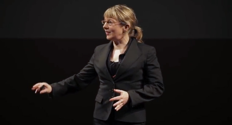
TEDxBedford Sarah Hyndman
![]()
Wake up and smell the fonts
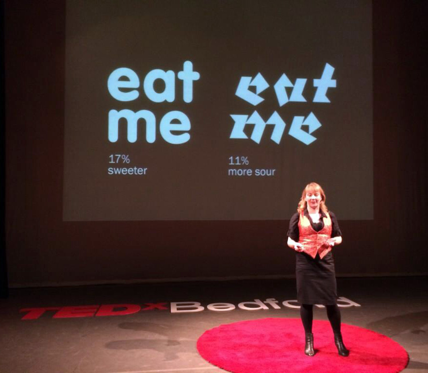
Sarah shares with us a story of type and invites us to consider our emotional response to the printed word. Each font/typeface has a personality that influences our interpretation of the words we read by evoking our emotions and setting the scene. We all understand this instinctively but it happens on a subconscious level. Sarah shows us that conscious awareness of the emotional life of fonts can be entertaining and ultimately give us more control over the decisions we make.
This talk was given at a local TEDx event, produced independently of the TED Conferences.
We are all type consumers and typefaces, or fonts, play a vital role in our everyday lives. They help us to navigate, they help us to make choices, they help us to shop, they keep us safe and sometimes they even play a game of sleight of hand. It is hugely important as the world involves that all of those involved in the future communication and technology understand the power of type.
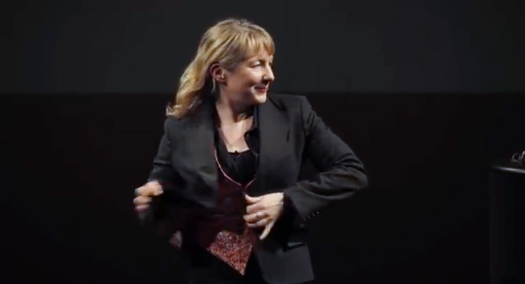
Just because I’m talking ‘typography’ there’s no need for me to be all serious and ‘Times New Roman’ about it.
“A brilliant #type talk. Loved your transformation from Times New Roman. True show it not say it.” Sandra Dartnell @mdh_sandra
Talking ‘fonts’ on BBC Three Counties Radio

I was recently invited to the BBC studios for a short chat with Nick Coffer about ‘fonts’ and he gave the book a good plug. I’m on at 1:37 after Elvis and it lasts for around 11 minutes.
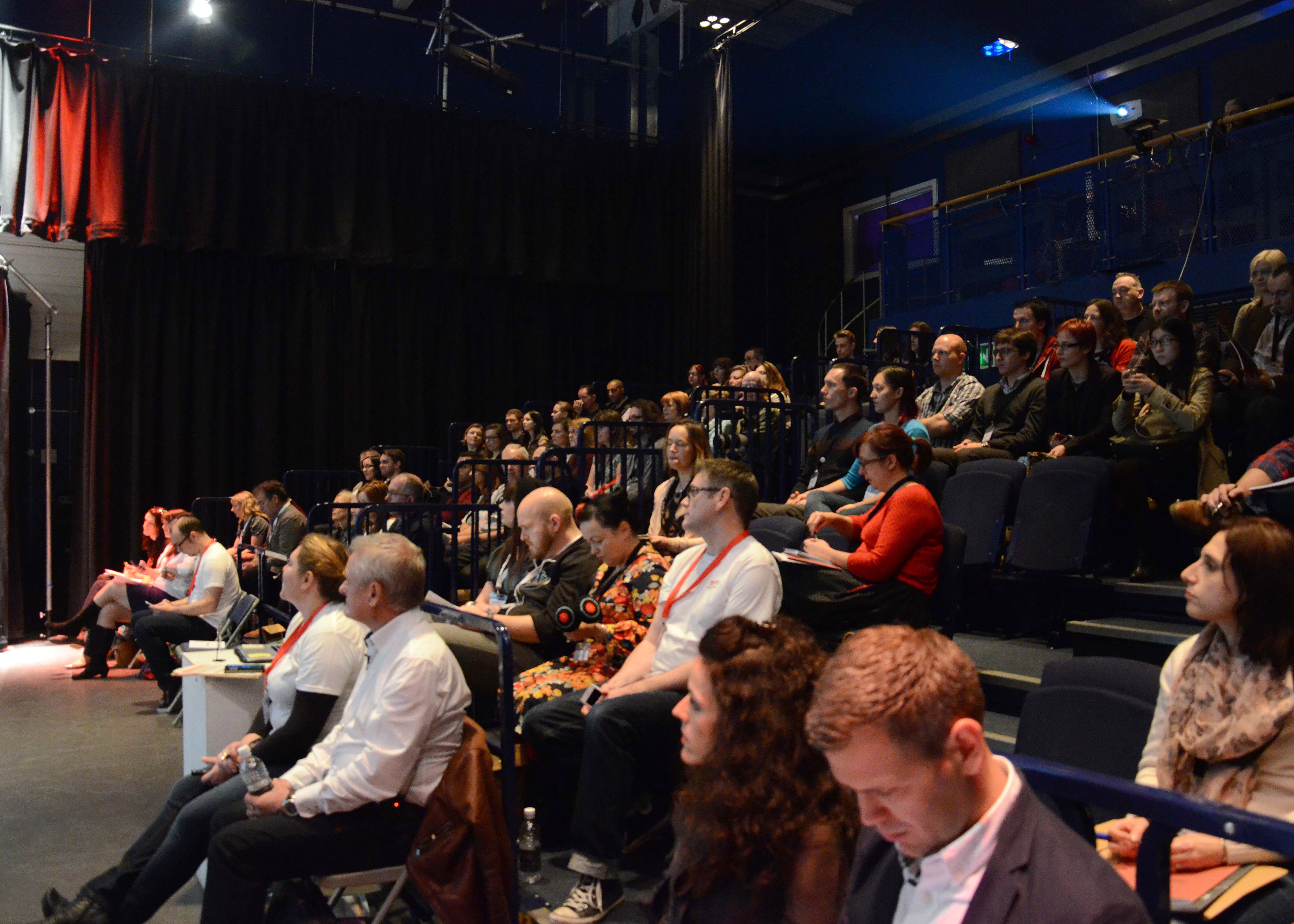
Behind the scenes of TEDxBedford
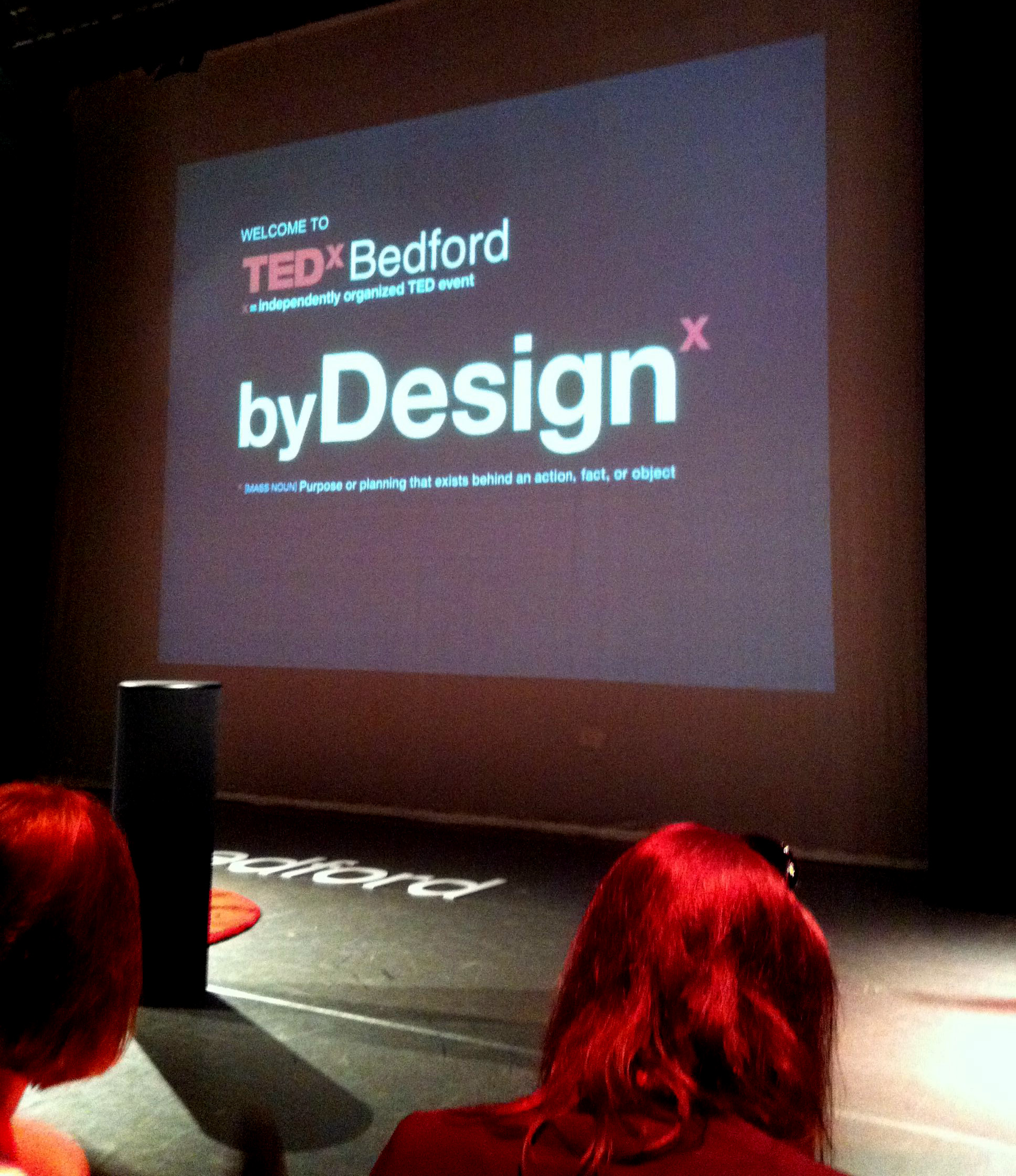
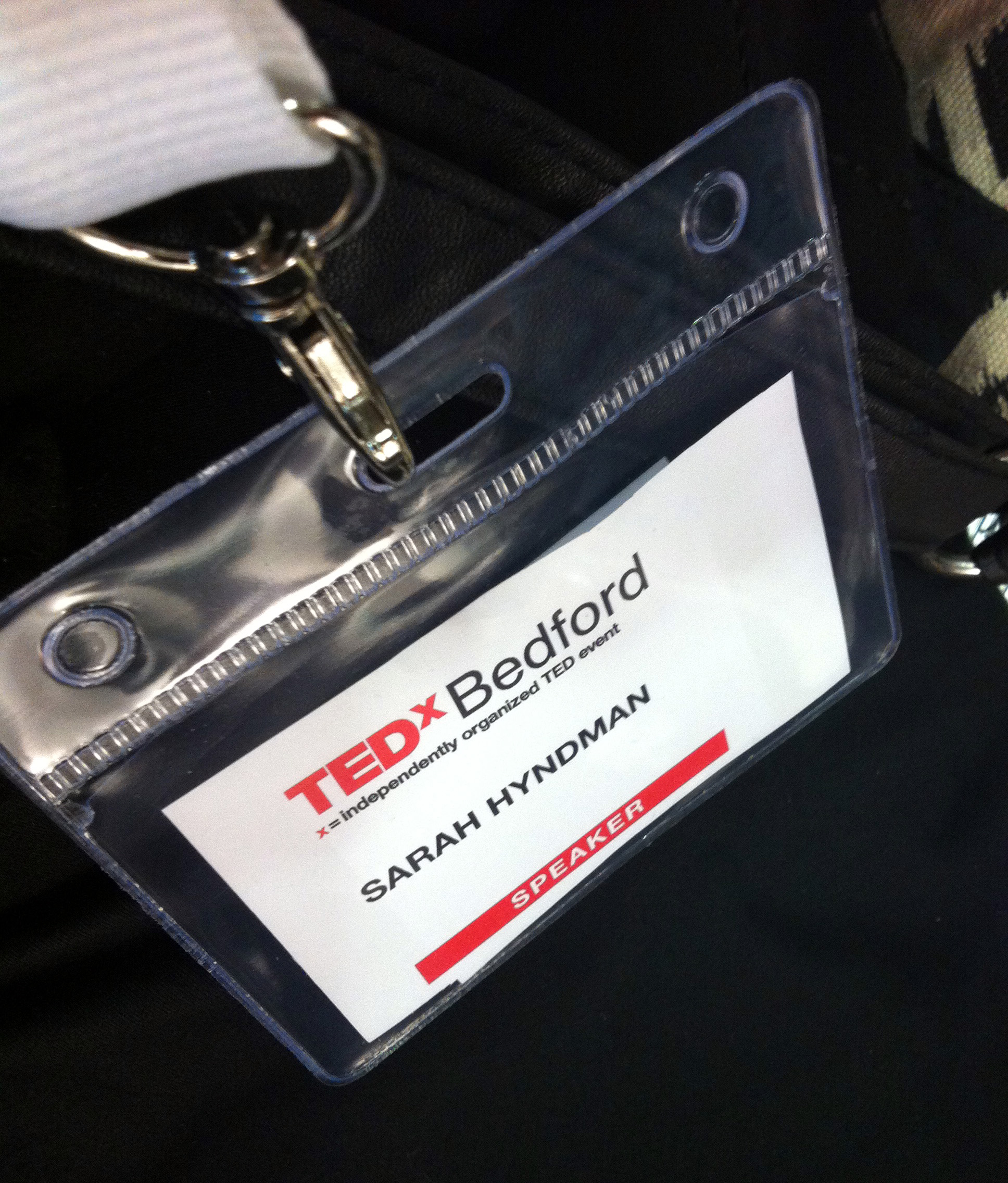
I am privileged to be a speaker at TEDxBedford on Saturday 15th November. The films of the talks will be available in a month, meanwhile here’s a glimpse of my experience from behind the scenes.
A year ago with the LDF at the V&A


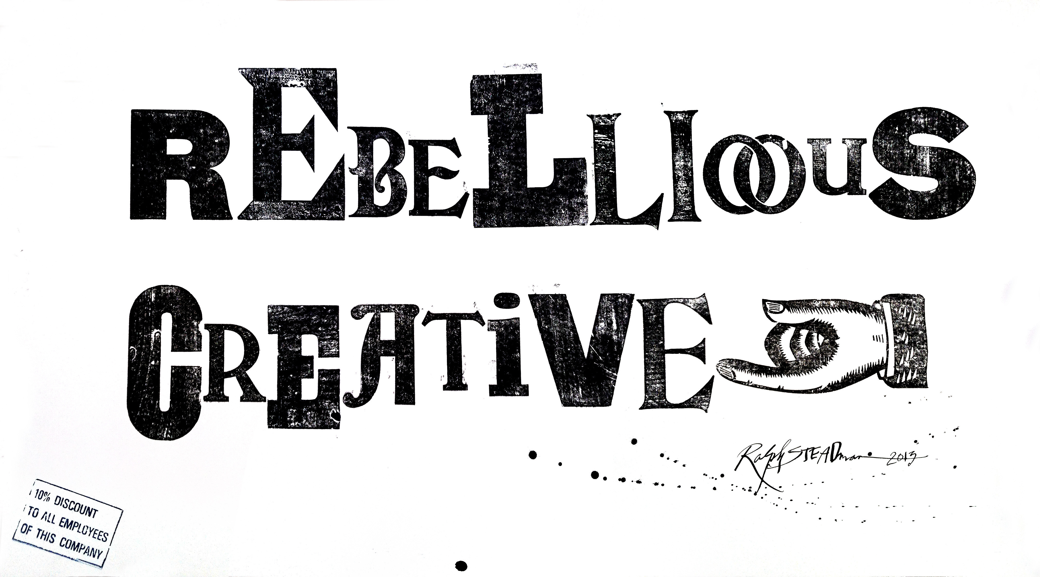
For the London Design Festival a year ago, Type Tasting posed the question “what’s your creative London?”. Stunning words were created for the exhibition by a wide range of designers and non designers of all ages and from around the world. We were delighted that Ralph Steadman and Alan Kitching created words in their own inimitable styles. All of the words were displayed at the V&A.
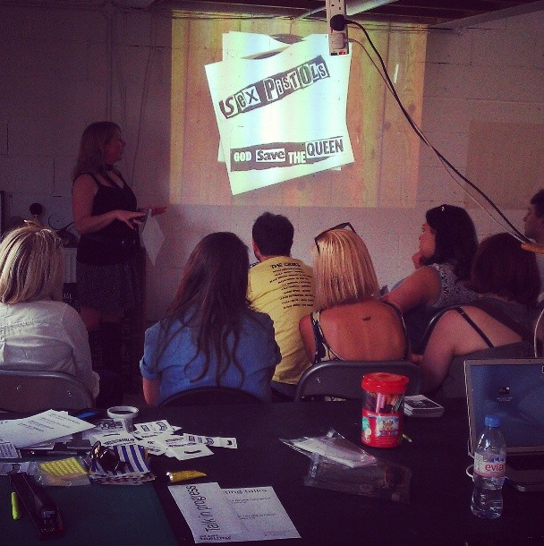
Wake Up and Smell the Fonts at TEDxBedford
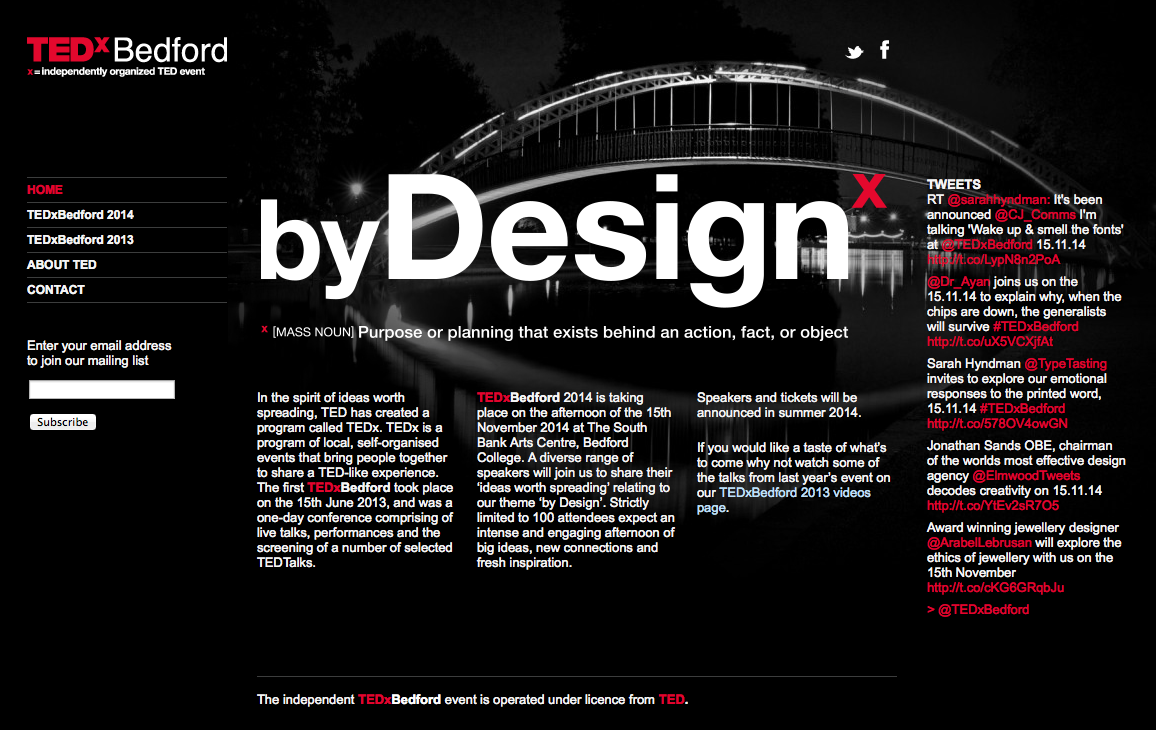
Sarah Hyndman, Wake Up and Smell the Fonts at TEDxBedford
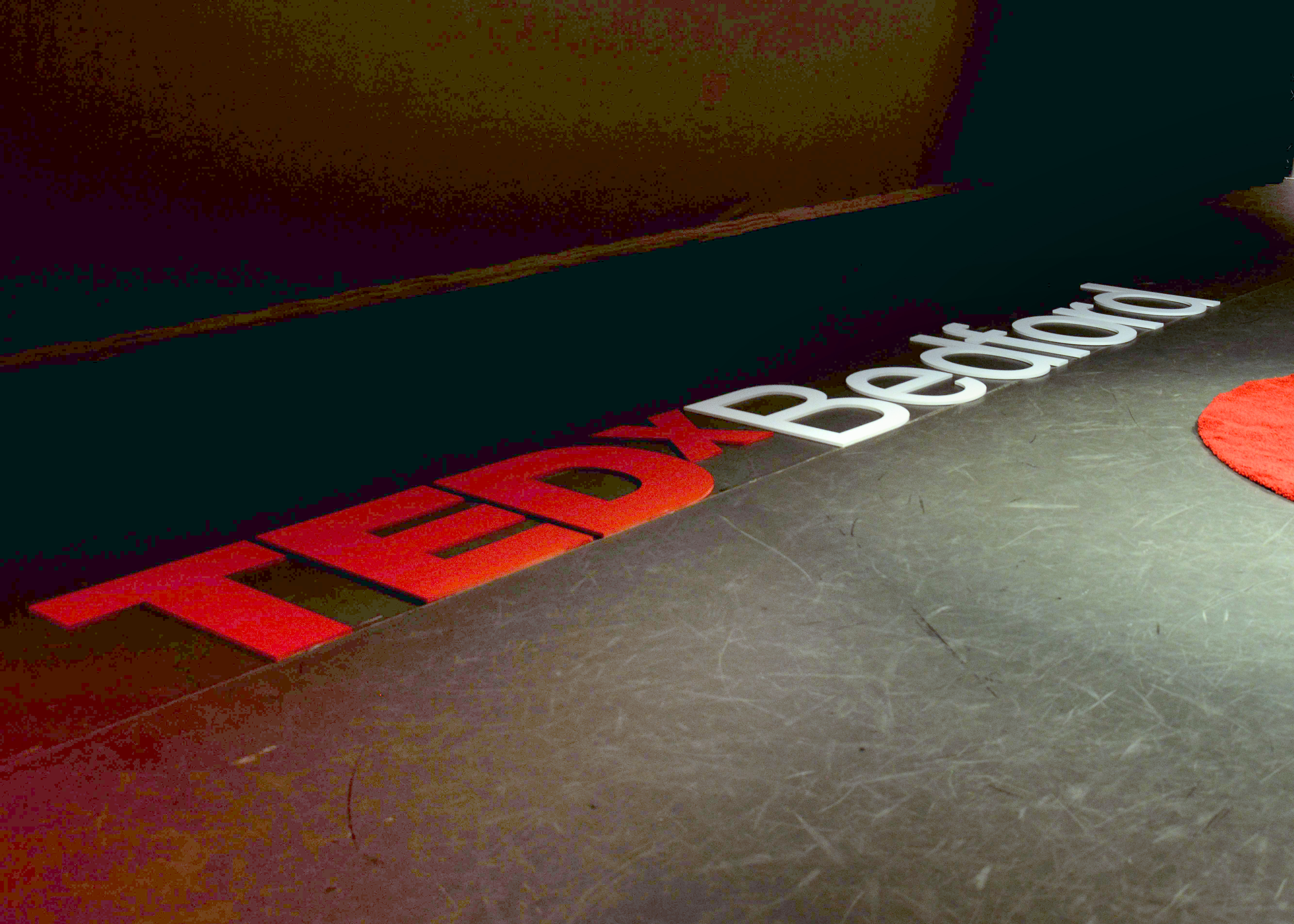
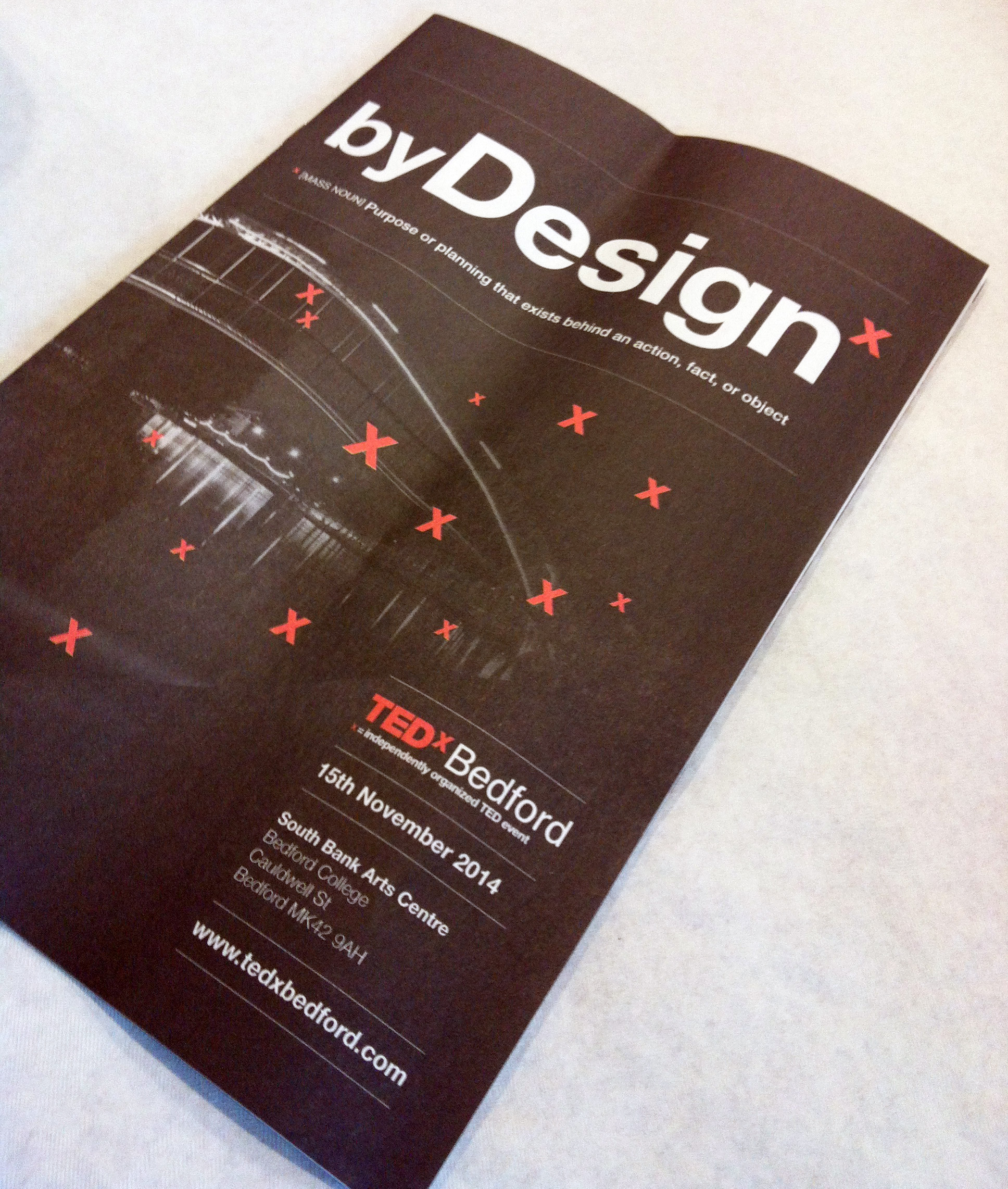
TEDxBedford 2014 is taking place on the afternoon of the 15th November 2014 at The South Bank Arts Centre, Bedford College. A diverse range of speakers will join us to share their ‘ideas worth spreading’ relating to our theme ‘by Design’.
Designer Sarah Hyndman explores typography as we experience it in our every day lives under the banner of Type Tasting. Since the launch in 2013 she’s curated an exhibition at the V&A for the London Design Festival, been interviewed on Radio 4’s Today, taken Type Tasting to South by Southwest in Austin, Texas and has been commissioned to write a book.
Sarah has been a graphic designer for over 15 years, working in agencies before setting up design company With Relish. After studying an MA in Typo/Graphics at the London College of Communication she was invited back as a guest tutor.
Sarah will share with us a story of type and invite us to consider our emotional response to the printed word. Each font/typeface has a personality that influences our interpretation of the words we read by evoking our emotions and setting the scene. We all understand this instinctively but it happens on a subconscious level. Sarah will show us that conscious awareness of the emotional life of fonts can be entertaining and ultimately give us more control over the decisions we make.
‘Typography Lab’ D&AD workshop
![]()
I’ve been having fun working with the D&AD to write a new typography workshop with them called ‘Typography Lab’. The first session runs in September in their wonderful new workshop space near Brick Lane. It’s going to be a jam packed day of exploring, choosing and customising typefaces in typical Type Tasting style.
The Session
Join typography expert Sarah Hyndman on a journey into the world of typefaces. Learn to use “the machine”, a proven process for choosing the right typeface, experience the joy of “typography yoga” and take the font “taste test”. Discover how to use typefaces to make an emotional connection that enhances the impact of your designs.
The Leader
Sarah Hyndman, Graphic Designer and Type Tasting Founder
Sarah Hyndman is an experienced graphic designer with over 15 years’ experience including running the Experimental Typography course at the London College of Communication. Sarah organised the creative typography exhibition at the V&A, as well as setting up her own design company With Relish in 2003. She is currently writing a Type Tasting book.

The Outcome
• Understand how typography delivers messages and creates emotional connections
• Apply a proven process for choosing typefaces
• Talk confidently about typography with clients and your team
• Explain how small changes to your typeface can radically change the associations it generates
• Communicate with your team to maximise the effectiveness of the briefing process and outcome
Who is it for?
Typography Lab is for anyone who is curious about how typography can be used to elicit an instinctive response. It’s perfect for junior creatives and non-designers and explores the experience of typography from both the designer and the readers’ viewpoint.
Photo of Sarah by Rita Abreu
From Dalston to Punk, a weekend of talks
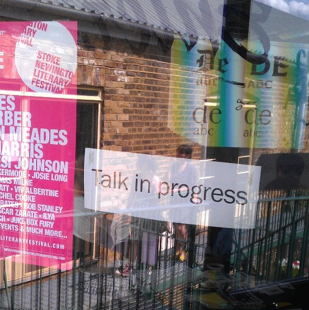
It was a weekend of talking typography with four Type Tasting talks, three of which were sold out ahead of time. The talks were 45 minutes with slides, props and quizzes which revealed how typography evokes associations long before the words have been read. For those of you who came along thank you for being so interactive and for asking great questions, the links and references are below.
On Saturday Sarah Hyndman shared her observations on the typography seen in Dalston, London, and explained what this reveals about the area and how signage is the visual DNA of an area.
“Thank you for the very enjoyable Dalston Type Safari talk on Saturday. A unique & interesting way to ‘read’ the city.” Sophie Nellis
“Thanks for the ‘type tasting’ talk you gave at the weekend as part of the Stoke Newington Literary Festival – great fun, and I enjoyed it.” Paul Richards
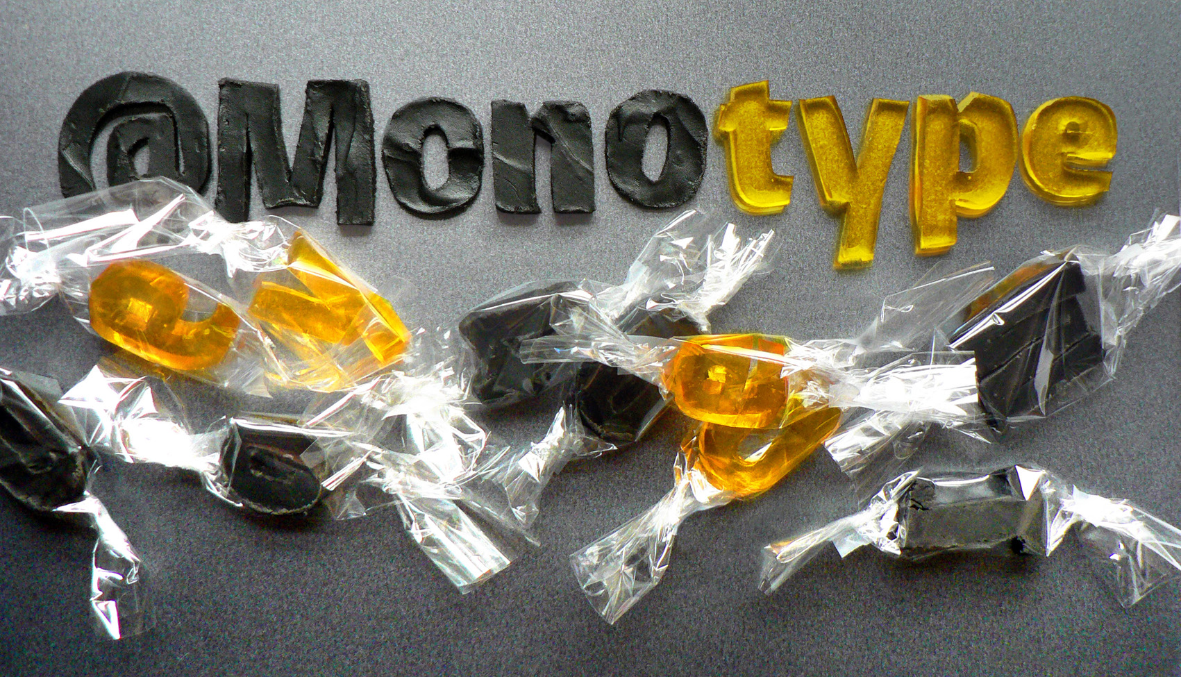
What would Monotype’s Burlingame typeface taste like?
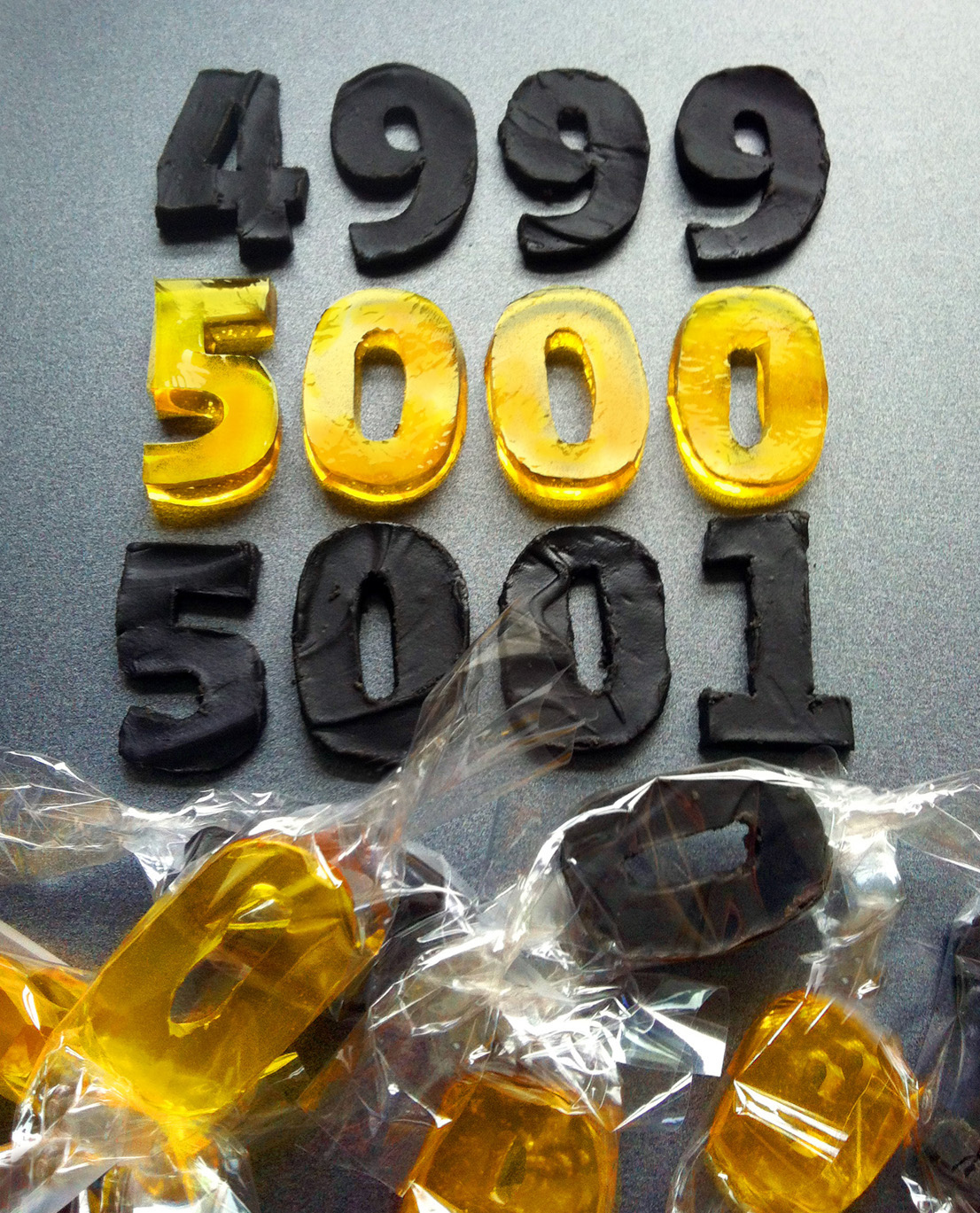
To celebrate their 5,000th Twitter follower, Monotype commissioned Type Tasting’s Sarah to create an edible version of their newest typeface release, Burlingame.
Burlingame was developed by Carl Crossgrove following pioneering investigations by Monotype into the legibility of vehicle displays. The research revealed a set of optimum criteria for dashboard display fonts: large counters and x-heights, simple shapes and a loose spacing of characters. It was found that a humanist sans serif typeface with these characteristics reduced male drivers’ glance time significantly.
Fonts: A love story. A talk about typography by Sarah Hyndman.
Type Tasting founder Sarah Hyndman explains why she thinks fonts and typefaces matter, how they add richness to our lives but can also be used to influence us. She does this by telling stories of her experiences from being a child to growing up and becoming a ‘typography professional’ in this entertaining 10 minute talk.
“…as a bit of a type geek myself, your take on the topic is pitch perfect and inspirational” Daphne D
Sarah explains that “I first fell in love with type in the 1970s, an era I remember as being in faded Polaroid colours and always hot like that summer of ’76”. She describes how, as a child, she was transfixed in a sweet shop looking at the words popping and fizzing with excitement on the sweet wrappers. How she later went on to become a ‘typography professional’ or a graphic designer, which is where she learned how type evokes emotions and that these can transform the meaning of a word. Also that type can enchant, inspire wonder…and coerce.
