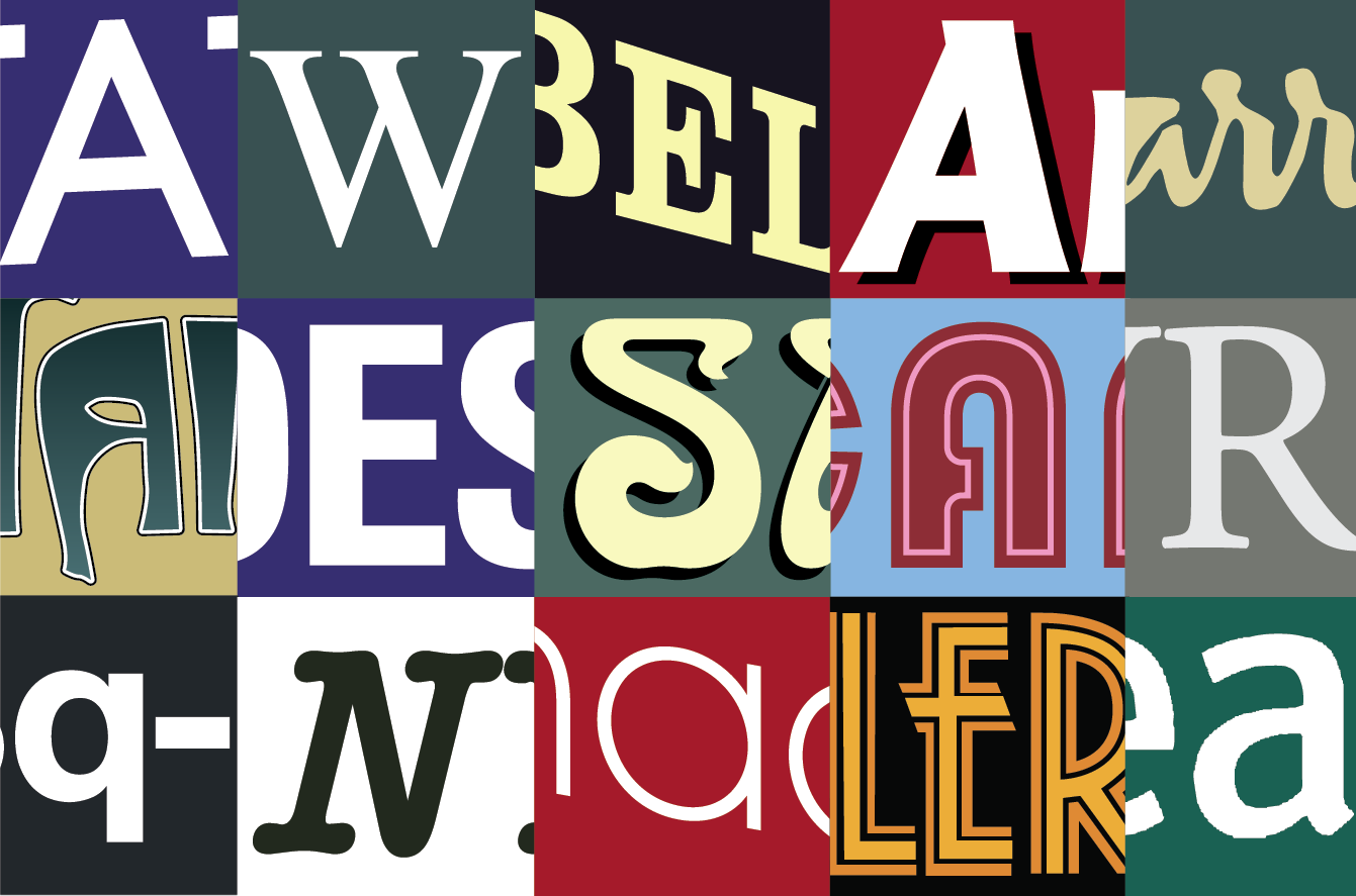
Typography bingo: cities
Can you recognise the three capital cities from the signage typography above? What landmarks or typefaces give you clues and what are they? Hints to help you below…
Typography bingo: cities
Can you recognise the three capital cities from the signage typography above? What landmarks or typefaces give you clues and what are they? Hints to help you below…

This is a sneaky peak for Type Tasters before public booking, but shh don’t tell…
To coincide with the London screenings of the Sign Painters movie, Mike Meyer, one of the film’s stars, is coming to town to deliver an intensive two-day sign painting workshop.
The workshop will be hosted in the Type Tasting studio and is brought to you by Ghostsigns.
To all of you test pilots who threw yourselves into the unknown so enthusiastically, the brilliant volunteers, everybody who came along to the big public Type Tastings, or booked bespoke tastings for your organisations. To those of you who submitted such beautiful work for the exhibition at the V&A, and everybody who tweeted, blogged, reviewed and wrote about it. Thank you also for all the encouragement, enthusiasm, commissions, challenges and the invitations. Cheers! Sarah.


Type Tasting launched officially on Valentine’s Day 2013 with an evening of Typographic Swearing ‘n’ Cussing. By contrast 50 year six kids participated in a typographic tour of Hoxton Hall’s history in with Hackney Wow.
You’ve taken Type Safaris through Islington and Dalston, talking typography and booze making for a perfect combination. And at the busy workshop at Pick Me Up at Somerset House we created a wall of inventively customised letters which had great feedback.


The question ‘what’s the future of type?‘ prompted diverse responses on Twitter, in Design Week, Creative Review and at the event at the St Bride Library. The next event was Type Tasting with the London Design Festival at the V&A with stunning submissions for the exhibition.
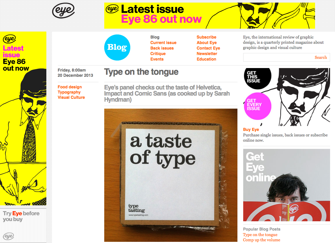
Eye’s panel checks out the taste of Helvetica, Impact and Comic Sans (as cooked up by Sarah Hyndman)
Designer Sarah Hyndman is known for her Type Tasting workshops – popular events at Pick Me Up and London Design Festival this year. For Hyndman’s latest project, A Taste of Type, she has reversed the approach by asking, ‘what does type taste like?’
The resulting edible letters, still in the prototype phase, boxed and mailed to a few associates, have been taste-tested and reviewed by Eye staff in our Shoreditch office: Jay Prynne (art editor), Janet South (editorial administrator), Simon Esterson (art director), John L. Walters (editor) and Sarah Snaith (editorial assistant). You can read about Hyndman’s intentions and recipes in her article ‘What does typography taste like?’
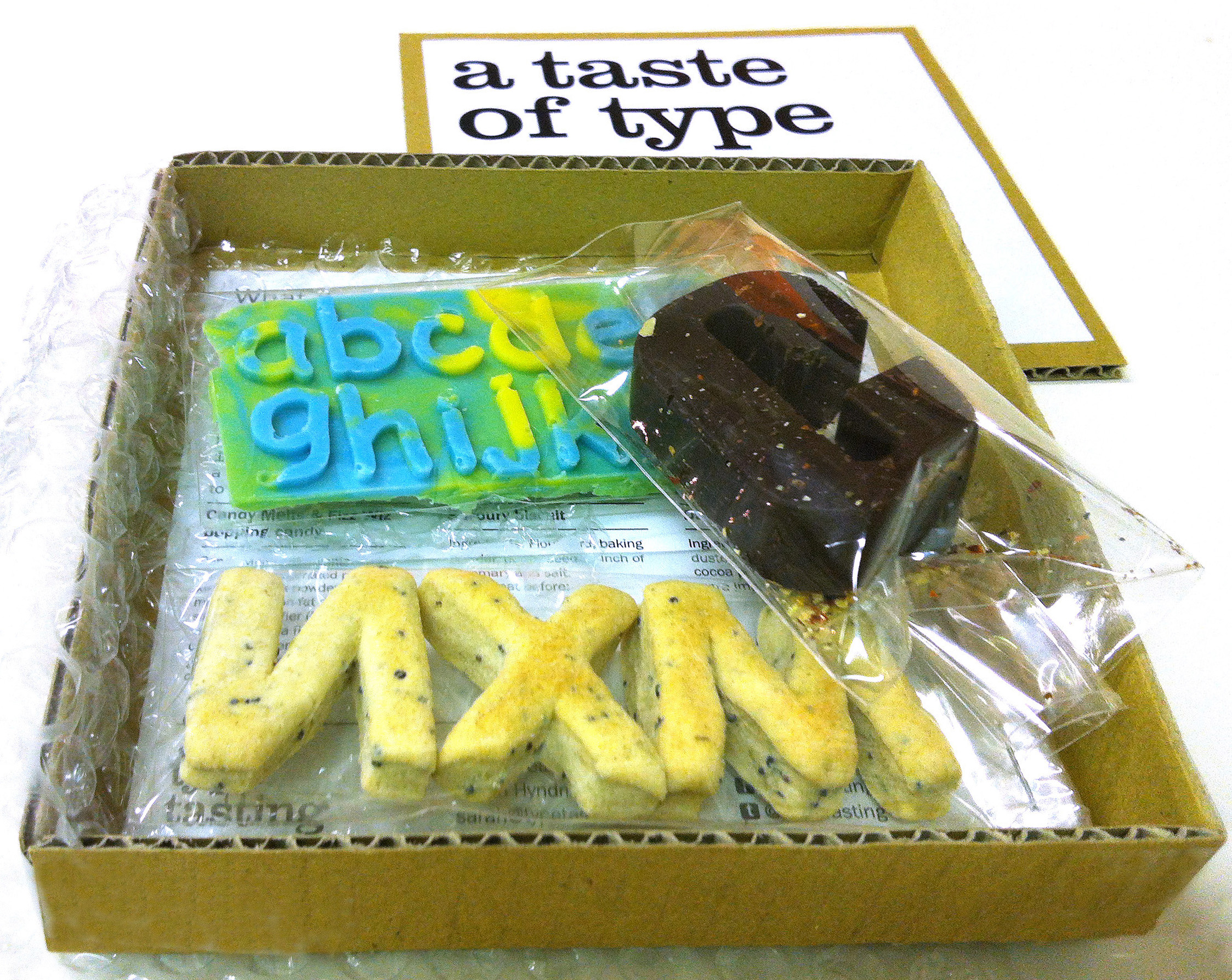
At Type Tasting I’ve been posing the question “what would type taste like?” I’ve put together a tasting pack to kickstart the discussion featuring Impact as dark chocolate laced with chilli, Helvetica as plain biscuits and Comic Sans as candy melts with popping candy.
The tasting pack comes complete with a chocolate box style description sheet introducing each typeface along with the suggested flavours. What do you think? What would your favourite typefaces taste like? Details of my suggestions with recipes are below…![]()

Today is 60 years since Abram Games designed the first BBC ident, nicknamed the ‘bat’s wings’. Click on the image above (or here) to see the BBC’s film of the idents from then to now.
The BBC logo has transformed through a range of styles and typefaces, sitting again today in the three square boxes that first housed the initials in the 1961 ident (can you namecheck the typefaces?).


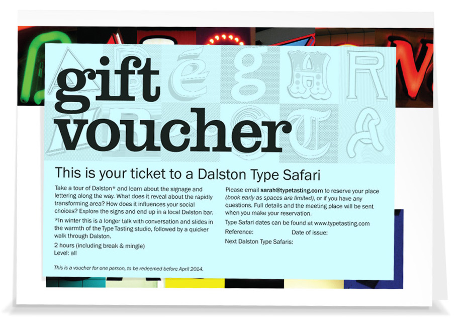
Gift Vouchers & new Dalston Type Safari Dates
Sunday 19th January, 6.30-8.30pm
Sunday 2nd February, 6.30-8.30pm
(book early as spaces are limited)
Safari ticket 1 person £20, includes souvenir map on the day
Safari ticket + gift voucher in a presentation card for 1 person £25, for 2 people £45 (UK). Please order by December 10th to receive the gift voucher before Christmas.

Check out the latest Type Tasting newsletter announcing the new suite of Type Tastings…
‘Typeface at the Rock Face’
By Sarah Hyndman
Originally published in Artrocker Magazine issue 134

In our everyday lives we are surrounded by fonts and use them to navigate through our environment, understanding instinctively that they communicate a great deal of the information before we’ve even read the words. We choose typefaces to express our personal style or to demonstrate our allegiance to a philosophy, music style or band.
This is possible because there is such a diversity of font designs which have absorbed a multitude of references and intended messages during their centuries of development. Type we use today is influenced by everything from stone carving, handwritten manuscripts, the evolution of the printing industry and now the plethora of designs available online. When we look at type we don’t just see the words, we also see the letter shapes which—much like fashion or cars—are loaded with associations.
Typefaces absorb layers of references and designers continue to use them in a way that reinforce these to help them communicate their message. We all interpret these meanings readily, often on an instinctive level, and we’ve been learning to do this all our lives.
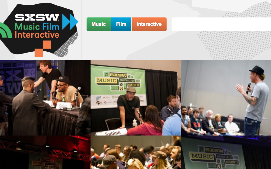
Type Tasting at SXSW, Austin, Texas
