Tag Archives: typography

Type Tasting at SXSW, Austin, Texas

ssss

Type Tasting at SXSW, Austin, Texas

Saturday March 8th
Type Tasting drop in workshops in which participants get creative to reinterpret letters inspired by streetsigns and signage from around the world. The variation of signage styles reflect social and historical development of typography in each region and will enable us to build up a visual representation of global typography trends. Participants will each be provided with a simple template for a letter which they will customise using a range of markmaking and collage materials. The event will be eight hours long, but participants can drop in at any time.
Speaker: Sarah Hyndman

Type Idol

Icon_TShirts©SarahHyndman

Type Idol

Band logos or album covers become iconic and result in a herd of spin off merchandising. We scribbled the logos on our school books, have the poster on our walls, wear the t-shirt, get the tattoo. They become so familiar that they become idols in their own right and can be reduced down to a simple typographic element and still be recogniseable.

How many do you recognise?

Continue reading

How Punk changed Graphic Design

SexPistols

How Punk changed Graphic Design
Sarah Hyndman on Punk, which first exploded in the 1970s and, at the time, looked like youthful rebellion.

In actuality it was part of the Postmodernist movement which began as a reaction to the rigid restrictions of Modernism. Its DIY ethos encapsulated the anti-establishment mood of the mid 1970s, a time of political and social turbulence. The former British Empire was dissolving and a new era in British music, fashion and design was beginning.

Taking the stage to articulate the feelings of a dissatisfied generation calling for change were the Sex Pistols, who played their first gig in 1975 at St Martins College of Art. Their outrageous behaviour and contempt for established conventions announced the beginning of Punk. The DIY ethos and uncontrolled, home made style was revolutionary at the time and launched a new era in British music, fashion and design.

sex pistols 1 sex pistols 5

(A side-note from the author: Be more Punk, a call to action in 2016.)

Continue reading

Top 5 spots for a typographic day out in London

B0042P 0006

Top 5 spots for a typographic day out in London
By Sarah Hyndman

1. London Transport Museum
This museum in Covent Garden is crammed with the informative typography that we have used every day for almost a century to navigate our way around the city. The buses and signage date from the 1920s to the present day and sit side by side, enabling us to compare the lettering and how it has changed over the years.

Photo ©TfL, from the London Transport Museum collection. http://www.ltmuseum.co.uk

©Kath Tudball

2. Highgate Cemetery
The inscriptions on the gravestones in this beautiful North London cemetery give a view of London’s social history dating back to 1839, with many prominent figures buried there. The lettering to be seen ranges from ornate Victorian script to the typographic simplicity of Patrick Caulfield’s headstone (above). Tours are open to the public all year round.

Photo by Kath Tudball

Continue reading

London = ‘25 Hr City’ built by Edward Hill

25HCITY final
25HCITY 1b 25HCITY 10b 25HCITY 6a

London = ‘25 Hr City’ built by Edward Hill

Process: Brainstorming / Exploration / Destruction / Preparation / Outlining / Heart / Crane / Building / Expanding / Pausing / River & Trees / Lettuce and Watercress / Conclusion

Continue reading

Type Tasting’s Sarah Hyndman on the BBC’s The Arts Hour

me on arts hour

Type Tasting’s Sarah Hyndman on the BBC’s The Arts Hour

“We hear from Sarah Hyndman about how new sign design in London is reflecting the cultural and economic changes in the city.” Interviewed by Nikki Bedi. Listen to the interview.

Continue reading

Type Tasting with the London Design Festival at the V&A

LDF workshop 053**_LR

Type Tasting with the London Design Festival at the V&A

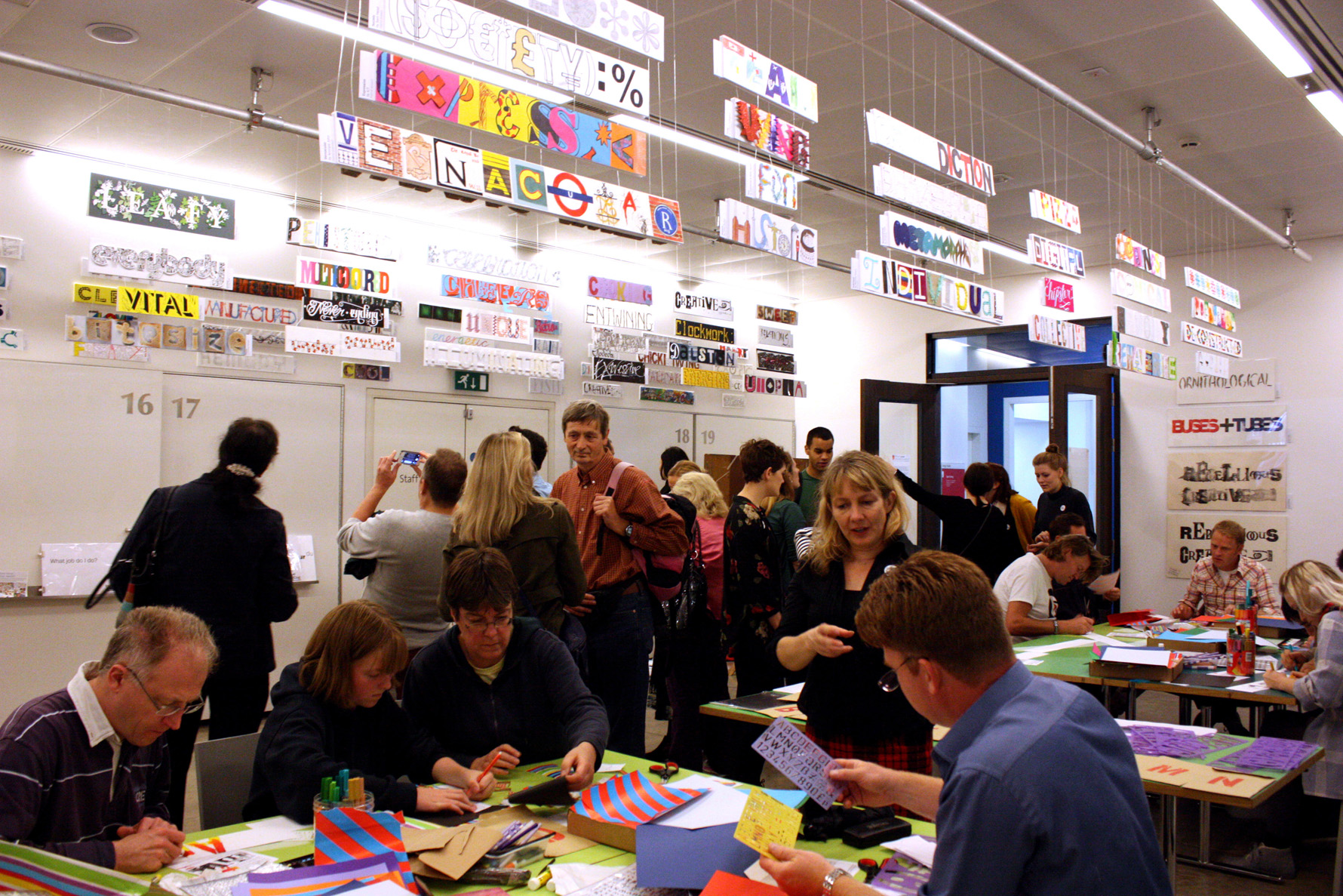
It was a weekend of Type Tasting drop in workshops at the V&A beneath our impressive collection of creative London words. The room was buzzing with chatter as people came in and looked at the collection, especially as the new words were added throughout the weekend and covered the walls by the end.

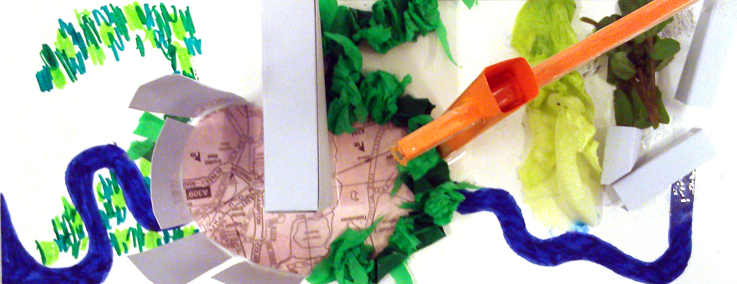
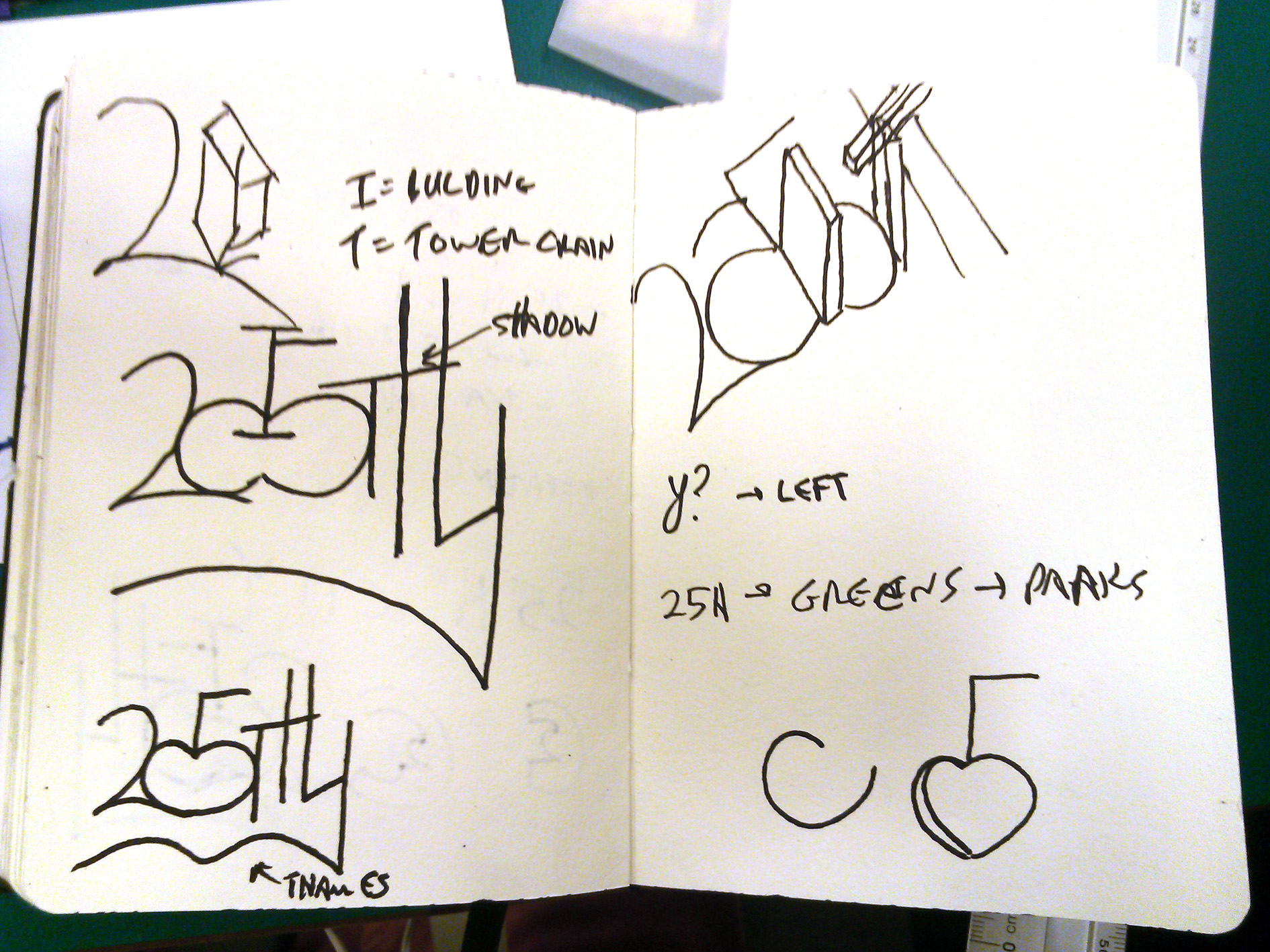
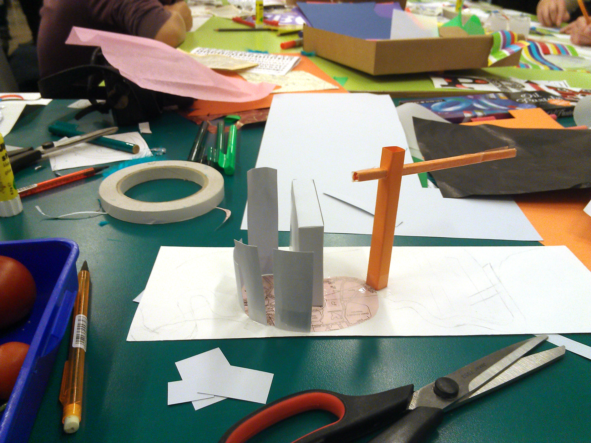
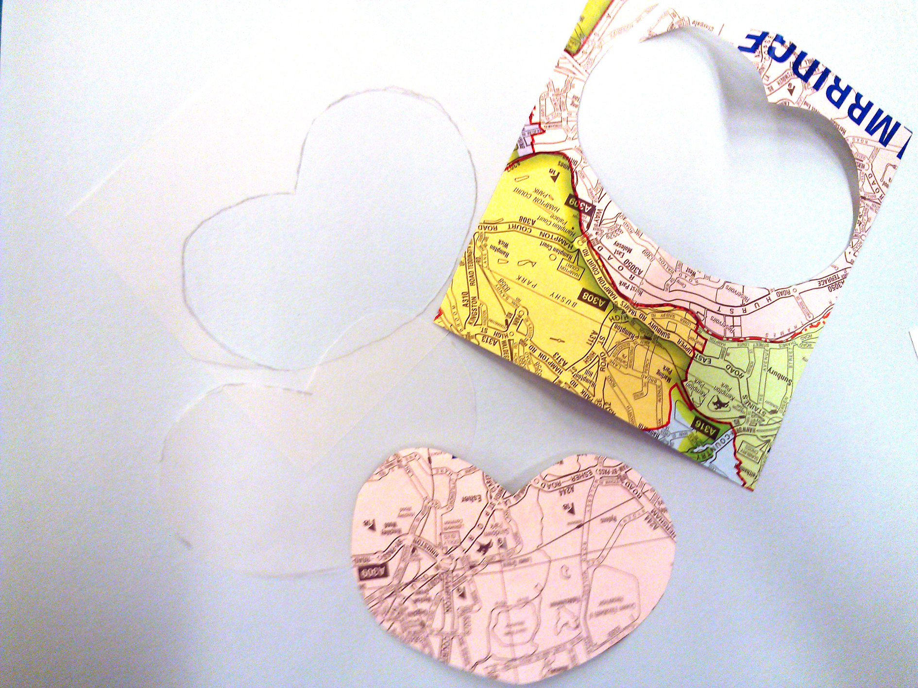
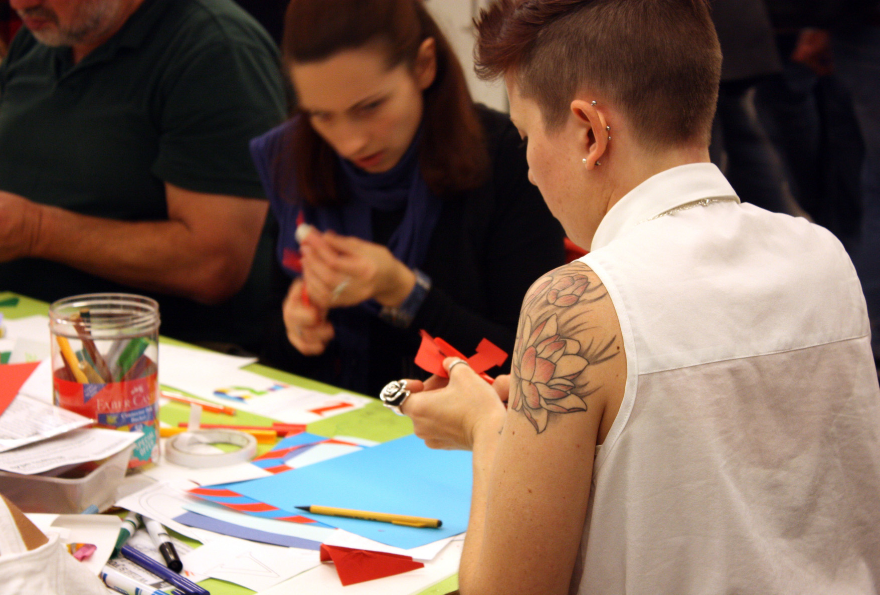
We’ve been posing the question “what’s your creative London?” and the collection overhead inspired participants to sit down and create their own responses. Many arrived looking determined and announcing “I’m here to make my word”. Our corner of the V&A became the hive of creativity and messy activity. The tables were filled with faces of concentration and the sounds of cutting and scribbling with the occasional “pass the glue?”. See portraits of the participants with their completed words.

LDF workshop 024_LR

We’re also delighted to have welcomed those who traveled from far afield to join us having listened to me being interviewed by John Humphrys and Justin Webb on BBC Radio 4 on Saturday morning.

The day was documented by Oli Frape who set up his easel for Live Lettering throughout Saturday, we played lively rounds of Typography Karaoke and covered much of the remaining wall space with the newly created words.

And most importantly thank you to the Type Tasting team who you all met at the weekend who briefed, encouraged, photographed and cheered everybody on.

Continue reading

BBC Radio 4 ‘Today’ interview with Type Tasting’s Sarah Hyndman

542253_10151695647431723_369642843_nScreen shot 2013-09-17 at 15.46.27

BBC Radio 4 ‘Today’ interview with Type Tasting’s Sarah Hyndman
John Humphrys and Justin Webb
Broadcast on Saturday 14 September 2013 at 07.18am
“Typefaces, they don’t really matter do they?” John Humphrys

“There is going to be a celebration at the London Design Festival this year to honour typefaces. Sarah Hyndman, a graphic designer who is involved in the festival, evaluates the promotion of London as the design capital of the world.” Listen to the interview…

Continue reading