
 We’re preparing for a weekend of painting signs in the Type Tasting studio, organised by Sam from Ghostsigns.
“If you have the ‘FIRE IN THE BELLY’ and really have a passion for lettering… this is a workshop for you!” Mike Meyer, Sign Painter
We’re preparing for a weekend of painting signs in the Type Tasting studio, organised by Sam from Ghostsigns.
“If you have the ‘FIRE IN THE BELLY’ and really have a passion for lettering… this is a workshop for you!” Mike Meyer, Sign Painter


On the road: The Art Deco Lark Cinema, Larkspur, California USA / Big Display Sans Serifs visible from a distance at the Billabong Roadhouse, Western Australia / Eurostyle & a Condensed Sans Serif on the 1950s style Antiques sign at Barbie’s Coffee Shop, Three Rivers, California USA / Casual Script and Slab Serifs at the Edgewater Inn, Pismo Beach, California USA…

Above is Club Labrynth by Sam Roberts from Ghostsigns who came along to Sunday’s Dalston Type Safari. He explains that “For me, Club Labrynth is the earliest memory I have of Dalston as a destination. Back in the mid-1990s it was the weekly hardcore/jungle night at the legendary Four Aces nightclub… The provocation of memory was an unexpected aspect of the Type Safari, and there were other long-term Hackney residents on the walk sharing their own recollections.”
Take a tour of Dalston* and learn about the signage and lettering along the way. What does the typography reveal about the rapidly transforming area? How do fonts influence your choices? Explore signage and end up in a quintessentially Dalston bar.
Upcoming Dates:
Sunday 19th January, 6.30-8.30pm (sold out)
Sunday 2nd February, 6.30-8.30pm (sold out)
*In winter this is a longer talk with slides and a glass of wine in the warmth of the Type Tasting studio, followed by a quicker walk through Dalston. As we’re walking through Dalston you’re invited to take photographs of the letters you see to make up a saying or phrase.
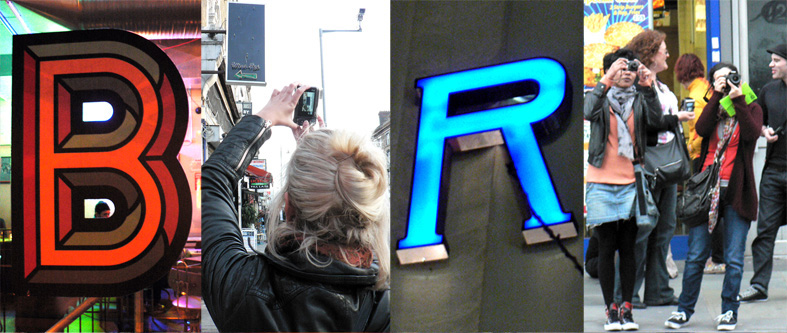
We’re surrounded by type and we use it to navigate our lives. The look of the fonts we encounter as we walk down the high street influences our choices before we’ve even read the words. These also transmit a great deal about the social, economic and historical development of the area.
![]()

Type Tasting Global Lettering Workshop
SXSW Interactive, Austin, Texas
Saturday March 8th
“Get creative whilst exploring and reinterpreting the typography found in street signs and signage from around the world.” We’re expanding on the Dalston Reimagined idea from last summer and take it global. Are there patterns to be found on a larger scale, what does the signage reveal about an area, a city or a country when compared?
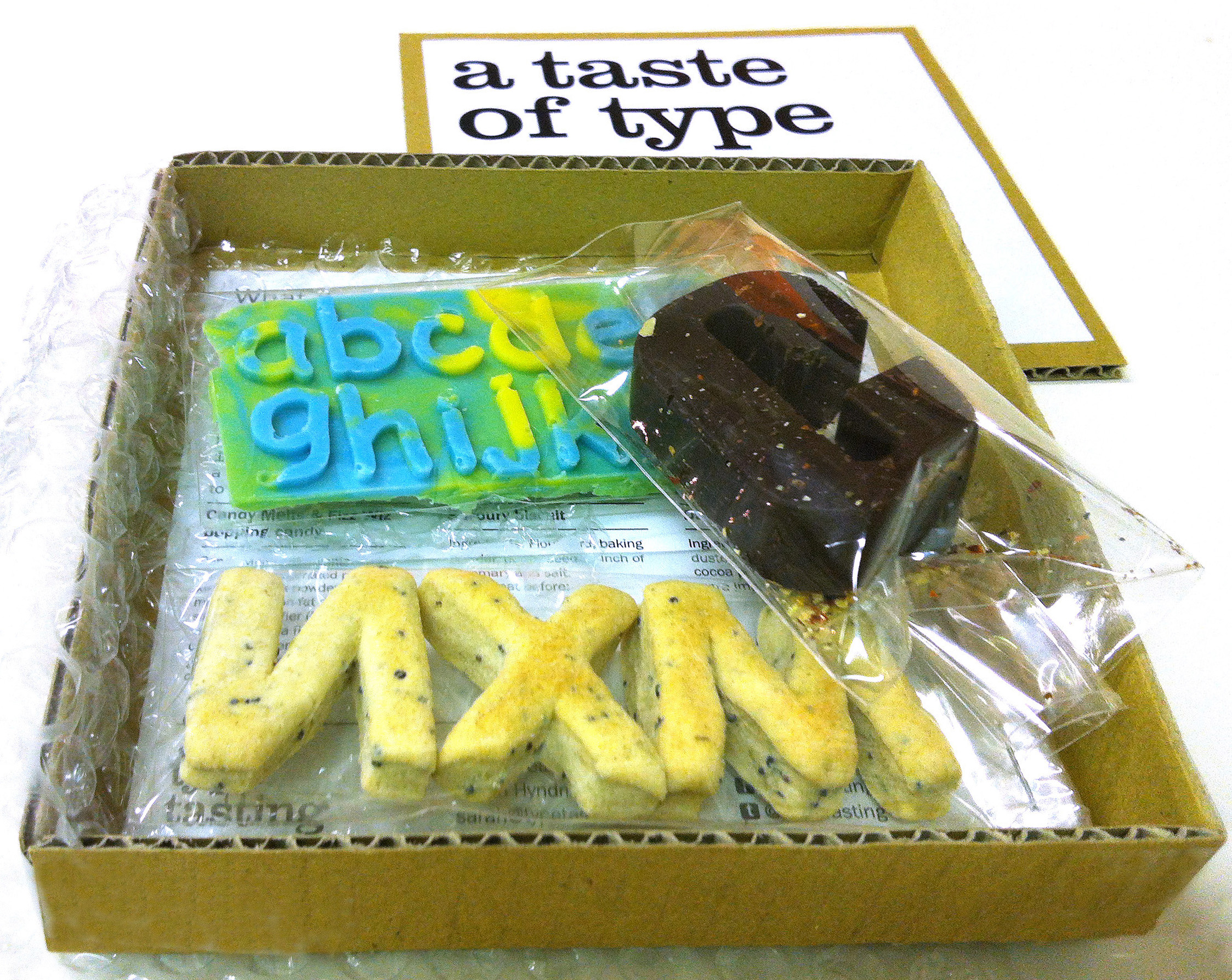
At Type Tasting I’ve been posing the question “what would type taste like?” I’ve put together a tasting pack to kickstart the discussion featuring Impact as dark chocolate laced with chilli, Helvetica as plain biscuits and Comic Sans as candy melts with popping candy.
The tasting pack comes complete with a chocolate box style description sheet introducing each typeface along with the suggested flavours. What do you think? What would your favourite typefaces taste like? Details of my suggestions with recipes are below…![]()

Today is 60 years since Abram Games designed the first BBC ident, nicknamed the ‘bat’s wings’. Click on the image above (or here) to see the BBC’s film of the idents from then to now.
The BBC logo has transformed through a range of styles and typefaces, sitting again today in the three square boxes that first housed the initials in the 1961 ident (can you namecheck the typefaces?).


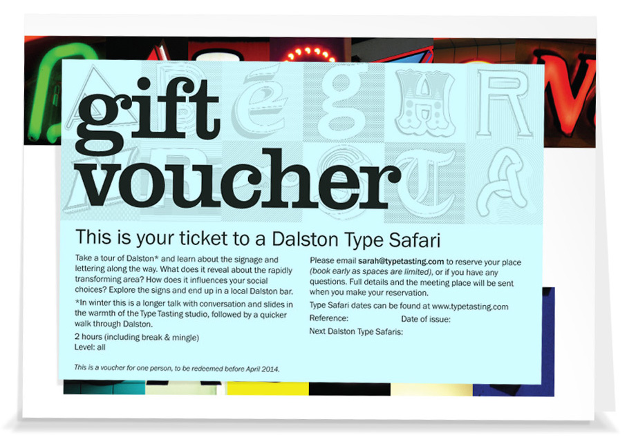
Gift Vouchers & new Dalston Type Safari Dates
Sunday 19th January, 6.30-8.30pm
Sunday 2nd February, 6.30-8.30pm
(book early as spaces are limited)
Safari ticket 1 person £20, includes souvenir map on the day
Safari ticket + gift voucher in a presentation card for 1 person £25, for 2 people £45 (UK). Please order by December 10th to receive the gift voucher before Christmas.
‘Typeface at the Rock Face’
By Sarah Hyndman
Originally published in Artrocker Magazine issue 134

In our everyday lives we are surrounded by fonts and use them to navigate through our environment, understanding instinctively that they communicate a great deal of the information before we’ve even read the words. We choose typefaces to express our personal style or to demonstrate our allegiance to a philosophy, music style or band.
This is possible because there is such a diversity of font designs which have absorbed a multitude of references and intended messages during their centuries of development. Type we use today is influenced by everything from stone carving, handwritten manuscripts, the evolution of the printing industry and now the plethora of designs available online. When we look at type we don’t just see the words, we also see the letter shapes which—much like fashion or cars—are loaded with associations.
Typefaces absorb layers of references and designers continue to use them in a way that reinforce these to help them communicate their message. We all interpret these meanings readily, often on an instinctive level, and we’ve been learning to do this all our lives.


