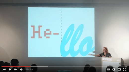
I was delighted to be invited to speak at Nicer Tuesdays recently. This is 12 minutes of audience participation including Typography Karaoke (in two teams), the Price is Right and the Type Dating Game. The audience is the star of this talk, you were absolutely brilliant, thank you. “A simple, but very effective demonstration of how type design affects the way we read, the way we respond to commands and even our moods from Sarah Hyndman.” It’s Nice That.
Tag Archives: Sarah Hyndman
Industry talk at Shillington
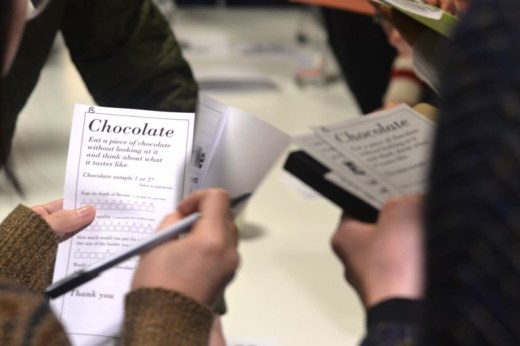
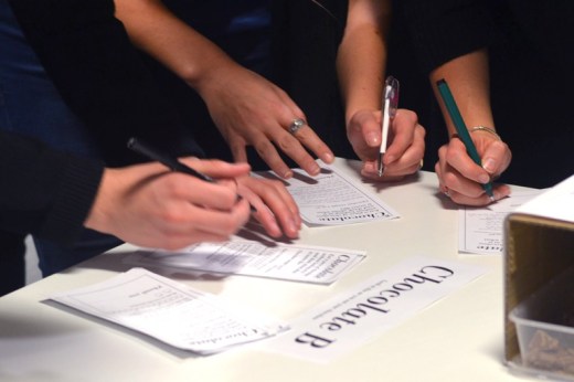
Are we really that influenced by typography? Type specialist Sarah Hyndman seems to think so! And it looks like she made converts out of our students following her talk at Shillington. We had the unique opportunity of being part of Sarah’s ongoing psychological research for Oxford University, and through a series of sensory experiments we all learned a little bit more about both typography and ourselves.
The best experiments involve jellybeans, a lesson Sarah Hyndman was about to reveal. We were privileged to be a part of Sarah’s type tasting experiment, tasting chocolate, jellybeans and smelling fragrances while looking at different fonts to see if they affected our experiences. Our results will become part of the data for the Cross-modal Research Laboratory at Oxford University who are studying how different senses interact.
Read Kate Allen’s full review of Sarah’s talk here.
Delhi Type Safari
Kawal Oberoi takes us on a Type Safari in Delhi
“The Quote I chose for Type Safari is “Dil Walon Ki Delhi” (English Translation—City Of People with big hearts—Delhi) which is a expression used for magnanimous spirit of Delhites. To letter this quote in Delhi’s Typographic DNA, I wanted to capture alphabets from signage of local restaurants, cinemas, old shops and public centres that are doing well despite globalisation. A weekend trip around the city got me lettering gems like the logo of Paras Cinema, which exists despite Multiplex cinemas attracting most of the audience. The flavours of Old Delhi—Karims, Pind Baluchi, Dhabas, the firework shops of Old Delhi, the tailor shops that exist from colonial times, the truck stands, the hand lettered exteriors of Herbal Medicine Tents and much more.” Kawal Oberoi
Take up the Type Safari challenge
The combinations of type found on signage reveal a great deal about a city, town or specific area. They reflect the social, economic and historical development of the area and create their own, unique typographic DNA. Take up the challenge yourself and create a composition that reflects the area you live in.
“Fun” “Brilliant” “Inspiring” “Eye-candy” “Enlightening”
![]()
![]()
![]()
![]()
![]()
“Fun” “Brilliant” “Inspiring” “Eye-candy” “Enlightening” Amazon reviews
“A fascinating insight into how type can influence our feelings, our senses, and even our taste” Professor Charles Spence, University of Oxford
Bookseller 10 titles not to miss
Why Fonts Matter by Sarah Hyndman is out now, published by Virgin Books (Penguin/Random House).
Taste your type
In a world that’s becoming increasingly visually dominant, Sarah Hyndman suggests that it’s more important than ever before to consider design as an immersive, fully multisensory discipline.
Computer Arts, March 2016 (20th anniversary edition)
Which Font do you Fancy? Hosting Design Museum’s #FontSunday

Type Tasting turns three years old on Valentine’s Day, having started with an evening of ‘Typographic Swearing ‘n’ Cussing‘ back in 2013. To celebrate this I’m the guest host for the Design Museum‘s #FontSunday with a Type Dating Game inspired theme of ‘Fanciable Fonts’. Get ready to Tweet/Instagram your photos of the typefaces you would date (or ditch) from 12 noon on Sunday 14th February to @DesignMuseum with #FontSunday.
Remember, no premature tweeting, the font flirting starts at 12 noon on Sunday!

Do you like your typefaces naughty or nice?
Sunday Brunch
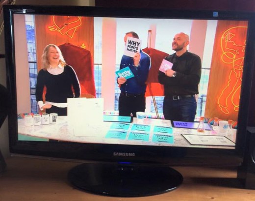
I was delighted to be invited on to Channel 4’s Sunday Brunch yesterday (Sunday 7th February) to talk about my new book Why Fonts Matter and play some classic Type Tasting games. It was a fast-paced and fun 9 minutes. The aim had been to show that typography can be fun and accessible; that it doesn’t always have to be an intellectual discussion, and from the feedback on Twitter we achieved this. I demonstrated how type tells us how expensive or calorific a product might be. I talked about Simon choosing a typeface for his restaurant menus to convey that the chef is skilful (and discovered that he has an aversion to italics). We had a quick look at the Type Dating Game, before Tim and Simon both chose a typeface card and read out their own personality analysis. We ended with font sniffing: pairing the smells to the shapes of typefaces, and I explained why most people give very similar answers.
Click here to play the Font Fortune personality analysis game yourself.

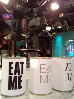
The Type Tasting props posing nicely with the Channel 4 logo in the background.
Font Fortunes card game
This is one of the games I’m going to play on Sunday Brunch tomorrow…
Choose the card you prefer and click on it to read your Font Fortune.
Grafik: Multiple Choice and a competition
It’s Nice That ‘Why Fonts Matter, and how they impact your mood’
Typography might just help you date, solve obesity and impact your mood; so we’ve learnt from type fanatic Sarah Hyndman. We’ve previously dubbed her “the one woman tour-de-force behind the Type Tasting enterprise”, which looks at the power typography has over our lives and senses. She’s now published a new book on the subject, Why Fonts Matter, and has kindly offered us an extract looking at the effects of typography on our emotions.
“Physically, we use our voice, facial expressions. gestures and posture to convey a wide range of emotional cues from the subtle to the dramatic. Typefaces and the way they are used provide a similarly extensive emotional range typographically.”
