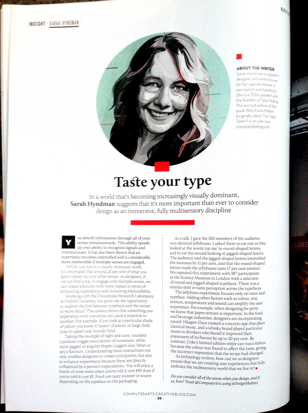
In a world that’s becoming increasingly visually dominant, Sarah Hyndman suggests that it’s more important than ever before to consider design as an immersive, fully multisensory discipline.
Computer Arts, March 2016 (20th anniversary edition)
In a world that’s becoming increasingly visually dominant, Sarah Hyndman suggests that it’s more important than ever before to consider design as an immersive, fully multisensory discipline.
Computer Arts, March 2016 (20th anniversary edition)

Type Tasting turns three years old on Valentine’s Day, having started with an evening of ‘Typographic Swearing ‘n’ Cussing‘ back in 2013. To celebrate this I’m the guest host for the Design Museum‘s #FontSunday with a Type Dating Game inspired theme of ‘Fanciable Fonts’. Get ready to Tweet/Instagram your photos of the typefaces you would date (or ditch) from 12 noon on Sunday 14th February to @DesignMuseum with #FontSunday.
Remember, no premature tweeting, the font flirting starts at 12 noon on Sunday!

Do you like your typefaces naughty or nice?
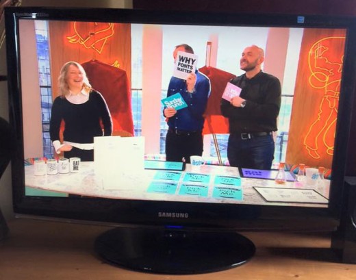
I was delighted to be invited on to Channel 4’s Sunday Brunch yesterday (Sunday 7th February) to talk about my new book Why Fonts Matter and play some classic Type Tasting games. It was a fast-paced and fun 9 minutes. The aim had been to show that typography can be fun and accessible; that it doesn’t always have to be an intellectual discussion, and from the feedback on Twitter we achieved this. I demonstrated how type tells us how expensive or calorific a product might be. I talked about Simon choosing a typeface for his restaurant menus to convey that the chef is skilful (and discovered that he has an aversion to italics). We had a quick look at the Type Dating Game, before Tim and Simon both chose a typeface card and read out their own personality analysis. We ended with font sniffing: pairing the smells to the shapes of typefaces, and I explained why most people give very similar answers.
Click here to play the Font Fortune personality analysis game yourself.

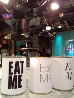
The Type Tasting props posing nicely with the Channel 4 logo in the background.
This is one of the games I’m going to play on Sunday Brunch tomorrow…
Choose the card you prefer and click on it to read your Font Fortune.


Happy Birthday to John Baskerville, the English printer and typographer who was born on January 28th, 1706. He was based in Birmingham, which is where he designed the famous transitional serif typeface that bears his name.
Baskerville (the typeface)*
Personality: Intellectual, academic, wise.
Values: Traditional, conventional, trustworthy.
Style: Neutral, credible, knowledgeable.
From Why Fonts Matter by Sarah Hyndman.
*Around 300 participants took part in an online Type Tasting survey, the majority in the UK and the US.
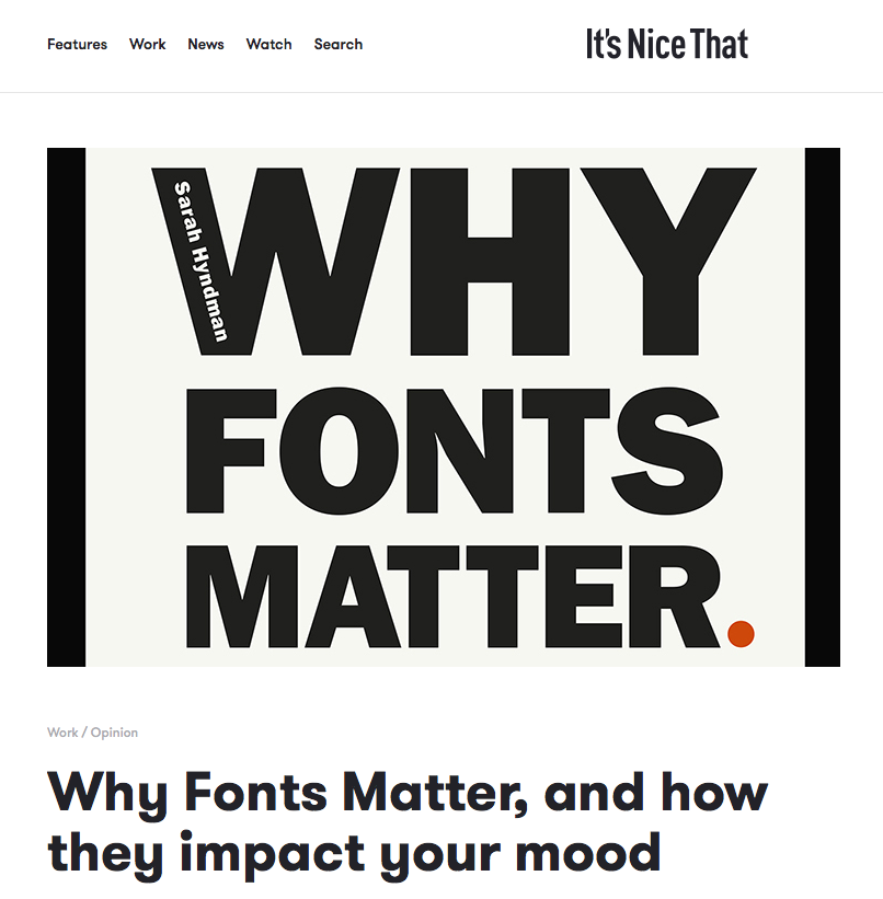
Typography might just help you date, solve obesity and impact your mood; so we’ve learnt from type fanatic Sarah Hyndman. We’ve previously dubbed her “the one woman tour-de-force behind the Type Tasting enterprise”, which looks at the power typography has over our lives and senses. She’s now published a new book on the subject, Why Fonts Matter, and has kindly offered us an extract looking at the effects of typography on our emotions.
“Physically, we use our voice, facial expressions. gestures and posture to convey a wide range of emotional cues from the subtle to the dramatic. Typefaces and the way they are used provide a similarly extensive emotional range typographically.”

“Lettering and typefaces combine to give a street its own individual dialect”

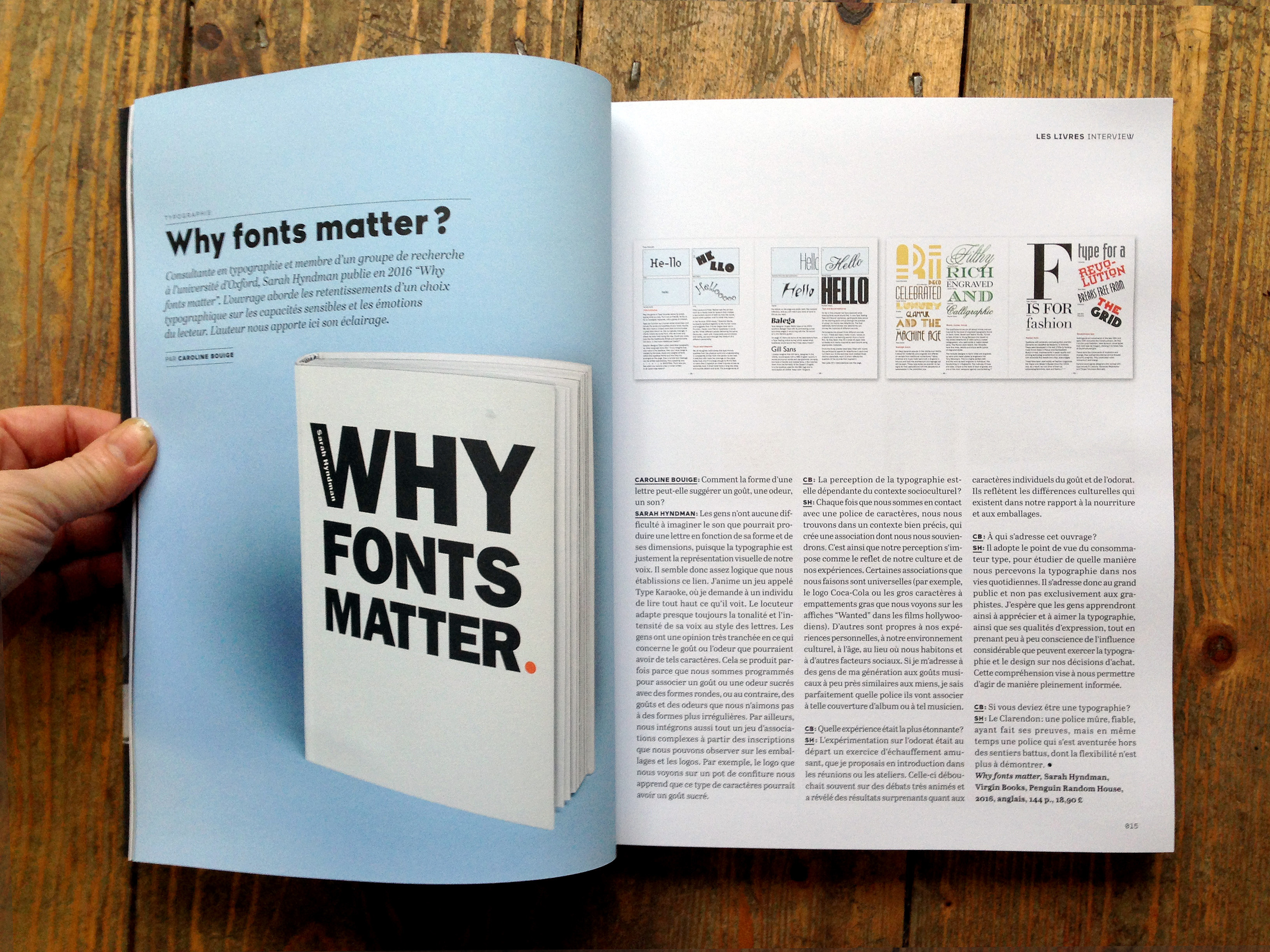
Sarah Hyndman interviewed in étapes magazine issue 229, the January/February issue, ahead of the January 28th publication of Why Fonts Matter.
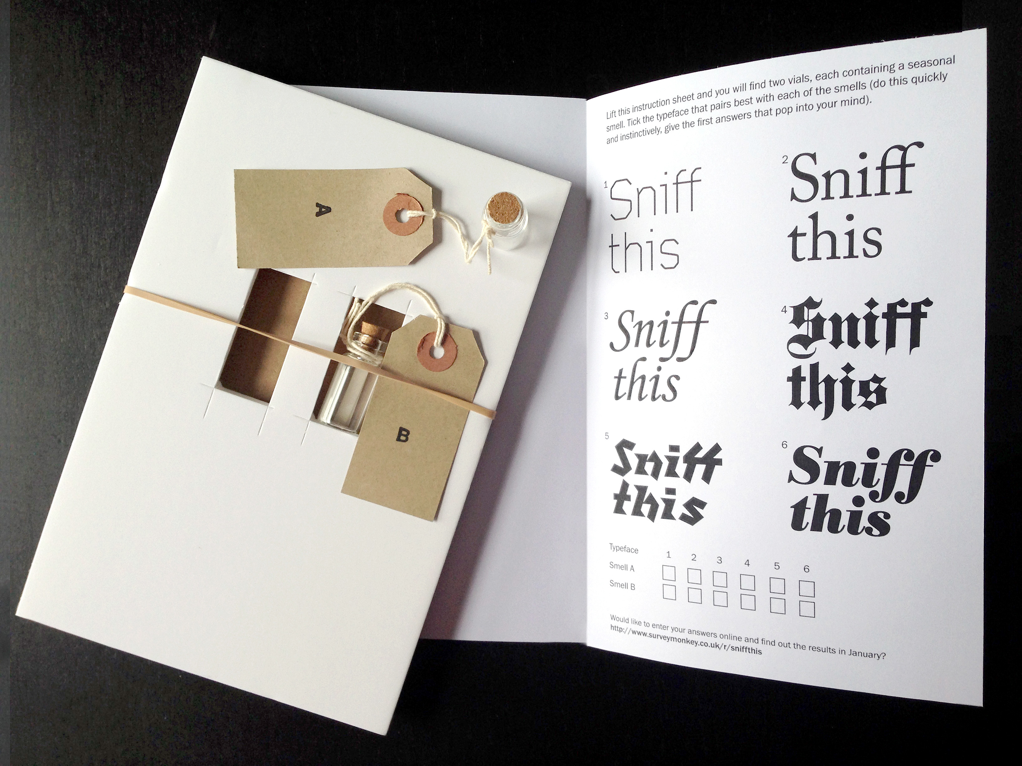
This year’s seasonal fun from Type Tasting invites recipients to play with one of the multi-sensory typography themes we’ve been experimenting with throughout the year. What smells would you think of as being quintessentially ‘Christmas’ and which typefaces would you match them with?