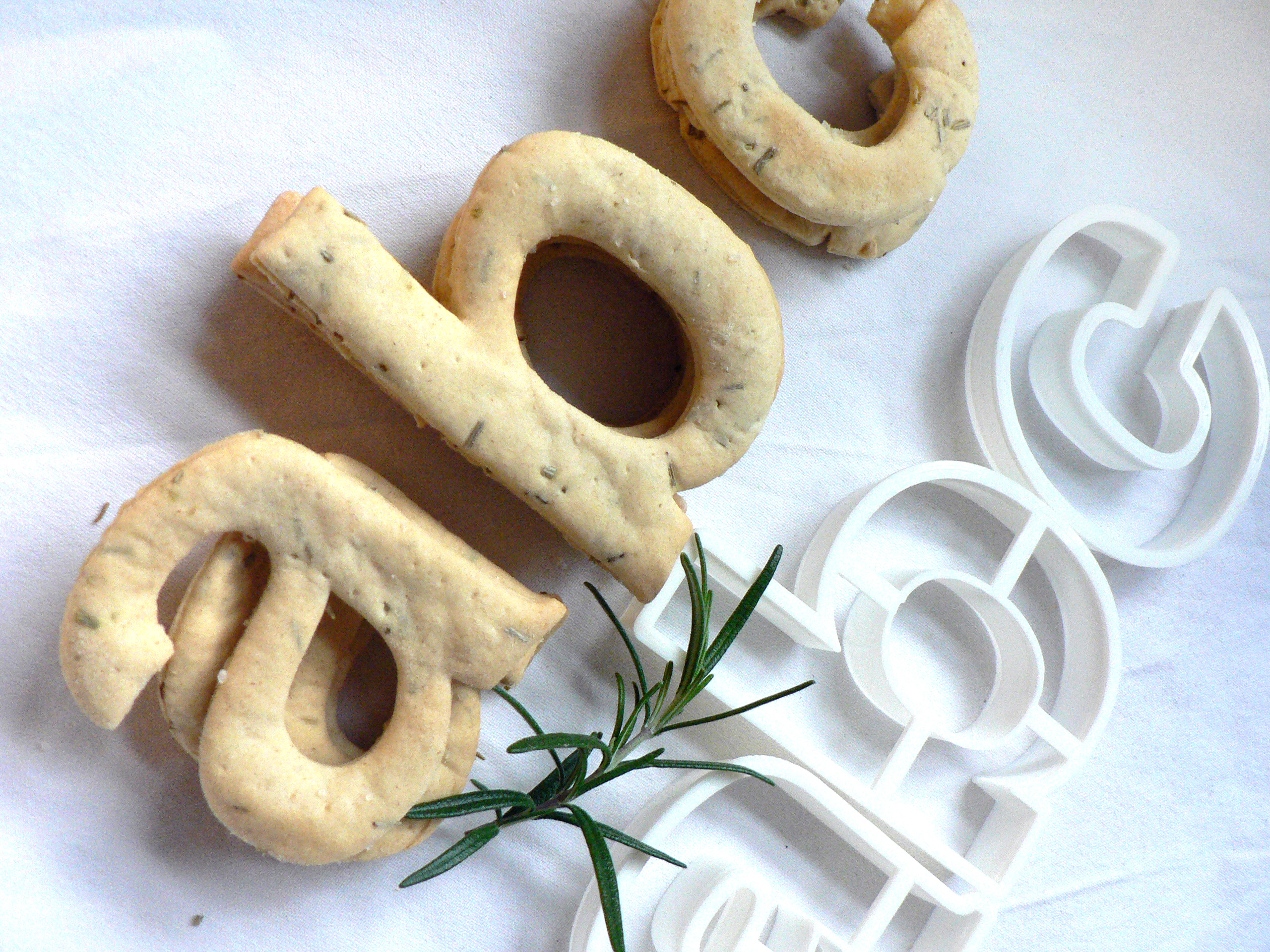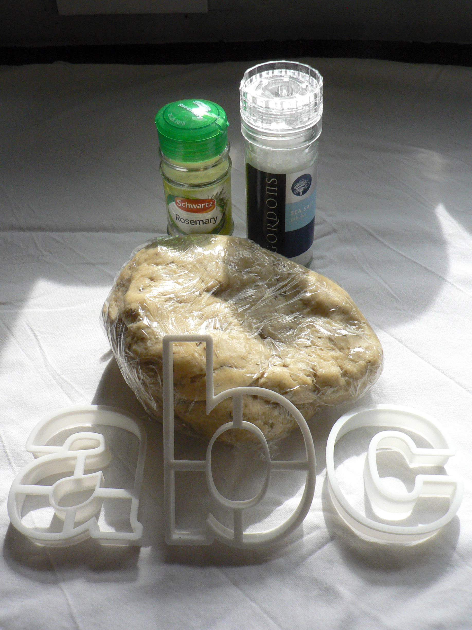
Baskerville Earl Grey tea biscuits recipe
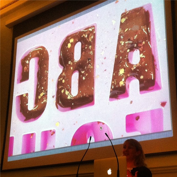
Edible typography
Using food to describe the experience of typography
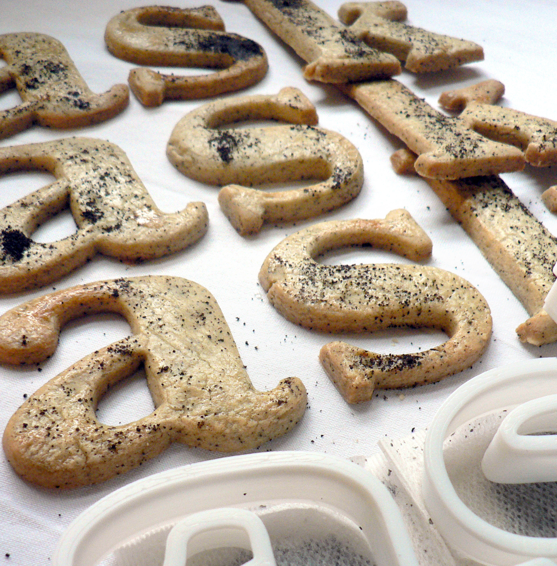
Baskerville is a transitional serif typeface that sits between the old style serif typefaces of William Caslon and the modern serifs created by Giambattista Bodoni & Firmin Didot. English printer and type designer John Baskerville developed a typeface with more defined angles and greater stroke contrast. This was a refined face with improved legibility which also took advantage of the improvements in technology happening in the 1750s. Baskerville is a recognisably English typeface that has stood the test of time as a legible, everyday text face.
My interpretation of Baskerville are Earl Grey tea biscuits for an authentic eighteenth century flavour. At this time improved technology and transport allowed foods to be enjoyed throughout the country. Tea had become the national drink and the tea leaves would be dried, rolled and used again. I had initially thought that Baskerville should be savoury, since it’s an everyday ‘jobbing’ typeface, but sweet biscuits tasted better.
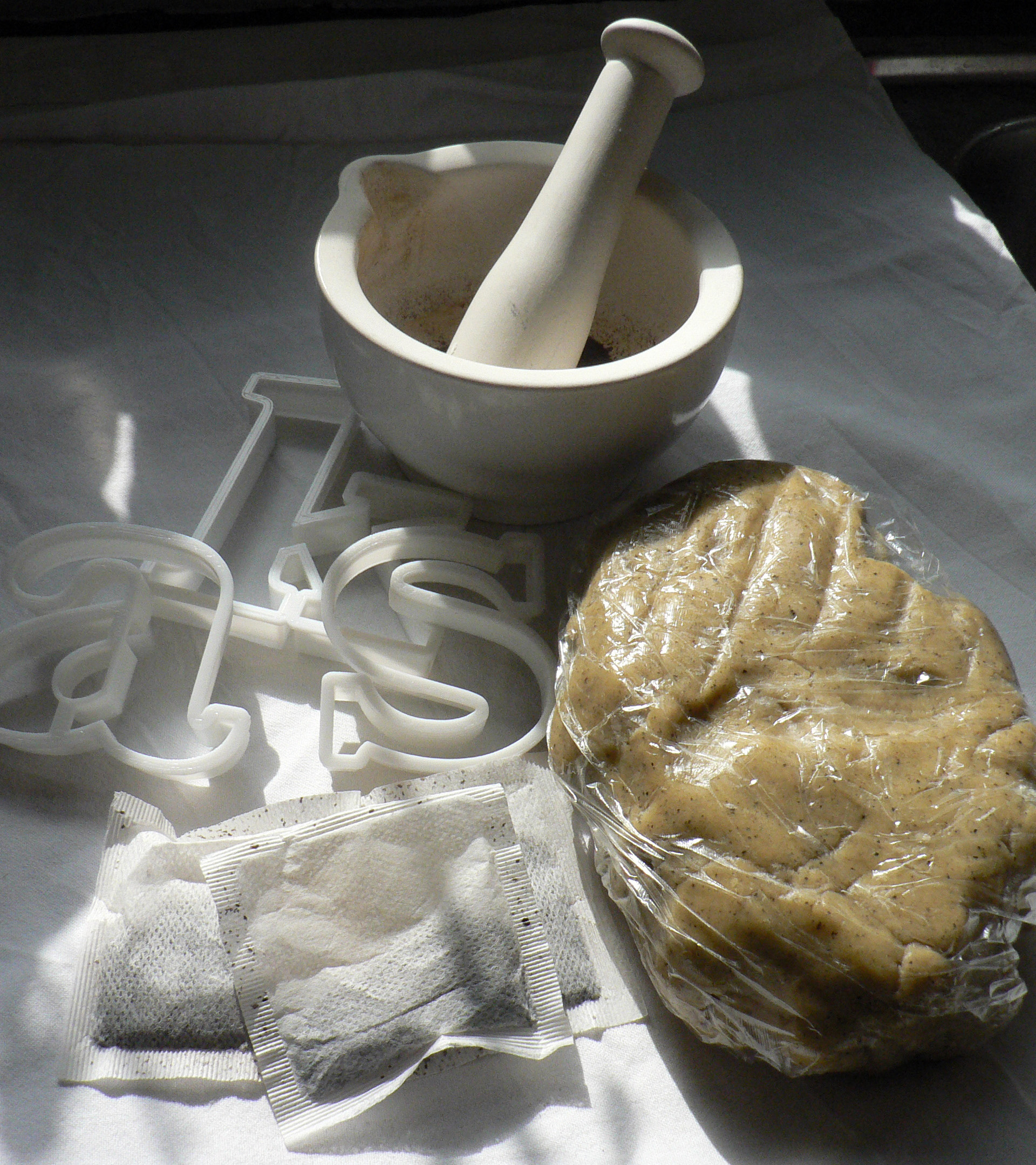
Recipe