I created and taught an Experimental Typography course at LCC (University of the Arts London) from 2001 to 2008. It feels so timely to bring back a new version of it online.
Would you be interested?
If there’s enough interest I’ll go ahead and do it!
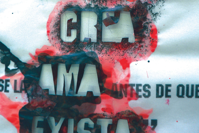
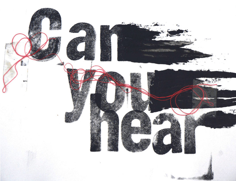
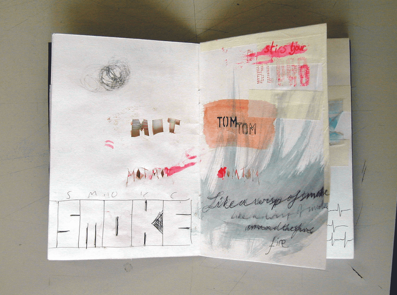
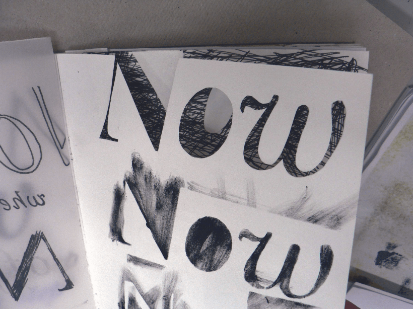
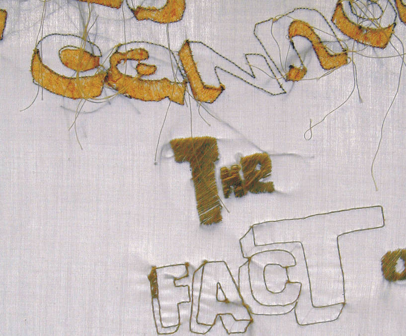
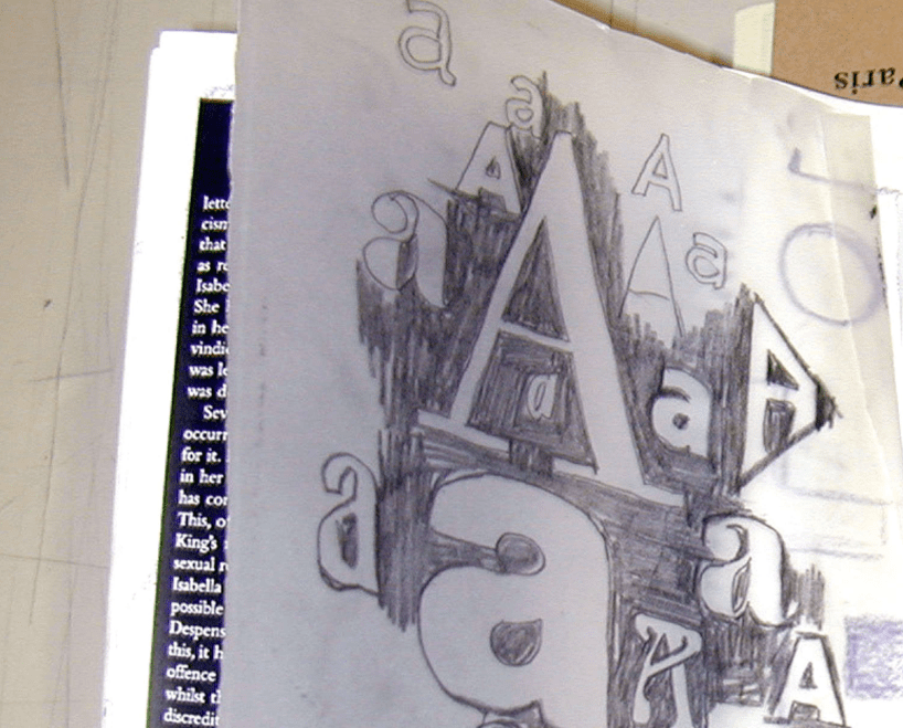
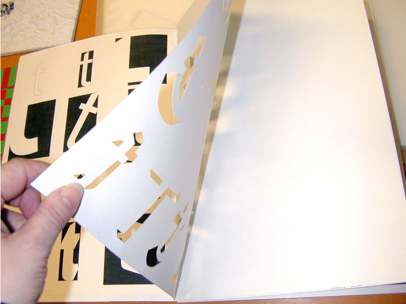
Images shown from Experimental Typography at LCC between 2001–2008. They’re by Jordi Biosca, Claire Pringle, Joe Gardiner, Becky Chilcott, Claire Mason, Angela Lamb and Zoë Chan.
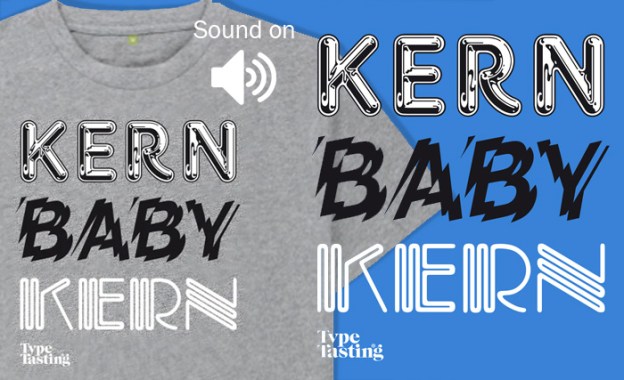
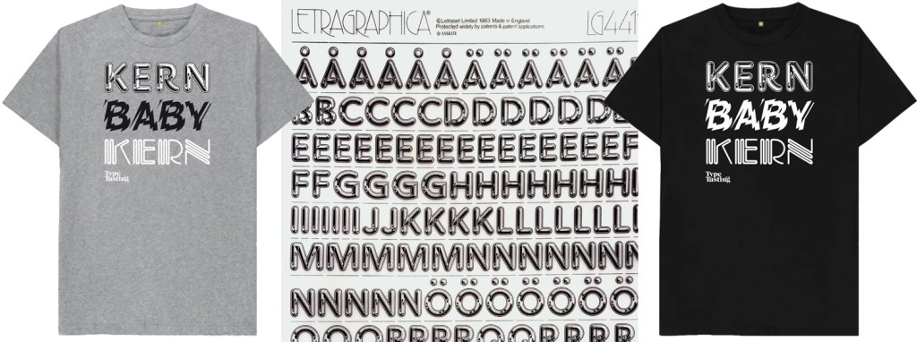
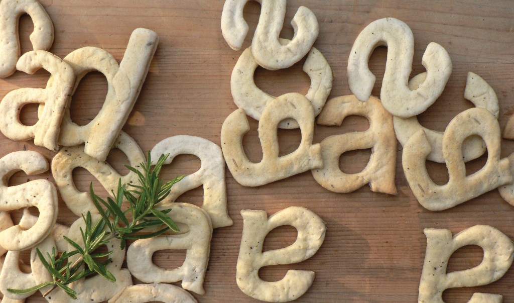
Kerning is a geeky typography term for the spacing between individual letters. There are lots of examples of when kerning goes wrong with unfortunate and amusing results. One of my near-misses was when I set the words FLICK THE PAGES on a scented book for an exhibition. I realised just in time that the close spacing between the L and I looked more like a U. Oops.
The three typefaces that feature on the Kern Baby Kern t-shirt were available as rubdown Letraset sheets. Chromium One was designed by David Harris in 1983. This was perfect for a decade of chrome and airbrushed posters. Shatter is an experimental typeface designed by Vic Carless in 1973. Carless literally smashed Helvetica up, which is what Punk did to Modernism in the 1970s. Piccadilly was designed by Christopher Matthews in 1973—this neon font is pure 1970s disco.
These are unisex t-shirts in regular men’s sizes (different colours and styles can be arranged on request). They’re printed on a 100% organic cotton t-shirt and printed in the UK in a renewable energy-powered factory. Worldwide shipping available.
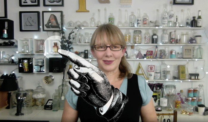
Not-to-be-missed interactive, funny and fantastical live events. Sarah’s on a mission to make typography exciting for everybody by inviting you to take part in games and demonstrations so you can make the discoveries for yourself.
Come along to this fun and irreverent online event with author Sarah Hyndman. Join in with games from her bestselling book Why Fonts Matter. She’ll answer as many of your questions as possible, no questions are too silly or too strange!
Ideal for beginners, students and anybody curious about reading fonts. We’re all font consumers in our everyday lives. Sarah will show you that you’re already an expert, even if you don’t realise it.
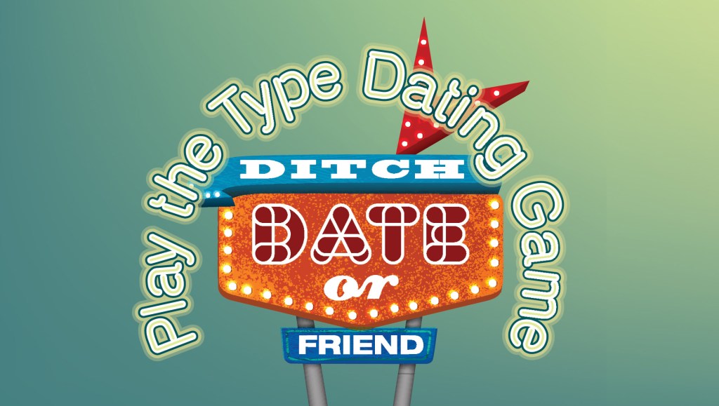
WHO’S THAT FONT? Tuesday 14th September, 7pm to 8pm (BST) Do fonts have personalities? Which would you date, ditch or just be friends with? What does a font reveal about your personality?
DO FONTS SMELL? Tuesday 28th September 7pm to 8pm (BST) What might different fonts smell like and what memories do they evoke? Can a font make your jellybean taste different? How do fonts interact with all your senses? Bring a matching pair of jellybeans for an experiment. £1.99 per person, only 25 tickets. Book here
Once you’ve purchased your ticket you’ll be sent the Zoom details. Please tell your friends, let’s have some fun.
Are you ready to immerse yourself in the fantastical world of fonts?
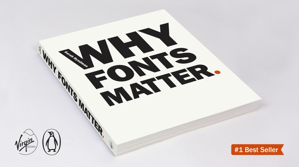
About your host Sarah Hyndman demystifies the amazing world of typography. She is the author of Why Fonts Matter. She is a TEDx speaker, a regular on radio (BBC Radio 4’s Word of Mouth with Michael Rosen, Saturday Live, Today.) and TV (Channel 4’s Sunday Brunch). Sarah is a multisensory typography expert and collaborates on studies with Professor Charles Spence of the University of Oxford.
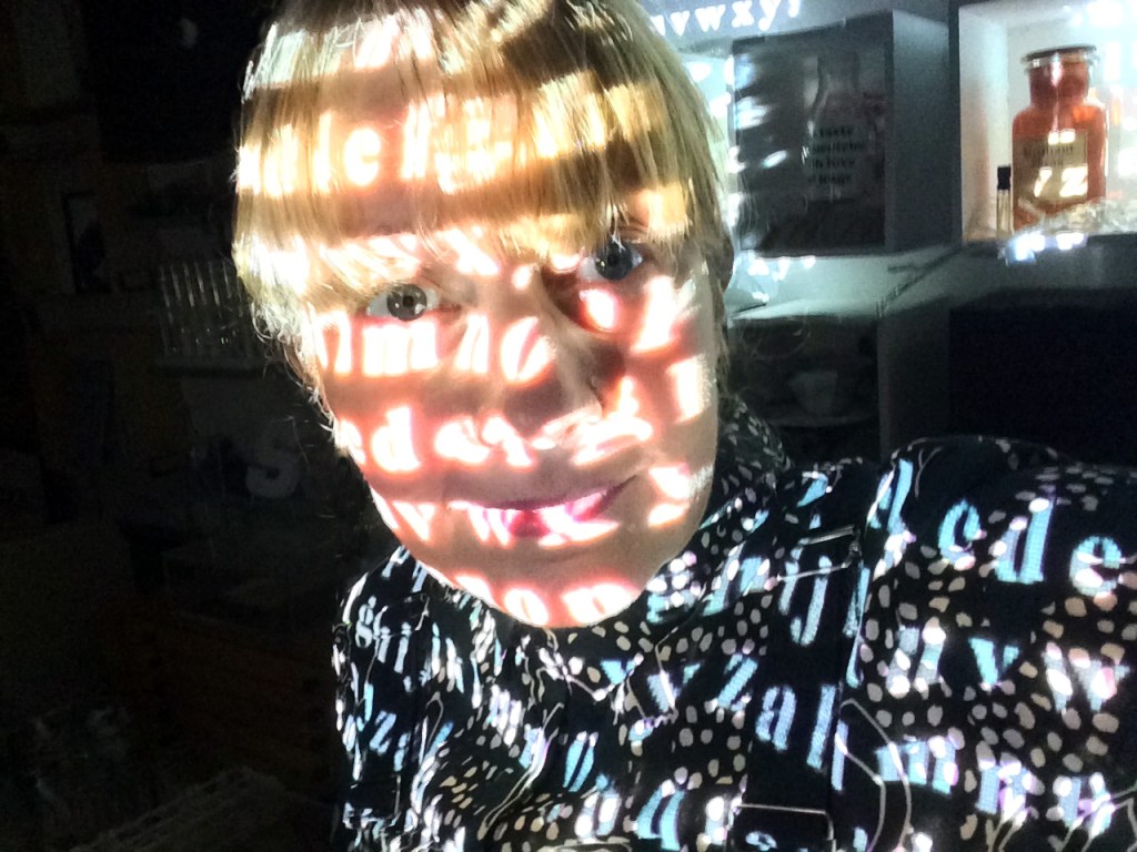
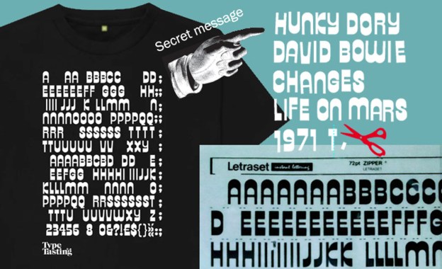
Many of you know about (and share) my love of Letraset—the sheets of rub-down lettering that often featured the fashionable fonts of the day. The first gig I went to was with my friend Caryl to see David Bowie. He was the soundtrack to our teenage years. My school books were adorned with meticulous drawings of lettering from his record covers. I was so excited when I found the Hunky Dory title typeface, called Zipper, as a sheet of Letraset. Now I could make my books look like Bowie merch with the official Hunky Dory font.
Your t-shirt is inspired by that sheet of Letraset. Letters have been removed to leave a secret message on your shirt. They spell out Hunky Dory, David Bowie, Changes, Life on Mars and 1971. (Geeky detail: the second ‘1’ in 1971 is made from a deconstructed ‘T’ because Letraset sheets don’t always have enough of the characters you need).
I’ve been chatting to artist friends recently who’re interested in psychogeography. I always assumed that psychotypography would be a similar field, just with type instead of geography. Searching hasn’t turned much up but I think psychotypography describes what I do pretty well so I think it should be a thing.
Since psychogeography describes the effect of a geographical location on the emotions and behaviour of individuals (Tate), then I propose that psychotypography describes the effect of the typographic environment on the emotions and behaviour of individuals.
I love that an early influence was the flâneur, or urban wanderer. I think my Dalston Type Safaris could be considered a flâneur’s ramble through lettering in the urban environment.
Who’s experimenting in this space?
I made a psychotypography website ready for some experiments, it’s very empty right now.
This is a question I’ve been asking recently. Thank you for all your great answers, keep them coming.
Maybe it’s “I want to use more trending fonts” or “I want to know what font rules I can break, so I can have fun with fonts” or even “My teacher wants a simple design that is typeset in Arial. Is there any way I could secretly drop in another font without them noticing?”.
I recognise many as problems I had earlier in my career, when I also shared your feelings of anxiety and frustration.
By sharing your problems you’re joining me in my mission to change the way we think and talk about typography by making it exciting for everybody. Let’s all go from “overwhelmed” to “empowered”.
I’ll pick one a week to answer. You’ll also be helping me to make sure my books and workshops are really useful for you.
These are some of the problems you’ve written to me about, how many of them resonate with you?
“Finding the right fonts for client’s websites” • “I want to use more trending fonts” • “My teacher wants a simple design that is typeset in Arial. Is there any way I could secretly drop in another better font without them noticing?” • “How to choose the best font” • “I love fonts, but never know when to use serif or non-serif ones—what should guide this decision?” • “I’m struggling to find a consistent font theme for my sector” • “I can’t decide” • “I want to know what font rules I can break, so I can have fun with fonts”.
How these make you feel
“Screaming” • “Disoriented” • “Old fashioned and stuck” • “Overwhelmed about how to start” • “Frustrated” • “Unsure” • “Frustrated, apprehensive (did I get it right?) & unconfident” • “Anxious that the font we select may not resonate” • “Frustrated” • “Curious”.
How you would like to feel about choosing typefaces?
“Happy” • “Relaxed” • “Free” • “Successful and able to more clearly communicate” • “Really happy” • “Empowered & confident (& thus relaxed!)” • “A lot more confident” • “Empowered” • “Joyous”.
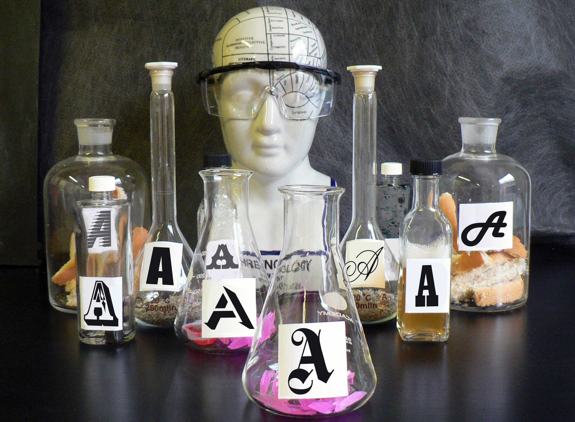
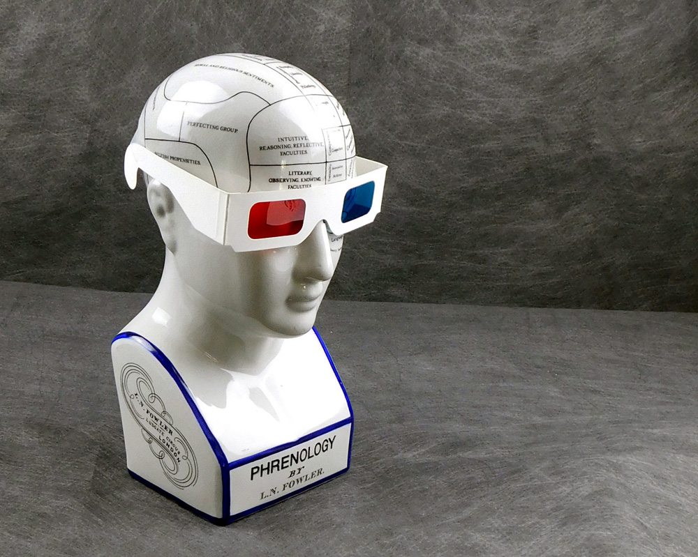
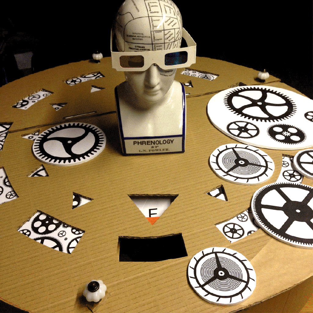
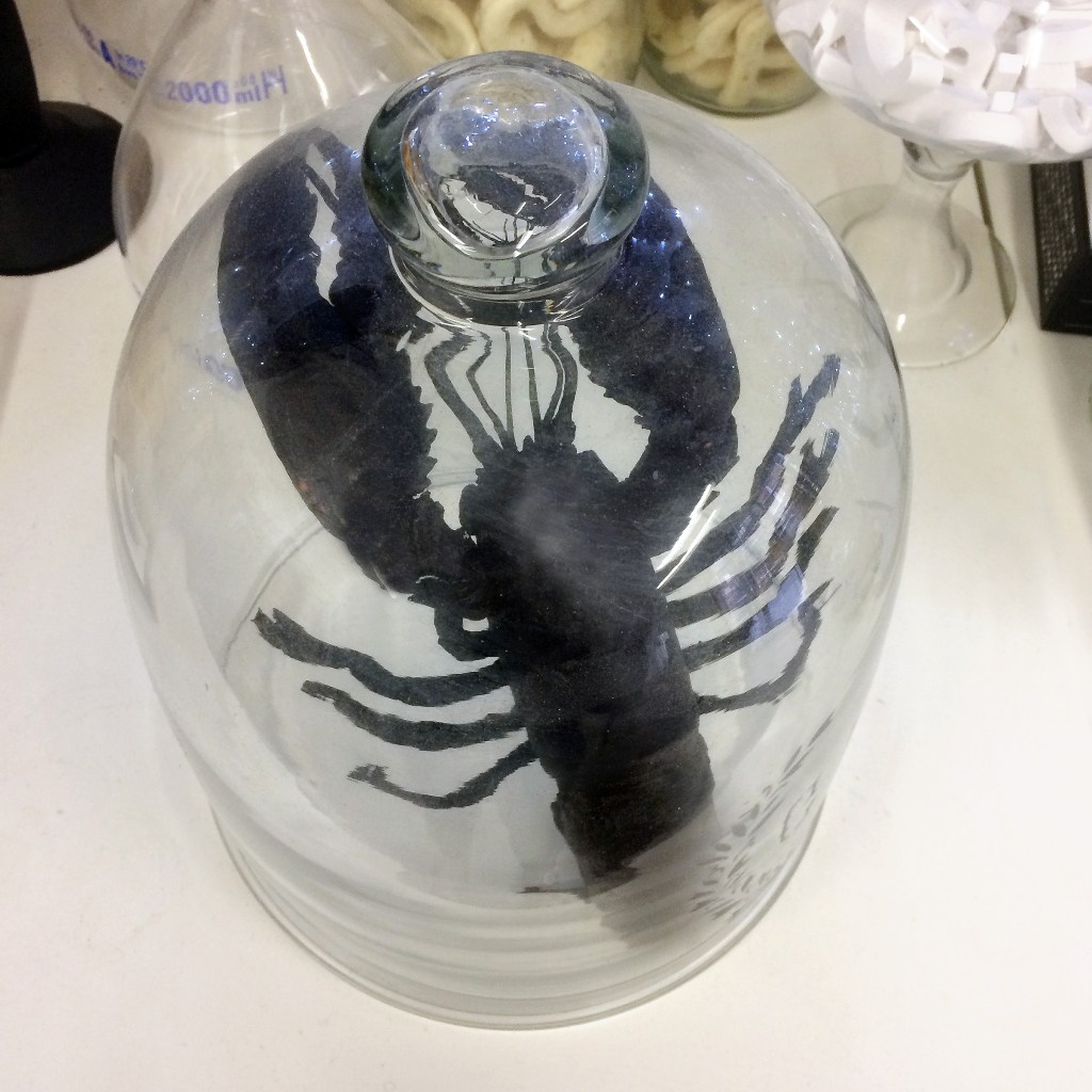
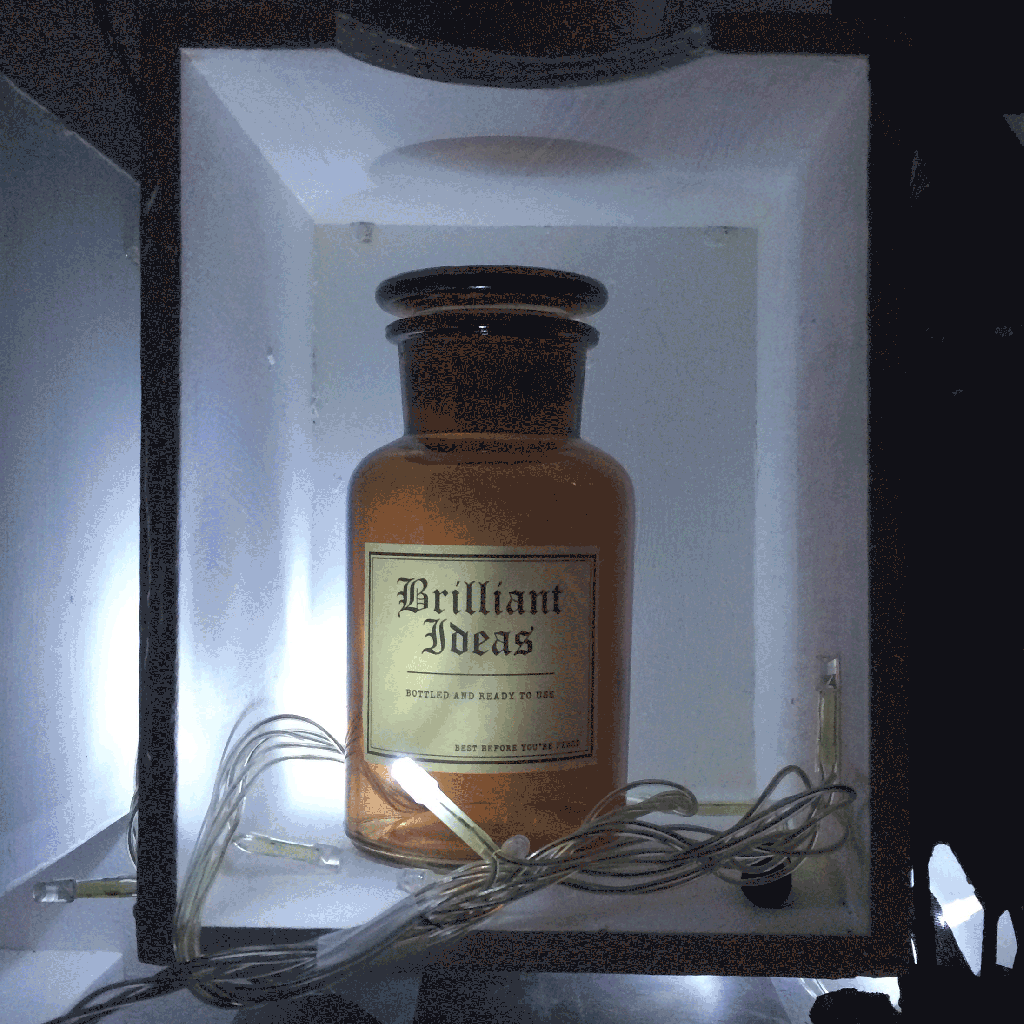
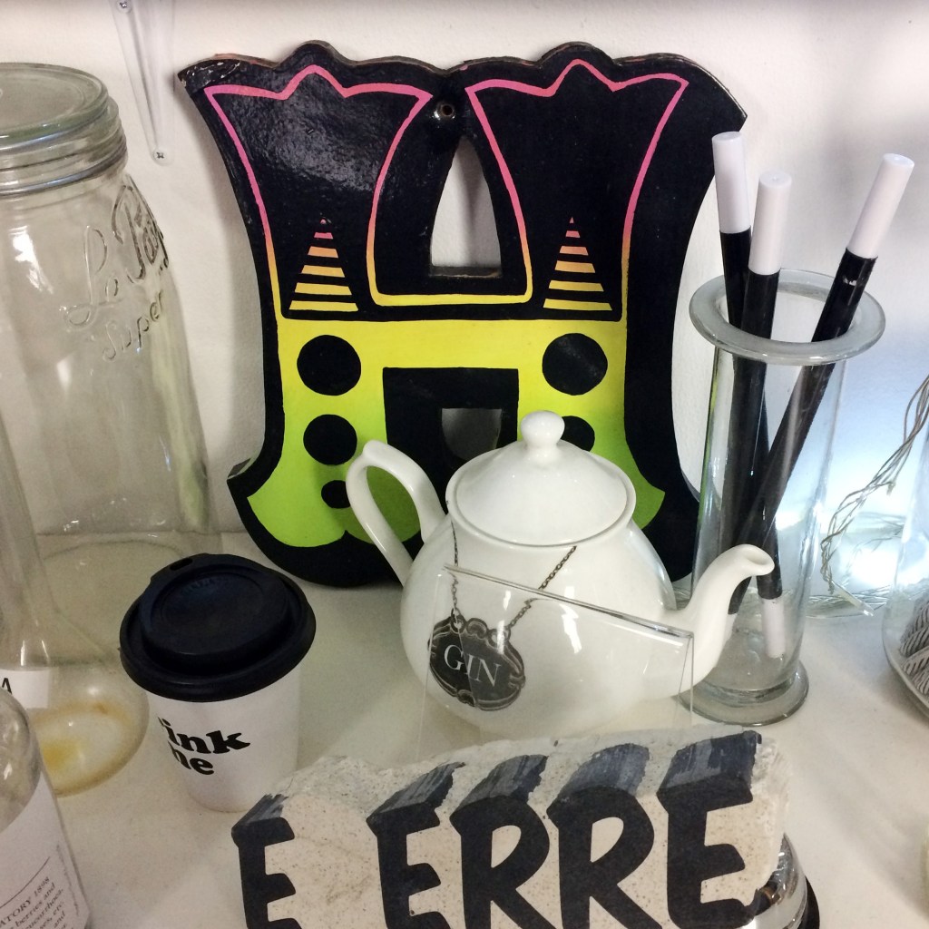
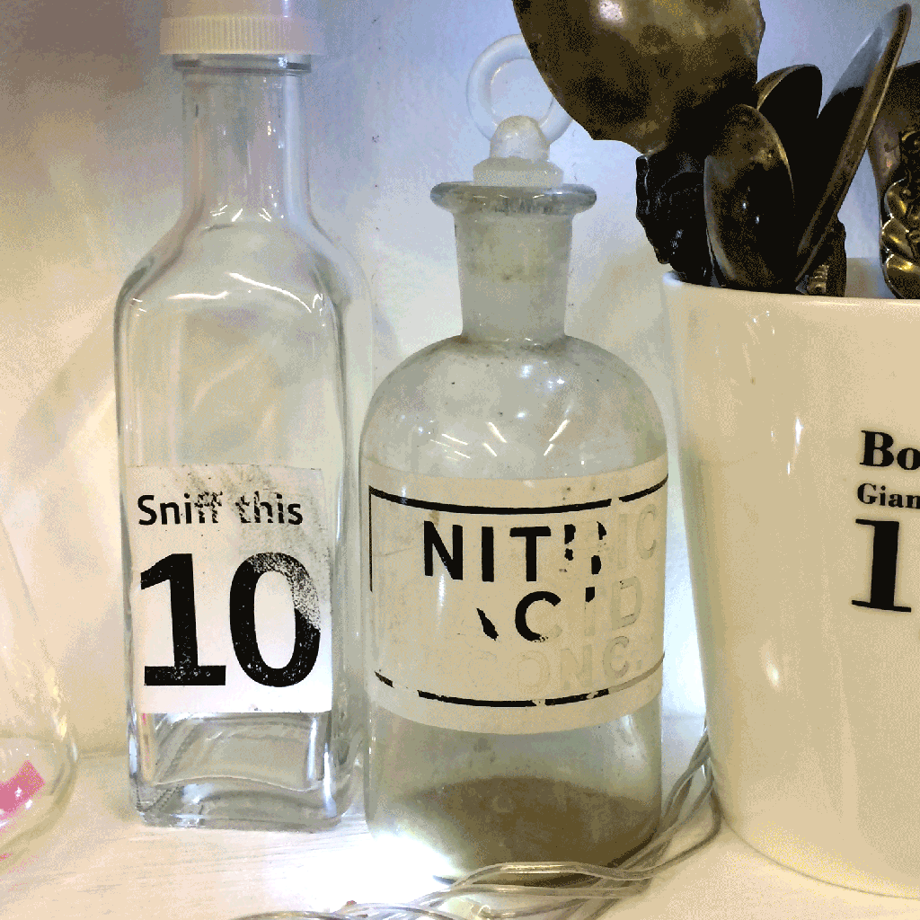
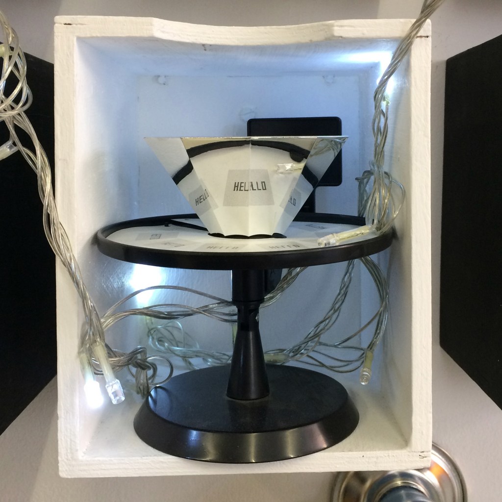
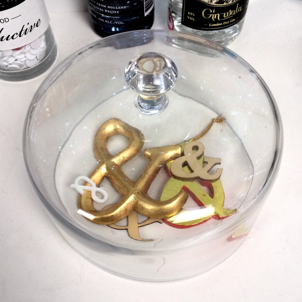
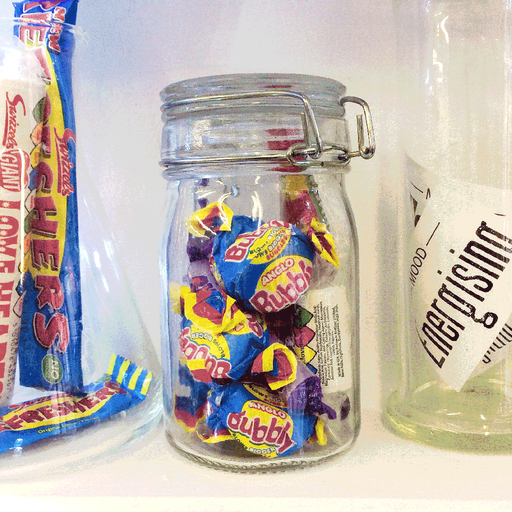
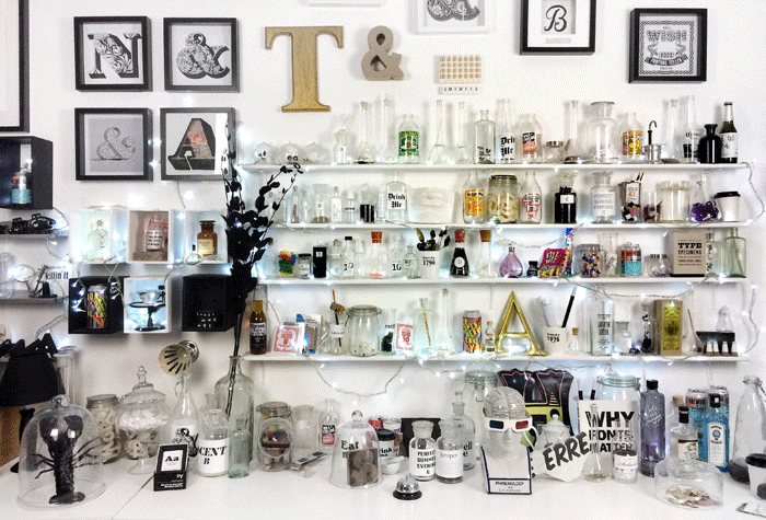
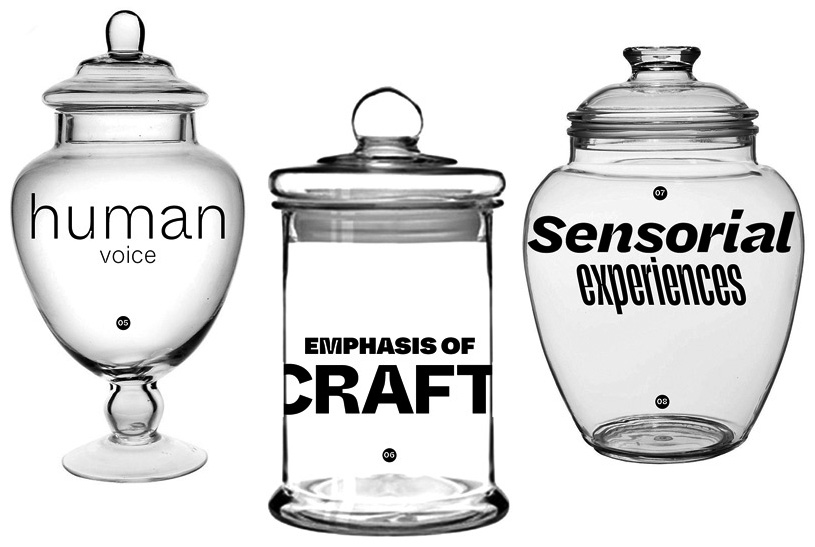
I’m a sucker for typographic ephemera and you’ve glimpsed the objects I collect in the background at my online events. Maybe you spotted Phrenny the phrenology head, the black lobster, jars of stale Helvetica, bottles for font sniffing, rescued shop sign letters, a zoetrope, or packaged childhood memories. I’m asked about them all the time and each curious object has a story to tell.
Now you can visit the online Apothecary of Curiosities to check out the objects and read their stories.
.
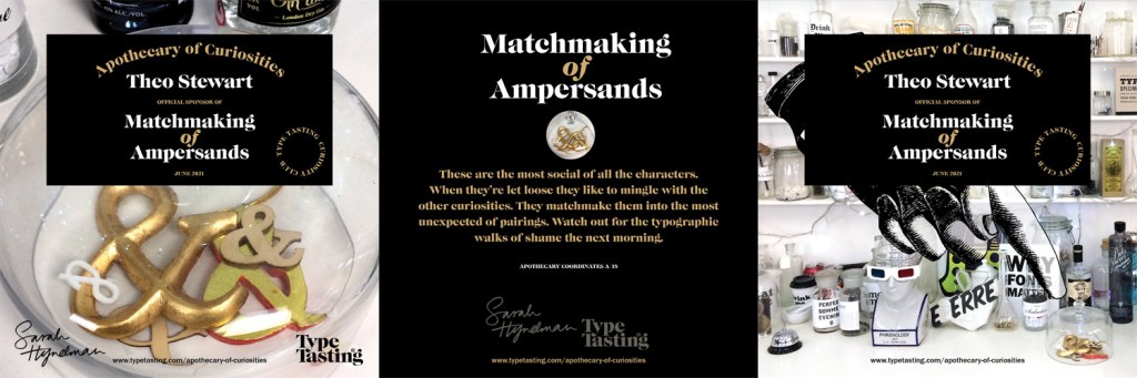
Would you like to become an official curiosity sponsor?
Take a look through the collection—which is your favourite curiosity? You can now be its proud sponsor. You’ll receive an official certificate of sponsorship and you’ll be credited here as the sponsor. You’re also amazing because you’ll be supporting my research and writing.
More objects will be added to the virtual collection so if a curiosity catches your eye that isn’t listed yet, just drop me a message and call first dibs on it.
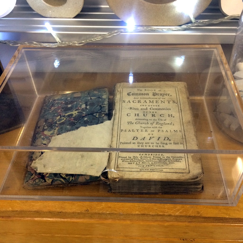
Curiosities shown: C/13 Phrenny, C/1 Black Lobster, H/5 Jar of Brilliant Ideas, D/14 The H that Ran Away from the Circus, H/11 Caustic Sarcastic Scathing Bitter, G/4 Zoetrope the Analogue Animation Machine, A/18 Matchmaking of Ampersands, F/0 1777 Not-by-Baskerville Prayer Book, H/16 Preserved Scent of Childhood. .
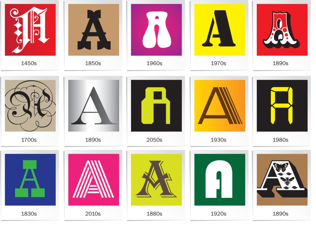
Looking at typeface trends might seem super-geeky, but it’s a way to unlock the secret visual codes that reveal so much about today’s social attitudes and the things you care about. Typefaces don’t just spell out words, they’re also visual codes for ideas. You interact with typefaces almost constantly in your everyday life. They’re the interface between you and your day-to-day experiences that not only inform, but shape, influence and narrate the choices you make.
The typographic landscape around you changes constantly, even if you might not notice at the time. It happens just like tastes in fashion and music change. Sometimes typeface silhouettes mirror the clothes of the day, think of those fat-bottomed fonts in the 1970s when everybody was wearing flares and big platform boots. Typefaces also reflect the cultural attitudes of the moment—ransom note type embodied the rebellious voice of Punk and Stephen Coles of the Letterform Archive observes that the popularity of minimalist typefaces happens in cycles coupled with new technology and waves of modernisation.
.
Do you want to know what type trends reveal about social attitudes today?
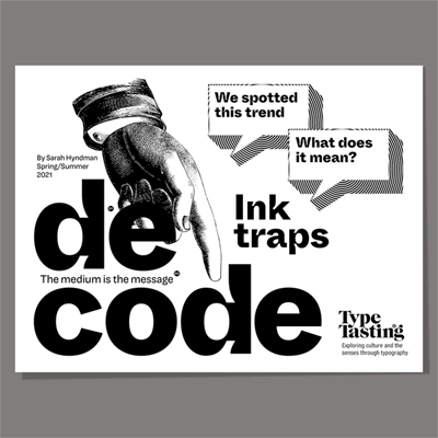
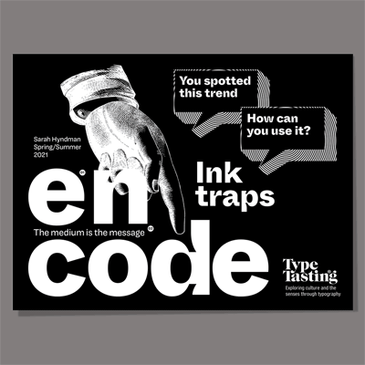
I’m excited to be launching two brand new experimental publications on Patreon. These are inspired by the conversations I’ve had with you at online events over the last few months. One of the most popular topics with everybody, not just designers, has been about type trends. Do they matter and what they mean?
As a result I’m creating two digital publications, which you can get hold of on Patreon. De-code looks at trends and cultural messages. En-code is for designers who use type.
The first trend you’ll explore is ink trap type. I was a judge for the D&AD Awards recently and I noticed that lots of the entries featured ink trap style typefaces. I wondered why, so this became the topic for the first issue.
.
Sign up to the tasting type curiosity club on Patreon. You’ll be supporting my research and writing, and you’ll get access to the publications:
.
De-code
What stories are these curious-looking letters telling you?
In this experimental pdf zine you’ll decode the cultural attitudes that a trend reveals and explore how creates meaning.
Launching 13th May Patreon, De-code Zine tier Sign me up now
En-code
Discerning or gimmicky? How to use this typeface trend
I’ll do the legwork for you and curate a directory of fonts for a current type trend each month to inspire you. You’ll also discover when to (and not to) use them in this experimental pdf companion to De-code.
Launching 13th May Patreon, Insider Insights tier Sign me up now
Are you a culturally curious lover of letters, do you scroll through a font menu as part of your work? What typography problem can I solve for you?
It doesn’t matter whether it feels silly (I promise it won’t be). Maybe it’s “I want to know how to use those new trippy type trends, but I don’t want to get it wrong” or “I want to choose more adventurous fonts, but I don’t know where to start” or “I want to understand how type links to culture”.
Tell me what your problem is so I can work out how to solve it. Click on the link that best describes you and answer three quick questions:
Thank you! You’re shaping the future of Type Tasting. Your name will be credited in the sequel to Why Fonts Matter, I’ll also share my suggested solutions with you (the typography problems will be kept anonymous).
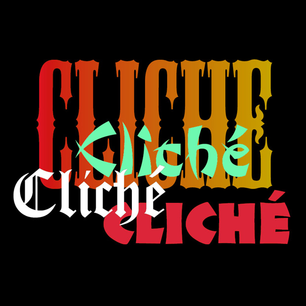
This is a question I’ve been asked a few times recently because the discussion is currently bouncing around social media. Typography is language visualised. It documents cultural attitudes and narrates social change, so it’s no surprise when it becomes a part of the conversation.
The terms we use in this conversation even originate with printing—the word stereotype comes from making identical solid pieces of metal type for printing from a mould, and the word cliché is a French term for this process.
We live in a global and nuanced world in which naive cultural tropes from the past feel lazy or out of sync with our values today. But it’s not the typefaces that are at fault—it’s the context they’re used in and the associations that are forged through repetition.
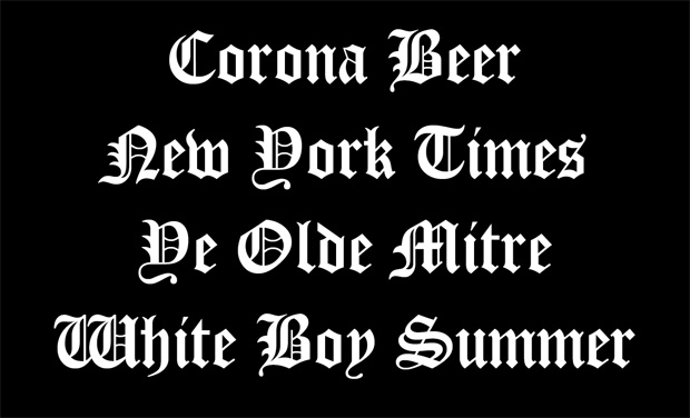
Why does context matter? Because what might have been quick visual short-hand for something that seemed exotic and new in the 1950s becomes an outdated or offensive cliché when used today. Or a typeface that suggests ‘gravitas’ on a newspaper masthead, ‘authentic German recipe’ on a beer, conjures up much darker associations when combined with words like ‘White Boy Summer’.
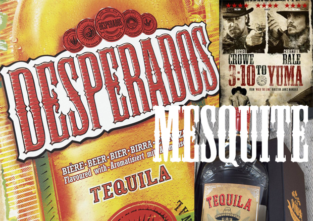
Can a name create fake provenance?
Since writing my first book I’ve tried to find out why decorative Antique Tuscan letters, hugely popular in the Victorian era, have become shorthand for ‘Mexico’. Maybe the silhouette could be a little reminiscent of traditional hacienda architecture, or the letters are spiky like a cactus, or Hollywood has taught us to think of these ornamental wood display types as being ‘wild west’ or ‘western’? But these aren’t genuine or authentic historical links to Mexico, it’s more like a fancy dress font. When I asked a Mexican friend she said ‘only tourists would expect to find that in Mexico’ and the type experts I’ve asked have been unable to shed any light on the mystery.
My theory is that it began when a digitised version of a C19th Antique Tuscan wood display typeface was released in 1990. All the typefaces in this collection were named after kinds of wood to reflect their wood type origins. This particular one was randomly named Mesquite, a plant found in Mexico. Could the name have led graphic designers to assume that the typeface has Mexican provenance? Over the last 30 years this typeface has become a signifier for all things Mexican: Desperados beer (launched in the 1990s), tequila, movie posters, Mexican restaurants etc. Now the cliché has been repeated so many times that it’s hard to unsee.
Here are some really interesting articles…
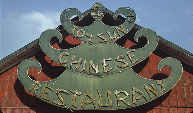
Credit: Library of Congress
Karate, Wonton, Chow Fun: The end of ‘chop suey’ fonts
By Anne Quito, CNN, 2021
Here’s a thought experiment: Close your eyes and imagine the font you’d use to depict the word ‘Chinese.’
There’s a good chance you pictured letters made from the swingy, wedge-shaped strokes you’ve seen on restaurant signs, menus, take-away boxes and kung-fu movie posters. These ‘chop suey fonts,’ as American historian Paul Shaw calls them, have been a typographical shortcut for “Asianness” for decades.
‘Neither the food nor the fonts bear any real relation to true Chinese cuisine or calligraphy. But this has not prevented the proliferation of chop suey lettering and its close identification with Chinese culture outside of China.’
White Boy Summer is a bad idea — but are its shirts racist?
By PJ Grisar, 2021
Despite Hanks’ protestations that the white boys in question were white hip-hop artists like himself, the phrase certainly seems like it might appeal to the Charlottesville and Capitol Siege crowd, and the clothing isn’t helping. Internet observers were quick to opine that, while not quite a Camp Auschwitz hoodie, the text on the clothing, in Gothic font, appeared to be a bit… well, Nazi-ish if not just flat-out racist. The Guardian noted that it resembled Fraktur, a style of script used on Hitler’s ‘Mein Kampf’ and early Nazi letterhead. But what if a font is just a font?
Steven Heller, an art director and graphic design historian who’s written extensively on fascist aesthetics, said that White Boy Summer’s merch ‘speaks more to tone-deafness than racism.’
He argued in an email that using blackletter should not be ‘a priori, considered White Supremacist. But the mash-up of word and letter equals a mental picture that is hard to irradicate.’
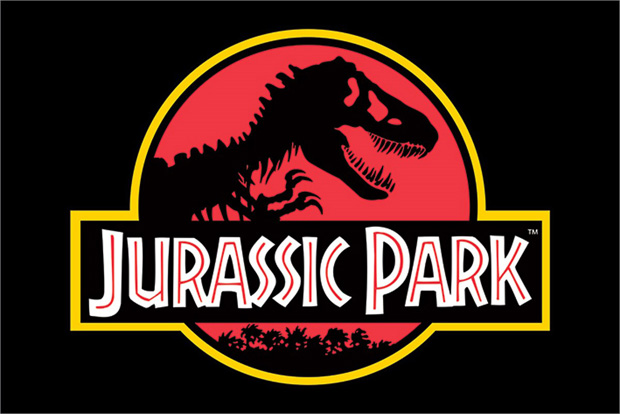
New Black Face: Neuland and Lithos as Stereotypography
By Letterspace (Journal of the Type Directors Club), 2004
The typeface Neuland was designed by Rudolf Koch in Germany in the early 1920s as a modern version of the German blackletter style. By the time it reached the United States it was simply promoted an advertising typeface, a ‘type that attracts attention’. Koch’s intentions for the font to modernise an ancient form of writing had been entirely lost.
Neuland has come instead to be used as a signifier of the ‘exotic’ or ‘primitive’ and often ‘Africa’, all far removed from the purpose for which its creator originally intended it. You’ll see it on Jurassic Park films, Trader Vic’s, Natural American Spirit cigarettes and The Lion King.
Type designer Jonathan Hoefler says ‘I suspect that designers who use Neuland or Lithos as an approximation of the Africanesque are being unimaginative at best, and jingoistic at worst.’
Would you like to know more about typography and culture?
Join me, Sarah Hyndman, for a Decoding Type Trends (Semiotics) Masterclass. Learn how typography reflects wider cultural trends and future-proof your communications. Ideal for those in the communications industries, designers and students.
Availability is limited so give me a shout now if you’d like to arrange a 10-minute call to find out whether this session is right for you.