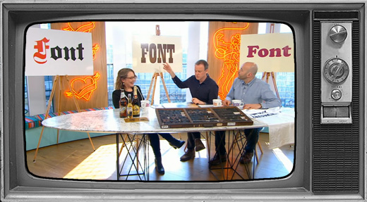
This is a question I’ve been asked a few times recently because the discussion is currently bouncing around social media. Typography is language visualised. It documents cultural attitudes and narrates social change, so it’s no surprise when it becomes a part of the conversation.
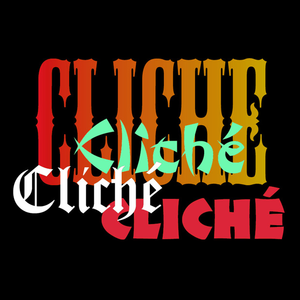
The terms we use in this conversation even originate with printing—the word stereotype comes from making identical solid pieces of metal type for printing from a mould, and the word cliché is a French term for this process.
We live in a global and nuanced world in which naive cultural tropes from the past feel lazy or out of sync with our values today. But it’s not the typefaces that are at fault—it’s the context they’re used in and the associations that are forged through repetition.
Why does context matter? Because what might have been quick visual short-hand for something that seemed exotic and new in the 1950s becomes an outdated or offensive cliché when used today. Or a typeface that suggests ‘gravitas’ on a newspaper masthead, ‘authentic German recipe’ on a beer, conjures up much darker associations when combined with words like ‘White Boy Summer’.
Can a name create fake provenance?
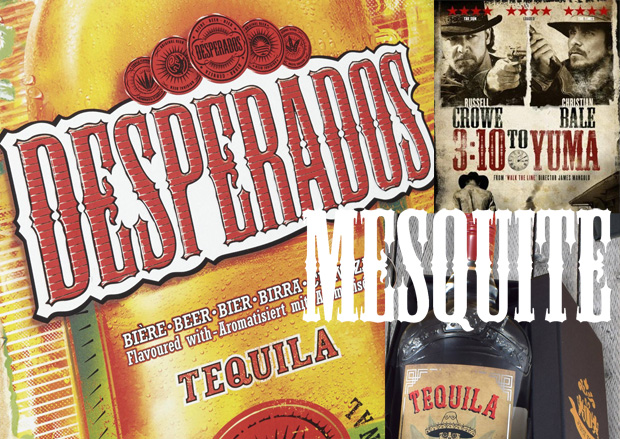
Since writing my first book I’ve tried to find out why decorative Antique Tuscan letters, hugely popular in the Victorian era, have become shorthand for ‘Mexico’. Maybe the silhouette could be a little reminiscent of traditional hacienda architecture, or the letters are spiky like a cactus, or Hollywood has taught us to think of these ornamental wood display types as being ‘wild west’ or ‘western’? But these aren’t genuine or authentic historical links to Mexico, it’s more like a fancy dress font. When I asked a Mexican friend she said ‘only tourists would expect to find that in Mexico’ and the type experts I’ve asked have been unable to shed any light on the mystery.
My theory is that it began when a digitised version of a C19th Antique Tuscan wood display typeface was released in 1990. All the typefaces in this collection were named after kinds of wood to reflect their wood type origins. This particular one was randomly named Mesquite, a plant found in Mexico. Could the name have led graphic designers to assume that the typeface has Mexican provenance? Over the last 30 years this typeface has become a signifier for all things Mexican: Desperados beer (launched in the 1990s), tequila, movie posters, Mexican restaurants etc. Now the cliché has been repeated so many times that it’s hard to unsee.
Here are some really interesting articles…
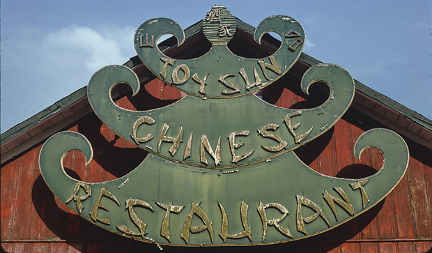
Karate, Wonton, Chow Fun: The end of ‘chop suey’ fonts
By Anne Quito, CNN, 2021
Here’s a thought experiment: Close your eyes and imagine the font you’d use to depict the word ‘Chinese.’
There’s a good chance you pictured letters made from the swingy, wedge-shaped strokes you’ve seen on restaurant signs, menus, take-away boxes and kung-fu movie posters. These ‘chop suey fonts,’ as American historian Paul Shaw calls them, have been a typographical shortcut for “Asianness” for decades.
‘Neither the food nor the fonts bear any real relation to true Chinese cuisine or calligraphy. But this has not prevented the proliferation of chop suey lettering and its close identification with Chinese culture outside of China.’
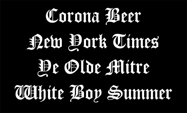
White Boy Summer is a bad idea — but are its shirts racist?
By PJ Grisar, 2021
Despite Hanks’ protestations that the white boys in question were white hip-hop artists like himself, the phrase certainly seems like it might appeal to the Charlottesville and Capitol Siege crowd, and the clothing isn’t helping. Internet observers were quick to opine that, while not quite a Camp Auschwitz hoodie, the text on the clothing, in Gothic font, appeared to be a bit… well, Nazi-ish if not just flat-out racist. The Guardian noted that it resembled Fraktur, a style of script used on Hitler’s ‘Mein Kampf’ and early Nazi letterhead. But what if a font is just a font?
Steven Heller, an art director and graphic design historian who’s written extensively on fascist aesthetics, said that White Boy Summer’s merch ‘speaks more to tone-deafness than racism.’
He argued in an email that using blackletter should not be ‘a priori, considered White Supremacist. But the mash-up of word and letter equals a mental picture that is hard to irradicate.’
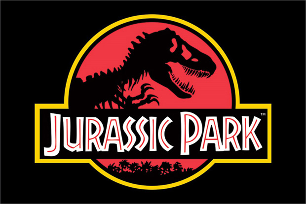
New Black Face: Neuland and Lithos as Stereotypography
By Letterspace (Journal of the Type Directors Club), 2004
The typeface Neuland was designed by Rudolf Koch in Germany in the early 1920s as a modern version of the German blackletter style. By the time it reached the United States it was simply promoted an advertising typeface, a ‘type that attracts attention’. Koch’s intentions for the font to modernise an ancient form of writing had been entirely lost.
Neuland has come instead to be used as a signifier of the ‘exotic’ or ‘primitive’ and often ‘Africa’, all far removed from the purpose for which its creator originally intended it. You’ll see it on Jurassic Park films, Trader Vic’s, Natural American Spirit cigarettes and The Lion King.
Type designer Jonathan Hoefler says ‘I suspect that designers who use Neuland or Lithos as an approximation of the Africanesque are being unimaginative at best, and jingoistic at worst.’
Would you like to know more about typography and culture?
Join me, Sarah Hyndman, for a Decoding Type Trends (Semiotics) Masterclass. Learn how typography reflects wider cultural trends and future-proof your communications. Ideal for those in the communications industries, designers and students.
Availability is limited so give me a shout now if you’d like to arrange a 10-minute call to find out whether this session is right for you.