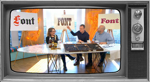
Channel 4’s Sunday Brunch features history and fashion in type with Sarah Hyndman
Sarah Hyndman interviewed on Sunday Brunch on April 9th 2017, this is available here on catchup TV in the UK (the interview starts at around 01:10). This is an overview of the conversation that covered 550 years of type in eight and a half minutes, with a few supporting facts added in.
The production team and graphics department at Princess Productions sourced and created most of the examples, we all had a lot of fun because they were excited about the segment. Presenter Simon is also a very big type fan and had his copy of the book stashed in his bag to take home with him.

Tim: Welcome back to Sunday Brunch live. We’re here with graphic designer and author Sarah Hyndman. You’re going to teach us a little about the history of typography, what is it first of all?
Typography is written language made from preformed letters that can be repeated over and over. During the centuries many shapes and styles of the letters have been designed, all of which have absorbed their own set of associations or meanings. We might think that we don’t notice these meanings, but we do because reading is a complex task performed by our non-conscious (like driving or walking), and as a result the type communicates directly with our non-conscious brain.
Looking at type in context is like code breaking. The shapes and styles appear in all aspects of our everyday lives and form a mirror for social history and cultural change. Looking at the typefaces gives you many clues about historical context, origins and genres.
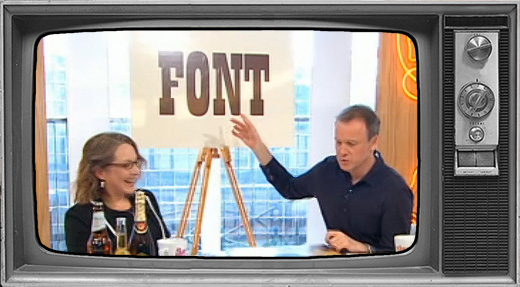
Simon: I like the word typeface better than font, what’s the difference?
A typeface is the design, like Helvetica. A font is the physical form of a typeface—this could be the metal type we print with, or the digital file on your computer. However, the terms are used fairly interchangeably outside the professional world of graphic design and typography.

Tim: You’re now going to take us through the history of a few well-known fonts. First we’re going to look at this gothic font, when was this first used?
Printing first came to Europe in the 1400s and at the time, like many new technologies, it copied the format of the existing technology—in this case hand-written books. Books were huge and prestigious artefacts, carefully hand written by monks and scribes in ornate and calligraphy style that we know as gothic or Blackletter.
Simon: You wouldn’t expect to read a book in this style today?
No, today we would consider this a display type style and would find this too ornate and difficult to read in the body of a book. However this was the style everybody was familiar with at the time, so they found it easier to read and you could almost consider it to be the equivalent of the Helvetica of its day.
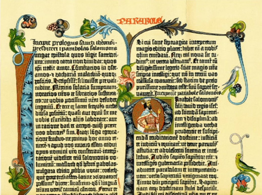
These ornate letterforms were recreated as metal type, each letter created as a separate printing block that would then be arranged one by one to create the page so that it could be printed. These were set in reverse so that they would print in positive, so it was easy to confuse some letters that are mirror-versions of each other such as ‘p’ and ‘q’. This is where the phrase “mind your ‘p’s and ‘q’s” comes from.
Tim: And it was used in quite an important book wasn’t it?
The first major printed book was the Gutenberg Bible, printed in Germany in the 1450s. The type style’s links to scripts written by monks and the first printed Bible have given it spiritual associations of wisdom.
Tim: How did the use of the gothic font change over the years?
These type styles were popular throughout Europe as the printing press, and the metal type, travelled. However it was difficult to create these incredibly ornate letters and to print them on the coarse-textured paper of the day so they were gradually replaced by much simpler styles inspired by Roman carvings. However they remained popular in Germany until the start of the 20th century, this was when attitudes in Europe changed from valuing the traditions of the past to embracing technology and the machine age of the future. This can be seen in the new, minimalist and often geometric type styles that became popular. It was re-adopted briefly in Germany during World War II when there was a return to nationalism and traditional values, but this was short lived.


Tim: The font is still in use today, isn’t it?
Typefaces are like sponges, they absorb meanings from the context we see them used in, and we can then find clues in this visual code. Yes these styles can still be seen all around us today, for example the associations with Germany can still be seen on beer labels. German brewers travelled around the world in the 1800s and they took with them their styles of beer. The San Miguel and Corona are both Pilsner style lagers, this is a style that originates in Germany and is associated with old world lager quality—this is reflected in the type styles appearing on the labels. The Leffe is not pilsner-style beer, but it was originally brewed in monasteries by monks so in this instance the type style is likely referencing the meticulous and calligraphic handwriting of the monks.
“German brewers went around the world during unrest over German unification so took German styles of beer with them. Their teutonic style remains a signifier of old world lager quality.” Beer writer Pete Brown
Simon: We were talking earlier about the difference it would make if it used a typeface like Comic Sans on the label instead, do you think that would change what you think about the beer?
Yes, firstly it would be aimed at a different and rather under-aged demographic. I think it would also suggest the beer would taste different—you wouldn’t be expecting so much of a fizzy pilsner-style beer and instead might expect it to be sweeter and more like pop.
Tim: What else do we associate this font with today?
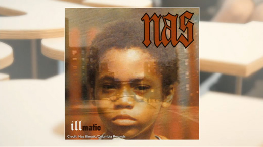
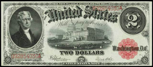
If I see it on a record I think of heavy metal music for which it’s spiky, aggressive shapes and negative associations mirror the sound of the music well (Tim mentions Motorhead). However when I show it to younger members of the production team they associate it with hip hop music. One of the reasons for this may be that it’s referencing the bling lifestyle of the rap artists by using type styles seen on old dollar bills.
Tim: Next we’re talking about Slab Serifs, when did these come about?
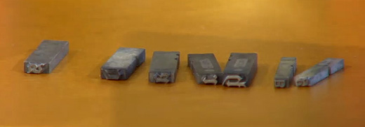
These styles of typefaces appeared in Victorian London after the Industrial Revolution. For the first time manufacturers were able to produce their goods in excess of demand, thanks to mechanisation. This led to the creation of the advertising industry as now products needed to be advertised to be sold. It was discovered very quickly that the delicate little typefaces used in books just weren’t big and bold enough for adverts and posters that needed to be noticed in a noisy and chaotic visual environment. In the 1800s typefaces like Clarendon were designed that had big, blocky serifs (these are the ‘feet’ on the letters) that were bold, robust and could be seen from a great distance.
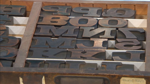
The tray of beautiful wooden Slab Serif type is Case No. 7, kindly lent to us by letterpress artists Julieta and David from Pixel Press.
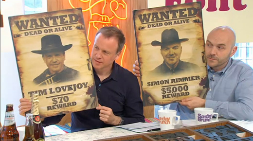
Tim: What is the association with Slab Serifs and the Wild West?
This was an era when the English were exporting their goods to the colonies, especially those in the New World, and these goods included typefaces and printing blocks. Travelling printers went from town to town in America, with the printing blocks bouncing around in the back of the wagon because it was long before roads, and only the most sturdy and robust typefaces survived. They printed everything each town would need, and Hollywood would suggest that one of the main things a town would require would be wanted posters. This is now a visual code that has been repeated in the movies so many times that we now associate it with Wester movies, and Country and Western music, even though these styles originated in Victorian London.
Simon points out that he doesn’t like it when a capital J falls below the baseline. This is a topic for another conversation.
Tim: Finally, we have Cooper Black…
This typeface is having its moment in the spotlight as it’s currently all the rage on fashion blogs and in high street fashion shops. It was originally designed in the 1920s and, unlike the angular and blocky Slab Serif style, it’s shape is curvaceous and looks like bubblegum bubbles.
Tim: Why was it big in the 70s?
Typefaces often reflect the aesthetics or fashions of an era, and I think Cooper Black mirrors the silhouette of the 70s: platform boots, flares, billowing smock shirts.
It was also the style of lettering you would use if you wanted to get customised t-shirts made up because Cooper Black was available as iron-on velour letters (it felt a little like the flock wallpaper in the local restaurant). You often find that typeface fashions follow developments in printing technology, and being the go-to font for D.I.Y. t-shirt printing meant that it became incredibly popular in the 70s from Summer holiday t-shirts to breakdance crews using the iron-on letters to create their uniforms.
Tim: It’s back in vogue now?
Once it became oversaturated it fell out of fashion, until it began to appear again in fashion blogs and on Instagram today. It has now become short-hand for 1970s style, which is popular again now. Cooper Black is like a typographic Instagram filter for the 1970s.
Tim: What will the next big trend in fonts be?
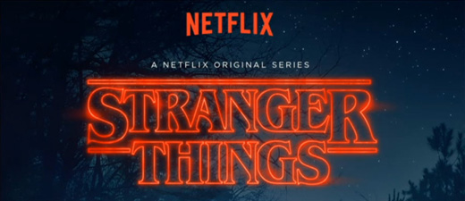
It’s hard to predict as these pop up anywhere and become social trends, it could be an artist using a typeface on a record cover or a TV series. We’ve recently seen a return to the 1980s with series like Stranger Things and Lethal Weapon using classic 80s style typefaces. The 1990s are on their way with series like Twin Peaks, so maybe the next big thing typographically will be to move towards the shoulder pads and pencil skirts/trousers silhouette of the 90s and for typefaces to be bold and angular at the top, tapering down to a point.
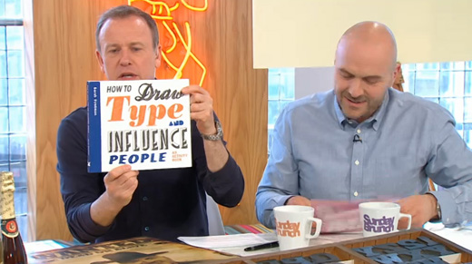
Tim: Thanks Sarah. Sarah’s book ‘How to Draw Type and Influence People’ is out next week.

How to Draw Type and Influence People: An Activity Book by Sarah Hyndman
![]()
Just my type: how Cooper Black became 2017’s most fashionable font
![]()
Vetements, Brioni and Kanye Agree: It’s Gothic Time
![]()
Type Tasting games and Why Fonts Matter
Sunday 7th February 2016
Read more…
.
