Author Archives: Type Tasting

Unknown's avatar

About Type Tasting

Sarah Hyndman is a graphic designer, author and public speaker.

Multiple Choice, Grafik

Grafik Grafik

In celebration of the official launch of Why Fonts Matter in the US today: Grafik asked how I chose the typfaces for Why Fonts Matter. “Choosing fonts for a book called Why Fonts Matter is always going to be tricky.”
(Please note, the competition date has passed).

Grafik
Multiple Choice

grafik logo


A taste of type, Creative Review

Creative Review Creative Review

In celebration of the official launch of Why Fonts Matter in the US today: Creative Review ran a piece on the pop-up Type Tasting at the V&A for the London Design Festival. “Type Tasting’s series of multisensory experiments, for me, turned typography on its head.” Natalie Kelter

Creative Review
A taste of type, Natalie Kelter

creative review logo 2up 300

(Photos David Owens)


Font of inspiration: London’s lettering, Financial Times

Financial Times Financial Times

In celebration of the official launch of Why Fonts Matter in the US today: The Financial Times reported on London’s lettering, giving Dalston Type Safaris a good mention. “Graphic designer Sarah Hyndman is on a mission to make typography more appealing.”

Financial Times
Font of inspiration: London’s lettering
By Rob Alderson

FT-Logo


Type on the tongue, Eye

eye 1Eye Eye

In celebration of the official launch of Why Fonts Matter in the US today: Eye’s panel checked out the taste of Helvetica, Impact and Comic Sans (as cooked up by Sarah Hyndman). “Perfect. Helvetica is too serious to be sweet.” “Tastes more like Akzidenz Grotesk”, “Comic Sans deserves better”

Eye
Type on the tongue

Eye logo


Why Fonts Matter, and how they impact your mood, It’s Nice That

Mood

In celebration of the official launch of Why Fonts Matter in the US today: This post about fonts and mood became the most popular post on It’s Nice That in the first three months of 2016. “The one womantour-de-force behind Type Tasting … looks at the power typography has over our lives and senses.”

It’s Nice That
Why Fonts Matter, and how they impact your mood

itsnicethat_logo


If You Love That Font So Much, Why Don’t You Date It? Wired

Wired

In celebration of the official launch of Why Fonts Matter in the US today: Liz Stinson from Wired played the Type Dating Game via Skype. “20 percent of women said they’d pick Franklin Gothic as their typographic beau, the winner by a landslide. I know it sounds weird.”

Wired
If You Love That Font So Much, Why Don’t You Date It?
By Liz Stinson

wired logo LR


What’s your type of lover? CNN

CNN CNN

In celebration of the official publication of Why Fonts Matter in the US today we’re looking back over articles and interviews that give a glimpse of the impression we’ve made on the world at large.

Jake Wallis Simons from CNN came to the Type Tasting studio and played a selection of Type Tasting Games. “As bizarre as it sounds, my job is to match up the bottles and fonts using only my sense of smell.”

CNN
What’s your type of lover? How fonts could help you find the perfect date
By Jake Wallis Simons

Why Fonts Matter in the US

Layout 1 (Page 9 - 10)

Why Fonts Matter US publication Why Fonts Matter US Why Fonts Matter US

Click on the images above to take a quick tour of the book, which will officially be launched in the US on June 1st.

You can buy it online in the UK here, and in the US here. It’s also in plenty of bookshops, museum and gallery shops, please send a photo if you spot it somewhere, and support your local bookshop.


Dalston Type Safari

old dalston 3
old dalston 4

Take a walking tour of Dalston in East London with author Sarah Hyndman. See how the signage reveals that the area dates back to the 1800s with its own grand department store, pie & eel shop, Art Deco cinemas, a factory that sold paints to JMW Turner, and the market that inspired Eastenders.

Update. There are no Type Safaris departing this year as Sarah focuses on new and exciting projects. If you would like to arrange a private tour for your company please get in touch with sarah(a)typetasting.com.

“Fabulous tour of Dalston… Exploring the urban fabric through type” Sarah Stewart, Londonist

“A unique & interesting way to ‘read’ the city.” Sophie Nellis

Find out more…

old dalston 5

It’s time for a type revolution

It's time for a Type Revolution

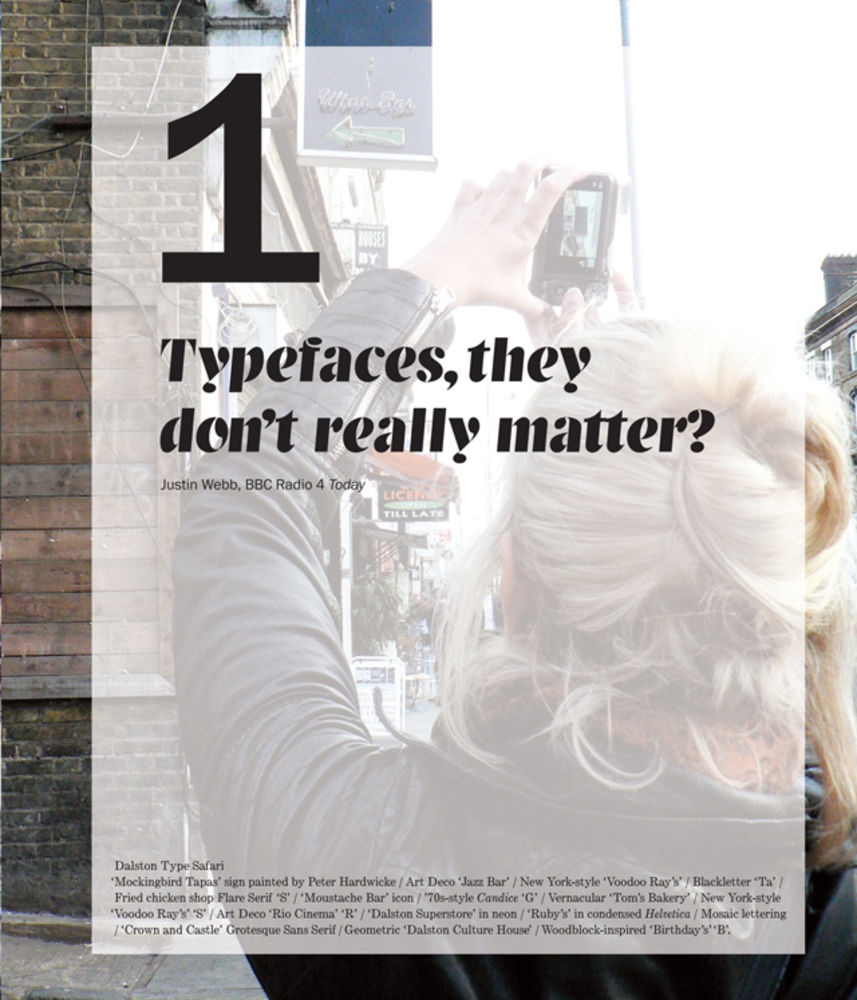
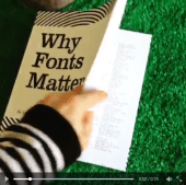
It’s time for a type revolution. It’s time to change the way we think and talk about type: for non-experts to join the conversation. 

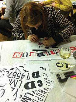
Type Tasting delivers talks, ice-breaker sessions, masterclasses and workshops that make the complex topic of typography accessible and relevant beyond the design studio. We take the type consumer’s point of view and explore the experience of type—how it influences our perception and can alter our decisions. 

“Clever, insightful and original, left a lasting buzz and excitement behind!” Charlotte Godfrey, BBC Bristol.

Playing Type Karaoke How you say it

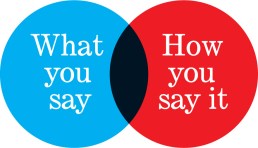
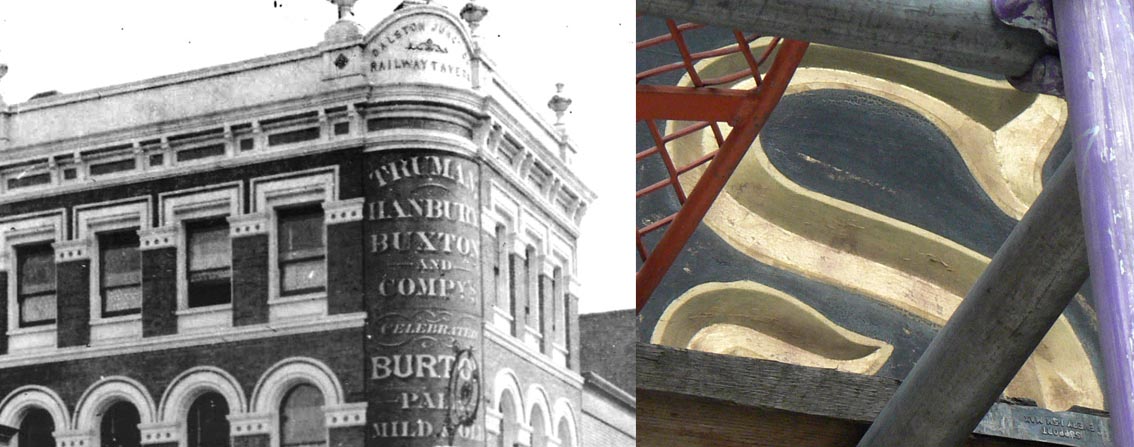
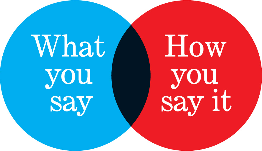
It’s time for typography to be demystified. Design tools are becoming everyday applications and they are used by all of us both at work and at home. Typography—the choice of fonts and how they are arranged—is a fundamental element of design because it is what the voice looks like. Yet it is wrapped up in the language of a specialist discipline and this makes it intimidating for those outside the profession to join in the conversation.

“Sarah brings the power of fonts to everyone” Patrick Burgoyne, Editor of Creative Review.

Type Tasting experiments Type Tasting surprise1

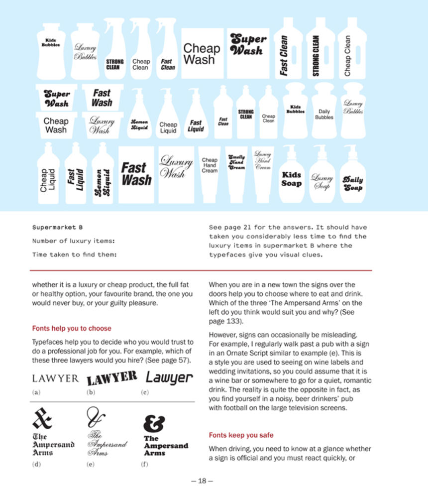
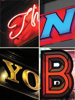
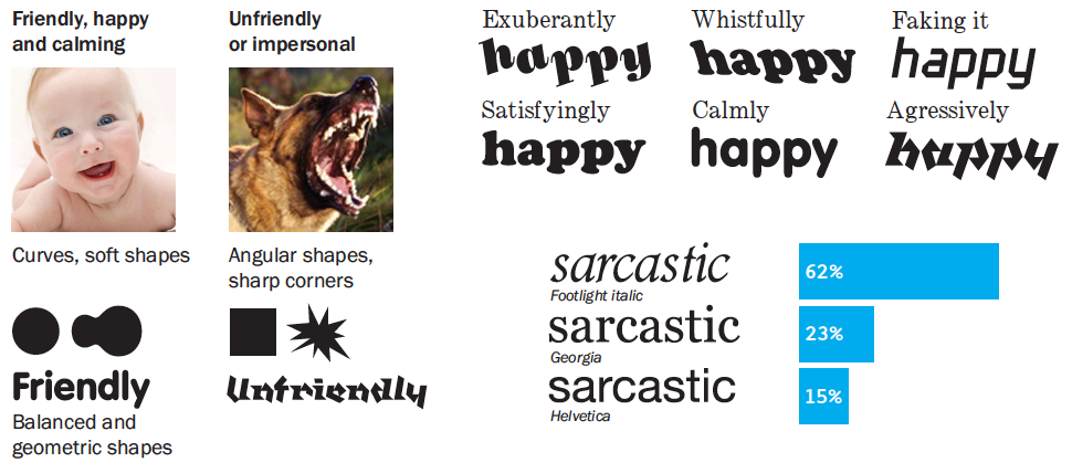
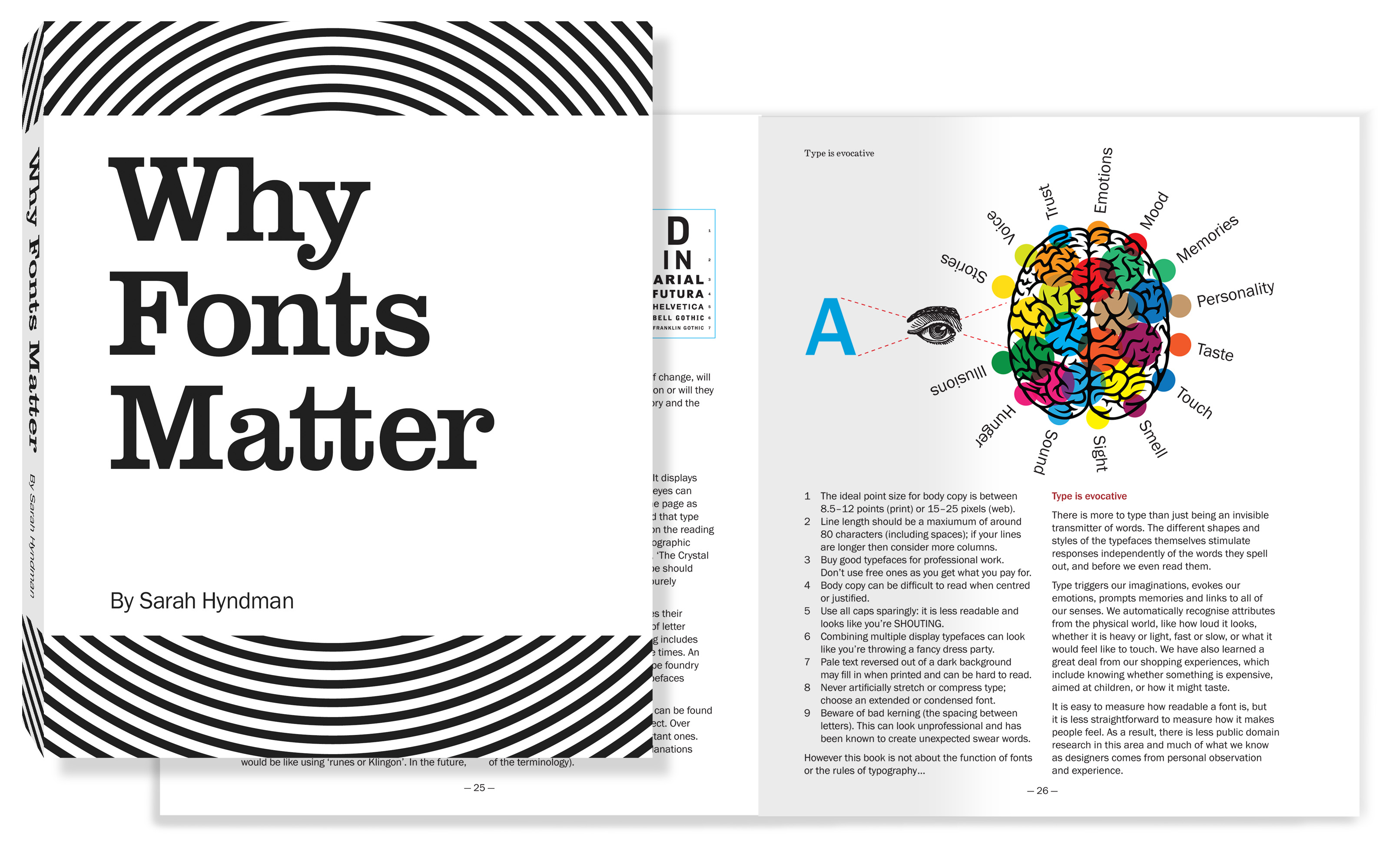
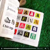
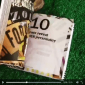
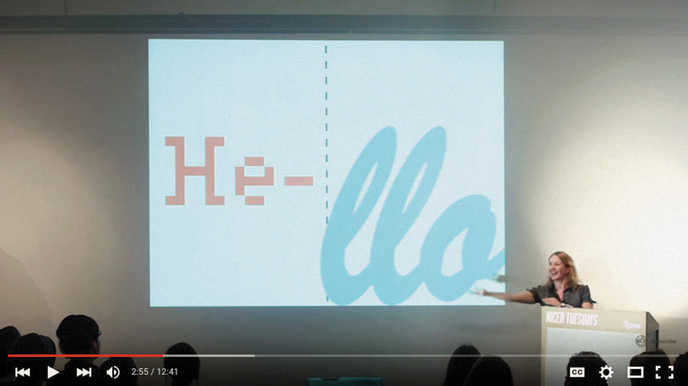
It’s time for typography to become visible. We live in a time of increasing design awareness and we now ask questions about the messages we are bombarded with in our everyday lives. Each font/typeface has a personality that influences our interpretation of the words we read by evoking our emotions and setting the scene. We all understand this instinctively but it happens on a subconscious level. Conscious awareness of the emotional life of fonts can give us more control over the decisions we make.

Continue reading